
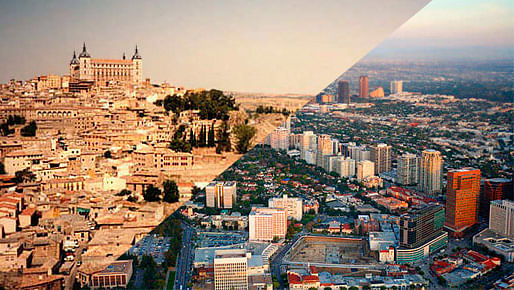
Our education is based upon the Classical education. An architect is a mason who has learned Latin. Modern architects seem, however, more likely to have mastered Esperanto.
Adolf Loos, “Grundsätzliches von Adolf Loos,” Adolf Loos (Vienna: 1930), p. 17.
In our world of powerful stimuli and the often irresponsible, commercially motivated love of experimentation for its own sake, there is a great deal that does not establish real communication. For intoxication alone cannot insure lasting communication.
Hans-Georg Gadamer, The Relevance of the Beautiful (UK: 1970), p. 51.
The art of building has been transformed into a business of self-display and promotion through the design and construction of figurative motifs, making it an object of consumption.
David Leatherbarrow, The Roots of Architectural Invention, (UK: 1993), p. 1.
Preface
This essay is my participation in the dialogue between the two ways of working in contemporary architecture – one that moves forward also by looking back, and another that is best described by Dalibor Vesely as “a discipline that is the result of the transformation of the broadly oriented art of building into a separate profession, judged mostly by the criteria of technical disciplines.”i
Issues in Building and Making
I think it is most significant that the criticisms on the contemporary way of architecture are not simply attacks on style or taste, but ones that address four issues that have been with us from the earliest times.
The first is related to the issue of over-reliance, or easy obsession. The objects of this obsession are decontextualized words; flattened images that are reproductions of the words; and tools and techniques of design for this reproduction. Architects struggle with words. This is perhaps why Vitruvius prioritized the skill of writing for us. In such a struggle, we seem to be easily fascinated with borrowed words that appear to legitimize our operations. The problem is that such fascination often takes the words so out of their original context that in the end their meanings are reduced. We witness that some of us are fascinated with words like “generative”, “non-linear”, “algorithmic”, etc. These words, borrowed from the disciplines of mathematics and biology, and used almost interchangeably, are used to describe a method of design in architecture.
The visualization procedure of “algorithmic design” happens in another medium – a computer-based design tool; between our hands (what we draw) and our eyes (what we see as we draw). And the ‘flattening’ takes place here as the complex non-linear algorithms are – through this separate visualization procedure - turned into diagrammatic reproductions, only to be used for interesting pattern-making and sculptural purposes in design of buildings and cities. Cellular automata, originally a microstructure modeling process, and the rhizome model of Gilles Deleuze, an analysis of a life organism first developed to better describe the social dynamics and connections, are just two of many non-linear diagrams that are repeatedly adopted this way by contemporary designers. But this is not a new problem limited to a certain way of designing. While architects really need urban research information to achieve the ability to design what Aldo van Eyck called “the physical counter-form to social form”, and what Alison and Peter Smithson called “active socioplastics”, the relationships and the powerful resources revealed by overlaying multiple-variable maps that show how social and economic conditions distribute in reality are often neglected, and pattern maps with single variables, which do not signify relationships, are used merely to aid the discovery of points in space and cool new forms.ii
Then there is the over-reliance on design tools and other techniques of production. Most of the computer-based tools that are employed in our profession are initially developed by people in other fields. Recently, we have adopted them from mechanical engineering, aero-dynamics, industrial product design, as well as the animation industry. While one could argue that this sort of adoption pushes the boundaries of our field – and it has - it also poses a problem: these design tools are concerned with parameters and circumstances different from those of architecture. Richard Neutra identified these given conditions in architecture: quantities of sunlight, of humidity, of wind, and so on. He also described the effects of these phenomena: baking, corrosion, erosion, etc. iii These effects of a location and material behaviors, elemental conditions, gravity and other forces of nature are not always included in the environment settings of these computer-based tools. The ones we have borrowed from the animation industry are especially problematic because they are not only mainly concerned with virtual image-making, but also they often give the illusion that the simulated natural behaviors are real, while they are in fact ‘simulations’ generated by codes written by some software developers. It is easy to find comfort in the hundreds of parameter settings of the flocking or swarming pattern generator (simulating birds, bees, or fish) in these tools. However, does nature work with a few hundred parameter buttons? It might work with a hundred million or just three. The point is, the simulation patterns generated this way should not be taken into design without this acknowledgement – that they are flattened reproductions. But this realization may take time, something that is only revealed through thorough exhaustion of the possibilities offered by the tools. This revealing of the limitations and potentials of a tool is, in another word, ‘craftsmanship’. It is the kind of craftsmanship that the Japanese Katana blade makers train for, and one that comes with tens of thousands of hours of practice. iv The blade makers either inherit their tools from their teachers or make own. This is not to say that architects should always develop our own computer-aided design tools. The point is that the blade makers know exactly how heavy their hammers are and what they do to the hot metal when they are swung with a certain amount of force. True possibilities of making are achievable only through true understanding of the limitations and possibilities of the tools used. But the way our profession is set up now makes this kind of craftsmanship difficult to develop. Currently, the business model of the software companies that own most of the computer-aided design tools works through continuous releases of new versions. These versions come with ‘upgrades’ that require some re-learning and definitely re-purchasing and re-implementation, and in order not to fall behind in the new trends of design, architects adapt to this constant replacement of their tools before they are fully tested and learned. This redundancy of effort makes our skill development run in circles. If the Japanese blade makers have to change their tools every six months, it would take them much longer to be skillful in their art.
Nevertheless, as I have stated earlier, these are born out of obsession. Obsessions are not only resistant to reason, but they could also result in - dare I say - something wonderful, given that the passion in being obsessive is well oriented. Imaginably, such rigorous obsessing with the tools could in the end result in some form of craftsmanship and tradition through reiterations – in a way similar to how the continuous rebuilding of the Ise Shintoist temple in Japan validates and passes down a tradition through cycles.
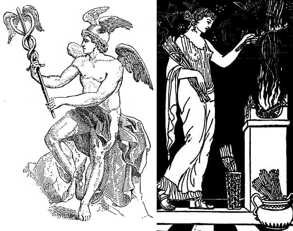
Therefore, this essay will focus on the latter three issues of architecture, which I think are more fundamental. The second and third issues are connected to the ancient Greek concept of ‘decorum’. Decorum comes from understanding the given situation and being ‘appropriate’ in response. For architects, praxis of architectural design can be an interpretive tool for the given, which can start as a form of site analysis that embraces not only the physical context, but also the cultural, technological and social dimensions in its scope. A portrayal of these issues can be found in Greek Mythology. Carved on the base of the great statue of Zeus at Olympia are the twelve gods. And these gods are arranged in orderly pairs -- Helios with Selene, Aphrodite and Eros, etc. Here, Hermes is paired with Hestia. (Figure 1) Hestia, or Vesta in Latin, is the deity that protected the hearth and Hermes managed the boundaries. v For an architect, this provides the place of residing and also the place of encounter with a world which cannot be controlled and is radically other. This bridging between the worlds encompasses the second and the third issues outlined above. In other words, there are the consideration for ‘what is given’, and the communicative structure of architecture that self-projects through and beyond the givenness.
The concept of communicative architecture can be further illuminated through a fourth and final issue -- one related to the ‘purpose’ of our art. Having a purpose is being oriented toward a goal. In art, this goal and the difficult road leading to it are most poetically described by Michelangelo: “On the way of the true there is not any truth, but only the imagination of truth; and the truth is there where it is… So, whoever is nearer the truth when he sees it, more knows himself not to be at the truth than does he who is far from it in a place from which he cannot see it… and then just as much more I see that I am outside it, because the imagination that increases me, diminishes me; and the true, by being there near at hand, makes itself more clearly known to me.” vi Gadamer offers us another account of this final issue in art: “The work of art transforms our fleeting experience into the stable and lasting form of an independent and internally coherent creation. It does so in such a way that we go beyond ourselves by penetrating deeper into the work. That ‘something can be held in our hesitant stay’ – this is what art has always been and still is today.” vii In this essay, through architects whose works I believe are exemplary in addressing these issues, I argue that the orientation toward the truth in architecture is toward an understanding of what it means to be in the world, in harmony, with the others. This is our version of the “difficoltà” – participation in the dialogue of our open society through the difficult, inclusive composition of ‘being here, therefore everywhere’ rather than the easy unity through exclusion.
Architecture in the Givenness
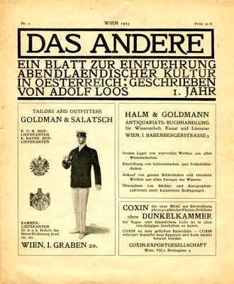
Participation in the emerging culture and responding to given conditions was important for Adolf Loos, as a matter of “principle.” For him, Decoration was no longer the issue. Instead, it was the old demand for decorum, or appropriateness.
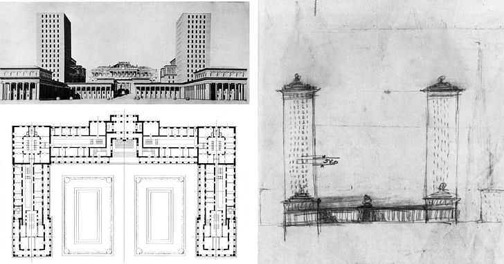
In the case of his project for the Development of the Horticultural Association Grounds in Vienna, while playing with the scale of the forms appropriate for a project of this character, Loos also considered the relationship of his towers’ height to the spire of St. Stephen’s Cathedral, and had provided for their due subordination by adjusting the height and also pushing them back from the façade so that the Viennese landmark can be seen from the public space in front. According to Ludwig Munz, “Loos had intended this whole scheme as a memorial to the victorious monarchy; he had devised it so as to create a large, clear and impressive building, which at the same time was suitable for its purpose in every respect.” viii (Figure 2)
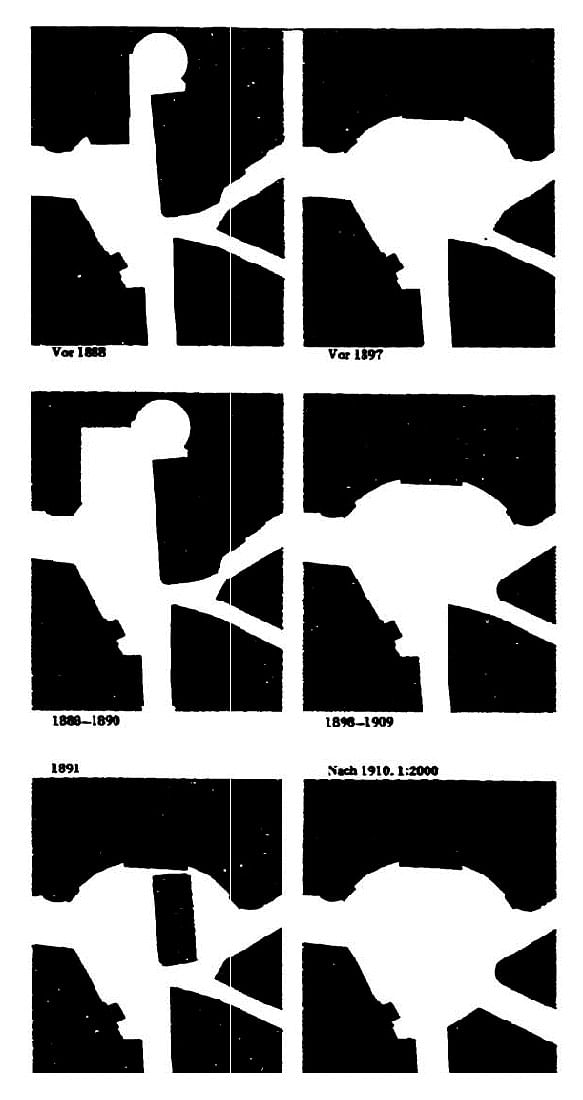
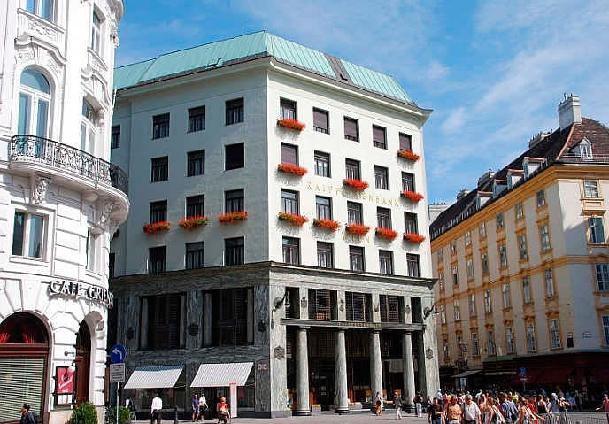
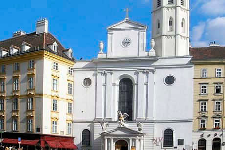
Such “suitability in every respect” can also be found in the planning of the Looshaus and its stepping back from the public area to make way for the more important church. (Figure 3) In fact, Werner Oechslin writes: “Looshaus in Michaelerplatz followed from an entirely different kind of architectural tradition than the one concerned with the application or omission of a more or less thick decorative hull. The building’s construction and sense of ‘decorum’ was closer to the Greek tradition.” ix This belief, that a style might be defined only through validation is a moral position. Moreover, the building plays with another aspect: its identity. The building is neither modern nor traditional. Such ‘clear ambiguity’ is generated by the combined use of modern elements with classical elements. While the punched windows, large open expanses without columns, and flat un-ornamented surfaces speak the language of modern cities, the Doric columns and their symbolic approximation of the entry porch to the St. Michael’s church hide the building’s modernity. This quiet yet decisive gesture is also what defines the characteristics of his architecture and his idea of participation in the dialogue of the city and through the difficult composition of ‘being here, therefore everywhere’. (Figure 4 & 5)
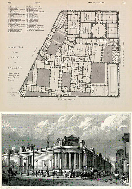
Such participation through decorum can also be found in Sir John Soane’s Bank of England. Soane was commissioned to reestablish the façades to enclose the distorted intricacies of interior spaces and courtyards of the bank that had accumulated over time. Hence there was a certain need to cope with the complexity that was already given in the site. The task of the facade was to represent the institution in a coherent manner, and to relate to the scale of the city in an appropriately civic manner. The result is an architecture that engages in a dialectic between the appearance of the self-sufficient whole on the outside, and the intricacies and fragmentations of the inside. (Figure 6)
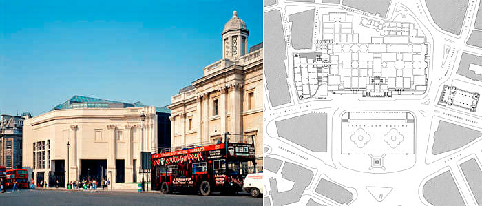
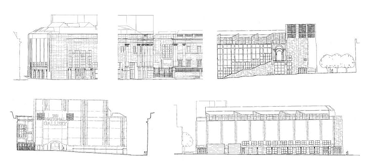
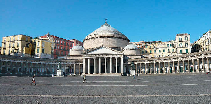
The same kind of appropriateness is also witnessed in Venturi and Scott Brown’s Sainsbury Wing project. (Figure 7) The given task here was to compose an addition to this monumental national gallery by William Wilkins, built in the 19th century. While it is easy to read four facades at first, there actually are five different faces, each independent and made appropriate for the sides they are oriented to. (Figure 8) The most playful face – one that is situated diagonally toward the center of Trafalgar Square - results from the introduction of the reveal joint between the existing and the new structures, and stepping back of the Southeast corner to conserve the dominance of the original building. This is also the face that most clearly acknowledges its immediate adjacency to the original historical building: it relates to the façade of the original structure through analogy and contrast. It is constructed of the same Portland limestone and classical elements – the cornices and the columns -- are retaken as exact replications of those on the original façade, but the compositions state something unmistakably modern. The entrance on this side appears accessible – in contrast to the original building. This is an important consideration as museums in our time reach out to ever more diverse audiences. Conversely, the South façade, though it can almost be read as one with the diagonal ‘front’ at an oblique angle, follows the rhythm and scale of the West Pall Mall street rather than those of the national gallery. While the play of the Museum’s architectural elements is unmistakably removed from this façade, it is quieter in its participation in the dialogue of the streetscape. So playfulness is controlled by its orientation and degree. The East elevation, “the Miesian façade,” is made of large glass curtain walls that let light into the main stairway inside, juxtaposing the reflection of the original building onto the movement of the visitors walking up and down the stairway. The combination of this transparency and the reveal joint between the original and the new structure makes the situation ‘clearly ambiguous’ -- is it a separate building or is it a continuation of the original program with a reveal in-between? The other two facades of the wing are also varied appropriately in response to adjacent buildings and to the smaller scale of their streets, with brick taking the place of limestone and column addressing specific characteristics of neighboring structures. x There is a version of decorum here - one that explains the playfulness on the diagonal face. “Spectacle-making”, when used in a strategic manner – it can be either ‘loud’ or ‘quiet,’ or sometimes somewhere in the middle; oriented toward a civic space or not – can effectively command the attention of the witnesses away from other distractions of the site. This is not unlike how a skillful speaker in a room full of noisy crowd can start his speech with a purposeful silence in order to gather attention. In Complexity and Contradiction in Architecture, Venturi states that the tensions created from the outside being different from the inside, as well as the contradictions between the facades, help make architecture. xi And this “being different” must serve a good purpose: in the case of the Piazza del Plebiscito in Naples, the colonnades hide the city complex behind, in order to achieve unity for the civic piazza. (Figure 9) The opposite of this would be a building where every side is playful. But if all is exception, exception is not interesting anymore. xii (Figure 10)
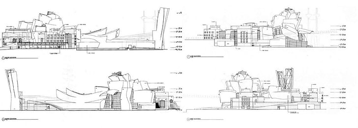
It is important to note the difference between what Loos meant by decorum and what Venturi and Scott Brown mean by “the good reasons” for being different. Their views are both those of functionalists, but the difference is in their definitions, or dimensions, of what it means to be functional.
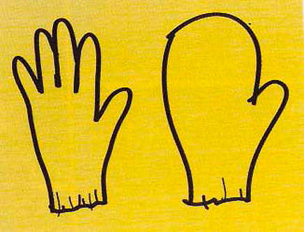
For Loos, a functional building is like a custom fitted English suit. (Figure 11) The spaces interlocked in his Raumplan are made to fit well the specific effects visualized by him. Venturi and Scott Brown offer a metaphor to explain their take on the association of form and function – a glove and a mitten. xiii (Figure 12) Gloves are shaped to fit each finger and therefore graded by size. Mittens, on the other hand, limit hand movement, but they allow wiggle room on the inside and can fit a wide range of hand sizes. In a mitten-building, some program elements of today may sit a little less well, but by sacrificing some adherence to the specifics of present programs, it offers flexibility for the future. This is the kind of flexibility offered by the basilica; the industrial loft building; and the palazzo, adapted to accommodate all manner of residencies and institutions, over hundreds of years. So for Venturi and Scott Brown, the appropriateness, or decorum, or the moral dimension of design includes a sort of socio-ethical obligation that has to do with the building’s ability to be ‘passed down onto the next generation’ without being demolished only to be reconstructed. Arguably, the act of ‘destruction and recreation’ is a necessity of the world, one that allows our society to progress through change. But what Venturi and Scott Brown are arguing for is the far-sightedness in designing flexible architecture that can accommodate various programs over time. In 1957, Kevin Lynch listed several means to achieve spatial flexibility. These included zoning and concentration of structure at a few widely separated points, leaving wide spans where future changes will not affect the fabric of the whole; use of modular or lattice structures whose peripheral growth does not affect the structure at the center; use of low-intensity buffer zone between spaces to allow their programs to expand and contract without running over other uses; avoidance of narrow adaptation of forms to specialized functions; over-supply of space to provide generous room for future expansion of programs; use of temporary structures; and a well-networked communication system, so that program and interaction changes can be analyzed and accommodated efficiently. xiv The ‘wiggle room’ in Venturi and Scott Brown’s ‘mitten’ spatial layout allows for initial flexibility in the layout of the building’s first users, and anticipates future growth of programs and recombinations of spatial layout between occupancies. The range of space types in Loos’s Raumplan, however, as the circulation serves them well, also allow for flexibility through variety.
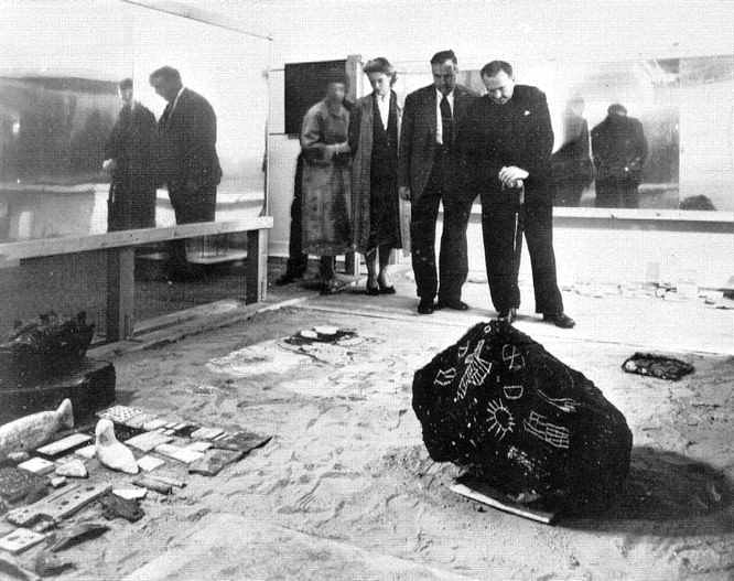
An understanding and acceptance of the given social, economic, and cultural conditions, and the effort to compose the whole from various “found” fragments can also be seen in the postwar works of the Smithsons. In a period “when you have to make do with what you have” and when utopianism was no longer a concern, a few artists and architects took a turn to a way of making and building that is an integration of the given things. David Leatherbarrow writes: “the ‘Patio and Pavilion’ collaboration of Nigel Henderson, Eduardo Paolozzi, and the Smthsons for the ‘This is Tomorrow’ exhibition of 1956 illustrated not only chunks or bits of Englishness in collage – English oak, for example – but also evidence of the aftermath of the war: wandering children, charred wood, rusted bicycle wheels. Again, the aim was not documentary realism, although that was partly the result, but an aesthetic transformation of the condition.” xv (Figure 13)
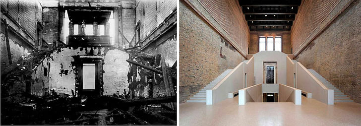
As architects, we sometimes find ourselves in the position of archaeologists. We are given some historical objects, whether it is our immediate site, or a city, or in the case of the Neues museum in Berlin, fragments of an old building. (Figure 14) Here, the architects David Chipperfield and Julian Harrap struggled with how to approach this relic of the past upon which they were to build. When architects are given existing architectural fragments, should the missing parts be filled in with our own design intentions? Or should they be left ‘barren’, purposefully, so that the spectators who come to experience the building can fill in with their imaginations? Perhaps more interesting is an approach that lies somewhere between these two extremes. Understanding an object from the past is always understanding it as something, and reproduction of its original meaning is impossible. Prejudgment from the viewpoint of our present-day understanding makes interpretation possible and richer in meaning. So leaving a ‘wiggle room’ for the witnesses’ participation can allow for the true experience of art. This is also part of architecture’s dialogue with society. And such experience can be more interesting and positively more complex by fusing another layer of structure – that of the new architects – to be read and deciphered by the witnesses. The communication ought to go both ways. Loos’s principle of decorum, Venturi and Scott Brown’s ‘being different for good reasons’, the Smithsons’ interpretation and composition of given fragments, and the questions raised in the outset of the Neues Museum renovation all start with understanding existing conditions and, in the end, communicate what is given.
...to be continued in Part 2 of the essay here on Archinect next week...
- ACKNOWLEDGMENTS -
My appreciation to Denise Scott Brown, Robert Venturi, David Leatherbarrow, Arthur Lubetz, Anne Lutun, Aaron Forrest, Sun-Young Park, Yong-gao Shi, Jiwon Choi, Yoonwhe Leo Moon, Pil-bae and Heekyung Song for their advice, inspiration and criticism in the writing of this essay. Also to Martin Hershenzon, Eric Bellin, Ariel Genadt, Tony Caicco, Bonnie Cate Kirn, Rebecca Ann Jee, Jade Heshmatpour, David Nix, Jen Tobias, Laura Lo, Jacquelyn Santa Lucia, Melody Rees, Arthur Azoulai, Diego Taciolli, Tyler Wallace, Dane Zeiler, Darren Taylor, Yamada Yohei, Ikje Cheon, and other colleagues at the University of Pennsylvania with whom I struggled together in the development of the topics discussed here.
i Vesely, Dalibor, Architecture in the Age of Divided Representation: The Question of Creativity in the Shadow of Production (Cambridge, MA: MIT Press, 2004), p. 3.
ii Denise Scott Brown in Silvia Micheli’s "Learning from Denise Scott Brown," http://www.gizmoweb.org/2010/12/learning-from-denise-scott-brown/ (2010).
iii Leatherbarrow, David, Uncommon Ground: Architecture, Technology, and Topography (Cambridge, MA: MIT Press, 2002), p. 257.
iv Malcolm Gladwell, in his book Outliers: The Story of Success, summarizes the research from the early 1990s of K. Anderson Ericsson. Ericsson and his colleagues went to the Academy of Music in Berlin, where the professors had divided violin students into groups. The researchers interviewed all the students to determine how much they had practiced by the time they were twenty years old. The most talented students had gradually increased their practice while growing up until they had logged over 10,000 hours. The researchers also studied professional and amateur pianists and got the same result. The professionals had logged at least 10,000 hours of practice. They found no "naturals" who rose to the top of their profession with less practice and no "grinders" who logged 10,000 hours but didn’t rise to the professional ranks.
v Vernant,Jean-Pierre, Myth and Thought among the Greeks (New York, NY: Zone Books, 2006), p. 157.
vi Summers, David, "The Road to Prato," Michelangelo and the Language of Art (Princeton, NJ: Princeton University Press, 1981), p. 201
vii Gadamer, Hans-Georg, The Relevance of the Beautiful (Cambridge, UK: Cambridge University Press, 1986), p. 53.
viii Munz, Ludwig, Adolf Loos (New York, NY: Praeger, 1966), p. 188.
ix Oechslin, Werner, Otto Wagner, Adolf Loos, And the Road to Modern Architecture (Cambridge, UK: Cambridge University Press, 2002), p. 116.
x Brownlee, David, David G. De Long and Kathryn B. Hiesinger, Out of the Ordinary (Philadelphia, PA: Philadelphia Museum of Art, 2001), P. 130.
xi Venturi, Robert, Complexity and Contradiction in Architecture (New York, NY: Museum of Modern Art, 1966), p. 86.
xii Scott Brown, Denise, "Mannerism Because You Can’t Follow All the Rules of All the Systems All the Time," Architecture as Signs and Systems: For a Mannerist Time, p. 212.
xiii Scott Brown, Denise, "The Redefinition of Functionalism," Architecture as Signs and Systems: For a Mannerist Time, p. 153.
xiv Lynch, Kevin, "Environmental Adaptability," Journal of the American Institute of Planners 24, no. 1 (1958), pp. 16-24.
xv Leatherbarrow, David and Mohsen Mostafavi, Surface Architecture (Cambridge, MA: MIT Press, 2002), p. 175.
Steven Song is a young architect who has practiced with VIUM, Skidmore, Owings & Merrill, Arquitectonica, Urban Design Associates, and Venturi, Scott Brown & Associates. In 2007-9, he collaborated with Robert Venturi and Denise Scott Brown on "Shifting Paradigms : Renovating the Decorated Shed," an essay which adapts their earlier thesis to address the changing conditions that young architects today will face. "Architecture in the Givenness : Toward the Difficult Whole Again" is about principles in architecture that persevere: the orientation toward the truth in architecture is toward an understanding of what it means to be in the world, in harmony, with others. The essay suggests that our version of the ‘difficoltà’ is the participation in the dialogue of the open society through the difficult, inclusive composition of ‘being here, therefore everywhere’ rather than the easy unity through exclusion.
No Comments
Block this user
Are you sure you want to block this user and hide all related comments throughout the site?
Archinect
This is your first comment on Archinect. Your comment will be visible once approved.