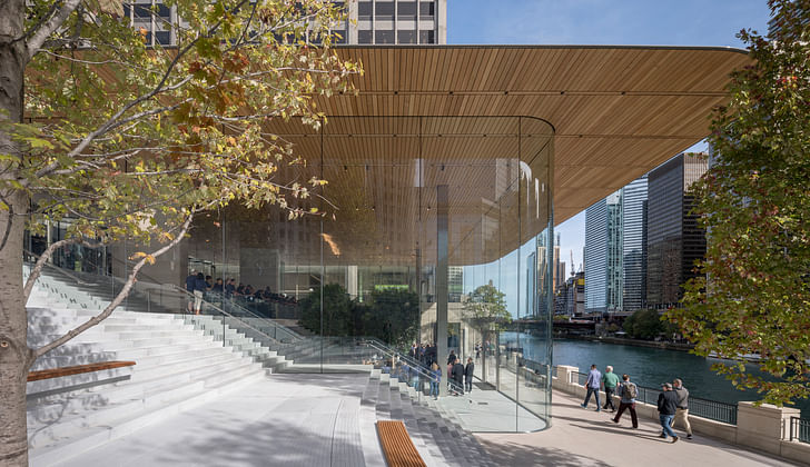

With the grand opening of Apple’s brand new Chicago outpost this month, it appears that the tech giant’s new line of stores, recently renamed "town squares", has well and truly dropped. We saw a sneak peek of their glass curtain wall system and super slim roof lines at the Apple Park this year but it now appears that this is more than just a one-off thing for their big time California HQ; it seems that this is their latest rendition of Apple Architecture, delivered by Foster + Partners.
What separates this line of Apple products from the rest is, of course, a complex urban context – after all, architecture does not roll off the assembly line and into the marketplace the same way an iPod or iPhone does. Yet, interestingly enough, it appears that this unique facet of the architectural product has, for Apple, been more than just a necessary constraint on this occasion: their latest iteration of wood, metal and glass seemingly focused on something more than just sales and after-purchase support, something more in the region of civic responsibility.
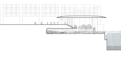
The new $27 million flagship Apple Store – replacing the company’s previous 16-year resident several blocks over – straddles an important step from the historic Pioneer Court down to the Chicago River. Carving out a gradual and engaging connection between these two formerly divided areas of prime public space.
Apple Michigan Avenue is about removing boundaries between inside and outside, reviving important urban connections within the city
As Apple’s chief design officer Jonathan Ive claims, “Apple Michigan Avenue is about removing boundaries between inside and outside, reviving important urban connections within the city.”
When first approaching the new Apple Store from the upper level of Pioneer Court, all that can be seen is a double height glass wall, two elegant metal columns and an ultra-thin carbon-fiber roof, bevelled and moulded like their iconic MacBook line. Even at this initial encounter (with what is mostly empty space) it is unmistakably an Apple product: with an elegance and level of precision that you’d be hard pressed to find anywhere else. At either side of the building’s transparent extents, is a set of cascading limestone steps incorporating sporadic sections of timber seating all the way down to the river’s edge.
it seems that such a level of understatement and subtlety is just what they were after
Stepping inside, past the thick glass façade and under the overhanging white oak ceiling, you reach the similarly finished (and stepped) mezzanine section of the store – here, quite simply for hangouts and taking in those river views when the Midwest winter demands something a little cosier than the bleacher style seating outside. With this and the staircases that run down either side of the store, dropping you almost directly in front of its riverside entrance, it is not at all surprising if the retail element of the building, lurking halfway under the plaza itself, is missed entirely. Indeed, it seems that such a level of understatement and subtlety is just what they were after: not focused on a mesmerising retail floor to shift their seductive goods out-the-door but more of a hip and sensitive space intended to propagate ‘the cult of Apple’ and its all-powerful lifestyle brand.
The operative concept behind this new line of Apple Store is, according to Angela Ahrendts, the vice president of Retail and Online Stores, the “Town Square”. Suggesting that Michigan Avenue’s involvement in the public realm is not to be an isolated occurrence nor is it limited to the mere materiality of the space (such as the connective public seating, the complimentary Wi-Fi or the disabled access) but instead incorporating its ‘extra-material’, spirit of assembly.
According to a press release from Foster and Partners, the entire space is to act as a venue for “the hub of Today at Apple and a live source of creativity, education and entertainment.” To celebrate this, Apple have organised a month-long education programme, The Chicago Series, focusing “on a number of creative fields including photography, music, coding and app design.” With such a ground-breaking commitment to public life, it begs the question whether Michigan Avenue is the start of a new trend in social responsibility among the major tech companies; and whether, like the Victorian Industrialists before them, this interest in philanthropic intervention comes from a desire to give back to a society that they’ve had such a hand in transforming …Or perhaps, like the low-key retail section in the Chicago store, they aim instead to blur the lines between public and private space, taking one step away from ‘the cult of Apple’ and one towards something even bigger. In any case, we can follow this trend closely as they continue roll out their new Apple Store ethos worldwide.
For drawings of the store, see below...
I have been active in architectural practice for over 15 years and in that time I have simultaneously undertaken my education in the discipline and, relatively recently, dedicated myself full-time to my final qualifying master’s degree at the Polytechnic University of Milan – a school ...
1 Featured Comment
They heat the Mies glass boxes just fine - all it takes is an inordinate amount of energy. At least Mies didn't pretend to be socially conscious or energy efficient. Also feel free to call me a cynic - but how the hell do you not acknowledge the obvious relationship to Mies' legacy in Chicago, specifically the Post Office, especially when One Illinois Center at 111 East Wacker is literally across the river? Ya'll know that the Chicago Architecture Foundation is moving to the ground floor there, right?
All 9 Comments
their idea of public space is to get together and watch tv
Similar:
But ^ has character.
It's demolished now, sadly. Bet it'd take far less effort to demo that lightweight lil' Apple box....
EDIT: OOPS! The Longaberger basket building is NOT demolished; that was an internet fake hoax thing! My mistake.
Donna, it can be yours for a cool $5 million. http://www.housebeautiful.com/lifestyle/news/a7020/longaberger-basket-building-sale/
Newark, Ohio. Pass.
Looking down the road a few decades...
I don't get it? Climate change is likely to lower the levels of the Great Lakes and tributary waterways if anything.
Not really. I was just in a symposium today where it was noted that the other part of climate change is groundwater level rise due to storms and saturation.
How do you heat those spaces in a Chicago winter?
They heat the Mies glass boxes just fine - all it takes is an inordinate amount of energy. At least Mies didn't pretend to be socially conscious or energy efficient. Also feel free to call me a cynic - but how the hell do you not acknowledge the obvious relationship to Mies' legacy in Chicago, specifically the Post Office, especially when One Illinois Center at 111 East Wacker is literally across the river? Ya'll know that the Chicago Architecture Foundation is moving to the ground floor there, right?
Interesting...
I meant interesting like...
These photographs are amazing. Some may object to describing Apple Architecture as “town squares”, but we think referring to these buildings as open public spaces is very American. “AA” could be used for American Architecture or Apple Architecture.
i sent this to Apple + foster =no response
When I was a student in US architecture schools, nothing was as actively discouraged and opposed by the teachers as axial symmetry.
Because it makes design absurdly easy; so there is nothing to teach; nothing to be academic about? — how can you be pendant about something a child does naturally — computers saved them by making drawing complicated.— the result is the glaring idiocy of this Apple store site placement
Agree. Most of what my studio teachers spewed was BS designed to mask their lack of real world built work and their main goal of having sex with the students they found attractive.
When aligning everything centrally to one axis you're just blocking it all! Never heard of view corridors I suppose.
I just saw a glaring mis-alignment; if it was all the way our of the way then there would be a view corridor
Would you know what material (aluminum or metal, (alucabond), etc.) are the metal interior columns/walls of the Apple stores?
Unobtanium
Block this user
Are you sure you want to block this user and hide all related comments throughout the site?
Archinect
This is your first comment on Archinect. Your comment will be visible once approved.