
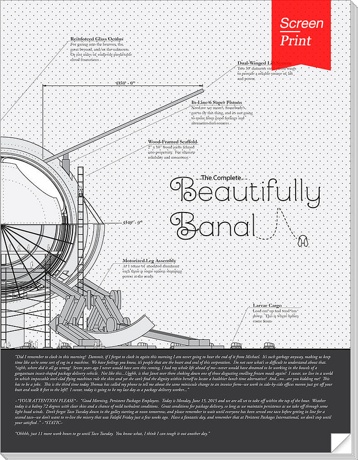
Beautifully Banal, a marvelously detailed, narrative-driven exploration of architectural drawing types via a fly’s structural adventures, is both a slender comic and an architectural delight.
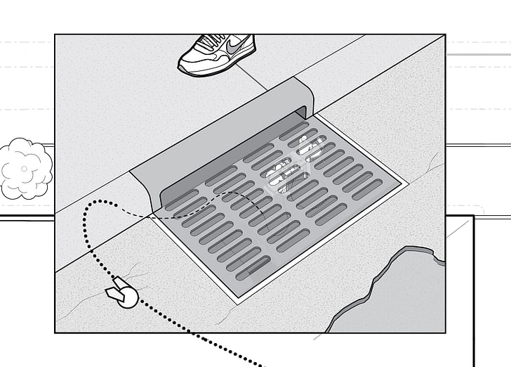
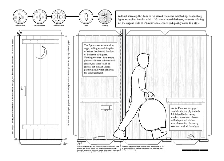
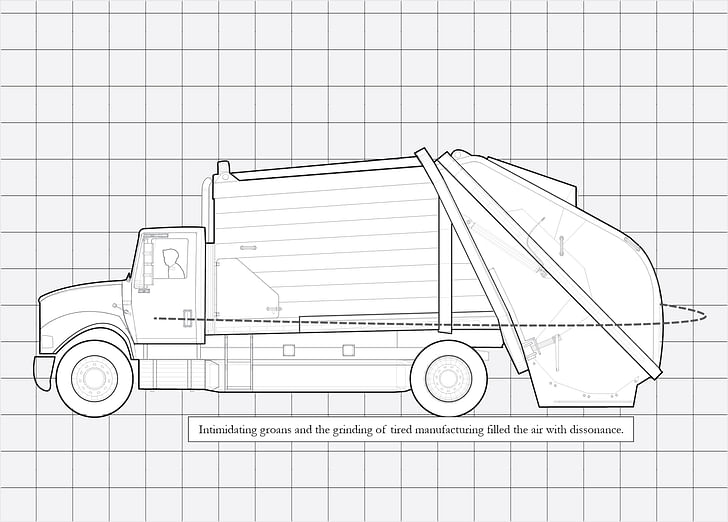
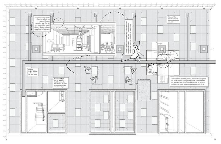
Although the physical dimensions and soft binding of the 64-page black and white Beautifully Banal are more reminiscent of a glossy magazine than a subway-ready comic, the work is a pleasure to behold. Created by Architecture Hero (whose members are comprised of architects Alexander Culler and Danny Travis), Beautifully Banal tracks the exploits of Phineas the Fly, a from elevations to sections to an exploded axonometric of a sliced turkey breast sandwich.curious insect born in an outhouse who travels to the big city. His ability to literally be a fly on the wall leads to the exploration all sorts of drawing types, from elevations to sections to an exploded axonometric of a sliced turkey breast sandwich. Meticulously conceived and executed from the front cover to the last, Beautifully Banal works as much as a fascinating introductory guide for the architecturally curious as well as comic relief for grizzled deadline veterans. Completed while the co-creators were both still architecture students at the University of Illinois at Chicago, the comic won 2nd place in the 2015 Architectural Fairy Tales competition. I asked Alex and Danny about the origin, process, and future of their work.
Did you always know the sequence of the chapters in Beautifully Banal, or did you experiment with their ordering/narrative progression?
Alex: The structure of our book emerged pretty much as a direct result of our process. We began Beautifully Banal as a competition submission—a tidy five spread story arc that told a cohesive story about a fly lost in the city and his experience through an office building explored at different scales. Upon conclusion of our submission we continued a discussion with a genuine curiosity about the fate of our character: Where did Phineas come from before arriving in the city? And what happened to him after being expelled from the office? We didn't know the answers to these questions right off, but we immediately knew we wanted to do a kind of "prequel" and "sequel" to the story we had created.
When you were in your apartment, in the last stages of trying to finish off the issue, how did you motivate yourself? Did you finally just set a deadline and make yourself commit to publishing it at that particular date, no matter what?
Alex: As difficult as creating this publication was from a creative standpoint in a relatively quick period of time, we were also met with the difficulty of running our first Kickstarter campaign. I think we underestimated the amount of time involved with simply promoting our campaign to as many media outlets as we could, and over the course of the month long Kickstarter very little work was devoted to the actual I think we learned a tremendous amount by going through the whole processproduction of the project itself. Because of this we ended up missing our pledged deadline by a couple of months. As a growing pressure mounted with the thought of disappointing our backers, we were also facing the pressures of producing quality work for our final year of grad school. In the end we probably could have stood to devote more time for proper editing and revision of the final printed product that we published—and in fact we are always noticing mistakes or things we know could be improved a bit—but all in all we are very happy to be able to call this project done and always have it as a benchmark representing our very early careers. I think we learned a tremendous amount by going through the whole process and certainly can treat it as a valuable learning experience for the future.
What surprised you most about the process of publishing a physical magazine?
Alex: There were a ton of logistical challenges that arose while creating our comic, from the page size and paper quality that come from working with a local printer, to the sheer volume of books we ordered to hit certain bulk discounts, to allocating physical space within a cramped apartment to store all of our materials, and then finally the physical process of packing up each of our books and shipping them to the people who ordered them. There were a tremendous amount of accounting-type tasks we discovered we had to find a way to manage in order to not come out completely in the red, in addition to learning way more about the United States Postal Service than we ever thought we would. I remember the week we were shipping out the books we would just dump a batch of envelopes every day into a blue mailbox at a few locations in the city—and everyday I was keeping my fingers crossed that I wouldn't come home to an apartment lobby filled with crumpled packages that were returned to sender. After a few days I realized that it really must have worked—the whole mystery behind mailing packages to a couple hundred people in a dozen different countries is really pretty astounding.
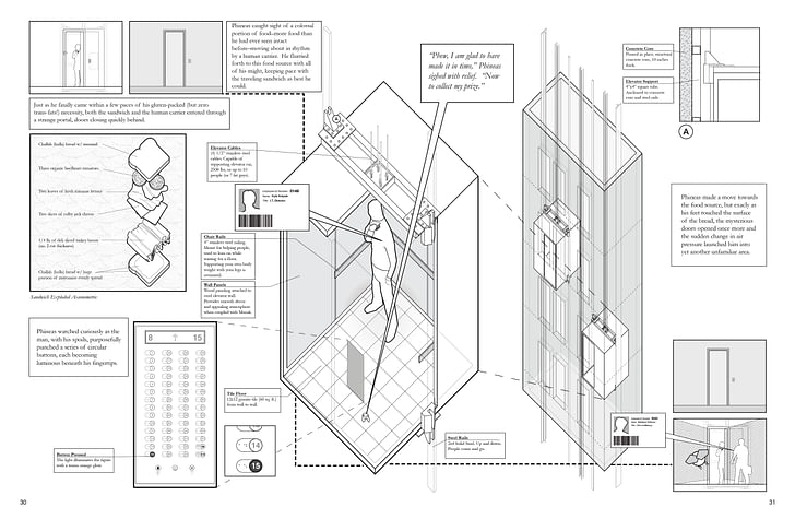
There’s a major stylistic difference between the lead image for each chapter and the actual drawings within the chapter. Why did you make that choice?
Danny: Each world we designed in three dimensions, and since it’s primarily all two dimensional graphics, we wanted to highlight in each lead-up chapter the actual three dimensional world we created to make the drawings. That led us to having this really dramatic rendering of the world and then we go into more black and white drawings. It was a nice break from the traditional line drawings to have a little render, break it up, and give this dramatic effect to set the scene.We liked that idea of a story connecting beyond just normal architects
The preface of this comic includes an essay from Jimenez Lai. Can you tell me about his influence on this work?
Danny: He was one of our professors, briefly. He has a strong graphic sense as far as doing comics. He was an influence because he was somebody that we worked with more as we were working on this, our architectural graphic novel. In his book he talks about architectural theory, and we’re going through all of the architectural drawing types. We liked that idea of a story connecting beyond just normal architects, so the graphic novel is kind of a means of doing that.
What are you working on now?
Alex: We are currently finishing up development for a drawing project called Queue: A Story About Waiting in Line. If Beautifully Banal can be read as a technical exercise that showcases the formal attributes of architectural drawing, then Queue looks to unpack the social nuances we see in everyday situations. The story is set up like a long continuous section drawing, with a narrative unfolding from two differing perspectives as key characters move through space. It is a comic without any frames, and a technical drawing that feels free to break the rules of convention. We are not entirely sure of the final form the project will take, something resembling an unfolded accordion print or maybe even an animated video. This project doesn't have a tangible deadline like Beautifully Banal did, so we are really taking our time to develop it while we search for an end publishing outlet.
Julia Ingalls is primarily an essayist. Her work has appeared or is forthcoming in Slate, Salon, Dwell, Guernica, The LA Weekly, The Nervous Breakdown, Forth, Trop, and 89.9 KCRW. She's into it.
No Comments
Block this user
Are you sure you want to block this user and hide all related comments throughout the site?
Archinect
This is your first comment on Archinect. Your comment will be visible once approved.