

In the high-gloss landscape of design magazines, all tables have been wiped clean. But in practice, things get messy: our desks are cluttered, our kitchens are flecked with sauce, our careers take form or falter as we finger the seams in the Formica. In this issue of Dirty Furniture, the second in a finite series of six, an object usually shrouded by its ubiquity is illuminated by a series of essays that considers the table not just as a formal object, but also as an architecture and convention that structures our familial, social, political, and spiritual relationships.
The London-based publication Dirty Furniture has quickly carved a unique space for itself within design media. Including a wide range of responses from a diverse set of thinkers, the magazine explores the “wider life of objects,” specifically, common household furniture like toilets or, in this case, tables.
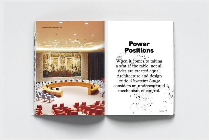
Tables are, after all, more than merely four-legged surfaces. They are where we gather to eat and to pray, to work and to play. Their form – round or square, long or small – can establish hierarchies or subvert them. And their history, stretching just about as far back as a history can go, speaks to the ways we relate to one another, to our gods, and to ourselves.
Our featured excerpt for Screen/Print is “Power Positions” by Alexandra Lange, an architecture and design critic whose writing appears in Curbed, Dezeen, and many other publications. In this essay, she considers a series of notable tables and the people who sat at them, from King Arthur to Betty Draper. As Lange makes clear, a table is rarely just a table – in fact, it’s often a mechanism of control.

"Power Positions"
by Alexandra Lange
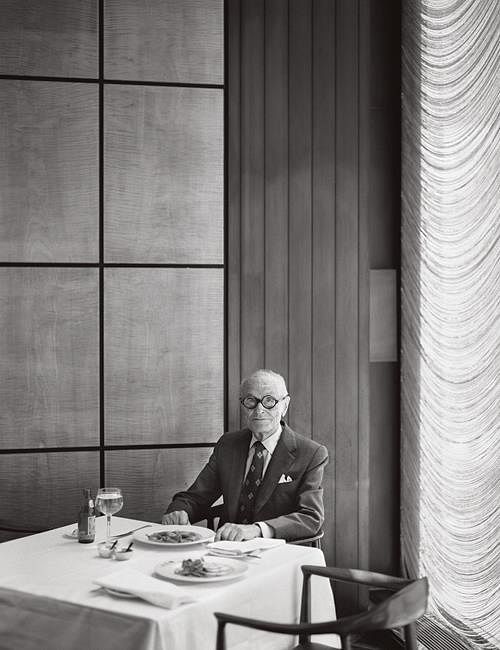
From 1959 architect Philip Johnson would lunch at a corner table in the Grill Room, part of the Four Seasons restaurant in the Seagram Building he designed. Contemporaries Frank Lloyd Wright and Henry Dreyfuss held court at the Oak Room in New York’s Plaza Hotel. How can Johnson’s decision to make his own Oak Room be interpreted as anything other than a power play? Here everyone had to sit, literally, at his table. Clients, colleagues, supplicants, artists: on his own turf, the architect trumped them all. And the table itself laid bare an unspoken hierarchy, depending on where you sat.
All tables do: choose a seat close to or far away from the seat of power and you reveal your sense of place. Take the seat you’ve been allocated and you find out where others place you. If you don’t like your position you can move, or, if an Arthurian knight, fight. It is more subtle, though, to change the rules of engagement by changing the shape of the board […]
The Boardroom Table
Now, the Board Room. I have in mind there the same general treatment that is, concept of de-furnishing. The room is planned to seat 30 persons. Instead of providing that horrible monstrosity produced by the Western World – the standard corporation board room table – why don’t we provide for each member a small lacquer tray, about 12 x 16 inches, and on these they could keep a neat rice paper pad and a pencil…I feel confident that you will be sympathetic to this whole approach – after all, you were brought up in California – and California owes so much to the Far East.
— Letter from Eero Saarinen to William A. Hewitt (April 26, 1960)
By 1960, the wood-panelled boardroom with a long conference table was already a solid-gold cliché. As cultural critic Lewis Mumford noted in his 1952 New Yorker review of Lever House, executives got cold feet about modern design when it came to their own quarters. Streamlined desks and eye-shadow lavender were fine for the typing pool, but the executive floor, he observes, retreats into ‘a drab plushness doubtless intended to symbolise solidity, power, and wealth.’ Saarinen was not going to let Hewitt, chairman of Illinois-based tractor maker Deere & Co, go down that path. choose a seat close to or far away from the seat of power and you reveal your sense of placeThrough a combination of flattery and mockery, the architect wanted his client to rethink his leadership, his meetings, and most importantly, his office furniture. When Hewitt sent Saarinen an issue of French magazine Connaissance des Arts with a section on Victorian furniture, tagging a love seat ‘for visiting bankers’, and a high-backed chair ‘for the board chairman’, Saarinen joked back, ‘We have just been working on models of the Executive Area and they show real promise of achieving interiors of the same quality as Katsura…It would be a shame to spoil them with furniture.’ Katsura – the exquisite, Edo-period imperial villa and tea pavilions, set in a perfectly groomed garden outside Kyoto – was a touchstone for modern Western architects travelling to Japan. With this comparison, Saarinen suggests – between the lines – that contemporary corporate life is as ritualised, and perhaps as antediluvian, as Japanese royal practices, with secretaries as updated seen-but-not-heard geisha girls gliding around the edges of the table. Indeed, in Sheryl Sandberg’s recent motivational book Lean In, she suggests that even today women need to be more aggressive about taking a seat at such tables; they should not relegate themselves to an outer ring of chairs with bad sightlines and no pads of paper.

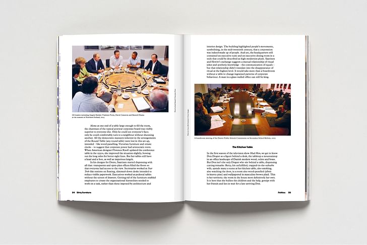
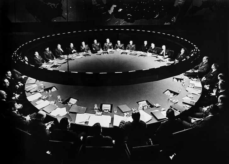
Alone at one end of a table large enough to fill the room, the chairman of the typical postwar corporate board was visibly superior to everyone else. Only he could see everyone’s face; only he could comfortably turn to a neighbour without shunning another. All the democratic manners inherent in the arrangements of the Round Table (any round table) were lost in this set-up, intended – like wood panelling, Victorian furniture and ornate clocks – to suggest that corporate power had aristocratic roots. When American designer Florence Knoll updated the conference table in the 1950s, she improved the situation slightly, bowing out the long sides for better sight lines. But her tables still have a head and a foot, as well as imperious length.
A man in a glass-walled office can still be kingIn his designs for Deere, Saarinen started dispensing with all that: transparent and open-plan offices filled the floors so that everyone had access to the view. Secretaries worked at Star Trek-like stations on floating, slimmed-down desks intended to reduce visible paperwork. Executives worked at pedestal tables without the screen of drawers. Getting rid of the furniture enabled employees to create the organisational hierarchies needed to work on a task, rather than those imposed by architecture and interior design. The building highlighted people’s movements, symbolising, in the mid-twentieth century, that a corporation was indeed made up of people. And yet, the headquarters still contained an executive suite and an executive dining room in a style that could be described as high-modernist plush. Saarinen and Hewitt's exchange suggests a mutual relationship of visual jokes and aesthetic knowledge – the communication of equals – but that relationship didn’t translate into the disappearance of ritual at the highest level. It would take more than a boardroom without a table to change ingrained patterns of corporate behaviour. A man in a glass-walled office can still be king.

The Kitchen Table
In the first season of the television show Mad Men, we get to know Don Draper as a figure behind a desk, the tabletop a mountaintop in an office landscape of Danish modern wood, ochre and brass. But Don isn’t the only Draper who sits behind a table, dispensing cutting remarks: Betty, his unfulfilled, trapped-in-the-suburbs wife, spends many a scene at her kitchen table, also smoking, also watching the door, in a room also wood-panelled (albeit in knotty pine) and wallpapered in masculine brown plaid. This is her territory; the room in the house most definitively her own. It is here that she bullies the children and the help, gossips with her friends and lies in wait for a late-arriving Don.
The table acts for Betty as a shield and a stageThe table acts for Betty as a shield and a stage. It is shield, in that we most frequently see her at its head, family members along the sides and at the foot. She is the home-ec executive, separated from the food, spills, and flowers on the tablecloth by her ashtray and cigarette pack. She doesn’t eat; she presides. The table acts as stage, in that upon it she performs the rites of good motherhood, providing the food and correcting the manners. Behind her table she is powerful in a way she can’t be when confronting Don in negligee in the bedroom, or being humiliated by him in front of guests at a dinner party.
The postwar kitchen table wasn’t meant to be a battleground. Rather, the eat-in kitchen, with its colourful Formica surfaces, was part of a more democratic vision of family life. In this vision, labour-saving devices freed women from drudgery, new materials made the table multi-purpose, and the family could gather each evening for a small, intimate meal without the formality of a separate dining room. In fact, in the most basic 850-square-foot postwar house – such as those built in Levittown – there was no room for a dining room. The postwar kitchen table wasn’t meant to be a battlegroundThe kitchen table replaced rooms and upended interpersonal dynamics, even as it seemed to re-inscribe the woman in her role as chatelaine of the suburban home. There were few spaces that weren’t part of the display of her cooking, her decorating, her housekeeping.
These democratic and technocratic aspects made the postwar kitchen the perfect setting for Richard Nixon and Nikita Khrushchev’s 1959 Kitchen Debate, at an American trade fair in Moscow. A replica of the house at 398 Townline Road in Commack, Long Island was built in Sokolniki Park. It was opened down the middle like a dollhouse, offering Soviet visitors visual access to the splendours of American life.

The journalist and presidential speechwriter William Safire was then a press agent for the manufacturer of the model home. In a 2009 reminiscence, he reported:
The kitchen table was no longer private; it could be neither haven nor a battleground when other families were waiting to use the stoveNixon made a beeline to the railing that exposed the kitchen.
Nixon: I want to show you this kitchen. It’s like those of houses in California. See that built-in washing machine?
Khrushchev: We have such things.
Nixon: What we want to do is make more easy the life of our housewives.
Khrushchev: We do not have the capitalist attitude toward women.
In Russia’s post-revolutionary years, the housewife was supposed to be freed from incessant chores by canteens and cafeterias. As the latter went unbuilt, many families ended up sharing kitchens. Food was prepared rapidly and typically eaten elsewhere. The kitchen table was no longer private; it could be neither haven nor a battleground when other families were waiting to use the stove. Betty Draper, perfectly coiffed and desperately unhappy, may subconsciously agree with Khrushchev about the evils of the capitalist attitude toward women. A former model married to an advertising executive, she could have been the star of a broadcast at the exhibition on the American way of life, but her appropriation of the kitchen table as an accessory of power – rather than a levelling agent – suggests an unconscious understanding of the prevailing forces keeping women in the home and men behind their desks.


Key members of Dirty Furniture:
Other contributors to the second issue of Dirty Furniture:
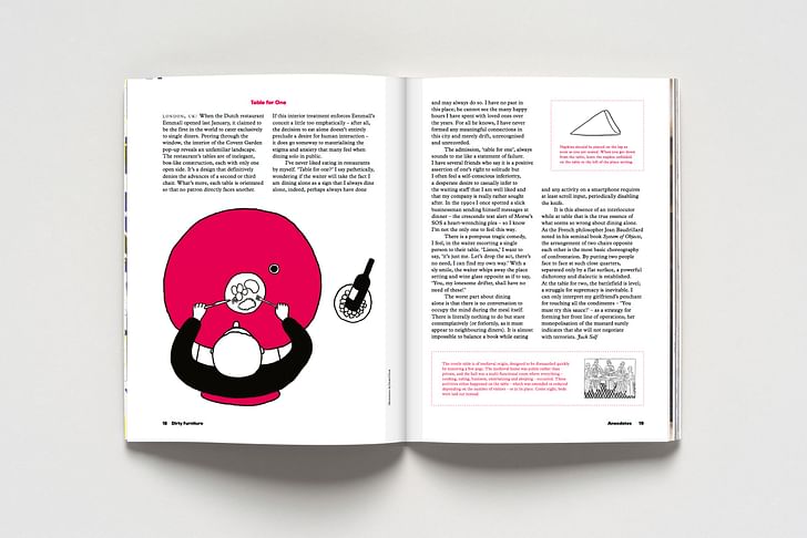
Screen/Print is an experiment in translation across media, featuring a close-up digital look at printed architectural writing. Divorcing content from the physical page, the series lends a new perspective to nuanced architectural thought.
For this issue, we featured Dirty Furniture's second issue.
Do you run an architectural publication? If you’d like to submit a piece of writing to Screen/Print, please send us a message.
Interested in other furniture-focused musings? Find more tables – as well as chairs and sofas and lamps – here, part of Archinect's special February theme, Furniture.
And don't forget to send us your own furniture musings, interviews, critiques, designs, projects and investigations for review to be featured on our site. The open call ends February 21, 2016 – more details here.
Writer and fake architect, among other feints. Principal at Adjustments Agency. Co-founder of Encyclopedia Inc. Get in touch: nicholas@archinect.com
No Comments
Block this user
Are you sure you want to block this user and hide all related comments throughout the site?
Archinect
This is your first comment on Archinect. Your comment will be visible once approved.