

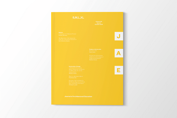
Approaching 70 years in publication, the Journal of Architectural Education is a foundational resource in the profession. As the peer-reviewed, biannual academic journal from the Association of Collegiate Schools of Architecture, JAE seeks to provide a platform for discussion of issues relevant to architecture education and academia, while also gathering up the profession’s diverse discursive threads in connection to architecture scholarship. Published to coincide annually with ACSA’s national and regional conferences, our Screen/Print feature focuses on the October 2015 issue, volume 69: "S,M,L,XL".
And true to its title, the issue features papers in reference to, or inspired by, Rem Koolhaas and Bruce Mau’s titanic text of the same name. Karen Lewis, the author of our Screen/Print excerpt and Associate Professor of Architecture at The Ohio State University, specializes in research concerning how graphical and infrastructural systems inform one another – a fitting combo given Mau’s and Koolhaas’ respective presences in S,M,L,XL.
Lewis’ JAE piece, “P.S. I Love You”, examines how architects (as opposed to graphic designers or cartographers) illustrate information, for their own research and iteration as well as outward communication. Focusing on an urban rail redevelopment project in New York, Lewis visualizes information from the site using three simultaneous scales – city (XL), neighborhood (L) and building (M) – to show how the design is informed through those varying graphics. Her inspiration comes from OMA’s approach to the two libraries at Jussieu in Paris, as described in S,M,L,XL’s “PS”.
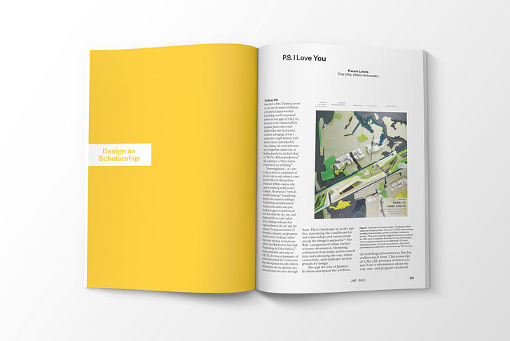

PS: I Love You by Karen Lewis, Ohio State University
The Marais, 1995
It was April in Paris. Traipsing across the river into the massive thickness of the Jussieu Campus was similar to finding oneself compressed between the final pages of S,M,L,XL. In contrast to the voluptuous Paris springtime, Jussieu was a banal mystery broken only by structure, circulation, and signage. It was a peculiar place: caught between dark layers of concrete punctuated by stairs, columns, and overscaled numbers, the figureless campus was, as Koolhaas described in the final chapter, “PS: The 2 Biblioteques Jussieu,” akin to floating in a “three-dimensional network, not a building.”
It was a peculiar place: caught between dark layers of concrete punctuated by stairs, columns, and overscaled numbersDiscovering Jussieu—as a site in Paris, as well as an explanation at the end of the recently released tome from the Office for Metropolitan Architecture (OMA)—was an education in redefining architecture’s vocabulary. The proposed “vertical, intensified landscape” would bring density to the campus by adding a “world of books and information.” At Jussieu, information was positioned as an agent of architectural form. Data about the city, site, and program yielded an active urban street, a building landscape that negotiated between the city and the occupant. The proposed matrix of information, structure, and program invoked an active landscape rather than a static building. As landscape architect Alex Wall wrote in his essay “Programming the Urban Surface,” released around the same time as S,M,L,XL, there was an abundance of projects that probed the “connective tissue that organizes not only objects and spaces but also the dynamic processes and events that move through them. This is landscape as active surface, structuring the conditions for new relationships and interactions among the things it supports.” For Wall, a programmed urban surface activates information, liberating architecture from static architectural form and embracing the city, urban connectivity, and landscape as rich grounds for design.
Through the lens of Jussieu, Koolhaas anticipated the problem of modeling information to develop architectural form. This postscript of S,M,L,XL prompts architects to ask: how is information about the city, site, and program visualized to produce urban form? How does the architect continue to draw, and draw upon, information as an architect rather than as a graphic designer, a cartographer, or an information graphic specialist? Architects change scales, collapse programmatic elements, form spatial relationships between components. Architects abstract, rather than illustrate, information. OMA’s ability to draw information to yield building form is revealed through their diagrams and models, which act as agents between information and statistics, rather than documentations of form. “For us, the diagram is no longer only a device that triggers architecture or enables us to trigger architecture. It is also a device with which to look at the world and to try to represent some of the bizarre conditions we observe.”*
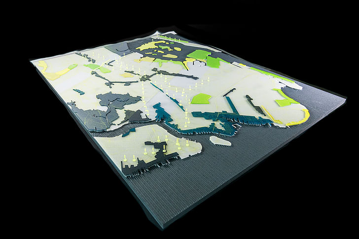
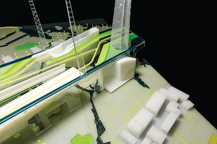
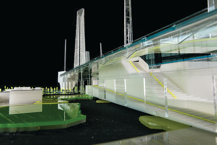
Architects abstract, rather than illustrate, information.To test these methods of graphically representing information to generate urban form, Light Industrial Landscape was developed into a diagrammatic model that visualized the city at three different scales (Figures 1**, 2). The project asked designers to redevelop the abandoned rail line, “The Queensway,” which runs eight miles between Rego and Ozone Parks in Queens, New York. The rail line crosses several types of urban spaces: industrial manufacturing districts, residential neighborhoods, commercial areas, recreational spaces, and major parks. Unlike the High Line, the Queensway urban fabric is diverse and dispersed. Light Industrial Landscape sought to visualize information at the scale of the city, neighborhood, and building through a single physical model. Using graphic techniques of mapping and diagramming, the project enfolded information at three scales in order to develop form. Participating in the lineage of Jussieu, Light Industrial Landscape took advantage of new forms and graphic representations of information to facilitate building form.
Modeling Information: The Map
XL Scale = 1:1,000
If the essential problem of the present podium is dispersal, then this reconfiguration generates, with the same substance, concentration. To create more density still, the two libraries are superimposed: science is embedded in the ground; humanities rise upward. Between them, the parvis—connected in the south with metro station and in the north with the Seine—runs into the building to become the accueil. (Koolhaas, “PS” (note 1), 1314–16)
Jussieu’s method of extracting urban data began by referencing existing maps and plans of the city and campus. Information was extracted from physical conditions that were previously measured. Currently, GIS technology in combination with expanded access to databases allow architects to extract information about nonphysical spatial components. The databases and mapping tools give designers the ability to sort and organize information that is neither the ability to sort and organize information that is neither visible nor tangiblevisible nor tangible. These tools allow architects to visualize nonphysical urban features such as zoning codes or demographics. The project map isolated urban districts zoned as industrial or manufacturing, as well as parks (Figure 3**). Operating between the two realms of industry and recreation, the city is isolated as a system of seemingly separate parts. New York’s history of infrastructure entwined with public space (Figure 4) generates a productive symbiosis between manufacturing and recreational activities. If recent urban projects have appropriated abandoned infrastructure for recreation, the model of the active urban surface should facilitate coexistence. How is the urban information map integrated with the activity diagram (Figure 4)? By visualizing information about physical infrastructure with invisible zoning codes (Figure 5), the relationship between components are rendered and understood.
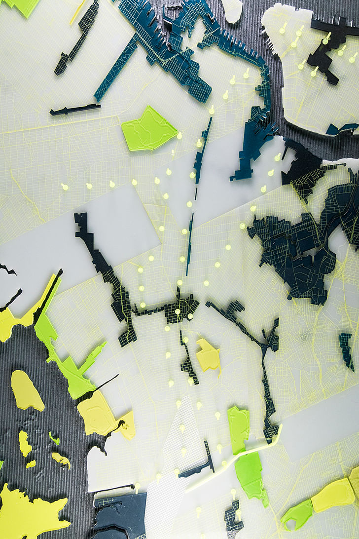
Folding Information: The Neighborhood
L Scale = 1:50
These surfaces—a vertical, intensified landscape—are then “urbanized”: the specific elements of the libraries are reimplanted in the new public realm like buildings in a city. Instead of a simple stacking of floors, sections of each level are manipulated to touch those above and below; all the planes are connected by a single trajectory, a warped interior boulevard that exposes and relates all programmatic elements. (Koolhaas, “PS” (note 1), 1314–16)
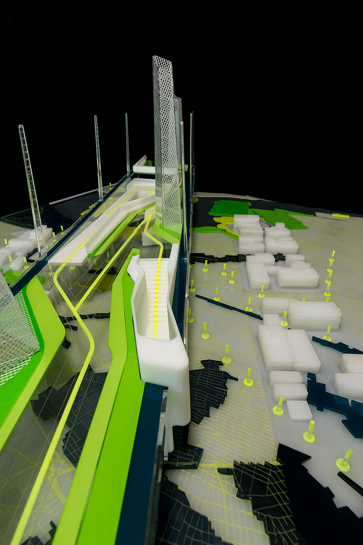
Light manufacturing districts require different circulation than recreational activities (Figure 6**). The ground plane remains free for truck and vehicular movement, while the park above connects to existing subway lines. Architectural form is produced through an untangling of the ground between movements of light industrial activity and recreation connections, linking the map into the proposal above through strategic color and scale. To further sculpt the relationship between industry and parks, ventilation systems for the manufacturing businesses located on the ground floor are extended through to the park above (Figures 7–9). The ventilation stacks are cloaked in mesh figures, extending the industrial roofline of train trestles and infrastructure into the new park above. Taking advantage of new microclimates in the park, a program of productive agricultural practices are suggested. The mesh forms host organic tomatoes, honeybees, and sassafras plants that can be used by artisanal meaderies or homemade pasta sauce distributors below (Figure 10**). The ground is brought to the sky through an intertwining of infrastructure and landscape.
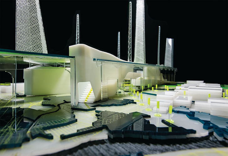
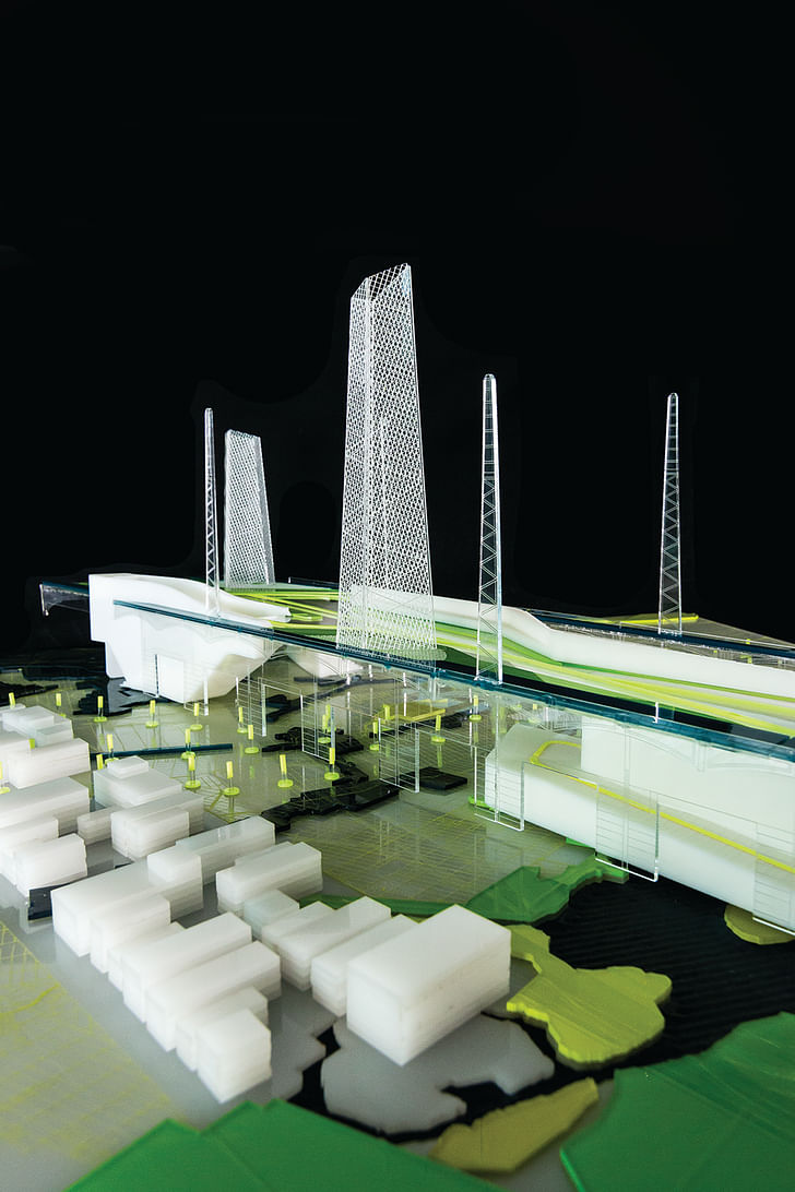
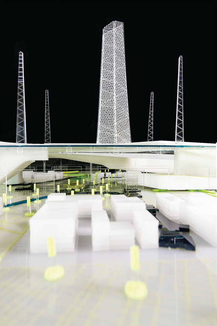
Elements of various architectural scales offer connection and repose for occupants of the Light Industrial Landscape (Figures 11–15**). Three-dimensional prints figure the connective tissue between the ground and sky. The “stair ramp” connects bicyclists and pedestrians, intertwining their movements in a combined infrastructure; the “stair front” announces itself along the street edge similar to a storefront, giving clarity to the stair access; the “street stoop” serves as a resting area for those who work in the light industrial zone, providing restrooms, drinking water, and casual urban seating. These inhabited spaces figure urban elements within the ecstasy of urban connectivity. The landscape is an active agent of recreation and manufacturing but clarifies moments of repose within the “three-dimensional network.”S,M,L,XL became a guide to the city, a way to discover site
Insight Into Practice
The OMA proposal for Jussieu presented a startlingly clear and fascinating architectural vocabulary based on the visual display of information. Observations, logics, and formal decisions were explained with diagrammatic models, maps, and images. Library Project for Jussieu offered a logic, an incandescently clear exposure of how and why an architecture practice made choices. OMA’s inscrutable documentation of existing conditions demonstrated a research method of visualizing information about the site, city, and building program and offered ways to craft this into architectural form. It served as a research method to yield ways of generating architecture, while simultaneously questioning the scope of architectural practice. As an emerging architect studying in Paris, S,M,L,XL became a guide to the city, a way to discover site, and a tool to consider the relationship between research and practice.
PS: The Library Project for Jussieu is significant as a predecessor for the Seattle Public Library but is also made important through its location within the research. This final moment of S,M,L,XL is its most optimistic—that architecture is never finished. Avoiding categorization, “PS” suggests that our ideas about architecture can always be reframed, recast, and explored under new criteria. The project is never complete but rather, especially at its conclusion, begins again. After the tome of effort, the reflection of practice, and the saturation of images, there will always be more to do.
Endnotes:
* Panel discussion with Rem Koolhaas in Peter Eisenman, Rem Koolhaas, and Brett Steele, eds., Super Critical (London: Architectural Association, 2006), 14.
** Figures 1, 3, 6, 10, 11, 13, 14 and 15 can be found in the image gallery below.

The theme editors for S,M,L,XL are Alicia Imperiale (Temple University) and Enrique Ramirez (University of Pennsylvania).
Also featured in the Journal of Architectural Education, volume 69 issue 2:
Martin Bressani, McLain Clutter, Daniela Fabricius, Urtzi Grau and Christina Goberna, Alicia Imperiale, Kathleen James-Chakraborty, Sarah Thomas Karle, Michael Kubo, Christoph Lueder, Robert McCarter, Kiel Moe, Marc J. Neveu, Whitten Overby, Enrique Ramirez, Fred Scharmen, Anooradha Iyer Siddiqi, Matthew Soules, Frederick R. Steiner, Sara Stevens, Léa-Catherine Szacka, Filip Tejchman, David Theodore, Panayotis Tournikiotis, Mimi Zeiger
Editorial Board
Executive Editor: Marc J. Neveu
Art Director: Pascale Vonier
Managing Editor: Amanda Gann
Associate Editor, Design: Amy Kulper
Associate Editor, Reviews: Ivan Rupnik
AnnMarie Brennan
Alpa Nawre
Aaron Sprecher
Mitchell Squire
Tricia Stuth
Mari Fujita
Doug Jackson
Eric Mumford
Saundra Weddle
Nora Wendl
Christina Contandriopoulos
Grace La
Georgeen Theodore
Franca Trubiano
Screen/Print is an experiment in translation across media, featuring a close-up digital look at printed architectural writing. Divorcing content from the physical page, the series lends a new perspective to nuanced architectural thought.
For this issue, we featured the Journal of Architectural Education's Volume 69, Issue 2, "S,M,L,XL".
Do you run an architectural publication? If you’d like to submit an excerpt to Screen/Print, please send us a message.
Former Managing Editor and Podcast Co-Producer for Archinect. I write, go to the movies, walk around and listen to the radio. My interests revolve around cognitive urban theory, psycholinguistics and food.Currently freelancing. Be in touch through longhyphen@gmail.com
3 Comments
(this issue also happens to be jam-packed with old school archinectors #justsayin)
Please note that Alicia Imperiale and I were the theme editors for this issue.
@Fred besides you, Enrique and your alter-egos, any screen-names I would recognize? How "old school"?
Block this user
Are you sure you want to block this user and hide all related comments throughout the site?
Archinect
This is your first comment on Archinect. Your comment will be visible once approved.