
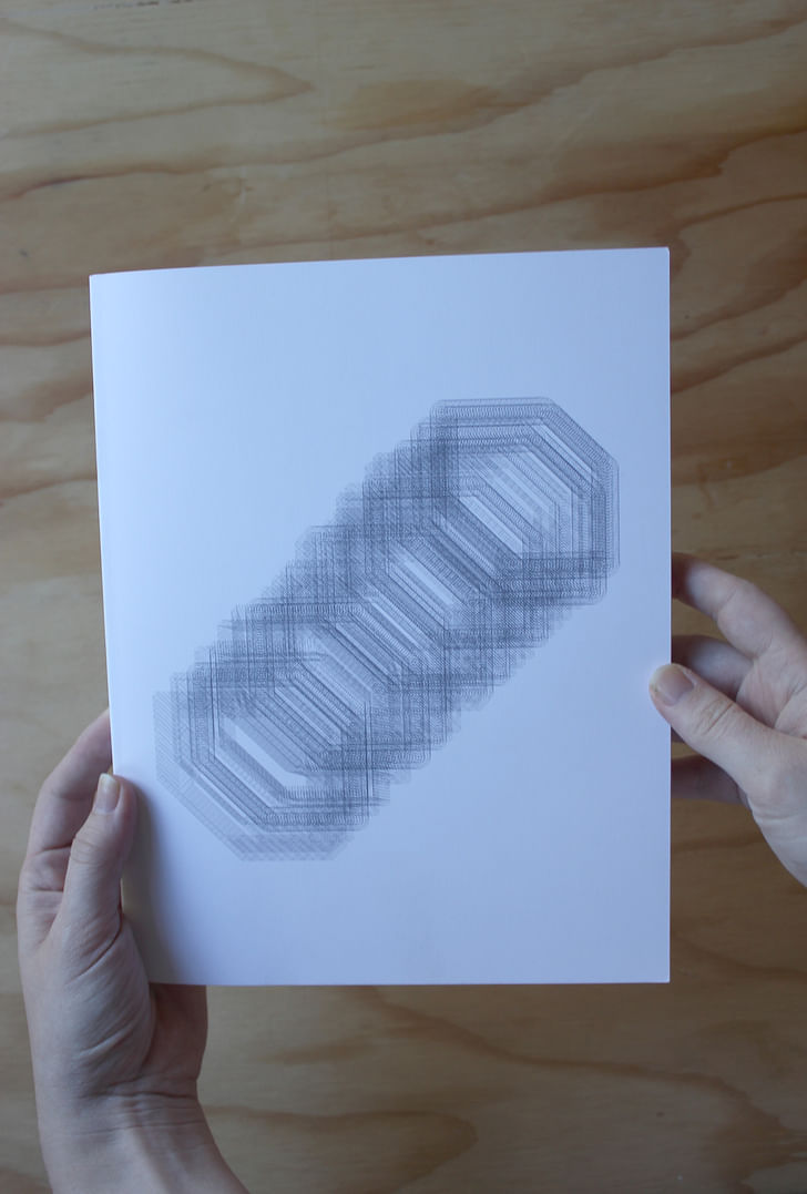
Student-run, annual, peer-reviewed journal KTISMA, from the University of Oregon’s School of Architecture and Allied Arts, does not appear to have any specific agenda. Instead, it aims to poke and prod a diverse community of professional peers into writing on whichever facet of environmental discourse they can imagine – any amalgamation of architecture, design, art, and their respective rhetorics is fair game.
Our Screen/Print features KTISMA’s fifth and most recent issue, “Lick Your Buildings” – the imperative title calling for a more sensorially holistic interpretation of the built environment. The presumption being that, in most forms of art, design or architectural discourses, the eye is king, and every other sense’s evaluation is secondary. Even the AIA is adopting this perspective in its #ilookup campaign. So how does this ocularcentric reading shape our connection to the built environment?
This question is taken up by our featured excerpt, “In Plain Sight: An Experiment on the Multisensory Experience through Design for the Blind”, by architect Justin Schwartzhoff. Using a proposed art institute in Atlanta, Georgia, specialized for blind students, as a case study, Schwartzhoff details the ways multisensory design can benefit all users of an environment, sighted or not.
Translated from Greek to mean “a created thing”, KTISMA is a reminder that the built environment doesn’t just happen, but is made by human minds, hands and intentions – and ideally, with all senses considered.
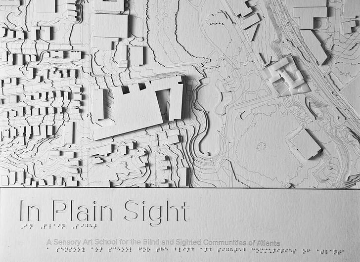

In Plain Sight: An Experiment on the Multisensory Experience through Design for the Blind
Justin Schwartzhoff
Architecture is inherently a multisensory art. Other mediums, such as painting and sculpture, offer stimulation to only limited sets of human senses. However, when one experiences architecture, the entire body is engaged. Buildings are accessible primarily through visual means of form and color, but these creations also reflect and produce sound, emit odors, and provide tactile cues. These stimuli evolve with time, maintaining a historical record of the play with weight and texture, and invoke scent-driven memories – all for poetic means.space within the sensory experience. Therefore, architects should seek to shape their soundscapes. They should play with weight and texture, and invoke scent-driven memories – all for poetic means. Architecture should not be created to be statically observed, but to be actively inhabited
Today, unfortunately, architecture risks becoming a creation developed solely to delight the eyes. The built environment is often designed digitally and marketed mostly through renderings and photographs. This process creates a visual bias. It causes architects to focus on sight-driven forms as multisensory concepts are difficult to convey through a digital medium. As a result, multisensory experiences are often not considered or become degraded.
Sight-biased architecture creates difficulties for the blind and those with impaired vision. If a building lacks multisensory engagement, the visually impaired may perceive its interiors as bland, seemingly identical spaces.[1] The experience of blind occupants, then, serves as a strong metric to judge architecture. If the removal of a single sense removes all beauty from the encounter, the work has forfeited architecture’s ability to fully engage the occupant.
Sight, however, is often considered a critical driver of architecture, as the eye provides the body with spatial hierarchy most commonly referred to as perspective. Information is delivered instantaneously in three-dimensions, which allows for rapid, idiosyncratic comprehension of the scene. Without sight, the immediate spatial order provided by perspective is lost. The surrounding world is no longer defined three-dimensionally, but instead temporally, evolving from the slow intake of sequential stimuli.[2]
Yet, the ordering provided by perspective removes the observer from the space. Vision alone causes a clear separation between the body – what is internal – and what is being viewed – that which is external.[3] If sight becomes too dominant, this detachment affects occupants socially. It fosters feelings of isolation[4] and degrades the concept of public and private realms.[5] Thankfully, other senses accommodate for sight’s limitations by internalizing stimuli to create an intimate connection with the surrounding.[6]
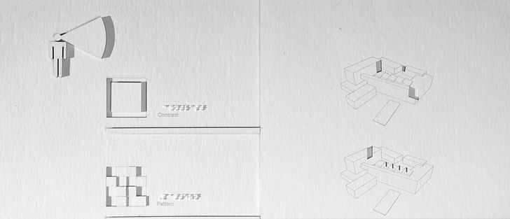
Many blind individuals retain elements of visual perception, though these responses are often fragmented and distorted.When designing for blind occupants, sight cannot be depended on to provide spatial hierarchy, but still it must be considered. Many blind individuals retain elements of visual perception, though these responses are often fragmented and distorted. Sight for these individuals does not describe a coherent, volumetric form, but instead results in seemingly random patterns of color and light. Still these patterns maintain the potential for visual delight, and the experience can result in vivid memories.[7] While perspective is lost, visual elements employing strong contrasts of light and shadow and bright, opposing colors remain as moments of interest, directional guidance, and potential landmarks.[8]
Better design requires engaging all senses. For example, if the occupant is no longer guided by sight, consider sound to define space. Navigation by sound is often ignored in sighted individuals, but to the blind, the skill is invaluable. External noise sources act as positioning tools, creating sound marks within the space. Reflected sound carries with it the aspects of geometry and materiality. As noises reverberate, their resonance is affected by a room’s form and material density. The resulting soundscape is received from all directions. The listener is centered within sonic space, wrapped in the reflections of their surroundings.[9]
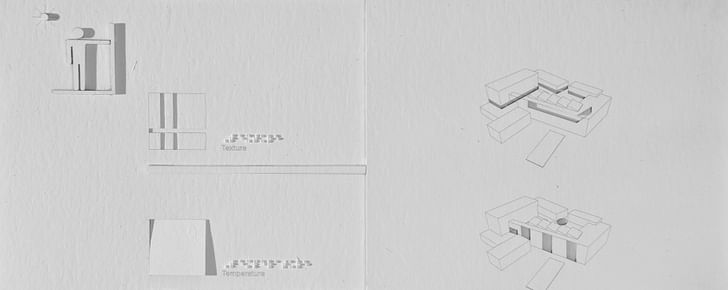
Likewise, the sense of touch can be employed in design to convey information for the blind. Braille and tactile warning strips create a textural language, most often used to denote location or provide warning. However, the sense of touch offers more design opportunities. Tactile properties let the observer understand materiality, mass, and thermal qualities. These sensations tie into bodily associations, partitioning the work into human scale elements. This links the body intimately to the surroundings, fostering an understanding of the work that comes from the occupants’ own self-awareness.[10]
The sense of smell is rarely employed within architectural design, as scents are sometimes unpredictable or overpowering. Odors linger and drift. They fill the volume of space. If not considered carefully in design, odors can pass beyond geometric boundaries. Therefore, defining spatial order by smell can be difficult. However, the effort expended here is worthwhile. Smell is strongly related to memory. Scents have the power to recall personal experiences of the spaces in which they were originally experienced.[11] In a built work, olfactory landmarks – scent marks – can draw from memory, creating spatial relations between different locations, all through a common trigger.
Improving access for the blind and visually impaired is an obvious reason to carefully consider all senses in a design. However, for both the sighted and the blind, the multisensory experience is essential for developing the full language of sensory perception. This is especially important for sighted individuals. While the blind have only lost the sense of sight, the sighted have often let their awareness of other senses become underdeveloped, resulting in their own form of “disability.”[12] Good architecture can reverse this process by providing stimulation and exposure to spatial cues that exist beyond the visual, restoring a multisensory comprehension.
odors can pass beyond geometric boundaries.To explore the potential for multisensory experiences within architecture, a sensory art institute for blind and sighted students is proposed for a location in Atlanta, Georgia. The design equally weighs considerations for sight versus other senses. The process seeks to understand how visually impaired individuals perceive space, and by drawing on these observations, aims to develop an architectural language that engages the entire body for all visitors and occupants.
Atlanta is a city defined and constrained by motor vehicle transportation and an anemic mass transit system. Three interstate highways and major state roads dissect and encircle the city resulting in areas of urban isolation, with travel between city neighborhoods often requiring vehicular assistance. The resulting car culture promotes a strongly visual culture within the city.
Fortunately, Atlanta’s infrastructure is evolving beyond the automobile with the introduction of the Beltline transit system. The Beltline is a conversion of Atlanta’s historic rail corridors into a multimodal system, consisting of a light-rail/trolley bordered by walking and bike trails. The new construction attempts to fix the issues of the previous mass transit system, MARTA, by providing pedestrian access to several previously isolated neighborhoods. Upon completion, the Beltline will create a 33-mile loop around the city core, promoting a walk/bike/ride culture that Atlanta has lacked up to this point.

The Beltline is also being used as an artistic center for the city. The path acts as an outdoor gallery, containing several commissioned works along its length. The majority of these pieces, however, are intended solely for visual consumption. Sculptural work is generally inaccessible, placed either behind construction fences or within planted settings, allowing the objects to engage only sight. Art that employs hearing, smell, and touch is present within Atlanta’s creative community, but only during temporary events; therefore the Beltline has great potential for a permanent multisensory setting.
The proposed Sensory Art Institute is positioned at a specific topographical condition between the Historic Fourth Ward Park and the Beltline trail. Here, a steep hill separates the trail from the park and surrounding neighborhoods. This creates the potential for the Institute to provide a connection between the two public amenities, directing the flow of traffic through the school’s public space. By providing a common path of travel, the Institute gains the opportunity to expose pedestrians to a multi-sensory experience and encourages further inquiry into the school.
an architectural language that engages the entire bodyFor students, the school will offer classes for various levels of visual ability. Courses will be taught by Institute teachers in conjunction with four resident, blind artists. The design includes onsite housing for these artists, who are expected to spend time teaching classes as well as creating and curating works for display in the main gallery. The Institute contains galleries for both the resident artists and students and provides workshop facilities. These workshops, when not in use by the artists, are available as studio space. This allows instructors and students to play with room geometry and isolation to further their creative experience.
Programmatic layout within the Institute is spread among three levels. Wrapping a central path, the facility’s program is zoned by type. The gallery and administration space is positioned to the northwest. Workshops are located along the eastern edge, which borders the Beltline. The gallery and workshops act as a buffer against outside sound pollution, creating a controlled soundscape within the complex. The classrooms and student gallery are positioned to the south and west of the building center, linked at the ends to the gallery and isolation workshops. Together, the workshops, galleries, and classrooms enclose the entry plaza on the Beltline level. This courtyard serves as the entry point for visitors arriving from the trail. A second courtyard, the city plaza, is positioned at the exit to the gallery on the building’s central level. Artist housing sits at the base of the site, facing the school’s sensory garden and Historic Fourth Ward Park. The garden serves as the entry to the school from the park and surrounding neighborhood.
To create an exploratory, sensory-engaging space, the Institute is designed around the language of perception possessed by blind and low-sighted individuals. To engage hearing, the architecture uses sound marks, spatial resonance, and the percussive qualities of materials. Vision is stimulated through contrast and patterning of light in order to provide guidance and visual delight. To create a haptic experience, the Institute provides moments of texture, sloped paths of travel, and experiences of thermal variety. Finally, to engage the sense of smell, the building makes use of scent marks and scent columns to provide order and link spaces through memory.
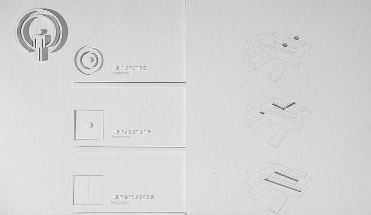
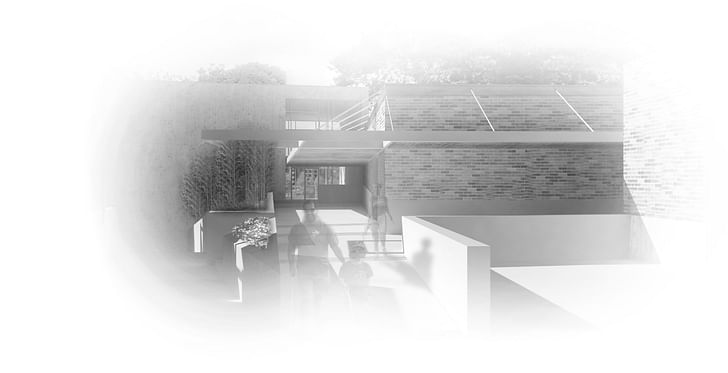
With sight-derived spatiality removed as the primary orienting system, the Institute uses other senses to announce its presence and locate itself within the Beltline system. Sound is the first stimuli encountered by visitors, as it can be heard at a distance. The entry along the Beltline contains an awning that reaches outward towards the trail. The edge of the awning extends over a planter containing river cane, which is allowed to grow through an opening in the structure above. The river cane is flexible, and with a slight wind or a breeze from the light rail’s movement, the plant strikes the metal structure, producing a sound mark that announces entrance.
From here, the soundscape is compressed by the awning and the walls of the workshops to guide the visitor into the entry plaza. As the guest moves between the workshops, the corridor widens slightly. Eventually, this opens to a large, exterior space with no immediate, architecturally derived resonance for guidance. To reorient the visitor, a second planter containing river cane blocks the direct path of travel. This planter is a second sound mark, denoting a critical path point for the guest. From here, one can follow the compressed sound created by the awning as it continues towards the gallery. Alternatively, the visitor can travel south. Here the courtyard contracts and becomes the entry to the classrooms. Those not interested in the school or the gallery can follow the stairs out of the courtyard to the city plaza below. As the visitor approaches the city plaza, the building opens to the park below, returning the sights and the sounds of the city.
scent marks and scent columns to provide order and link spaces through memory.Within the building, sound is compressed and released in the hallways between programmed areas. The classrooms and workspaces (though left largely as open and modifiable) also employ sectional variations to shape sound and provide orientation within. Each classroom is identical in plan, reducing the need to relearn each space as the blind artists move between rooms. The ceilings within these spaces, however, are sloped. This alters the acoustics within the room, creating directionality without interfering with movement.
Within the entry plaza and the transitional space between classrooms, several wood panels are placed into the path of travel. Though visually identical, the panels are of varying depths, creating a unique percussive response when struck by the foot or the cane. The resulting sonic effect yields a gradient soundscape, shifting between hollow sounds at the entry to the classrooms and solid, dense responses as one approaches the finished work of the gallery.
Sight-based cues are employed within the Institute as landmarks, utilizing contrast and patterns of light, color, and shadow to describe location and create destinations. The gallery’s large entrance atrium is glazed on both ends, creating a bright void in what is otherwise a monolithic exterior wall. This allows the gallery to announce itself from the courtyard, drawing visitors up the path to its entry. This effect is also used within the school building to guide visitors from the entrance to the classroom hallway, where lighting shifts from overhead to side-lit, western facing windows. Large wooden shades within the classroom hallway create areas of shadow at the entry point to several rooms, adding a secondary guiding tool during certain lighting conditions.
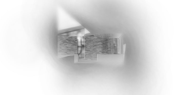
Inside the classrooms, lighting is delivered primarily through north facing, saw-tooth skylights. The classrooms also contain sidelights that face the entry plaza. Each sidelight is unique, containing different patterns of brightly colored, translucent glass, which act as a registration mark for the room. When backlit, the window patterns contrast against the courtyard wall. Their unique pattern fosters an understanding of the spatial relationship between the courtyard and the classrooms, even for those with limited vision.
For haptic guidance, textured wall treatments aid those who navigate by “trailing.” While standardized in placement, variations in material create landmarks for blind users. Along the classroom hallway, cork registration panels provide a soft, playful surface announcing each classroom through different patterns of reveals. On the exterior walls of the classrooms and workshops, concrete registration panels are cast into the base of the brick walls. Each building’s base contains different casting treatments to create textures designed to mimic the artistic process taught by the school. Towards the classrooms, the board-formed panels provide a rougher, unfinished texture. As students move towards the gallery and the workshops, the concrete transitions into a smooth panel form as the creative process becomes more refined. A major sensory shift occurs at the gallery. The building’s exterior is cast-in-place concrete, with wood slat registration panels. The slats recall the board-formed concrete, creating a narrative loop between the finished gallery work and the creative process it feeds.
the shift in radiant heat indicates arrival at major intersections along the path.Extending the textural guidance provided by the registration panels, subtle slope changes are implemented throughout the entry plaza and within the gallery. To travel towards the gallery entrance, one steps uphill. This sectional act invokes an interaction with gravity to provide another sense of direction. This method is employed within the gallery itself. It allows display space to remain unobstructed for the various needs of the artists, while providing directionality to the path between rooms.
Temperature shifts of shade and exposure are used to demark locations within the entry sequence and classroom walkway. In both locations, the visitor moves quickly into and out of direct sunlight. Here, the shift in radiant heat indicates arrival at major intersections along the path.
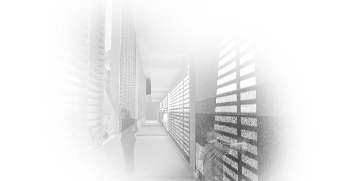
The sense of smell, though lacking spatial definition on its own, provides one of the strongest spatial orderings within the building. On the central path, landscaped planters act as scent marks, each containing different combinations of local flora. These spaces are isolated from one another, in order to maintain a distinction between the aromas. The scent marks, however, are not limited to external use. Within the double height classroom corridor, planters are placed along the base of the wooden blinds. During favorable weather, these blinds are opened, creating scent columns that are perceptible along the path through the park level, all the way up to the classroom corridor on the Beltline level. Invoking memory, the scent columns offer a spatial link between the three vertical spaces, something that may otherwise be difficult to perceive without sight.
No single sensory system provides a full picture of the InstituteNo single sensory system provides a full picture of the Institute, as each aspect of perception provides a differing description of space. However, when taken together, the sensory experiences overlap, yielding an internalized understanding of the building. When a visitor steps into the entry plaza, they are drawn, through sound, sight, or other senses, to the central, guiding landmark. From here, the Institute begins to educate, offering clues for guidance and rewarding exploration with a multisensory understanding of spatial relations.
The four user groups – the artist, student, visitor, and passerby – are equally affected. Regardless of destination, the building interacts with the occupants, encouraging them to broaden their experiential perception. As the visitor leaves the building, they are now primed with the tools to understand the surrounding environment on an intimate level.
Designing for the blind occupants does not require the architect to reduce the visual enjoyment within a space. Conversely, designing for those who are sighted should not diminish the sensory experience for those lacking vision. Careful consideration of the multitude of perceptual methods results in a rich experience for all occupants. With the addition of each multisensory experience, the space gains added depth, internalizing the work within the guest, relating the architecture to the realm of the body, and thus expanding the occupant’s connection with the surrounding world.

Justin Schwartzhoff received his Bachelor of Science in Architecture from the Georgia Institute of Technology in 2007, and a Master of Architecture from the University of Washington in 2014. He now works at the architectural firm GGLO, where he performs a mixture of sustainable design guidance and architectural practice.
KTISMA staff:
Editors-in-Chief: Stephen Maher + Josie Baldner
Layout Editor: Zander Chanin
Outreach Coordinator: Veronika Jonsson
Finance Coordinator: Cara Mitchell
Managing Editor: Tom Moss
Editorial Board: Sam Ridge, Vincent Mai, Erik Larson, Casey Williams
Advisor: Philip Speranza

Contributors to "Lick Your Buildings":
Nathan Smith
Philip Chang
Natalie Chow
Akshaya Lakshmi Narsimhan
Bryan Brooks
Nicholas Venezia
Justin Schwartzhoff
Matthias Neumann
Brendan Shea
Peter Olshavsky
Clara Lee
Mark Faulkner
Erin Moore
Ivan Kostic

Screen/Print is an experiment in translation across media, featuring a close-up digital look at printed architectural writing. Divorcing content from the physical page, the series lends a new perspective to nuanced architectural thought.
For this issue, we featured KTISMA's fifth issue, "Lick Your Buildings".
Do you run an architectural publication? If you’d like to submit a piece of writing to Screen/Print, please send us a message.
Former Managing Editor and Podcast Co-Producer for Archinect. I write, go to the movies, walk around and listen to the radio. My interests revolve around cognitive urban theory, psycholinguistics and food.Currently freelancing. Be in touch through longhyphen@gmail.com
1 Comment
Really love this project and the way it proposes such a layered "multisensory experience". At first I worried it would be very gimmicky but in reality all the approaches employed seem natural and simple. Rather than using technology or being radically different, the project (re)packages obvious elements in a holistic approach that can be appreciated by all user groups (sighted or not).
Block this user
Are you sure you want to block this user and hide all related comments throughout the site?
Archinect
This is your first comment on Archinect. Your comment will be visible once approved.