
ShowCase is an on-going feature series on Archinect, presenting exciting new work from designers representing all creative fields and all geographies.
We are always accepting nominations for upcoming ShowCase features - if you would like to suggest a project, please send us a message.
This house in the Osaka Prefecture Sakai City of Japan was built as a single family residence for three. It is located in a quiet residential neighborhood near the old Hamadera Suwanomori tram station. The client purchased the plot in this part of town because his childhood memories are deeply rooted within this neighborhood.
In the North, the house faces a narrow 4 meter-wide road, and in the West and East, it is framed by neighboring houses. In the South, house connects to the lush green area of the Suwanomori shinto shrine. It was a main request, that the green in the South was to be felt in the plans.
↑ Click image to enlarge
North facade
↑ Click image to enlarge
North facade
↑ Click image to enlarge
South facade
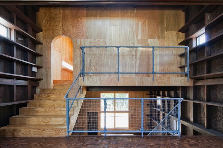
The interior is sprinkled with natural light through many small windows and ceiling lights which achive a bright space and avoid installing big east/west windows. The space is dominated by the split-level circulation and the material choices.
Both east and west walls have been fully utilized as bookshelfs to act as book storage and also display the growth of the family's child. The design mentality that seeks to avoid clutter and uselessness has the bookshelf walls also act as additional layers of insulation against the outside heat.
↑ Click image to enlarge
Interior
↑ Click image to enlarge
Interior
↑ Click image to enlarge
Interior
The spatial configuration is designed in a way that lets the inhabitants feel as close to nature as possible: natural light and the rich green from the South coming in, and natural ventilation that can be controlled through additional openings and shutters in the North, South, East and West, depending on the respective season.
To obtain this, an opening with shutters on the first floor facing the South toggles ventilation, according to the current climate situation, and maintains privacy from the outside. An additional dividing wall can be created with half room-high folding doors.
↑ Click image to enlarge
Interior
↑ Click image to enlarge
Interior
↑ Click image to enlarge
Interior
↑ Click image to enlarge
Interior
↑ Click image to enlarge
Interior
↑ Click image to enlarge
Interior
↑ Click image to enlarge
Interior
↑ Click image to enlarge
Interior
Special energy was devoted to creating a union between the single shades of plywood used on the floor, the wall, ceilings, and fittings. A careful selection was applied to the arrangement of colors, paints, and wood stains to give the space a light attitude. The client's personal mark can be felt here and there.
The idea was to create a timeless and environmentally friendly residence that adjusts naturally to the family's changing needs as time passes.
↑ Click image to enlarge
Interior
↑ Click image to enlarge
Interior
↑ Click image to enlarge
Interior
↑ Click image to enlarge
Interior - Bathroom
↑ Click image to enlarge
Interior - Bathroom
↑ Click image to enlarge
Interior - Bathroom
↑ Click image to enlarge
First floor plan
↑ Click image to enlarge
Downstairs plan
↑ Click image to enlarge
Upstairs plan
↑ Click image to enlarge
Roof plan
↑ Click image to enlarge
Longitudinal section
↑ Click image to enlarge
Longitudinal section
↑ Click image to enlarge
Cross section
↑ Click image to enlarge
Cross section
↑ Click image to enlarge
Construction section
Akiyoshi Nakao, born 1969 in Nara Prefecture, is principal of Osaka-based architecture firm Coo Planning.
Creative Commons License
This work is licensed under a Creative Commons License .
/Creative Commons License
6 Comments
like the small cars, japanese are getting way ahead of any other developed nation when it comes to small detached houses.
i like this project. though, i would much preferred it photographed lived in condition.
at what point does this foam-core exterior/ply wood austerity become cliche? The only thing I can see distinguishing this project from the other cute japanese houses is the nostalgic Wes Andersonian curves.
nice house, but the style of the railings detract from the core aesthetic.
p.s. core aesthetic: huge tree house look
@monull yeah it kind of makes it look nautical don't you think. as opposed to the tree house look
Yes Nam, I agree the railings do seem nautical however they would be found on a ship's exterior unless sans netting. I can see your point in the the door and interior window treatment. However when I looked at the doorways I thought Keebler elves...perhaps i was just hungry at the time.
Block this user
Are you sure you want to block this user and hide all related comments throughout the site?
Archinect
This is your first comment on Archinect. Your comment will be visible once approved.