
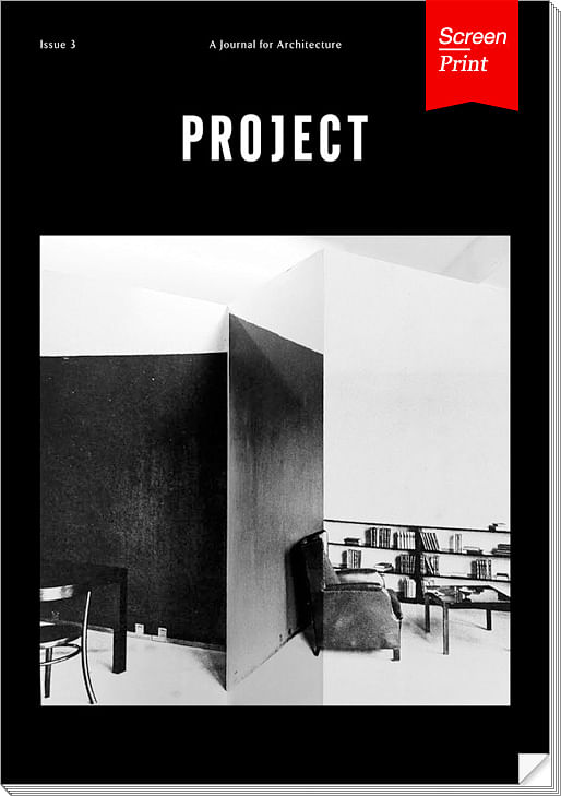
Project Journal is a place for critical architectural discourse, with few restrictions regarding content, but an insistence on zealous, young voices. The journal aims simply to provide a platform for new, potentially dissenting ideas in architecture, but (as the name implies) was initially inspired by discussions with practicing architects about the motivations and explanations behind individual projects. For its third issue, featured here, Project Journal is now published under the Consolidated Urbanism nonprofit, its prior two issues made possible via Kickstarter.
Project is edited by four younger architects based in New York City, Los Angeles and the UK, with an advisory board of more senior architects and educators. Published twice yearly, the journal doesn’t seem to structure issues around precise themes, but always includes an insert dedicated to images of contemporary projects.
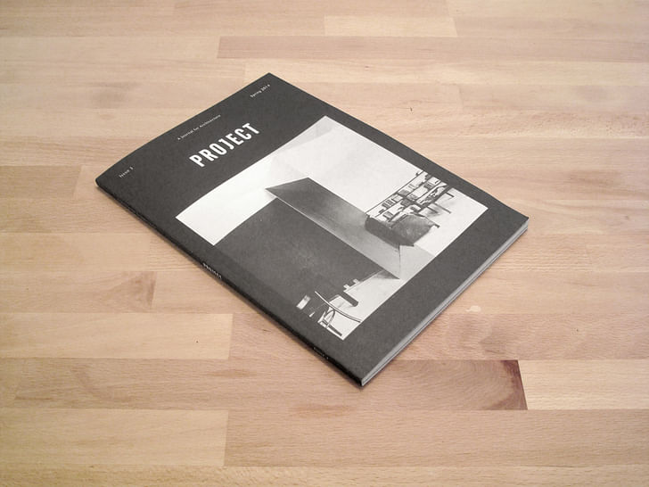
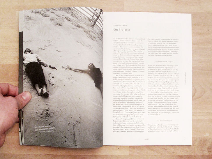
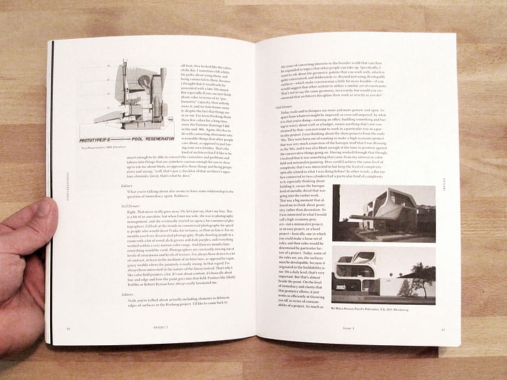
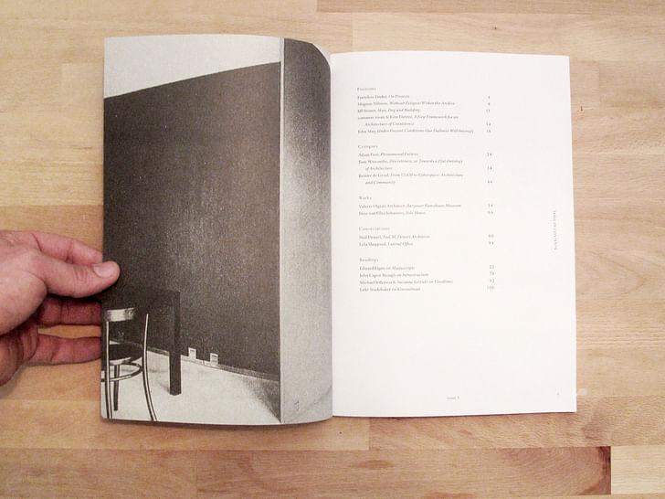
Our Screen/Print excerpt from Issue 3 features a conversation between Neil Denari and the editors of Project.

PROJECT Issue 3
Conversation with Neil Denari (excerpt)
Neil Denari is a Professor at the University of California, Los Angeles School of Architecture and Urban Design and founder of Neil M. Denari Architects.
PROJECT: More than boldness or the excitement of graphic design, there’s another side of legibility besides legibility of form, which is signification. What would you say is the status of signification in architecture? Are there issues that you see as loose ends, in terms of the work of Venturi and Scott Brown, that you’re able to pick up now and deal with in a more contemporary way than you were earlier on?
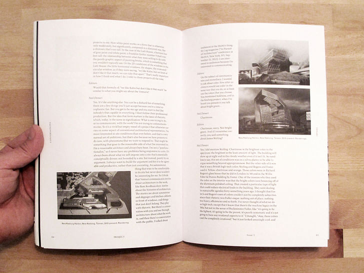
Denari: Sure. How would an architect work on a basic interest in the graphic, and convince other people to be interested? It would inevitably have to do with a project of communication, in two realms: number one, what is the mechanism to communicate? And number two, what’s the content? I approach those questions knowing that both are dodgy, taboo problems in architecture that come in and out of interest and never seem to become perennial, yet they should. My interest in trying to figure out how to make architecture communicate without talking about content is, today, the problem of living in the 2D. I put it out as a kind of problematic, and a taboo coming from an architect. It stems from “this will kill that,” or something more hyperbolic, like, “people care about the new app more than the New Museum,” or, “I’ll just look at the museum online.”
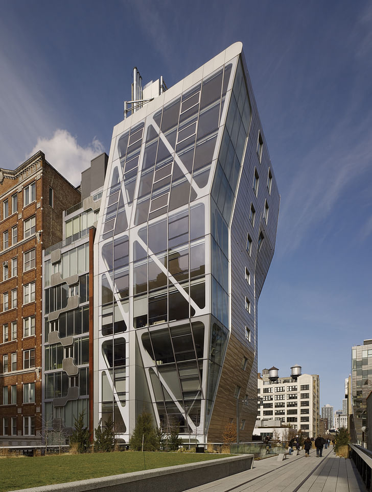
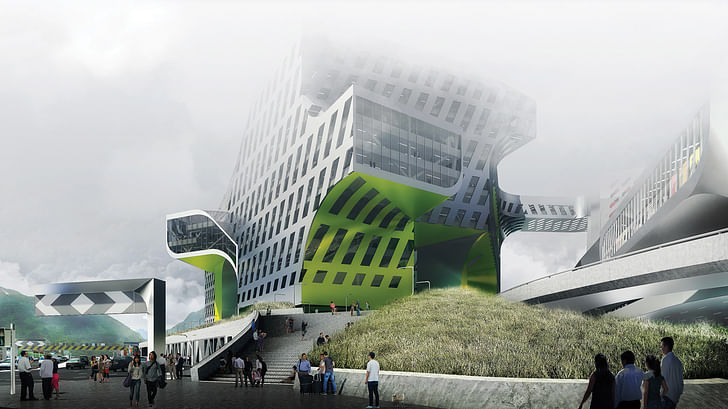
When you talk about living in 2D, you’re talking about living in screens; a smartphone screen, a computer screen…
Yeah. That's not to say that all socioeconomic strata inhabit this world. It’s not a position of elitism. In fact, it’s quite the opposite: the level of technology is greatly and openly saturated. I want to argue that technology today is not completely owned by the first world. I don’t mean that as a critique, I just mean that it's available. It doesn’t imply status or education, it really is a global premise. And I live in that world and I love it. It’s how I operate, from entertainment-gathering to information-gathering, to communication and so forth. So here we are practicing as architects, working in a medium that, theoretically, would be seen as the guardian of the I want to argue that technology today is not completely owned by the first world.real, and the thing that’s impervious to flattening or the 2D. How can we make architecture participate in a way in which it also has its level of attraction? That would start the debate about whether or not architecture needs to entertain, or issues of the spectacle. There are also questions as to whether or not architecture should provide information; information could be seen, in a quotidian way, as space and shelter. The tension between architecture as the silent witness background world and the spectacle has been polarized, at least since 2008. And I’d like to try to advance an architecture that's not conciliatory, but that is slippery in the way in which it can be vivid. I'd also like it to be complex: not reductive, but there’s still immediacy to it. How to do it, and how to talk about it, and what the methods are—that’s a whole fuzzy ball of things. It’s definitely not, “here’s five rules for it,” like Bob Somol would say, “to make a building graphic, you just put a hole in it” [see R.E. Somol, “Green Dots 101,” in Hunch 11].
Right.
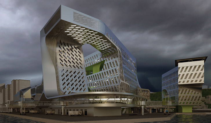
You can have a fuzzy edge, or a straight edge and a fuzzy hole. I understand all of those things, but it’s a different project. I read Venturi and Scott Brown's main texts a long time ago and felt that, by the time I read those texts, the work that they were doing at the dawn of the '80s had already moved well past the work that they did in the '60s. The earlier work was culling from modernist history, in a weird way—and some vernacular history, like the Vanna Venturi House—but it was obviously not in the realm of historical rhetoric. So I lost interest in those texts because I lost interest in the work. And yet Guild House, the Lieb House and the Fire Station No. 4 in Columbus—those two or three projects are super important projects to me. How white paint works on a form that is otherwise only moderately, but significantly, composed in a distorted way, like a chimney that’s too tall. In the case of the Lieb House, a horizon line of gray paint and white paint, a Franklin Gothic number 9 that’s ten feet tall: the relationship between what they were willing to do with the purely graphic aspect of painting bricks, which is something that you wouldn’t typically see. Or the 2D conditions of the windows in the Lieb House: the little horizontal windows, the shapes, the truncated circular window, as if they were saying, “we like Kahn, but we kind of don’t like it that much; we can take that apart.” That's really important in how I think and what I do. I refer to those projects all the time.
Would that kind of formula of, “we like Kahn but don’t like it that much” be similar to what you might say about the Venturis?
Yes. It's like anything else. You can be a diehard fan of something; there are a few things you'll just accept because you’re a total sycophantic fan. But you get to be my age and you start to feel like nobody’s that capable in everything. I don’t follow their professional production. But the idea that form matters is the issue of rhetoric, which, today, is the same as signification; what is one trying to do, or to communicate, with the work? I’m not trying to communicate stories. So it’s a vivid but empty vessel of a project that otherwise carries on people care about the new app more than the New Museumsome aspect of conventional architectural representation. I’m more interested in site conditions than ever before, and that’s a very normal set of ambitions; but that’s also because we have projects to do now, with phenomena that we want to respond to. That might be something that goes to the reasonable side of what I’m interested in; I’m a reasonable architect and always have been. I’m not a “postfunctionalist,” so I never have any problems being responsive to a site. It’s always been about what we self-impose onto a site that’s essentially conceptually driven: not bounded by a site, but instead, purely by an argument. I always want to build the argument, and for it to be agreeable and productive, rather than just coexisting. An autonomous thing that tries to be comfortable in its site but never does wouldn’t be interesting for me. So I think that Venturi communicates stories about architecture in the work, like Rem Koolhaas does: stories about the histories of architecture. The stories are about symmetries and slippages and kitchen cabinets in front of windows, and things that just don’t belong. They play with rhetoric. But there’s a conversation with you and me through architecture about what the work is, and then there’s a conversation with the public. I am interested in audiences because I’m interested in communicating.

Project Journal's Issue 3 also includes contributions from:
and more…
Screen/Print is an experiment in translation across media, featuring a close-up digital look at printed architectural writing. Divorcing content from the physical page, the series lends a new perspective to nuanced architectural thought.
For this issue, we featured Project Journal's Issue 3.
Do you run an architectural publication? If you’d like to submit a piece of writing to Screen/Print, please send us a message.
Former Managing Editor and Podcast Co-Producer for Archinect. I write, go to the movies, walk around and listen to the radio. My interests revolve around cognitive urban theory, psycholinguistics and food.Currently freelancing. Be in touch through longhyphen@gmail.com
No Comments
Block this user
Are you sure you want to block this user and hide all related comments throughout the site?
Archinect
This is your first comment on Archinect. Your comment will be visible once approved.