Archinect
Derrington Building Studio

Derrington Building Studio

Austin, TX

anchor
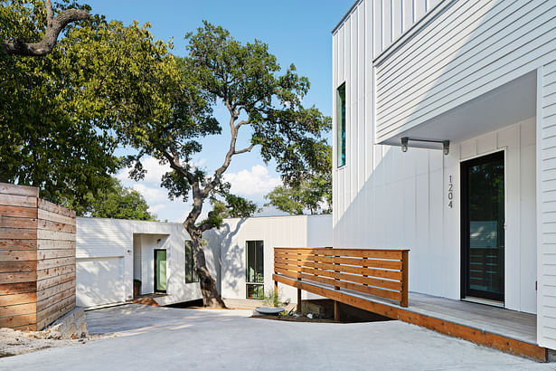
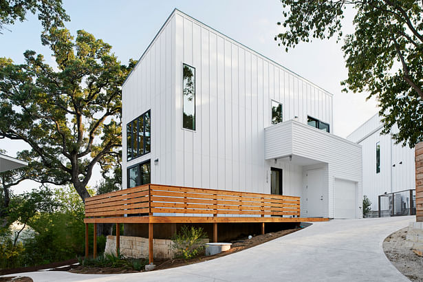
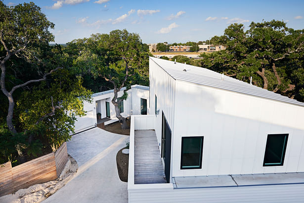
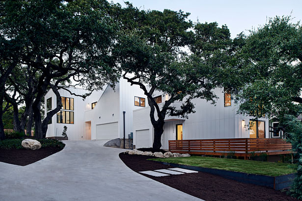
The entry drive to the Woodland property showing Houses 1 and 2. The white elevations are intended to be a clean backdrop to the organic, unrestrained nature of the site. Note the diagonal line above the garage in House 2. This is a functional element in that it’s the guardrail for the stairs that lead to the expansive roof deck, capturing 360-degree views of the tree canopies, and the city beyond.
19 more images  ↓

Woodland Residences

Woodland is a small residential community nestled among a grove of large trees in a neighborhood that is just minutes outside of downtown Austin, Texas.  The development started with a simple program of four houses, but quickly became complex through the site’s general conditions and restrictions. Unusual property lines, a steep bluff, and an abundance of old-growth trees squeezed the buildable area for the project. This, in turn, presented privacy and view concerns given the close proximity of each house to the surrounding trees, as well as one other. Along with these issues, permitting violations from a previous owner had to be overcome. 

Rather than seeing these challenges as problematic, the design team chose to embrace these issues and allowed the constraints to influence the design.  The result produced a unique experience that provides both ample space, and a sense of privacy for each dwelling, while weaving between the trees and their root systems.  The windows were carefully placed to maximize indirect light and views of the surrounding greenery, while also minimizing less desirable lines of sight. 

The development forms a unified and intriguing community of dwellings that create a backdrop for the surrounding trees, while also utilizing them to offer a wooded reprieve from a busy city life.  The material palette for the project was selected based on a simple aesthetic and an appreciation of economy and durability. Tall, pre-manufactured windows are arranged vertically within each dwelling to accentuate the height of each space and to capture framed views.  Due to the topography, different homes utilize different foundation types.  Some homes use elevated pier and beam systems, perching the massing on at a hilltop, overlooking the trees. Others depress into the earth, allowing the opportunity to expose concrete retaining walls.  The modest, white exterior elevations are intended to be a clean backdrop to the organic and unrestrained vegetation on the site.  The color palette makes them modern, but the combination of board/batten and lapped siding roots the project in the vernacular of old Austin.

 
Read more

Status: Built
Location: Austin, TX, US
Firm Role: Architect
Additional Credits: Developer/Design Director: George Blume of GHB3

Construction Manager: William Hodge

Engineer: JM Structural


Landscape Designer: Casey Boyter

Contractor: GreenTex Builders

Photography: Craig Washburn Pictures
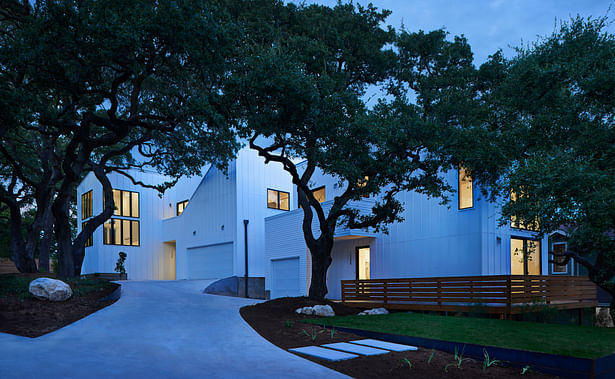
 
The white canvas of the exterior walls reflect subtle, as well as dramatic, changes in the color of the environment as the evening progresses.
Personal privacy was a large consideration in the design. Placement of windows limits direct views into each neighbor’s home. We capitalized on the site’s topography - not only is there horizontal distance between the houses, there is vertical distance. Because of the height, width, and space, privacy feels more conventional despite the close proximity of the buildings. House 4 in the background was not only built around the tree, but sunken into the site to reduce the perceived scale of...
Personal privacy was a large consideration in the design. Placement of windows limits direct views into each neighbor’s home. We capitalized on the site’s topography - not only is there horizontal distance between the houses, there is vertical distance. Because of the height, width, and space, privacy feels more conventional despite the close proximity of the buildings. House 4 in the background was not only built around the tree, but sunken into the site to reduce the perceived scale of this 1800 square foot home. A portion of the house seems to float in space - a dog run intentionally bridges the gap from the garage to the main living space to avoid impact with the tree roots and preserve the life of the oak tree.
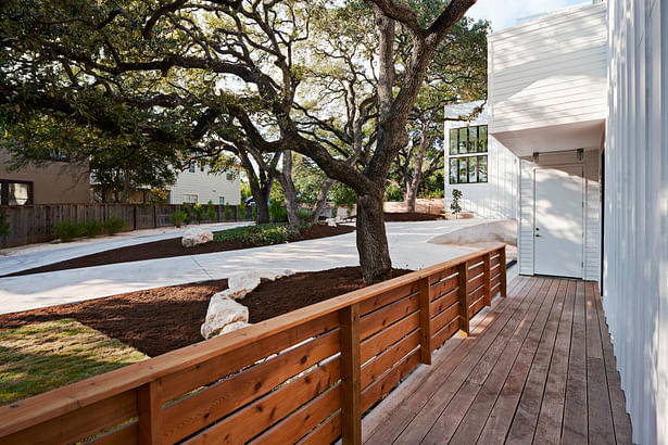
The driveway leading through the community viewed from House 1. Landscaping services by Casey Boyter Gardens.
In working with a limited budget and economical materials, we placed extra attention on massing and fenestration. This particular house is 850 square feet of living space and includes two bedrooms and one and half baths. Simplicity of form with dynamic elements and limited use of color creates an impactful form without being overly dramatic.
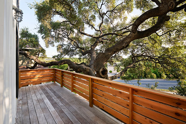
A view from the balcony of House 1 looking onto a tree that was already well-established by the time of the American Revolutionary War. We took great care to preserve the tree’s roots and placed each pier of this house’s foundation one by one.
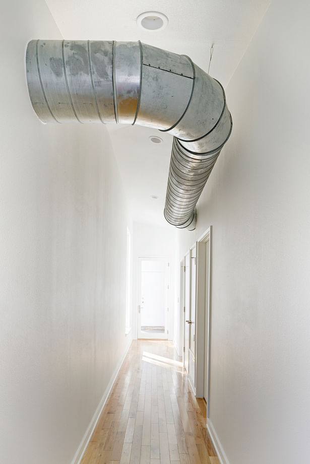
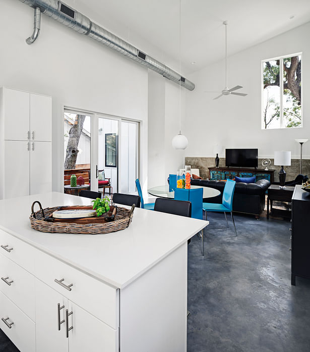
We eliminated the need for furdowns and attics to create a taller space. This required the ductwork to be exposed, and rather than investing resources in custom ductwork, we chose to display cheap and utilitarian materials, recognizing this as a necessary element to the function of any modern building.
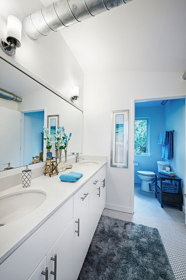
This basic bathroom layout is simple by design, but cohesive in material selections, and allows plenty of natural light via its window that looks onto an undevelopable forested property directly next door.
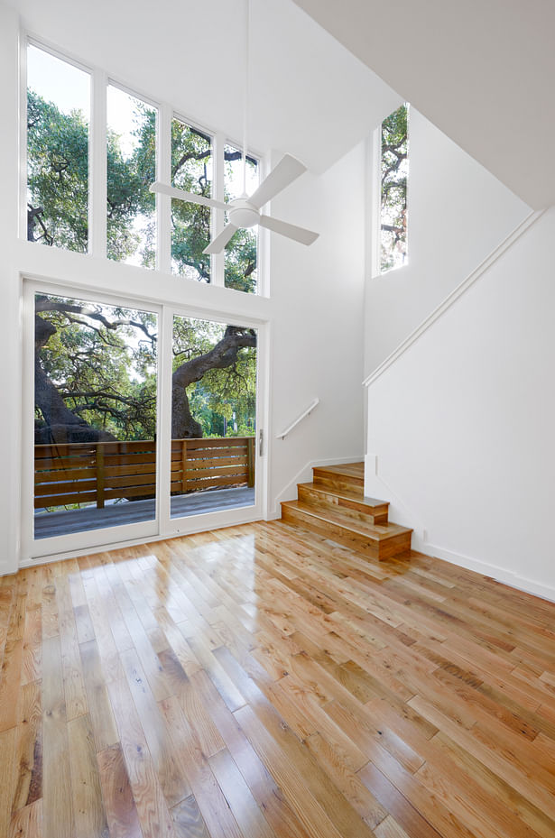
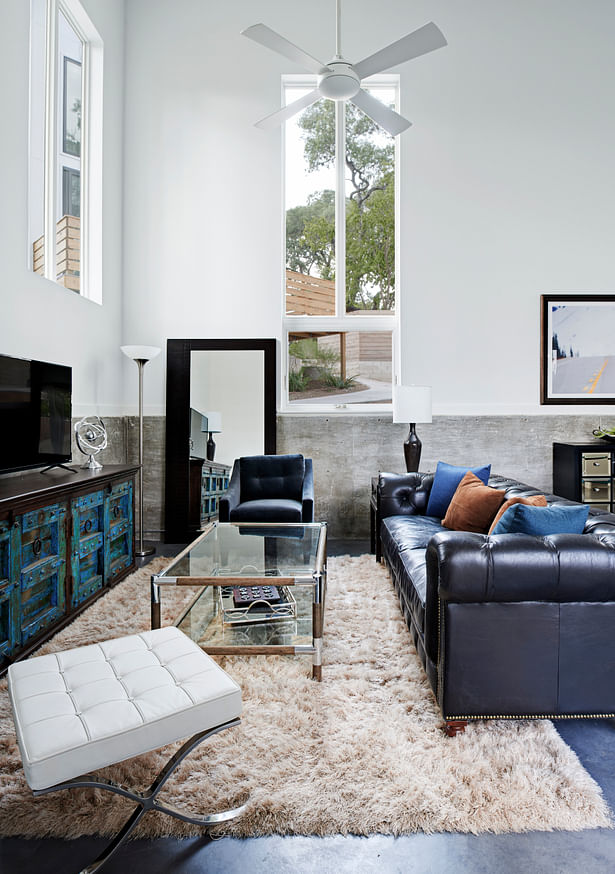
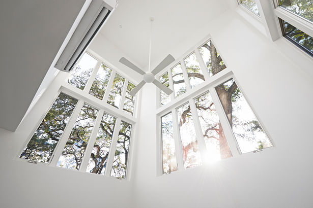
Generous ceiling height (16 feet) is accentuated by tall windows that allows sunlight to lazily stream across the floor as the day passes.
The balcony of House 1 is close enough to the 400 year-old oak to climb on to the tree. This house is only a few feet from the street. The guardrail and the tree shield the occupants from the street. The pecan flooring was chosen for its durability and is a nod to the Central Texas environment (remember, pecan is the Texas state tree).
The height of the space gives one a greater awareness of light and shadow.
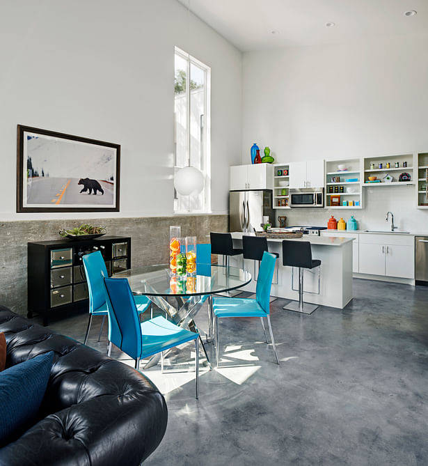
The unapologetic use of cheap materials and finishes allowed for greater investment in the shape and form of the space, and placement of doors and windows. The framed view of a tree is displayed on the wall like a hung painting. A private balcony extends the dining and living space beyond the four walls.
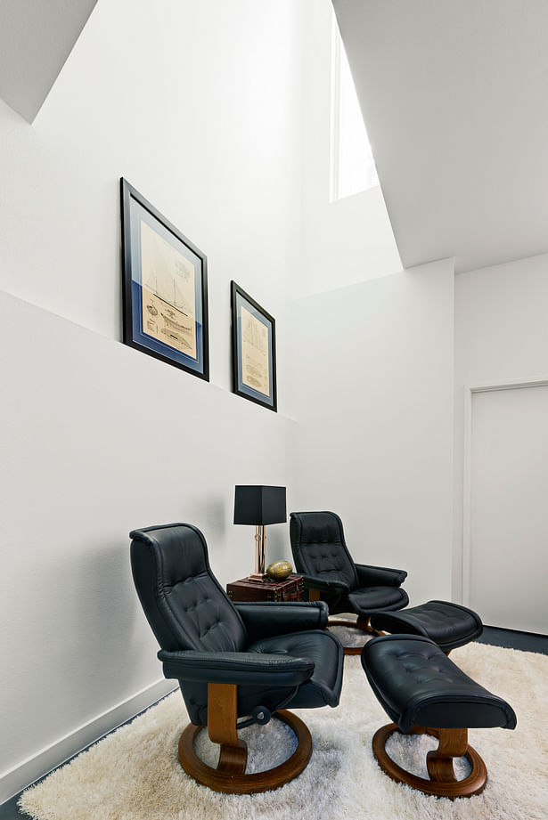
A view of the sky-lit reading nook from across the master bedroom
The owner’s eclectic sensibilities balance with the crisp and economical material selections. Tall, pre-manufactured windows are arranged in vertical bands to accentuate the height of the space and capture framed views. White-framed walls sit atop an exposed concrete retaining wall that submerges the house waist-deep into the site in this shot.
The master bedroom of House 4 is nestled into the limestone hillside and restricted on opportunities to bring natural light into the space. Our solution was to create a light well at ground level above to provide diffuse light for this reading nook.
This project is built on a hilltop, filled with diverse views and giant, protected oak trees. Irregular lot lines, situated on the edge of a rounded bluff with wandering setbacks and a tight budget make for a complex design challenge. In spite of the difficulties, the opportunity to nestle homes amongst large trees of this sloping grove, minutes from downtown Austin, was too great to pass up.
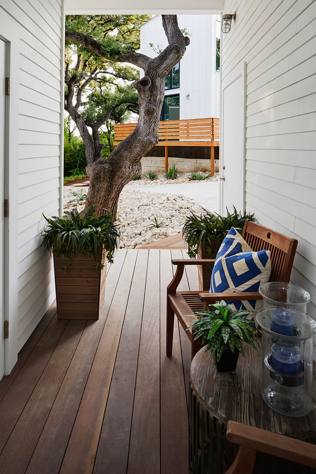
Floating dog run of House 4 connecting the garage and main house with views into the central oak tree and House 3 perched beyond. The flooring is tropical hardwood, chosen for long-term durability and ease of maintenance.
A driveway hugs the corner of the living room in House 2. These windows were intentionally placed high to protect the people inside from the awareness of cars driving directly beside them. An additional benefit to raising the windows comes from the home being surrounded by a tree canopy. The view of the late afternoon sun from one’s sofa speaks for itself.
Due to the site constraints and placement of the houses, conventional yards are not included. Instead, we landscaped everything in front and back of the homes to be usable as a garden, a path, or some other form of outside experience.
Window placement is literally and figuratively highlighted. There are no direct views of the activity inside the home. The houses are exposed without being vulnerable, private without being closed.