
With about a two and a half weeks left in the course before we arch-students stopped doing classes and fall head long into studio fancyfootwork-flashmob-midnighthustle time, the main points to hit in the development of the Design Research were site and program.
For Design Thinking, there really is only a limited amount of time to define and refine ideas. After that, it becomes more about having enough quality ideas to work with and make sense of during the Degree Project semester. So with a blog like this, I can go back and look at what I had done after the scholastic dust has settled and try to make sense of it all.
All that said, there are not going to be any Design Research posts where I show a progress in developing the logical connection between sections shown in the previous posts. Mostly there will be a further accumulation of ideas and, like I’ve said before, some presentation cleaning.
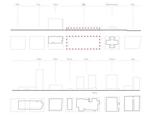
For site, the first critique was for me to dig deeper and show more information about the site. The second critique was that the round-edge rectangular program diagram did not fit at all with the previous work building up to it. Truth. I agreed.
So my first idea about site documentation/definition was to draw some plan/elevation diagrams that had a running photo scroll of the pedestrian experience and main program definitions.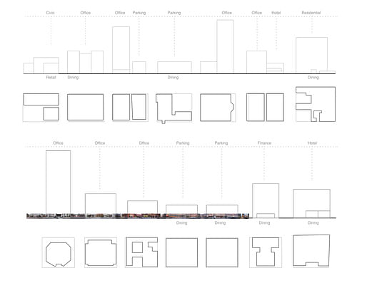
Get some of that Google Maps bird’s eye view. And start modeling a very, very basic strategy for intervention.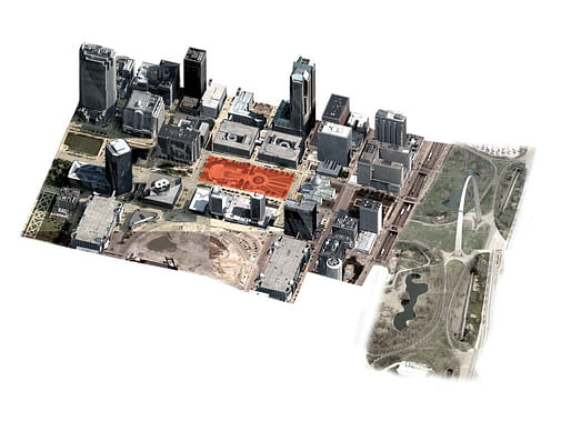
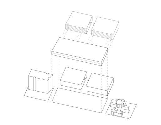
However, my Professor (Derek) and I were a lot more excited about what making another model or collage might do for my progress. It had all been 2D for too long. And I find that when I have no idea what something should look like, models are a good way to figure it out.
So I made one around the idea of a “commercial landscape” which would have some kind of “public insertion” into it. Since I had some fishnet stockings lying around from a model I had made earlier at WashU (don’t ask) I figured it’d be a nice, stretchy and scale defining material to use.
I made a wire frame around it and an overhead track along which to run the “public insertion” pod around to test different positions.
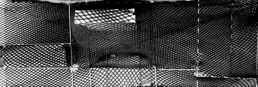

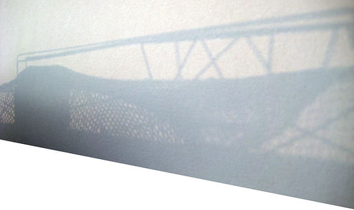
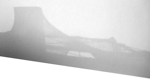

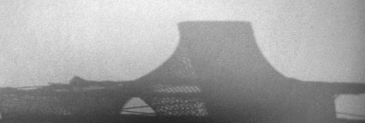
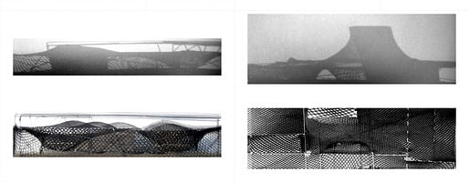
[Sorry that I only have these photos to show. My PC took a downward turn last Saturday, so I have been using my work computer and external hard drive to upload the rest of this series.]
While taking photographs, I was most impressed by the sectional and silhouette/profile qualities of the model. In order to push it all further, I thought a collage would be a good next step.
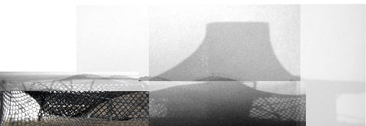
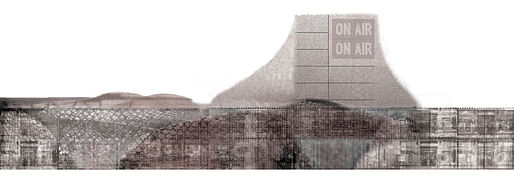
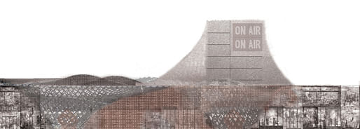
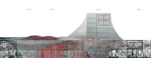
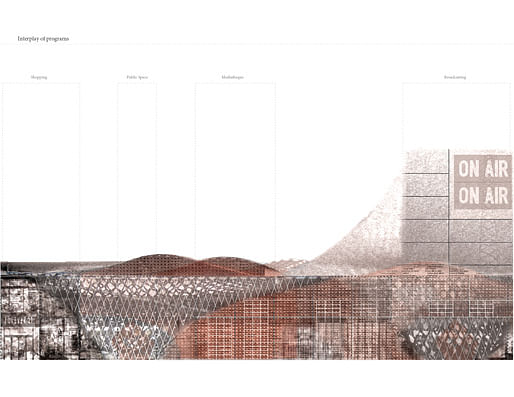
After testing composition and textures, I decided to start adding some hardlines and tentative programmatic feelers.
For me, collages aren't supposed to be a hard blueprint from which to immediately make a finished product. They’re kind of picture orientated idea maps. So while my Degree Project did not end up looking like the collage at all, it, like the other main collage before it, the collage became a reference point to look back on and see where the project has moved and where it wants to go.
All for now.
Take care,
Christopher
I will chronicle my design research and degree project, providing commentary on my thought process at the time. From there, I will transform the body of work into a book which seeks to place into dialogue the two (currently) separated semesters of work.
No Comments
Block this user
Are you sure you want to block this user and hide all related comments throughout the site?
Archinect
This is your first comment on Archinect. Your comment will be visible once approved.