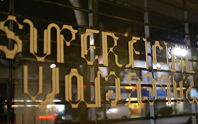
For the past eighteen weeks, I (plus four other young warriors and one elder wizard) have been designing an installation for the Paul Gleason Theatre in Hollywood (California). The address: 6520 Hollywood Blvd. The site is basically two window boxes oriented perpendicular to the street. Measurements: 100"x84"x40" and 100"x84"x21". In the images below, it is the space with the black bar above the entry.
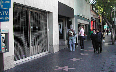
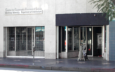
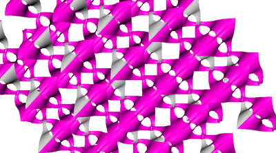
Okay, so I think I am going to purge some thoughts on the project and hopefully this will not become too fragmented or vague. The seminar was lead by David Erdman. Two teams. One for the LACE space next door, which I believe has been posted in this blog previously. The name of the project is: Eviscerated Glowwormz. Our project is titled: FIZZLE. Though, that is getting a little ahead of myself. Back to the beginning. We started with a minimal surface: MANTA. A minimal surface is a surface with a mean curvature of zero. These can be found physically by dipping a closed wire frame into a soap bubble solution (see Frei Otto, or click
link). The minimal surface basically gives us an immediate formal launching point. In the end, the project will evolve to the desires of the designers.
The key to success is the maintenance of a reciprocal process of digital and physical testing. I have chosen to focus on the physical end of that pendulum here. The computer gives us the opportunity to quickly generate surface accumulations, devise structural connections and study other logistics, such as wiring or siting. Physical tests are ideal for studying lighting, stabilities, finishes, etc. Another key to success is a solid group name: Snuka.
The first tests occurred simultaneous to digital modeling. Actually, most of the process worked that way. The schedule dictated things move at a swift pace throughout. Therefore, we had to be creative with our testing and the ways in which each medium could inform each other without pause. One initial test was a hose model and some diodes. Here we were trying to find some of the shadow tendencies with differing light orientations.
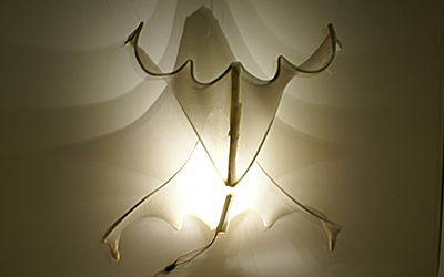
Cutbacks have been necessary throughout. Some of these were more difficult to swallow than others. For instance, we initially designed four window boxes (including the two Woodbury spaces next door). These two installations told a back story of the formal accumulation, the restrictive grid and the deformation starting points. However, time and finances were not on our side. It became apparent these windows needed to be cut. Another cut was a “second” primitive. The primitive was reminiscent of a snake weaving through the lattice with some kind of alien head of light that attached to the windows. Several weeks in, we decided the manta presented enough problems for one plate. The images below is as far as we got in the physical testing of these snakes.
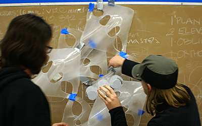
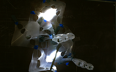
At some point, veins became the lighting strategy we adopted. We all liked the idea of directing comet like beams of light across the surface as opposed to a generic internal glow. Across the iterations, the vein strategy developed significantly -thankfully. After the first tests it became apparent we were going to need something additional to direct the light because we did not plan to make the double skin tight enough around the light (this meant the light would leak out the back of the vein and create a glow between the two surfaces). Sanded plastic tubing worked out quite nicely as a director and container of the light.
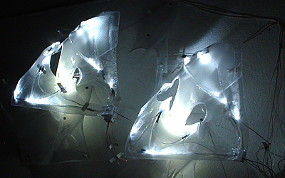
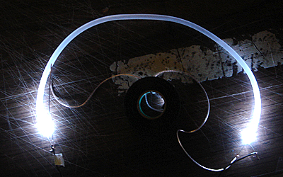
Another aspect to the project is the behavior of light. We had planned to design the light as a reactionary devise to people's movement. However, we found the technology to be out or our budget. So, we flipped it. The light behavior was designed in a way to induce movement in people. Part of the testing of these behaviors was the construction of scaled mock-ups of the windows. These were termed: light brites. Throughout, we were able to program behaviors into the board and see tests in the mock-up.
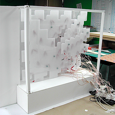
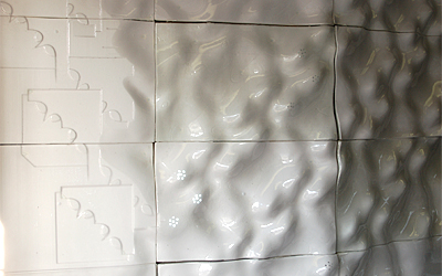
The term final marked the first physical test of the “wall” concept. Rather than have these surfaces hang in the space, we decided to design the installation in a way suggestive of an emergence of the surfaces from the wall. The wall also operated as a structural support that is built into the space with minimal disturbance to the existing condition of the window boxes. The first take on this surface was to make it a relief for the primary surface. We struck a plane through the side elevation of the piece and wherever it collided with a surface a relief was created. The surface was then cradled by the wall.
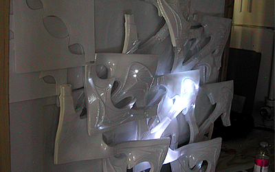
Soon after we burst into final production of the pieces necessary for the installation. Some numbers: 53 4' x 8' sheets of 1/16” Polyethylene Terephtalate Glycol, 2 4' x 8' sheets of 1/8” Acrylic, 900 5mm white LEDs, 43 Polyurethane foam molds, 400 Plastic bolts, 250 feet 1/4” clear plastic tubing, 500 feet electrical wiring, 8 Arduino boards, 30 Computer Numerically Controlled laser cut pieces, 376 Vacuum formed PETG pieces, Lots of Titanium White + Transparency inducer Airbrush paint. And endless hours of production time.
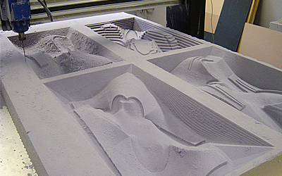
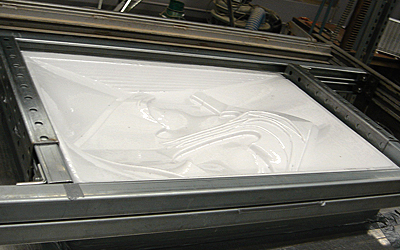
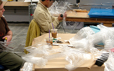
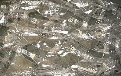
One interesting wrinkle in the process was the need to do some heat forming of pieces. Although we had 43 molds, we still could not quite get the variety of pieces we desired. Milling more forms and performing alternate vacuum forms would have been too costly. So, we built physical forms and heat the vacuum pulls and laser cut pieces by hand into the shapes we needed.
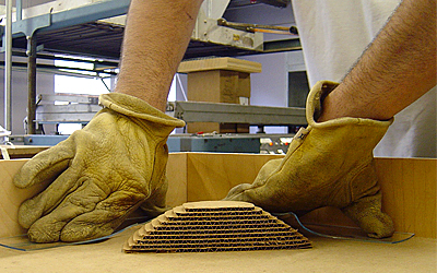
We could not get the desired transparency/opacity ratio we were seeking with spray paint. This required us to air brush the pieces. The problem with air brushing is the paint scratches off the plastic extremely easily. This decision has haunted us through to the end. I wish we had found a viable alternative to the airbrushing; it has been a disaster.
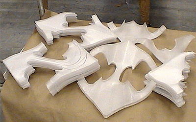
The walls were developed through a system of curves that hugged the lattice. Using these curves, we were able to generate surfaces that could be aggregated to create a wall condition. One wall is generally struck straight across the back of the window box. The other wall bends in plan to adapt to an offset of glass in the window box. This system has worked out tremendously as it has an inherent tolerance for the lack of precision in the vacuum forming process.
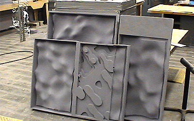
The process has been one definitive test of mental endurance. Luckily for me, it is coming to an end. These pictures are the window boxes as they stand today. We plan to have the installation completed by the end of the week. It certainly has taught us much and it will be nice to finally take a step back, wipe our eyes and see what we created.
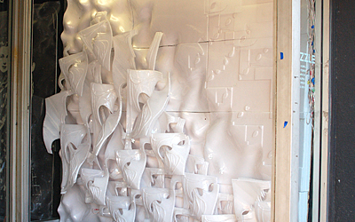
If you are in the Los Angeles area, I recommend checking out the two projects (FIZZLE can only be viewed on days of a show, usually Friday, Saturday and Sunday evenings). Then, go across the street for cocktails at Geisha. Or, if you have a wallet the size of me, go across the street to Los Burritos!
-jt


7 Comments
Very nice! I used to live just down the street from there. It's nice to see something finally happening to that place!
the work looks interesting, but does it go beyond just that? is there anything giving any kind of resistance to developing the design of these projects? reminds me of warhols statement about effective art. he said something like: an effective piece of art is one where when you first encounter it you go "Huh" and then after absrobing it for some time you go "Wow." less effective art is when you look at a piece and you go "Wow" and then after some time "Huh."
Most of these superglow projects seem to hit the 'wow' and then the 'huh' and then the 'so what'. I wish that a few had tried to work in reverse.
maybe the comment is more about the assigment than the work. it seems to do little to develop the role of the architect beyond that of set-designer.
thanks for sharing the work. again, if the goal was to make stuff that looks interesting, then mission accomplished - but is that ever enough?
Thanks for the comments. lifeform; Interesting you mention Andy Warhol given his financial connection to the LACE space. I think it is difficult to test the "resistence" factor, if I understand the sources of resistence you are referring, on these projects given their scale. Most of the technology seminar courses are focused on smaller scale projects that inevitably tend to operate at a building detail scale. That being said, this project was one of the most optimistic in terms of scale I have seen from these courses. The result, it may take the project to another scale also in terms of critiquing -which is where I think your question is the correct one to raise. I can go into some depth discussing the pieces "effective" or affective qualities. But really, I think this may be best in the hands of the critique. When I experience the environment created by the window boxes, I get something out of it. Though, I fully expect this to be a different experience for each person. Honestly, I am growing a little weary of me, or other designers, telling people how they should experience their work. I know it is part of the critical process... but in this case, the design is (almost) fully installed and prepared for comments. Shoot, I am late for class... I have more to say when I get time.
I think the critical depth of the project also depends on the approach a student takes in these courses. These are not studios. Therefore, one may argue this is about development of technique or process rather than a fully encompassing design solution (at times, such as with one this quarter, these courses are directly connected to studios as a support mechanism to develop the project further). In our case, we believe we have taken it beyond a technical exploration. Still, it is interesting you used the words "art" and "set design" as possible descriptors. I suppose the latter of these terms may fall short of architecture for you (although, any piece of set design is probably more successful in terms of affect than most buildings), and the former I do not know. Tentatively, I believe the way in which this installation is experienced is somewhere between art and architecture (as I define the terms). This is a boundary preset by the initial problem and the siting situation, which we have attempted to alleviate through our programming of the forms. I anticipate observations of people and how they react to the installation will be the judge of success in that regard.
Superficial projects draw superficial critiques. This project is a prototype and obviously a formal study. Does this make it less worthwhile? Of course not, for many reasons. Anytime a project has a degree of geometric complexity some armchair critique shoots it down for not having enough value. What the hell does this mean?
If you really want to take the practioner's standpoint- there are numerous times on a project where a fragment needs to be given form wheter its a reception desk or a wall assembly. These objects don't always gain form from extrinsic forces. Not every piece of the building carries a social statement or participates in energy performance. Yet they can still perform and act upon individuals, measured by their ability to communicate. This is where the idea of superficiality becomes interesting as part of an efficiency in communication to project and display more layers and depth of information than can physically be there. Communication and moments of interface are becoming more and more a part of the architectural environment as every surface becomes wired and intelligent. Originally, these projects were going to be more directly studies in interactivity including sensors and more complex programmed behavior. But as they stand, they are still valuable as a way to measure how the reading of form is altered by aspects of glow.
Thats one way I see this project as having importance. In addition plastic has become a very prevalent design material and learning aspects of its fabrication were interesting. Keep in mind, these projects are not free formed, they cannot be. For reasons of economy, they had to be highly modular and require a great deal of control with curvature to create a gradient series that can fit tightly together.
Lastly, there is a theoretical agenda that we are all participating in. Many professors here are second and third generation descendents of Peter Eisenman so this is a formal indexical study but at the same time a critique of that generation because it recognizes the need to fold additional phenomena in from the outside world- a less autonomous autonomy. In this case its glow, for others it may be gravity, or atmospheric affect.
I think it's cool, and as several have indicated above, the larger body of work in which these projects take part is that continuing 'wow' factor. A lot of these do add new things to the evolving language that they're a part of. In this case I'm interested in that quasi-orthogonal figuration that shows up just as the thing lifts off into the interwoven minimal surfaces, that's what's interesting and new here to me.
Not bad at all for a course that's, as was said, not a studio, and really just an introduction to the fab technologies and their interaction with the modeling software.
And anyway, Warhol sucks, I'd argue that Warhol has no 'wow', just straight to 'so what'.
fuckit, i dig it
Block this user
Are you sure you want to block this user and hide all related comments throughout the site?
Archinect
This is your first comment on Archinect. Your comment will be visible once approved.