“ design is not for philosophy its for life.” Issey Miyake. Once in awhile we have clients come to us and ask for simplicity. The client had a humble requirement making the house more homely and not jazzy. This is also a challenge when you have to also merge indianness with minimalism. This house is a perfect blend of paradox
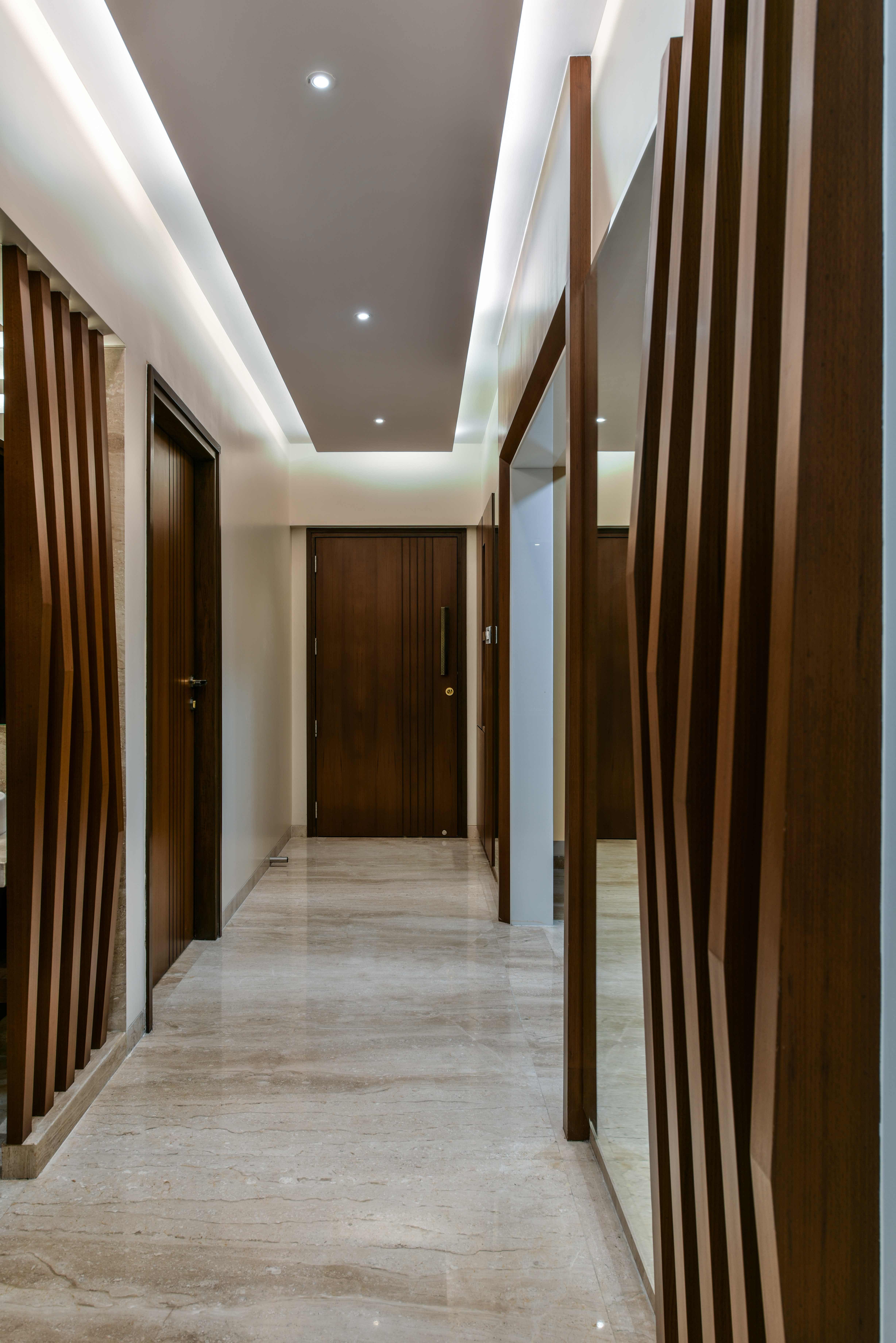
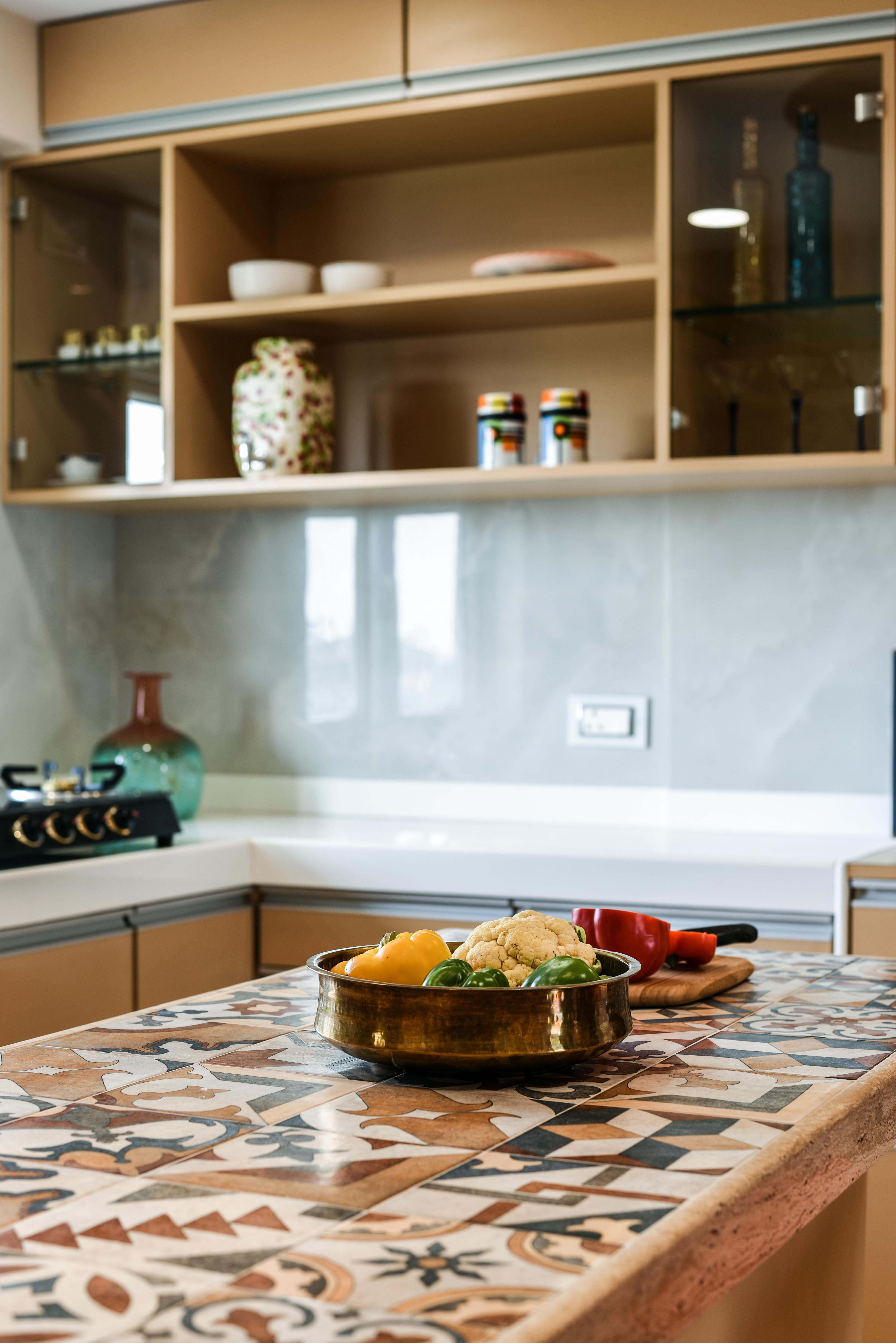
Grounded to their roots we kept the palette very indian but played around with the design elements. Merging the very ethnic motifs with a contemporary application. The house opens into a very long passage. We widened the entry to the kitchen opening up the kitchen so the passage was not narrow any more. Vertical elements were added so make it more voluminous. Combination of wood and mirror was used alternately in the passage; the use of mirror made the space more spacious and welcoming. The lights used overall in the house are a combination of yellow light and daylight making the place warm and cosy. The was modified, merging the servants room into the kitchen making it bigger. An island platform was customised with the top being made in hand made tiles, the overall kitchen has warm tones and a pure white top for the main platform. The overall flooring in the house is beige marble that blends well with the sand colour kitchen. The mandir was of prime importance to the client. We customised a laser cut jali in a traditional tamilian ‘kolam’ (rangoli) design with a gold background visible.
The living room is a perfect amalgamation of the new and old. A very contemporary and minimalist tv unit made of a contrasting marble to the floor that wraps around the wall dividing the living room and the passage. The marble selected was an art piece by itself with its natural veins forming beautiful patterns. The other part of the tv panel is the contradictory matte finish veneer panel to the glossy marble surface.
The living dining area was a very elongated space divided by the passage that made the living and the dining space individually very small. The seating was planned in such a way that it created an illusion of the living space being bigger. The tv panel was designed in such a way that it did not further divide the place into smaller areas. The angular cut helps in making the living space appear bigger. The furniture was customised to be minimal and fabric selection was such that it blended more than stand out. The piece de resistance of this room is the ceiling above the dining table. We used a traditional Kancheepuram silk saree and framed it . a modern black hanging light above the dining table again a stark contrast blends perfectly with this unique feature. The whole treatment is off centered; this again helps in breaking the division of the living dining space. Overall the design is a paradox but in doing so it's important to balance it out. A very muted olive green colour was chosen for the long wall in the living dining area. A huge photograph was framed and placed in the dining area. The mere scale of the very indian photograph is overwhelming and eye catchy.
The passage that leads to the bedrooms had some electrical boxes that could not be avoided. So we added wooden frames making it more playful. Each of the four bedrooms were designed for a different requirement catering to the individuals using those specific rooms.
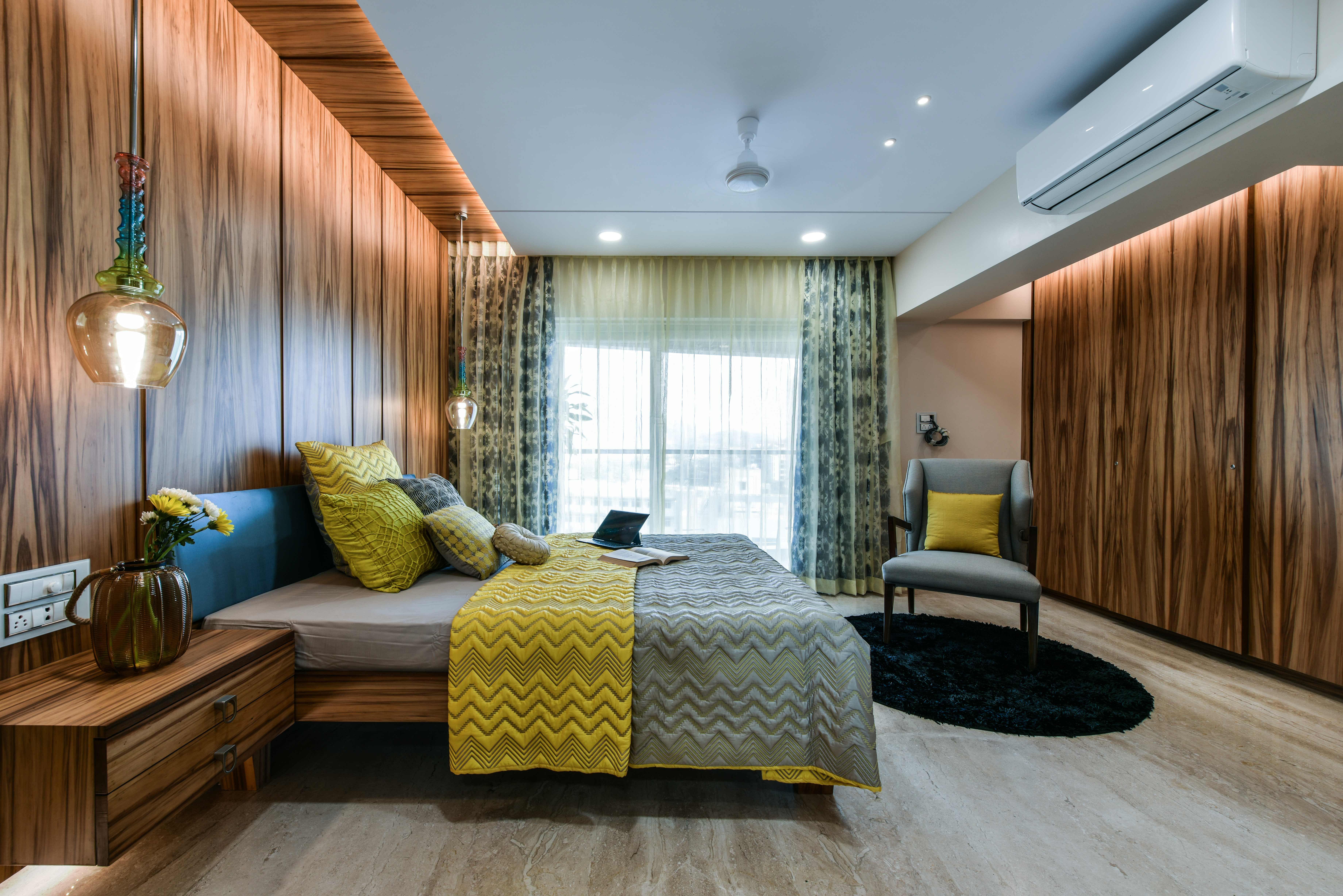
The master bedroom had extremely minimal requirements, also we increased the size of the bathroom by breaking a bathroom and including it in the bedroom space. The Bedroom consists of a sliding wardrobe, a bed with side tables, a reading accent chair and a dresser. The highlight of the room is the veneer we selected. The grains in it create a statement on their own. Accents of a poppy yellow was used in the soft furnishing and the decorative lights of the room, a complimentary sublime blue colour was also used sparsely. Light has been used aesthetically than just functionally. This also helps create a very ambient overall look.
The teenage daughter wanted a room to be bubbly and bright. Considering she is in her mid teens and with growing years her taste will evolve we kept the room neutral for such a change. The colours used are subtle even though the study area is multi coloured. A vertical headboard instead of the traditional horizontal one was planned. Considering the size of the room the planning is compact yet functional. The vertical headboard runs in the ceiling culminating into the dresser. The study unit is comprised of open and closed storage. The bubbly character in the room is bought in from the soft furnishing. A very playful metal chandelier has been used. The son being the elder of the two siblings wanted a very minimalistic and open room. The fact his rom was adjacent to the balcony just helped us. A unique headboard was designed with a reading light provision for the voracious reader that he is. An inbuilt book unit was combined with the bed without breaking the seamlessness of the headboard design. A suspended table top that acts as the study table. Ice grey and white oak shades were used. Mirror has been strategically placed to make the room look larger. This is a key feature that you can see in the overall house where mirror has been used in ways to tie the place together or to create illusions of a larger space.
Status: Built
Location: Mumbai, IN
Firm Role: design and execution
Additional Credits: Photography Credits: Prashant Bhat
Team Aum : Ar.Manish Dikshit , Ar. Sonali Pandit, & Ar. Nachiket Borwake
MATERIAL/ COMPANY
Wall Cladding: Marble from Millennium Marble, Veneer from Timex
Interior Finishes: Lustre paint, Gold leafing, Zinc Paint
Lighting Fixtures: Teknolite for general lighting, Decorative lights sourced from Deepam
Furniture/decor: customised furniture from Royal Art Centre
Soft Furnishings: Sreeji
Curtains / blinds : Sreeji
Hardware: Unique Enterprise