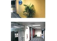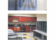
View of Aisle way showing one of the blue columns.
The client during construction was concerned with the oversized blue columns though once the carpeting and furniture layout was in place the columns communicated and accented the area locations and were not overbearing as they could have been interpreted to possible be. The columns made their statement and the queue for the blue was taken from there trademark logo. The other individual colors used which were softer in their tone to identify certain group areas worked in conjunction to make the space seem larger and more appealing to those working there and visiting.
In bringing the site facility director to understand what I was providing in design, material and colors I achieved their original program requirement which was to make this new area lighter in feeling then the area they were coming from. The only items we reused were that we bought the same Herman Miller furniture and carpet and the overall affect was achieved with plan layout, minor details and softer palette of colors with the exception of the large blue columns and hi-lighted conference room entrances that were hi-lighted in the maroon color as shown in two other photographs.
Furniture and modular system used was Herman Miller.
Paint used was Sherwin Williams.
Status: Built
Location: New Jersey
My Role: Designer
