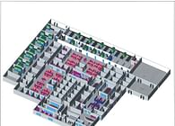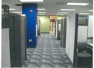
The Client wanted simple yet identifying features and elements to identify its floor plan layout for employees and visitors alike.
In the plan organization by department, aisle ways and walls were used to identify groups and columns to identify dedicated areas and special uses at those column locations while using a pallet of colors also. The big blue columns were all sized equally and due to their large size could be easily viewed above the modular furniture to help serve as focal points in the different areas. The column location serve to be where multifunction printers and non-multifunctional equipment is located since the cubicle space with the column left enough space for that purpose.
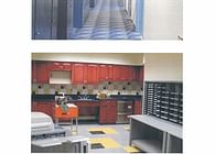
The break areas were designed to have a residential quality to serve as a change to the corporate setting in plan. I used a kitchen setting as what you may have at home to serve as a mental relaxed setting in taking your break. High end solid wood cabinets were used and came within budget.
With the interior design coming in under budget it allowed the company facility director to purchase art for the walls which was not in the original budget. The art was placed at locations were a person could see them at the end or along an aisle way bringing yet another focal element. (Art work was not installed at the time the pictures were taken.)
Furniture and modular system used was Herman Miller.
Status: Built
Location: New Jersey
My Role: Designer
