Mumbai, IN | Bengaluru, IN
Established on the lower slopes of a hill, amidst the sprawling 40 acres land of Pune's renowned educational institute Symbiosis, SUHRC has been developed on a forested hill, in a discrete and quiet location. Envisaged as a Multi-Specialty Hospital to provide excellent health care facilities and a State of the art - Centre that would enhance Skill development in the Field of Medicine, the development envisions to educate and empower medical students. Conceptualized to cater to the needs of all the stakeholders, the hospital caters to the nearby population of Pune and its neighboring areas, while providing Tele-Medicine services to ensure outreach services to peripheral, far-flung and access-compromised settlements. Amidst today's context, currently, the hospital is being used for Government welfare as COVID 19 hospital.
Sitting along a slope, the building is strategically positioned to minimize the cut-and-fill of the hill site. Planned as a robust curve along the contours of the land, it forms the façade of the project. Imbibing the client brief of 'grandeur' being a key element, two significant and symbolic entrances have been designed, distinct in approach to cater to the client brief of unique identities for the hospital and the academic block. While the entry to the hospital is welcoming, peaceful, it also provides a sense of grandeur along with a structure that expresses Solidarity, resonating care, and shelter for the patients in distress. A large open-to-sky courtyard separates the Centre from the hospital. The entrances for both these blocks lie on either side of the building, making them seem like two completely different entities, providing the students with different access as well as a space for them for relaxation and academic purposes.
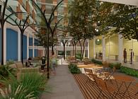
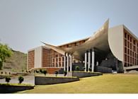
The entrance for the Skill Centre draws inspiration from the stainless steel surgical instruments used in hospitals. A mammoth silver steel bird, with wings wide open, welcomes the visitor into the building. Supported by steel pipes, a futuristic roof under the sun beaming brightly, is symbolic of a contemporary architectural response. The roof sits above the large semi-circular staircase that leads the visitor to the entrance. In contrast, the response to the other block is humbler. Split into two entries, where one is for casualties and the other for regular populous, the base of the entrance is lifted to be in line with the interiors. Above this large entrance, a slightly curved roof is designed, shading the entrance and making it possible for people to wait outside too. The tip of the entrance is stretched upwards, thus letting in more light to create a deeper canopy so that at least two lanes of vehicles could be parked along the length of the building under it. The canopy was stretched to the complete width of the building and gave it a smooth curvilinear shape in the front, which mellows down the impact of the sheer size of this structure. A balance between light and shade has been achieved with smaller skylights within the roof, and a larger opening towards the upward bending tip. The upper surface of this canopy was converted to a terrace garden, such that even the single bed patients would be treated to a biophilic space, which would promote healing. Two large courtyards in the building create buffer zones that help in healing patients, bring in ample light, and are overlooked by wardrooms and the Out-Patient Department. The OPD has no air-conditioning but allows for fresh, natural air while ensuring sufficient ventilation. All departments and spaces of the hospital are designed such to bring in daylight and natural ventilation. Even areas like OPD, waiting have courtyards on both sides and are naturally ventilated. Similarly, at all levels, there is a 3m wide corridor that abuts the central courtyard, which lets in natural light and ventilation, thereby reducing the AC load and power consumption for these areas. The courtyards act as spaces for healing, for the congregation while reducing cross-infections. The terrace gardens are landscaped with flowering trees and plants to create a soothing effect for the patients as well as the accompanying caretakers. The main central courtyard transforms the space around it, unlike any regular hospitals, which are much mundane, completely air-conditioned spaces without any daylight and natural ventilation. Keeping sterility in mind, the courtyard is non-accessible, full of plants and small trees, etc. to avoid the risk of contamination and maintenance. The accessible spaces in the courtyard are paved with tiles and stones that are maintenance-free.
The main central courtyard not only brings in the above features but also makes the space aesthetically pleasing, soothing to the eye creating a calm oasis. The space is completely transformed, unlike any regular hospitals, which are much mundane, completely air-conditioned spaces without any daylight & natural ventilation in significant areas. This also helped in simplifying the way-finding in the building, which otherwise in other hospital projects is a complicated affair for the users adding to their trauma in searching spaces/ departments within the structure.
This 216 Bedded Hospital provides state of the art 5 Operation Theatres, equally well equipped 22 ICU units. The Radiology department offers MRI, CT, X-ray, Fluoroscopy, BMD, and other scans. A dedicated Cardiology department with Cath Lab facility, Kidney dialysis with nine beds, separate Gynaecology Department with an independent OT Facility.
Functionally, the building comprises of four sections; three of them belong to the hospital and the last one being the Skill Centre. Every section has been planned and conceptualized for its functionality- driven design and a distinct formal response as a result. The three blocks of the hospital, namely, the general hospital block, the procedure block, and the multi-specialty block, all have been planned with keeping in mind the ease of functionality and avoiding criss-cross movement.
Amongst the 900 beds in the general hospital block, 600 beds are for free patients and procedures, which are all taken care of and treated by the medical college students. This block has been connected to the procedure block, with services running along one side of the corridor. At the same time, the departments are situated on the other, allowing for ease of access without causing any disturbances. Further, the procedure block is well segregated from the ward block to ensure privacy to every patient, while being shared as a standard procedure block by paid and free patients alike. This block is equipped with the latest medical technology being robotic Operation Theatres and surgical operations.
The hospital is planned across five levels; departments such as the OPD, casualty, radiology, MHC, etc. which require easy ground access and are frequented by more patients every day have been planned at the ground level. The first-floor compromises of General, Twin, and Single bed wards, most of which overlook the garden space. The critical areas such as OT's, Pre-Op and Post Op, ICU's Cath, etc. are planned on the 2nd floor, making it the sterile zone and thus are also segregated from other areas of the hospital. The 3rd floor, which was earlier planned for future expansion, was also converted to a ward floor as the client decided to get a DNB Accreditation, which required 200 + beds. All services are planned in the basement and lower ground level, including parking, stores, and other necessary hospital facilities such as morgue, medical gases, workshop engineering offices, garbage disposal, etc. The partly enclosed basement and LG levels are designed such that they use natural ventilation and daylight as much as possible. A 2.5 m wide ramp is also provided in the central courtyard, which will help patients to evacuate during a fire without being dependent on any mechanical systems.
Attention has been paid to construction details, where post-tensioned slabs are used to achieve flexibility, minimum beams, and larger spans that facilitate different size room arrangements and to allow for easy routing of ducts. The flexible grid is designed to synchronize the structural system at all levels. To enable a natural, original, and permanent finish on the building, which would be maintenance-free, brick was adopted as the material of choice for the double skin on the façade with deeper shading projections that would reduce heat gain. The resultant boxing forms were skewed, twisted, or tapered to achieve variations in shape to form a multi-faceted façade that reflects light in different tones in any part of the day. Creating dynamism through its texture, capturing the play of light and shadow each day, the façade looks different, complimenting every mood of the day. What is typically done in concrete, has been made possible in the brick and looks exclusive. Naturally compressed, sundried earthen bricks produced on-site, have been used for façade and masonry work and methods such as brick-boxing were incorporated to achieve efficiency, while reducing pollution. Together with exposed concrete, the skin and the façade flatter the green hills beyond.
Smaller details have been taken into account to ensure a calm and serene atmosphere that promotes healing while encouraging research and creating spaces that are easy to use and maintenance-free. Colour coding has been enabled for easy identification of the assortment of spaces and critical areas such as ICU's are endowed with light colors of soothing shades to reduce anxiety. To maintain a warm and tranquil environment for patients, soft home-like colors cover the inner walls of the hospital. The ward rooms are designed with warmer and subtle hues of colors that are complemented with teak laminates. Varied temperatures and light with correct lux levels have been worked out for different areas, and the furniture has been customized for special and diverse needs. Acoustic materials in the ceilings of corridors and rooms reduce noise pollution and provide easy access to services. Encouraging way-finding, the nurse stations are highlighted with shades of warm yellow/orange to be identifiable from any side of the long corridor.
The Skill Centre is planned on the fourth and fifth floor with a separate entrance at the ground level. Being a part of the Symbiosis institution, the client brief called for a grand entrance that would be symbolic to the medical field, reflect Symbiosis legacy, and depict a futuristic approach. A grand entrance with steps ascending 8 m moves into the entrance porch. Shaped like the wings of a bird stretched to its extreme ends, the entrance is made of steel with an aluminium skin. Resting on a combination of steel and concrete Columns that give it a solid base and balance, the double-height entrance leads into a curvilinear café, which in turn connects to the Skill Centre designated vertical cores connecting to the 4th and 5th floor. The café gains ample daylight and natural ventilation as it has an enclosed courtyard on one side and stepped landscape on the other, thus creating a pleasant view for the users of the Café. The Skill Centre has four departments; Centre for health skills, School of Nursing, Institute of health science, and a School of Open and Distance learning. They share 9 classrooms with approximately 60- 90 students per class, a 300-seater auditorium, a library, meeting rooms, labs, changing areas, where all professionals such as Surgeons, Doctors, Nurses, and other allied fields. All the departments are designed, planned, and implemented with one cohesive design vocabulary for medical professionals, with sufficient natural ventilation and daylight.
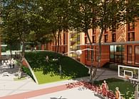
As multi-facetted angular walls create an orthogonal earthen tone on the façade, the landscape is designed as a free-flowing organic form, using plants of different colors, flower shrubs, and small trees. This creates a healing effect on the patients while acting as pleasant distractions for the patients' relatives and hospital staff. The vast open space has been planned with approximately ____ number of trees of different species, shrubs, and plants with a vast retention pond at the lowermost level to facilitate zero discharge. The large retaining wall of exposed concrete also gets covered with climbers and plants, converting a blank mass of concrete to an aesthetically pleasing feature that adorns the approach to the hospital.
Carefully and strategically planned, the building attempts to make gestures that are grand, yet local and responsive with attention to details such as the brick-art and the exposed concrete. Sitting comfortably on the fringe of the hill, the inner courtyards seem like a continuation of the hill, where the built form amalgamates with the site. Allowing nature to be a part of the hospital and integrating it as a comforting element for the patients, the hospital creates a space for recovery and rejuvenation.
Energy
To ensure efficiencies in terms of cost, time, and impact, all details such as glass façade, percentage of glass vs. brick (not more than 30% glass on the entire façade), shading factor, temperature, and humidity requirement, etc. were finalized at early design stages. This ensured energy efficiency as per functionality and not based on other projects or standard values.
In a centrally air-conditioned hospital, 55-60% power gets consumed by the air-conditioning system and 15-20% power by the medical equipment. The balance 20% is shared by all the other systems such as lighting, water circulation, treatment, convenient power outlets, the vertical transportation system (Elevators), etc. Since there is a limited option to reduce energy consumption by Medical equipment, it is crucial to arrive at an appropriate air conditioning system. Water Cooled Chillers with Variable Speed Drive, premium efficiency pumps, and cooling towers with CTI certification for the assured thermal performance has been selected. The chilled water system is designed for low flow high delta T (temperature difference), making the chilled water flow requirement 17% lesser as compared to the regular conventional system. Vertical Transportation Elevators are selected with gearless drive motors and VFD controls to save the energy consumed by elevators by 35%. Transformers are selected to meet the loss values permitted by the Energy Conservation Building Code published by the Bureau of Energy Efficiency of India. Light fixtures are selected with LED bulbs, and the domestic water is wholly recycled, treated, and used for secondary applications such as Air Conditioning, gardening, etc. – all resulting in zero liquid discharge from the building. Water Cooled Heat Pumps integrated with the air conditioning chillers are used for hot water production, thereby consuming only 35% of the energy as compared to conventional electric heaters. Additionally, the by-product of chilled water produced is taken back into the chilled water system to reduce the load on the chillers. A thorough mode of System Testing, Adjusting and Balancing was enabled to ensure that the design intent is achieved in the actual functioning of the project by a third-party testing and commissioning agency.
Status: Built
Location: Pune, IN
Firm Role: Architect
Additional Credits: Structural Consultant - The Axis Structural Consultants, Pune
Civil Consultant - The Axis Structural Consultants, Pune
Mechanical Consultant - Radiant Consulting Engineers, Navi Mumbai
Electrical Consultant - Radiant Consulting Engineers, Navi Mumbai
HVAC Consultant - Radiant Consulting Engineers, Navi Mumbai


