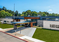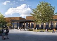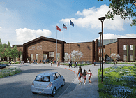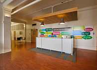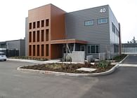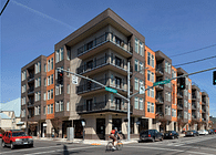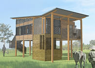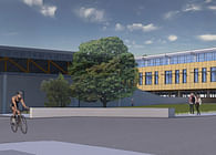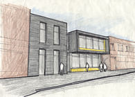
The Darwin Eye Care Competition sought to update the image of a small optometrist’s office which had not been updated since the current owner took over in the early 1990’s. The project consisted of 2 phases: the first was to come up with a new logo to brand the office, and the second was to create a screen wall to give the small CMU building more presence on a very busy street.
The logo is a hybrid between an eye and the Darwin “fish” sticker; creating
an instant correlation between the Darwin name and an optometrist’s office. The screen wall has the logo lasercut into plywood and placed behind a second wall of glass covered in Lumisty translucent film, making the logo blurred when seen from afar, and clear when seen up close.
Collaborative project with Kristopher Huisinga.
Status: School Project
Location: Milwaukee, WI, US
