I'm here at the GRAVITY FREE interdisciplinary design conference in Chicago and I'll be using this thread to report live from the conference for the next three days. In the meantime, check out my cool pass:
Feel free to leave comments here, or questions that you might like to ask the speakers....I'll try to include if possible.
I did not ride my bike here. I took Frontier Airlines. They have animals on the tails of their planes, including Wally the White Wolf, on the plane I rode.
I just want to mention that Chicago (and much of the Midwest, from what I hear) is entirely too cold for May.
What is you preliminary schedule & hoped for interviews?
I'd try to meet Theo Jansen & get a ride on one of his machines
Arturo Vittorri seems interesting but spacy
Michelle Kaufman seems more talk then action
Can you start an archinect/gravity free bookclub after you've read all those tombs and start them circulating?
...Jansen, Vittori and Kaufman are all on my tentative "hit" list. I'm planning on seeing the whole thing though. I'm still not sure how these roundtable sessions are going to go, how much time I'll have for questions, but I'll do my best. PS. I don't think Theo Jansen brought any of his machines with him, but if he did, I'll take one for a ride!
First up at GRAVITY FREE was Charlie White, a legendary illustrator. He's been in the business for over 27 years and showed some amazing paintings, illustrations, and built work that displayed a remarkable imagination for fantasy.
~~~~~
Now we're hearing from Ryan Genz & Francesca Roselia, creators of CuteCircuit.com, an interactive clothing and wearable technology company. Their presentation is engaging and amusing.....they are clearly taking a very critical and detailed approach to their problem set....some highlights:
-a blinking t-shirt
-"the hug shirt" - a shirt that allows you to hug yourself and send a hug to your friend at the same time (this thing is crazy!)
-"the mobile phone dress" - the dress is a phone...it rings....the speaker is in the sleeve
-"the SkateHoodie" - jacket that is an MP3 player....w/ speakers in the hood of the sweatshirt
-"the Kinetic Dress" - w/ sensors in the skirt that cause the skirt to light up as it moves
-"Skirteleon" - skirt changes w/ mood or time of day
-"An iPod is not wearable...you put it in your pocket, not on"
-"Wearables hold a promise to make life better"
-"Do we really need to send emails while skiing?"
-Clothing is the most intimate thing you own....you never forget it (hopefully)....it should help connect us to people and places
We just heard from Jamie Drake, a NYC based interior designer whose use of color could potentially be considered dangerous to anyone who has a predisposition for, let's say, epilepsy. Sample images included the magenta foyer of his NY apartment; 19th-century-style living rooms dripping in gold, leopard print, bright red, and teal; and the blue and lime living room of his own house in the Hamptons. Oh and a picture of him on his baby blue Vespa.
I'm going to go out on a limb and say I don't know many people who would (or could) commission interior designs like these....then again I don't know anyone in the Hamptons, either.....
~~~~~
The four of them are now talking about the loss of actual hand-drawing ability in design. I am interested to see if this theme continues throughout the rest of the conference....
Emily are you taking photos with the speakers. I'd like to see that - proof that you were actually there and not playing hookie and tanning yourself at the beach in some remote Caribbean island like say...Montserrat
And now for someone we're all pretty familiar with......
Michelle Kaufmann is a pioneer of pre-fab, green design with her own architecture firm in the San Francisco bay area. Her specializations are:
-Preconfigured designs
-Custom design
-Modern Green Communities
She's describing how their preconfigured designs are actually available in model form online so a client can go get a model, plop it on their site in Google Earth, and then see their surroundings....interesting!
Now she's talking about how by next year, all of her homes are going to have solar, whether they like it or not, and if they don't want it, they have to take it off themselves. (I think this is great.)
Now she's going through the factory fabrication of the SmartHome that is set up here at the Museum of Science and Industry in Chicago....we get to see that tomorrow on a tour.
I'm running out of battery at the moment....I'll save more comments for later when I have an outlet :o)
Since I was here last, I saw Rod Keenan, a hat designer out of New York City. Rod's presentation was very simple.....you've probably never heard of this guy, but you've seen his hats on Jamie Foxx, Justin Timberlake, Brad Pitt (apparently every hat Brad wears is by Rod), and the list goes on. He has a really admirable approach to design, and although he produces hats, not buildings, I think we can all appreciate the sentiment that he expressed earlier when he said "details DO matter."
And for the rollicking finale of the day we had Stefan Sagmeister. I'm sure you've all at least heard of him, or some of his work, which is really remarkable. He started off by telling the audience about a recent trip to an aquarium where he viewed a marine animal with a, ahem, rather large member. From there he launched into a discussion of some recent experiments in type, based upon a list of his life philosophies, which are each so inventive that they defy characterization. Here is one of my favorites, "Self-confidence produces fine results!" which was produced with different color stacked bananas, which then ripened into a sea of yellow, and almost came back when the bananas started to brown:
I'll be back later with some photos and some end-of-the-day thoughts.
Em- great first day of blogging - keep it up! you did better then my debut at greenbuild. I'm aiming for next year's eco-city world summit as my next archinect-reports assignment...
So the Kaufmann-Keenan-Sagmeister round up was brief....we were running short on time apparently, and the audience was only able to ask 2 questions. Bummer because I was about to get up and ask something profound (really!) but it was not to be....the three made for a very animated discussion on the stage, while their time lasted, anyway:
And here is a picture of the U-505 Submarine exhibit in which the end-of-the-day reception took place. More on that in a bit.....
Before I go any further, I want to make sure that I thank the USC Stevens Institute for Innovation, who co-sponsored me for this trip. I am on their Student Advisory Board (I also work there part time) and they are awesome! Also, I want to thank my roommate who is letting me use her computer while mine is in the shop :-/
So, some first day thoughts:
On Michelle Kaufmann:
OK, so I am of the impression that many people think that she is more talk than action. I honestly cannot say if this is true, but she is a lot of talk and a lot of action, and perhaps the reason she has gotten so much attention for her designs is her personality. She was vivacious on stage today....she effortlessly presented her work, apparently without the use of any prepared material, in a way that was enthusiastic, compelling, and convincing. You can say what you want about her designs, but she is a knowledgeable and uncompromising voice for the green design movement, and it seems like she offers real-life solutions to the problems that Ed Mazria brings up. So, in short, I liked her.
Unfortunately....so did everyone else, and at the end-of-the-day roundtable session she was totally mobbed. I got a seat at the table but I couldn't get a word in edgewise. It may have been for the best as my question was a little different than the rest of the crowd....I think I'll email her later and see if I can get the answers to the rest of my questions.
On the venue:
The conference is taking place at Chicago's Museum of Science and Industry, and while there are some really amazing things in this vast museum (see above), does anyone think it's ironic that a conference about innovation is taking place in the only in-place surviving building from the 1893 World's Columbian Exposition? You know, that exposition about neo-classical design?
On the format:
I really had no idea what to expect but I like the speaker set up and the way that they summarize things at the end of every few speakers. It reinforces the goal of the conference, which is to bring many different perspectives together and see how they relate to each other. Which leads me to....
On the crowd:
I am still trying to get a feel for who is in the audience. I have met several people who are industrial designers and interior designers, but judging from the questions asked, I wonder what percentage of the audience is actually clients. Or maybe it is truly a learning experience for everyone? The jury is still out. I'll see what happens tomorrow.
~~~~~
That's all for now. Thanks for reading! I'm going to pass out soon. See you tomorrow.
Emily - having a large conference in a neoclassical building 120 years after it was built is a testament to its usefulness - it will be around a lot longer than most - isnt that pretty green when you think about it?
Our first speaker today is Theo Jansen. He really reinforces my belief that anything and anyone from Holland is automatically cool. His "Animari" sculptures are his attempt to create "life" using a tiny computer, algorithms, thousands and thousands of tubes, and the wind. I don't think there is anyone in this auditorium who hasn't gasped at least once during his presentation. He is showing us videos of many different versions of his walking sculptures, including one "herd" of similar creatures that had a race on the beach.....he described how he would then copy the "genetic code" of the winning creature for reuse.
He is now showing us his latest Animari which is quite different from his earlier work and honestly, it would probably scare you if it came at you on the beach. This is what it looks like:
These things are amazing....he truly regards each of them like an animal, and is showing us the brain of one, and nerve cells of another. Fascinating!
Next up is Deborah Adler, a graphic designer with Milton Glaser in NYC whose designs for prescription medication labels have revolutionized the prescription-bottle-labeling industry. Her designs can be found in Target's pharmacy and the idea first came from an experience where her own grandmother accidentally took her grandfather's medication and nearly died from it. She turned it into a Master's Thesis......so take heed, all designers working on a Master's Thesis! Perhaps your designs will one day become suitable for mass consumption.....
Now she's talking about how she had to deal with 23 different variations of regulations in order to get the new labeling approved by each state's Board of Pharmacy....red tape nightmare!
Her labeling system is called ClearRx.....she got a special commendation from the Surgeon General, which is cool.....now she's showing a story about it from NBC Nightly News. Oh Brian Williams!
Deborah and her Master's Thesis version of ClearRx:
A quote from Deborah:
"Despite the success of ClearRx, we're still at the very beginning of medical innovations....."
And now we have an Irish guy named Stephen Brown who is......well, I'm not entirely sure what he does. He was described as a marketing person's worst nightmare. Right now he's talking about elephants. In Versace.
Now he's talking about dancing elephants.
He keeps showing a slide with an elephant that says "Fail Better".
There are sound effects of squeaks, creaks, crashes, and ......elephants.
I gotta be honest with you, I have no idea what this guy is talking about. School ended last week for me, so my capacity for tolerating lectures that make no sense has temporarily diminished. I think I'm going to take a pass on this one.....
One last thing....he just said "some of my best friends are figures of speech." Yeah, I got that much.
"Next up is ....."
"Now she's talking about ....."
"Now he's talking about dancing elephants."
"I gotta be honest with you, I have no idea what this guy is talking about."
"Yeah, I got that much."
"One last thing...."
oh man... it is just too beautiful for live reporting... word by word, i am a fan.
A little break and now we have Chip Kidd, who is a graphic designer who revolutionized the way book covers are designed (I am sensing a theme of revolutionaries today...). They say that there are two eras of book design....before Chip Kidd and after Chip Kidd.
This guy is a real trip...talk about someone who enjoys designing and talking about his designs. He is starting off with some covers he did for author Augusten Burroughs, who wrote Running with Scissors. Here is his design for the book Possible Side Effects:
He loves doing impressions of students who ask him questions....as in, in a goofy voice, "Um, Mr. Kidd, do you ever refuse projects on moral grounds?" He proceeds to explain that he does pick and choose but a poorly written book? "What the hell, I have to eat!" This kicked off a discussion of his design for the book Fangland, which he described as not very good (his actual language was a bit different).....
A great quote: "Limits are possibilities".....this came out of a story about his struggle for the book cover for a biography of Charles Schultz and his Peanuts cartoon.
The best thing about this presentation is that he has framed it around a clue for a crossword puzzle, and with every new piece of work he shows, we get another letter, like Hangman: "A number of people" = ANESTHESIA (get it? a numb-er of people?). He uses this to explain that we need to begin to think differently....
Lastly he tells us that he started a band to celebrate his mid-life crisis and now he's showing us a music video for his band! His band is named "artbreak" and the song is "Asymmetrical Girl"....vado, want to YouTube it?
Ok, so Janne Kyttanen just took the stage and up until this point, I just thought he was a nice-looking European dude attending the conference like the rest of us. I guess that's the beauty of GRAVITY FREE....all of the speakers are, for the most part, sticking around and watching the presentations, and engaging attendees in conversations outside of the auditorium. The good news is, it's fairly easy to talk to a person if you have questions about their work...the downside is that it's a really informal environment, so it's not exactly appropriate to whip out a video recorder and start taping your conversation.
Anyway, back to the speaker at hand....Kyttanen has done some things that I know a lot of you would love, particularly with rapid prototyping. He is talking right now about the work that he produces with his company Freedom of Creation (FOC), some of which is on display at this week's Design Week in the Meatpacking District in NYC. If you are in NYC May 17-19, check it out....they have some really beautiful stuff. Here is their design for an ad for a Japanese Shoe called the Onitsuka Tiger, which I believe he said was based on a concept of the city of Tokyo:
He is now describing their designs for actual "clothing" (using this term loosely) that has been created with a 3D printer. Basically this stuff looks like chain mail....and the powder they use in the 3D printers is quite expensive...so I don't see this being realistically marketed as wearable any time soon. But interesting in theory.
Time for lunch and a "Play with your Food Design Competition"!
A question was asked to Chip Kidd about the social responsibility of his job as a graphic designer...he agreed that there is a social responsibility for some people IF that is their job....he said that his job is to get people to read and that that is a social responsibility in and of itself. He said that some people are responsible for designing the little subscription cards that go in New York Magazine and they need to do their job well also, despite the fact that there is no apparent social responsibility inherent in that.
And back to the discussion of the use of pen and paper versus the computer....Janne Kyttanen admitted that he doesn't really do hand sketching anymore, period. And Chip Kidd said that he was in the last generation of graphic designers who learned without a computer and he's glad about that.
I'd like to talk about this more but I'm rather hungry....go ahead and discuss. I'll see you in a few. ;o)
EK thanks this, like Orhan I really enjoy your reporting an unlike many of these running gabs I was able to read and appreciate it all - like I was actually there. I don't know half of those people with the exception of Kauffman but you make it seem like it doesn't matter; and I really like that. Nontheless we want to see more of you there, and like you said design is in the details...get up close and personal, snap away we want to know what the place smells like.
, rock 'n roll photographer. On the surface, you might question his relevance at a so-called design conference, but his presentation was clear, concise, and the most carefully crafted of all of the ones we've seen so far. He eloquently related his history and what he learned by working with many different artists throughout the years to the theme of "dangerous minds" by talking about rock n' roll, its inspirations, and impact on society. It was a really wonderful presentation.
~~~~~ Massimo Vignelli is up now....I mean, I think the best title here is design legend, right? He designed the original New York City Subway Map and right now he's talking about it, and a recent reprint of it where he signed a bunch of copies and they sold out in one day.
Wow....now he's talking about how they came up with it...pictures! (Running out of battery again, will upload later....)
Other work that you might be familiar with is the logo for American Airlines, aka the only airline logo that hasn't changed in 40 years.
I've met a lot of graphic designers at this conference and I can hear all of their cameras going crazy in the room right now.
LIVE from GRAVITY FREE 2008
Hi everyone!

I'm here at the GRAVITY FREE interdisciplinary design conference in Chicago and I'll be using this thread to report live from the conference for the next three days. In the meantime, check out my cool pass:
Feel free to leave comments here, or questions that you might like to ask the speakers....I'll try to include if possible.
did you ride your bike there?
hey archinect paul, can you get me a press pass to all the killer music festivals this year?
hi vado!
Be careful, Emily! No gravity could mean lots of bruises!
Have fun, can't wait to hear your report(s)!
I did not ride my bike here. I took Frontier Airlines. They have animals on the tails of their planes, including Wally the White Wolf, on the plane I rode.
I just want to mention that Chicago (and much of the Midwest, from what I hear) is entirely too cold for May.
emily
LA is like 50 degrees
Emily- just remember to sleep.
What is you preliminary schedule & hoped for interviews?
I'd try to meet Theo Jansen & get a ride on one of his machines
Arturo Vittorri seems interesting but spacy
Michelle Kaufman seems more talk then action
Can you start an archinect/gravity free bookclub after you've read all those tombs and start them circulating?
...Jansen, Vittori and Kaufman are all on my tentative "hit" list. I'm planning on seeing the whole thing though. I'm still not sure how these roundtable sessions are going to go, how much time I'll have for questions, but I'll do my best. PS. I don't think Theo Jansen brought any of his machines with him, but if he did, I'll take one for a ride!
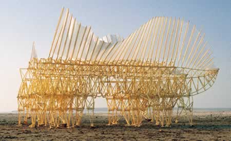
One of Theo Jansen's creations:
Emily, that is some kick-ass pass! Have fun in Chi-Tonw.
PS: We just posted your thread to the news. Whoo-hoo!
Thanks Alex!
First up at GRAVITY FREE was Charlie White, a legendary illustrator. He's been in the business for over 27 years and showed some amazing paintings, illustrations, and built work that displayed a remarkable imagination for fantasy.
~~~~~
Now we're hearing from Ryan Genz & Francesca Roselia, creators of CuteCircuit.com, an interactive clothing and wearable technology company. Their presentation is engaging and amusing.....they are clearly taking a very critical and detailed approach to their problem set....some highlights:
-a blinking t-shirt
-"the hug shirt" - a shirt that allows you to hug yourself and send a hug to your friend at the same time (this thing is crazy!)
-"the mobile phone dress" - the dress is a phone...it rings....the speaker is in the sleeve
-"the SkateHoodie" - jacket that is an MP3 player....w/ speakers in the hood of the sweatshirt
-"the Kinetic Dress" - w/ sensors in the skirt that cause the skirt to light up as it moves
-"Skirteleon" - skirt changes w/ mood or time of day
-"An iPod is not wearable...you put it in your pocket, not on"
-"Wearables hold a promise to make life better"
-"Do we really need to send emails while skiing?"
-Clothing is the most intimate thing you own....you never forget it (hopefully)....it should help connect us to people and places
Its way too cold to be May - I think God is playing a joke on us
other than possible AA battery shock, anything dangerous yet?
We just heard from Jamie Drake, a NYC based interior designer whose use of color could potentially be considered dangerous to anyone who has a predisposition for, let's say, epilepsy. Sample images included the magenta foyer of his NY apartment; 19th-century-style living rooms dripping in gold, leopard print, bright red, and teal; and the blue and lime living room of his own house in the Hamptons. Oh and a picture of him on his baby blue Vespa.
I'm going to go out on a limb and say I don't know many people who would (or could) commission interior designs like these....then again I don't know anyone in the Hamptons, either.....
~~~~~
The four of them are now talking about the loss of actual hand-drawing ability in design. I am interested to see if this theme continues throughout the rest of the conference....
Emily are you taking photos with the speakers. I'd like to see that - proof that you were actually there and not playing hookie and tanning yourself at the beach in some remote Caribbean island like say...Montserrat
And now for someone we're all pretty familiar with......
Michelle Kaufmann is a pioneer of pre-fab, green design with her own architecture firm in the San Francisco bay area. Her specializations are:
-Preconfigured designs
-Custom design
-Modern Green Communities
She's describing how their preconfigured designs are actually available in model form online so a client can go get a model, plop it on their site in Google Earth, and then see their surroundings....interesting!
Now she's talking about how by next year, all of her homes are going to have solar, whether they like it or not, and if they don't want it, they have to take it off themselves. (I think this is great.)
Now she's going through the factory fabrication of the SmartHome that is set up here at the Museum of Science and Industry in Chicago....we get to see that tomorrow on a tour.
I'm running out of battery at the moment....I'll save more comments for later when I have an outlet :o)
And I'm back.
Since I was here last, I saw Rod Keenan, a hat designer out of New York City. Rod's presentation was very simple.....you've probably never heard of this guy, but you've seen his hats on Jamie Foxx, Justin Timberlake, Brad Pitt (apparently every hat Brad wears is by Rod), and the list goes on. He has a really admirable approach to design, and although he produces hats, not buildings, I think we can all appreciate the sentiment that he expressed earlier when he said "details DO matter."
And for the rollicking finale of the day we had Stefan Sagmeister. I'm sure you've all at least heard of him, or some of his work, which is really remarkable. He started off by telling the audience about a recent trip to an aquarium where he viewed a marine animal with a, ahem, rather large member. From there he launched into a discussion of some recent experiments in type, based upon a list of his life philosophies, which are each so inventive that they defy characterization. Here is one of my favorites, "Self-confidence produces fine results!" which was produced with different color stacked bananas, which then ripened into a sea of yellow, and almost came back when the bananas started to brown:
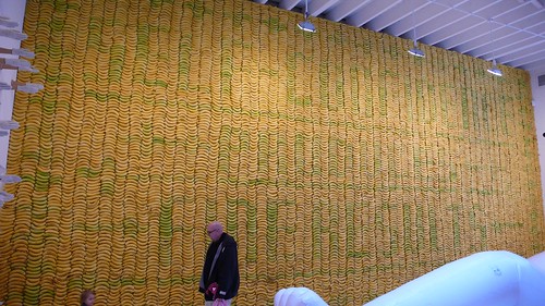
I'll be back later with some photos and some end-of-the-day thoughts.
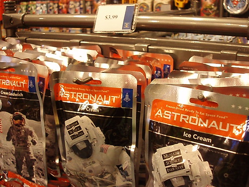
you eatin' astronaut ice cream?
Em- great first day of blogging - keep it up! you did better then my debut at greenbuild. I'm aiming for next year's eco-city world summit as my next archinect-reports assignment...
So the Kaufmann-Keenan-Sagmeister round up was brief....we were running short on time apparently, and the audience was only able to ask 2 questions. Bummer because I was about to get up and ask something profound (really!) but it was not to be....the three made for a very animated discussion on the stage, while their time lasted, anyway:

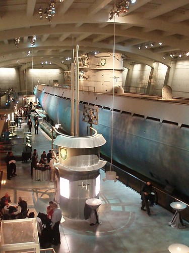
And here is a picture of the U-505 Submarine exhibit in which the end-of-the-day reception took place. More on that in a bit.....
ive been on that uboat lots of times.
Thanks Barry!
Before I go any further, I want to make sure that I thank the USC Stevens Institute for Innovation, who co-sponsored me for this trip. I am on their Student Advisory Board (I also work there part time) and they are awesome! Also, I want to thank my roommate who is letting me use her computer while mine is in the shop :-/
So, some first day thoughts:
On Michelle Kaufmann:
OK, so I am of the impression that many people think that she is more talk than action. I honestly cannot say if this is true, but she is a lot of talk and a lot of action, and perhaps the reason she has gotten so much attention for her designs is her personality. She was vivacious on stage today....she effortlessly presented her work, apparently without the use of any prepared material, in a way that was enthusiastic, compelling, and convincing. You can say what you want about her designs, but she is a knowledgeable and uncompromising voice for the green design movement, and it seems like she offers real-life solutions to the problems that Ed Mazria brings up. So, in short, I liked her.
Unfortunately....so did everyone else, and at the end-of-the-day roundtable session she was totally mobbed. I got a seat at the table but I couldn't get a word in edgewise. It may have been for the best as my question was a little different than the rest of the crowd....I think I'll email her later and see if I can get the answers to the rest of my questions.
On the venue:
The conference is taking place at Chicago's Museum of Science and Industry, and while there are some really amazing things in this vast museum (see above), does anyone think it's ironic that a conference about innovation is taking place in the only in-place surviving building from the 1893 World's Columbian Exposition? You know, that exposition about neo-classical design?
On the format:
I really had no idea what to expect but I like the speaker set up and the way that they summarize things at the end of every few speakers. It reinforces the goal of the conference, which is to bring many different perspectives together and see how they relate to each other. Which leads me to....
On the crowd:
I am still trying to get a feel for who is in the audience. I have met several people who are industrial designers and interior designers, but judging from the questions asked, I wonder what percentage of the audience is actually clients. Or maybe it is truly a learning experience for everyone? The jury is still out. I'll see what happens tomorrow.
~~~~~
That's all for now. Thanks for reading! I'm going to pass out soon. See you tomorrow.
Fantastic and informative fun to read your opinion, as always, Emily. Get some rest!
great job emily! keep it going... great live reporting energy.
Emily
You sound like Larson with that Chicago comment
mdler....I'm just saying!
I told you that you would love Sagmeister... hard to describe, easy to love. Glad to hear it's lived up to expectations so far!
go Emily go! great reporting, keep it up!
Emily - having a large conference in a neoclassical building 120 years after it was built is a testament to its usefulness - it will be around a lot longer than most - isnt that pretty green when you think about it?
Im enjoying your updates - keep them comming.
evilp, that's a great point!

aml and everyone, thanks. And good morning! We started off today with breakfast and a tour of Michelle Kaufmann's SmartHome:
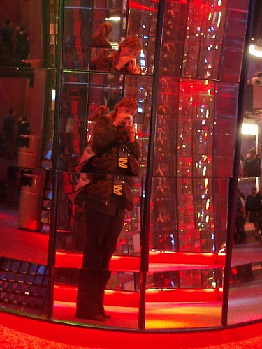
This is for mdler:
Me in the funhouse mirrors:
Our first speaker today is Theo Jansen. He really reinforces my belief that anything and anyone from Holland is automatically cool. His "Animari" sculptures are his attempt to create "life" using a tiny computer, algorithms, thousands and thousands of tubes, and the wind. I don't think there is anyone in this auditorium who hasn't gasped at least once during his presentation. He is showing us videos of many different versions of his walking sculptures, including one "herd" of similar creatures that had a race on the beach.....he described how he would then copy the "genetic code" of the winning creature for reuse.

He is now showing us his latest Animari which is quite different from his earlier work and honestly, it would probably scare you if it came at you on the beach. This is what it looks like:
These things are amazing....he truly regards each of them like an animal, and is showing us the brain of one, and nerve cells of another. Fascinating!
Next up is Deborah Adler, a graphic designer with Milton Glaser in NYC whose designs for prescription medication labels have revolutionized the prescription-bottle-labeling industry. Her designs can be found in Target's pharmacy and the idea first came from an experience where her own grandmother accidentally took her grandfather's medication and nearly died from it. She turned it into a Master's Thesis......so take heed, all designers working on a Master's Thesis! Perhaps your designs will one day become suitable for mass consumption.....
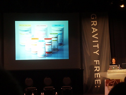
Now she's talking about how she had to deal with 23 different variations of regulations in order to get the new labeling approved by each state's Board of Pharmacy....red tape nightmare!
Her labeling system is called ClearRx.....she got a special commendation from the Surgeon General, which is cool.....now she's showing a story about it from NBC Nightly News. Oh Brian Williams!
Deborah and her Master's Thesis version of ClearRx:
A quote from Deborah:
"Despite the success of ClearRx, we're still at the very beginning of medical innovations....."
And now we have an Irish guy named Stephen Brown who is......well, I'm not entirely sure what he does. He was described as a marketing person's worst nightmare. Right now he's talking about elephants. In Versace.
Now he's talking about dancing elephants.
He keeps showing a slide with an elephant that says "Fail Better".
There are sound effects of squeaks, creaks, crashes, and ......elephants.
I gotta be honest with you, I have no idea what this guy is talking about. School ended last week for me, so my capacity for tolerating lectures that make no sense has temporarily diminished. I think I'm going to take a pass on this one.....
One last thing....he just said "some of my best friends are figures of speech." Yeah, I got that much.
why is it called gravity free? i don't see any defying of gravity here. maybe gravy free. anyway take a trip down to the coal mine.
i love emily's reporting style. pure energy...
"Next up is ....."
"Now she's talking about ....."
"Now he's talking about dancing elephants."
"I gotta be honest with you, I have no idea what this guy is talking about."
"Yeah, I got that much."
"One last thing...."
oh man... it is just too beautiful for live reporting... word by word, i am a fan.
A little break and now we have Chip Kidd, who is a graphic designer who revolutionized the way book covers are designed (I am sensing a theme of revolutionaries today...). They say that there are two eras of book design....before Chip Kidd and after Chip Kidd.

This guy is a real trip...talk about someone who enjoys designing and talking about his designs. He is starting off with some covers he did for author Augusten Burroughs, who wrote Running with Scissors. Here is his design for the book Possible Side Effects:
He loves doing impressions of students who ask him questions....as in, in a goofy voice, "Um, Mr. Kidd, do you ever refuse projects on moral grounds?" He proceeds to explain that he does pick and choose but a poorly written book? "What the hell, I have to eat!" This kicked off a discussion of his design for the book Fangland, which he described as not very good (his actual language was a bit different).....
A great quote: "Limits are possibilities".....this came out of a story about his struggle for the book cover for a biography of Charles Schultz and his Peanuts cartoon.
The best thing about this presentation is that he has framed it around a clue for a crossword puzzle, and with every new piece of work he shows, we get another letter, like Hangman: "A number of people" = ANESTHESIA (get it? a numb-er of people?). He uses this to explain that we need to begin to think differently....
Lastly he tells us that he started a band to celebrate his mid-life crisis and now he's showing us a music video for his band! His band is named "artbreak" and the song is "Asymmetrical Girl"....vado, want to YouTube it?
Thanks Orhan! I'm just getting warmed up....
Ok, so Janne Kyttanen just took the stage and up until this point, I just thought he was a nice-looking European dude attending the conference like the rest of us. I guess that's the beauty of GRAVITY FREE....all of the speakers are, for the most part, sticking around and watching the presentations, and engaging attendees in conversations outside of the auditorium. The good news is, it's fairly easy to talk to a person if you have questions about their work...the downside is that it's a really informal environment, so it's not exactly appropriate to whip out a video recorder and start taping your conversation.
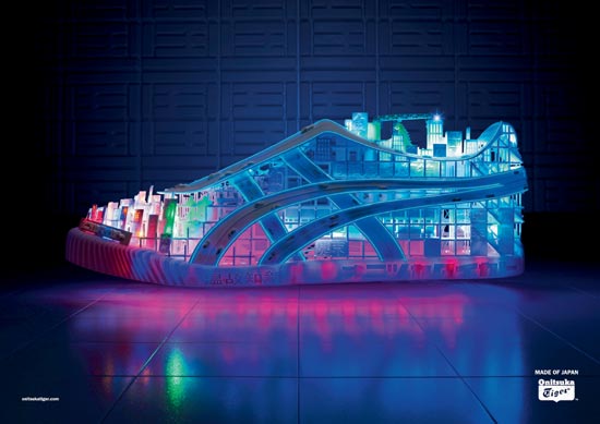
Anyway, back to the speaker at hand....Kyttanen has done some things that I know a lot of you would love, particularly with rapid prototyping. He is talking right now about the work that he produces with his company Freedom of Creation (FOC), some of which is on display at this week's Design Week in the Meatpacking District in NYC. If you are in NYC May 17-19, check it out....they have some really beautiful stuff. Here is their design for an ad for a Japanese Shoe called the Onitsuka Tiger, which I believe he said was based on a concept of the city of Tokyo:
He is now describing their designs for actual "clothing" (using this term loosely) that has been created with a 3D printer. Basically this stuff looks like chain mail....and the powder they use in the 3D printers is quite expensive...so I don't see this being realistically marketed as wearable any time soon. But interesting in theory.
Time for lunch and a "Play with your Food Design Competition"!
vado
nothing should be gravy free...including your goat/tire
free gravy for all!!!!!!!!!
^next archinect t-shirt
A couple of notes before lunch:
A question was asked to Chip Kidd about the social responsibility of his job as a graphic designer...he agreed that there is a social responsibility for some people IF that is their job....he said that his job is to get people to read and that that is a social responsibility in and of itself. He said that some people are responsible for designing the little subscription cards that go in New York Magazine and they need to do their job well also, despite the fact that there is no apparent social responsibility inherent in that.
And back to the discussion of the use of pen and paper versus the computer....Janne Kyttanen admitted that he doesn't really do hand sketching anymore, period. And Chip Kidd said that he was in the last generation of graphic designers who learned without a computer and he's glad about that.
I'd like to talk about this more but I'm rather hungry....go ahead and discuss. I'll see you in a few. ;o)
ek- what's for lunch?
don't worry about interviewing. Just ask.
EK thanks this, like Orhan I really enjoy your reporting an unlike many of these running gabs I was able to read and appreciate it all - like I was actually there. I don't know half of those people with the exception of Kauffman but you make it seem like it doesn't matter; and I really like that. Nontheless we want to see more of you there, and like you said design is in the details...get up close and personal, snap away we want to know what the place smells like.
thanks (again)
, rock 'n roll photographer. On the surface, you might question his relevance at a so-called design conference, but his presentation was clear, concise, and the most carefully crafted of all of the ones we've seen so far. He eloquently related his history and what he learned by working with many different artists throughout the years to the theme of "dangerous minds" by talking about rock n' roll, its inspirations, and impact on society. It was a really wonderful presentation.
~~~~~
Massimo Vignelli is up now....I mean, I think the best title here is design legend, right? He designed the original New York City Subway Map and right now he's talking about it, and a recent reprint of it where he signed a bunch of copies and they sold out in one day.
Wow....now he's talking about how they came up with it...pictures! (Running out of battery again, will upload later....)
Other work that you might be familiar with is the logo for American Airlines, aka the only airline logo that hasn't changed in 40 years.
I've met a lot of graphic designers at this conference and I can hear all of their cameras going crazy in the room right now.
eK - can you add sound effects? ;-)
whirrr, click, click, clickclickclick, flash!
I have nothing of substance to contribute, but I love you Emily! <3
silly thing, but what people around here probably know Vignelli best for are his calendars...
i have nothing to contribute either but i'm really enjoying your reporting, so i thought i'd help out:


sorry, that map has really bad res
Two very outstanding examples of Graphic Design.
Genius!
Block this user
Are you sure you want to block this user and hide all related comments throughout the site?
Archinect
This is your first comment on Archinect. Your comment will be visible once approved.