

There are small problems that vex as much as they intrigue us, whose answers only lead to larger questions.
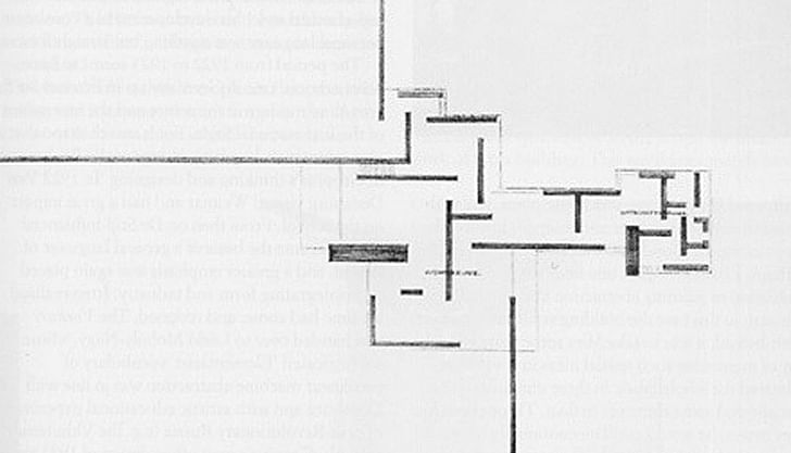
Mies van der Rohe’s Brick Country House, conceived in 1923 or 1924, is an early piece that anticipates his later work, presenting ideas about architectural forms and construction considered visionary at the time. While it was never actually built, the Country house is very well known – it’s often reproduced and helped establish his reputation. Almost all that remains now is a couple of charcoal drawings – a three-dimensional sketch, and a floor plan.

It’s the drawing of the floor plan that has most captured attention. It reflects aesthetic interests of the time, Cubist ideas about space, and is a work of art in its own right, reminiscent of De Stijl paintings.a work of art in its own right, reminiscent of De Stijl paintings.
The image has the concise, complex grasp of an ideogram that opens up the world. It appears on the cover of the third edition of William Curtis’s Modern Architecture Since 1900, serving as gateway to the subject. Records of the project, however, are sketchy. It may only have been a conceptual work on paper, but there is some evidence Mies once had plans to build it for himself. Both drawings circulated widely throughout Europe at modernist exhibitions and, later, in the United States.
The project was a step towards Mies’s goal "to bring Nature, houses and people into a higher unity”*. He broke the convention of orderly, enclosed boxes for living. As he says:
In the ground plan of this house, I have abandoned the usual concept of enclosed rooms and striven for a series of spatial effects rather than a row of individual rooms. The wall loses its enclosing character and serves only to articulate the house organism.**
Organism is a term as ambiguous as it is resonant. The rooms flow into each other without clear definition of their boundaries or their separation from the exterior, as they do in his Barcelona Pavilion built a few years later. The influence of Frank Lloyd Wright is obvious and was acknowledged.
He uses the traditional material of brick, and some forty years later Werner Blaser, under Mies’s supervision, drew a floor plan that showed the placement of each brick and the overall The rooms flow into each other without clear definition of their boundaries or their separation from the exteriorcoursework. As Blaser says in his book, Mies van der Rohe: The Art of Structure, "the ground plan of the brick house is a good example of the manner in which Mies van der Rohe developed the art of the structure from the very beginning. The structure of a brick wall begins already with the smallest divisible unit: the brick."***
That cannot be true as you consider the first rough drawing. But as Kleinman and Duzer suggest, the drawing and Blaser’s comment form a statement that, long after the fact, with his reputation well-established, helped clarify and fix Mies’s method for the critics and historians.
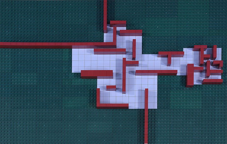
I assume in my model (pictured above) there are patios beneath the cantilevered parts of the roof. The two parallel walls in the largest room, close together, near the top, most likely enclose stairs to the upper floor.
The walls and the areas they suggest give a sense of internal involvement, denser, more enclosing, more defined in the compact rooms on the right, that opens through the narrow middle section out to the rest of the house—and beyond. Little is in line with anything, and there is an energy in the overall plan that never settles. But the plan is not chaotic. Rather, it shows a precise, asymmetric logic where control is never lost. It is the outside walls, which do not intersect at a common point, that give the house its greater energy and suggest extension that, theoretically, since their lines run to the edges of the drawing and look to go further, might be endless. The plan presents a picture of a mind asserting itself, opening up to the universe.

While the three-dimensional drawing is only a preliminary sketch, there looks to be no place for trees or other landscaping, which would be disruptive to the horizontal character of the house. Nature has been rendered as a sheer plane. The effect is orderly, serene, even breathtaking—and solitary and chilling.
Practically speaking, with the closings and barriers removed, the design encourages an open way of living, with full visibility and the chance for common interaction among the inhabitants. The rooms on the right might be utility rooms or, if privilege is involved, living quarters for servants. Or they might provide working space for the owner, removed from the rest of the house for concentration. The narrow middle section could be a library or casual den. The rooms on the left allow more formal social functions, dining and gatherings. The second floor, since separate and private, might have bedrooms and other rooms for repose and intimacy. The only indications Mies wrote on the floor plan, however, are the general designations “living space” and “service space.”
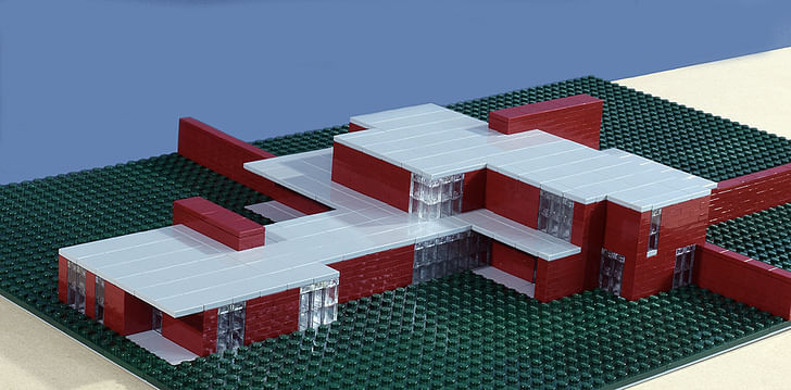
To pursue the building from a practical standpoint, however, is to hazard getting lost or running into conundrums. It is not clear what is front or back or where the main entrance is, if there is one, or how the house might communicate with the rest of the world, as these distinctions have been put aside in the larger scheme. Such distinctions might not matter or even make sense, however, in a home in the country, and perhaps Mies wanted a house that maintained the openness of the setting and its lack of orientation while avoiding the conventional formalities of entry and exit. There is no overt pretension in the facade, if we can find it.Nature has been rendered as a sheer plane. The effect is orderly, serene, even breathtaking—and solitary and chilling.
The exterior walls are intriguing. The only way to move through the three outside areas they create would be through the house. Also they exert complete domination of the estate, with all that might imply. They would mean three separate yards, though for what purposes I can’t imagine and I’m not sure Mies intended different uses. They provide division but not functional definition.

The drawings are only initial sketches, and changes would have been made were the house built. I don’t know how revision might be done, though, without diminishing the overall concept and effect. The outside walls, however long practically they might have been made, are vital yet the most problematic. Or maybe it is a only concept piece. If we assume hypothetically Mies did build the house for himself we would have to explore his life and mind to bring the building to final form.
The three-dimensional sketch has a wide perspective with a low horizon and vanishing points well off the visible picture plane; I assume to give the building the horizontal cast Mies wanted. The upper room on the right is especially hard to read. Nor does the sketch match the floor plan in all aspects. It may have been drawn before the floor plan, nor is it certain Mies himself even drew it. In building the model I stuck to the floor plan for walls and openings on the first floor and used the sketch for overall appearance. I wanted to maintain the horizontality, so I kept the walls low. It was intended, I think, to be a spacious home.
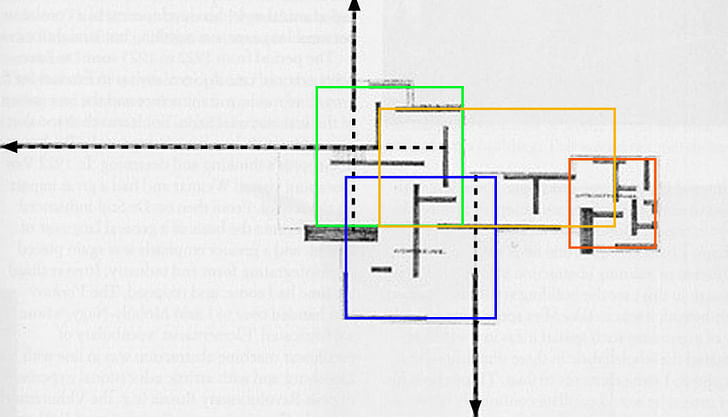
There is no plan for the second floor or any view of the rest of the building. Thinking about this floor in conventional terms ran me into all kinds of problems and felt like a violation. So instead I followed guidelines of design, maybe concept, and not use, suggested by the two drawings: structurally, the walls provide support points for a reinforced slab that forms the base of the floor, though I’m not sure my design is structurally sound. Doubts, however, were raised at the time about the building’s structural integrity as shown. The second floor should be contained within the borders of the first and not extend beyond. Like the first, it should be composed of free-standing walls and openings floor to ceiling. It should provide several openings for light and view of varying widths and keep the dynamics of the open design.what assumptions Mies made about art and the world, and whether they are valid and vital
Again, almost nothing is aligned in the first floor except the exterior wall at the top with the house's wall past the large patio. This reinforces the influence the extending walls have on the overall energy of the plan. In my design for the second floor, I made the back wall of the back room on the second floor align with the bottom exterior wall, for the same reason.
I also added that room to give the floor some width to better fill and integrate the whole building rather than have a narrow, isolated floor on top of the first. I decided it did not make sense, formally or practically, to have windows at the back of the floor overlooking the greater span of the roof, although I see alternatives to my placement.
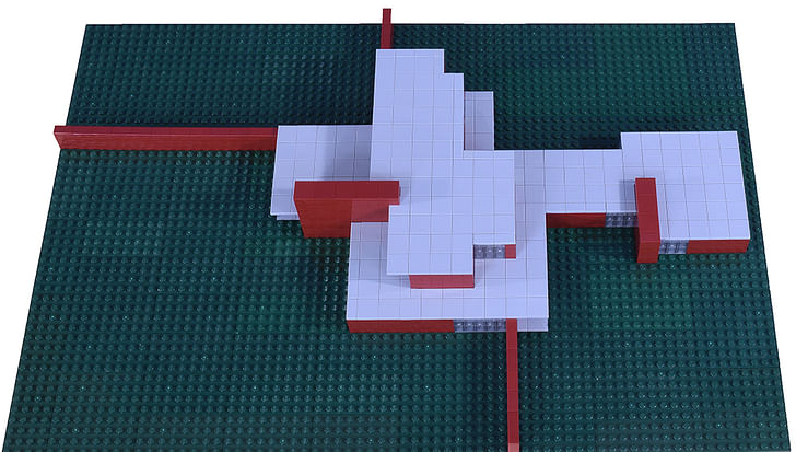
The enclosure should suggest and complement the first floor, and have some complexity but not repeat its forms. My second floor, as is apparent from the overhead picture below, provides a complex shape that echoes its length and provides offsetting variety. That it's set at a right angle to the first reflects the cross shape of the exterior walls, reinforcing their influence and adding another degree of tension.
The first floor has overlapping squares and rectangles, these suggested but not completely defined. Study could be made of them, of their proportions and relationships, to find a pattern that, once understood, might provide a key for the second.
I only made a quick, tentative effort, without result. I have no basis for this whatsoever, but in order to maintain the open relationship with the outside I decided there would be a door or doors on the floor and continuous walking space on the roof around the exterior.

A window or door is not marked on the original floor plan or in Blaser’s drawing for the opening next to the exterior wall, seen above, so I left that space open, providing internal penetration and allowing protected entry. Possible second floor plan:
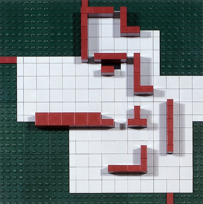
The black tiles represent where the stairs enter the second floor. As in the first floor plan, doors and windows have not been placed.
I have no confidence I got anything right and am curious how others might complete the house. How the conflicts between design and construction might be resolved; how his thoughts of an open way of life might have suited his contemporary society or the lives of those he imagined living there in the future; what such a life might actually be like and whether it is worthwhile; what assumptions Mies made about art and the world, and whether they are valid and vital; what architects might take from the house now; what they would reject, and why; what their own assumptions are when they design, and whether they have validity or vitality—all these questions remain open and linger.
An earlier, more speculative version of this essay, appeared on the author's blog Under Construction, as "Mies van der Rohe: The Brick Villa".
End notes:
*Wolf Tegethoff, Mies van der Rohe: The Villas and Country Houses (MIT Press)
**Jean-Louis Cohen, Mies van der Rohe (Taylor and Francis)
***Kent Kleinman and Leslie Van Duzer, Mies van der Rohe The Krefeld Villas (Princeton Architectural Press)
Other sources:
Toshimasa Sugimoto, Department of Architecture, Hiroshima University, has made 3D CAD renderings of the house with a different interpretation, which can be found here.
Alex Maymind references the Mies drawings and others related in "5 Projects: Interview 5 - Alex Maymind,", his proposal for a public art institution.
Franz Schulze and Edward Windhorst, Mies van der Rohe: A Critical Biography (University of Chicago Press) provided many of the factual details.
I am a writer and college English instructor with a lifelong interest in art and architecture. Many of my essays and short stories have appeared in print and online. I am currently at work on a collection of essays and my third novel, which will be set in the future. One of the issues I want to ...
10 Comments
sometimes the architect's "vision" is a real vision, one in which the construction is evident and how humans will occupy the space is understood........ based on what you wrote above and the little I know about this project, Mies may have had only a vision for a floor plan and not necessarily a house. What this means, like many architecture projects, the process of "design" was needed to resolve or make the vision of a floor plan a reality. Take BIG (Bjarke Ingels) for example. It appears most the time the Visions are of methods and process images within the design process (not actual architecture) and whatever reality that is achieved is somewhat unpredictable. sometimes a concept appears to be so exciting and radical its well worth the pursuits of designing it into reality and to await the outcome.......in writing it would be the same as taking one really good sentence and turning it into a book. sometimes the results are great and sometimes they are miserable. all architecure worth doing and studying is an experiment. you just worked out Mies' experiment.
Thanks for reading and commenting, Chris.
Mies’s floor plan offers an image, active yet still orderly, of extension into and relationship with a larger, in fact total, space. That is impossible to construct. Eisenman’s drawings for his houses present an entirely different set of problems that challenge Mies’s assumptions—internal questions and contradictions that cannot be constructed as drawn either.
But this is my question: if it is a vision, what is it a vision of? Mies offers us a break from tradtional notions about houses as symmetrical, axis determined constructions, contained, orderly, and hierarchical, though I still wonder about Mies’s designations of “living space” and “service space.” He gives us a different way to think about life, more open, active, and interrelated, and about buildings as volumes not masses, free standing planes and openings that bring us out into the world. But after that?
I’ve been rereading the history of architecture, and what strikes me this time around is how abstract the conceptions of the Futurists, Constructivists, and other strains of modernists are about life and society—and how incomplete. They are trying to create a new world and a world for the future, but upon what do they build it? The works of Mies and Le Corbusier have been described as “spiritual,” but what does this spirituality contain and how does it relate to the world we see and know? We aren’t provided much at all, instead feel that world has been excluded. Their ideas, taken to full conclusion and construction, present a picture of society that is limited and not a little terrifying, as we see in Le Corbusier’s Ville Radieuse.
The other larger question is this: if we reject Mies’s model and its assumptions, what do we replace them with? There’s nothing new in this debate, of course. But it will remain with us in some variation as long as we think and build.
I had a thought while writing this and building the model, probably impractical, intriguing or terrible, or both: What if an entire neighborhood were constructed of similar offsetting walls and volumes?
no - thank you for responding, always good to discuss after reading a text.................i think Lefevbre said something like 'architects have no idea on how their spaces are inhabited, their plans have very little to do with reality.' which naturally brings me to Bernard Tshumi, who Kipnis says in an essay is the best theoretical architect out there who builds, may be worth following his 'visions' through..............back to Mies, there is a bit of a contradiction I guess in what amounts to an "open plan" free flowing space and having divisions such as "service" and "living". I would suggest its not uncommon for architects to resort to formal methods in case the vision is failing or the architect is too tired or uninspired to create a vision. maybe he thought it would be funny to label open spaces as such and see what happens, or to apply traditional labels to radical forms and see what happens.........I would suggest much of the 'new world' approach is to create a much other world than the present and lets assume the other may only be ideas, in short its a bit of a crap shoot to imagine the world and how it would be, unless you create a mockup as you did and visualize a movie in the place................much of the 'new' in architecture thought are just reapplied systems of thoughts or analogies to other sciences and art, that often is the vision, which of course little to do with a planned reality......... we went out to LA in grad school and visited Morphosis' Caltrans building, someone was filming a sci-fi scene for a movie........Lebbeus Woods drawings were knocked off for the Movie 12 monkeys, and he won in a lawsuit.........if you look at the Futurists and Sant E'lia you would almost see today as their future bakc then, but oddly enough none of his key drawings have humans in them............no foundation is the foundation for some architects. deconstruct and start new. disregard the past as it has failed in many instances, etc............your last point reminded me of an installation by Douglas Coupland,on phone apologize for link http://projects.vanartgallery.bc.ca/Coupland/the-lego-345-project/ ..........i like where you are headed and often try to imagine radical or any apaces and their uses in day to day activities and then dive into like a Douglas Coupland scenario and imagine my way out of it..........I think it was the movie America Beauty that played out the suburban home scenario as it does play out. in this manner the mies project would get interesting...........
for instance: the long brick wall would become a place for kids to hide, dogs to piss, teenagers to make-out and smoke pot out of ear shot and vision of parents, a place to sell your drugs, the useful and segregated outdoor man cave, long line of statues and collectibles for a nutty old lady, a colonade with fountains for those with at least three face lifts, a place to hide all your cars from the neighborhood, a place for birds to land and poop, for kids to shoot birds with bb guns, an annoying obstruction when cops chase burglars, a canvas for fundamental Christians to paint scriptures on the wall for all the passer-bys to read, a house like this displaced close to a commercial road becomes a place for an advertisement and the renters get a new billboard monthly.... .............. ........ ...further instance as per architect - I am the tenant of such a Mies house with such s wall. every morning this month I have to walk by some girls bikini bottom with a Corona in an ice bucket next to it. my girlfriend smacks me everytime I play grab the girls bottom. after 2 weeks of this my girlfriend thinks i could be cheating on her, given all the attention the Corona Ass on the brick wall is getting. we get into a fight in front of the wall and realize all the neighbors are watching. she runs inside and back out on the other side of the wall. we pace back and forth behind the wall screaming at each other. we knock over the long line of flower pots. i run around the wall to hide. she launches the pots over the wall randomly exploding next to me. i shout i am leaving, get in my car and go to the liqour store and buy a six pack of Corona as i stare at the same Corona Ass ad behind the clerk. was it the walls fault and zoning or Corona's? thanks Mies.
"a work of art in its own right, reminiscent of De Stijl paintings."
This has always been my issue with this kind of work. It's graphically elegant but ultimately not a place many people would like to live. Not that great architecture isn't frequently elegant graphically, but that shouldn't be the central element of built design.
Romanticization runs wild.
I don't know if this is of interest, but I added more notes about my design decisions in my original piece here:
https://returningcenter.wordpress.com/2015/07/26/mies-van-der-rohe-the-brick-villa/
None of which I have confidence in. I really am curious how practiced designers and informed Mies scholars might tackle the many problems posed.
Gary Garvin, nice article. If you don't know already, artists Michael Asher and Daniel Buren's Haus Lange and Haus Esters (two seperate works in two of Mies' Houses) installations could be interesting research for you as well. I briefly mention them here:
http://archinect.com/sleeplesinshenzhen/learning-from-michael-asher
Orhan Ayyüce,
Thank you, and I am intrigued.
The floor plan for the brick country house for me is one of the most compelling and engaging figures in architecture. You only have to compare (there are similarities) and contrast it with the floor plan of the Parthenon, review assumptions and methods, and all kinds of questions open up.
The image provides an intriguing way to think of the individual’s relationship to the world, open and active. But it is wholly abstract and doesn’t consider site or context, or the larger society. There may be a statement in that.
I would like to see several projects:
1. Create a floor plan—and image—equally compelling, that better suits our time. What could take its place? What are its assumptions?
2. Create a better theoretical model. My major question in my model, which I couldn’t answer, is how the motion of the two-dimensional floor plan might extend into the third dimension, height, up into the second floor. And Michael Ashner fans could be installed so we could feel the motion of air. I review other design questions I couldn’t answer in my longer piece.
3. Create a model for an actual site in Mies’s times. Wolf Tegetthoff argues Mies did plan to build the house for himself in a German suburb, in fact had two sites in mind, and the two drawings were designed for each, thus their differences. This would be a tremendous challenge, as I note above.
4. Try to contextualize the model (either one or both) in our times, and see what critique comes out of that, as Asher does in his Lobby and his Haus Lange.
Someone Should Start a Competition to Really Complete it.
Block this user
Are you sure you want to block this user and hide all related comments throughout the site?
Archinect
This is your first comment on Archinect. Your comment will be visible once approved.