
Sep '09 - Feb '12
In between jet setting across Europe, I've been devoting (some) time to my studio's proposed project for Florence, a new Mediatheque located within the walls of the Fortezza da Basso.
From the syllabus, under the guidance of Alberto Francini. //
"The new mediatheque will have to become an asset to the city at large. Both in terms of image and functionality, it will have to become a major forum for the public life of the city. The design will have to respond to the surrounding context in whatever way deemed appropriate by the student, who will have to support his/her own ideas through a strong design rationale. The design of the open space has to be integrated with the design of the mediatheque and will have to appeal and respond to contemporary culture and sensibility.
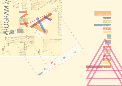
Program //
Lobby / 100 sqmt.
Cafeteria + restaurant /200 sqmt.
Bookshop /200 sqmt.
Exhibition space (multi-use) /200 sqmt.
Restrooms /100 sqmt
Mediatheque /250 sqmt.
Emerotheque (video/music) /150 sqmt.
Library + reading halls /400 sqmt.
Lecture hall /400 seats
2 conference rooms /300 sqmt.
Archives /200 sqmt.
Storage /100 sqmt.
Administration + services /100 sqmt.
Management + production offices /150 sqmt.
Restrooms /100 sqmt.
I presented my project at its (then) current state about 3 1/2 weeks ago to a jury consisting of my studio professors and two architects from MDU architetti. Mid-term reviews before this had always been either a) the last thing I want to do after a week of sleepless final production, or b) a chance to look back and reflect at my massive heap of half-mindless work in hopes of pushing my project forward. This semester took an alternative route, partially because of my struggles this semester, partly because of the typically light work-load here in Italy. Reason 1) I haven't been doing much work. Backbacking across Europe is way more interesting than studio right now. Reason 2) I threw this presentation together without much thought and had a wonderful night of sleep beforehand. Architectural taboo. Kick me out of the club.
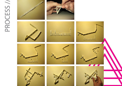
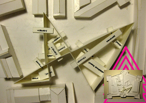
That said, the project below is still in its baby stages, arriving only now at a concept model and general direction to where I want to take it (and in the last 3 1/2 weeks still hasn't pushed much further). If you feel inclined, visit my Flickr set for more detailed explanations and to view the presentation at a higher resolution.
In the end though, the project has been well received. The only disappointment I have with that is many times reviewers at juries are more apt to criticize and put down students than become creatively involved in the intention of the project and leave one (me) without any input. So, input is encouraged.
![Kent State University [Justin]](/images/nav/related_blog.png "Kent State University [Justin]")
3 Comments
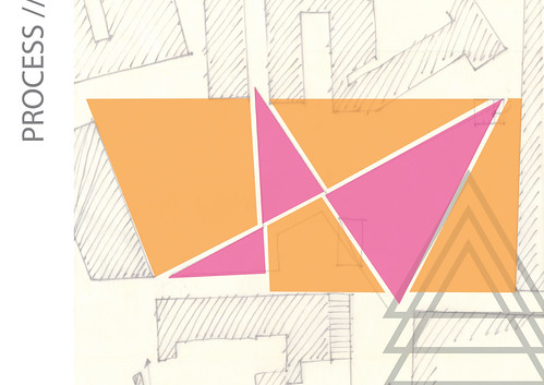
i like the sort of 'jewels on a necklace' concept and the ideas of paths, desire lines, etc.
right off the bat your project reminds of rem's iit project (existing paths inform the building) and libeskind's berlin museum (continuous line with stuff happening along it).
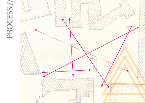
but i think the line you have in the process image gets lost once it's twisted onto the site. looking at your study model that line is all one height and appears to go all the way to the ground .. i think if you could get it wrapping over itself so the line could still be read it would be more successful and reinforce your concept. also that could open up the site so you could go under/over the building within the existing plaza. so you could still maintain the 'travel vectors' of the site but also divide it up into the smaller public spaces.
interesting I applaud the use of the site, but I'm curious to see similar effect from the site in section
First off, in terms of graphics, the connection lines on the precedent board are more of a distraction than informative. Also, the three triangles do the same thing. I'd think about either getting rid of them completely or minimize them so they don't distract the eye.
I agree with architechnophilia with regards to the section cuts of the site. I think there needs to be a more thorough investigation of the site than just assuming these paths of activity. What do these paths mean? Are these existing pedestrian movements or proposed? If they are proposed, what are their significance? Why orient the programmed spaces in the way that you have them organized? Visual connectivity i think is important and sections of the site help reinforce that.
I agree that breaking the large space down into more human scale is a good idea, but right now it looks like the plaza is completely blocked both phisically and visually into 3 public spaces and 3 private spaces...does it have to be a wall? Can it be more permeable? A row of columns can still define a space without completely enclosing it from adjacent spaces.
Block this user
Are you sure you want to block this user and hide all related comments throughout the site?
Archinect
This is your first comment on Archinect. Your comment will be visible once approved.