Manchester, GB
Design agency SpaceInvader – winner of both a BCO and a Sustainable Design Collective Award in 2023 for its workplace design projects, as well as being named Design Practice of the Year at Mixology North Awards - has just completed a new, 25,683 sq ft office project in Broadgate, London, within one of the City of London’s most dynamic neighbourhoods, for client Aldermore.
Brief and Approach:
Contemporary working practices were to be enabled in the new scheme, including greater emphasis on team wellbeing, with space allocated to both a dedicated wellbeing area and new quiet zones. One of the most enjoyable and unusual aspects of the scheme for the designers was the brief to integrate Aldermore’s parent company FirstRand Group’s African ownership and culture:
‘We looked to the dramatic and varied landscapes of the African continent as our aesthetic inspiration’ Sarah Dabbs explained. ‘This route found expression in the scheme’s colour palette, along with textures, patterns, forms, artwork and lighting. The scheme also features planting species originally found in Africa, all set within a warm and earthy overall palette with a bold edge.’
Sustainability and Building Challenges:
The scheme also focused on best practice usage of the existing fit-out from a sustainability point of view.
‘On a sustainable level, the existing fit-out wasn’t to be wasted. On an aesthetic level, however, the prevalence of the colour grey and the lack of vibrancy in the existing scheme were distinctly off-message!’ Sarah Dabbs explained. ‘Another challenge was the unusual floorplate shape, which included pointy ends to spaces in a number of meeting rooms, for example.’
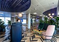
The SpaceInvader design team, working closely with contractor CBRE Global Workplace Solutions, retained the majority of the existing ceilings, apart from areas that had been lowered. A lot of the existing flooring was also retained, except in areas where new feature carpets needed to be added. A number of decorative lighting elements were also kept in situ, because of the ceiling retention, as long as they integrated well with the scheme’s new rafts and linear features. Totally new elements include the new gantry over the desking areas, for example, which features a rippling water texture, with this space inspired by the landscape of Africa’s great lakes.
New furniture supply and installation was by Furniture23, whilst all desking and task chairs were re-used. Surplus furniture was taken either by CBRE (who introduced SpaceInvader to the project and additionally carried out project management and QS services) for its repurposing scheme, where items are redistributed through the Waste to Wonder initiative to Mokwe Development Association in Cameroon and FAST Romania – or was retained by Aldermore for potential use in other locations.
‘Here, as with many projects in the contemporary workplace field, demolition and refurbishment have to be undertaken with great care’, John Williams, SpaceInvader Founder, explained of the agency’s approach. ‘The build-and-burn era is over, thank goodness, and the best contemporary approach is about taking the time and care to ascertain the optimum next step for everything that has been inherited rather than selected.
At the same time, the final scheme needs to look impeccable and be completely bespoke to each client and their brand ethos, so it’s about being ethical and tactical at the same time. It makes the design work a lot more complicated at the outset in many ways, but personally I think those parameters are a genuine part of the joy of being a designer. It’s in our nature to want to make people’s lives better, whilst reducing or eradicating any potential harm to the environment.’
The African Influence:
A new gym, proper showers and a multi-faith and ablutions room were also added to the new scheme, with all washrooms completely refurbished. Once it was decided which elements might usefully stay or be re-used elsewhere on the scheme, it was time for a complete overhaul of the look and feel of the space. The existing grey palette definitely had to go! It was also decided not to pursue the simple application of corporate colours in a 3D setting, but to create instead a palette based around African landscapes instead, allowing warmer colours and materials to infuse the scheme.
Six different landscapes were chosen as the inspiration for different areas:
The Savannah
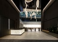
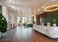
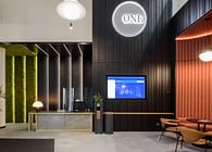
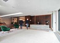
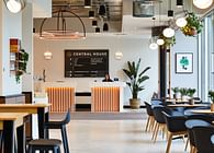
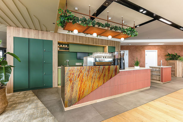
For the look and feel of the reception and concierge spaces, the coffee barista area and business lounge, the design looks to the African Savannah, homing in on its vibrant, sunset colours, with rich amber and soft olive tones used for upholstery finishes, along with fresh and light natural textures and planting that was natural to the African Savannah.
‘The planting was a very important part of the mix on this project’ Sarah Dabbs added. ‘SpaceInvader worked closely with Plant Plan to get it right. A lot of research was undertaken into different regions of Africa, so that planting was chosen to reflect relevant plants for each area of the design. Whilst we chose species that were native to Africa, such as the date palm, we also had to select very carefully to ensure these were plants that would also thrive indoors.
The meeting rooms in the scheme also follow a plant name nomenclature. We provided a long list of possibilities to the client and suggested different routes, whilst the client made the final choices and undertook the graphic design for these directly.’
The ‘Savannah’ areas also take inspiration from traditional and modern African architecture, through the application of angular forms in the form of terracotta tiles for use within the planters - and for the joinery of the screens. The barista area features stunning, metal wraparound panels from Homapal via Formica, which were made to order. The panels respond to some of the photography used by the design team as inspiration from the Savannah, featuring both the more obvious reds, oranges and golds of sunsets, but also less obvious tones of blue and violet.
The Sahara Desert
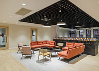
For the breakout areas, ‘Town Hall’ space, library nook and any flexible spaces, the landscape the design team looked to was the Sahara Desert. This pointed towards a stronger colour palette, including energetic blues, burnt orange, soft mauve and mustard tones. These were paired with tactile surfaces, creating a visual link to the desert dunes and the movement and pattern they create, which was then translated into solid surfaces, metals, acoustic wall panels, patterned rugs and vinyl flooring.
3D bricks used in the screening surrounds and enclosed within timber structures in the breakout areas create additional visual interest, whilst new furniture here includes booths and loose furniture from NaughtOne. Woven baskets for planting and also large-scale cushions were all sourced from African designers via South Africa’s Evolution Product platform.
The Great Lakes
For the traditional working areas, both open plan and cellular, as well as touchdown areas and private call rooms, the inspirational landscape is the Great Lakes. This finds form in a colour palette of serene soft blues, lush greens, pale blush and ochre tones, paired with rich walnut timbers, warm-toned paint finishes, acoustic wall panels, tactile wallcoverings and metal laminates, all inspired by the ripples and reflections seen in water. Contemporary African architecture once more inspired angular forms in the form of terracotta tiles used within the planters and screens joinery.
The Rainforest
The fourth inspirational landscape typology was the rainforest, used for the scheme’s quietest focus spaces, including the wellbeing lounge. This is expressed through a palette of calming blues, with a tonal range of soft greens and ochre tones, ensuring relaxing spaces for users. These finishes are accompanied by dark timbers, patterned carpet inset rugs, acoustic wall and ceiling finishes, tactile African wall tapestries and loose cushions. The planting brings vitality and directly expresses a connection to nature.
Johannesburg
South – and southern - Africa’s largest city, Johannesburg, is the inspiration for the look and feel of the scheme’s enclosed meeting rooms and Co-LAB Room. As well as referring to the city’s vibrancy, the scheme uses natural colours, such as the earthy tones found throughout the city, with additional sunset colour references for the furniture, wall finishes and joinery.
The new boardroom tables and chairs in all client-facing meeting rooms are by Brunner, who also supplied the sofa in the wellbeing lounge and the sofa/table configuration in the client lounge. The AV wall joinery in the meeting rooms makes use of the existing surfaces, though these were also pared back to be simpler and more in line with the scheme’s overall aesthetic.
The Namib Desert
The final landscape in the pack is the Namib Dessert, which related in the scheme to the washrooms, the active/ fitness space and the multi-faith and ‘returning parent’ rooms.
Rich, bold tones elevate the facilities areas, where they’re paired with soft-textured paint finishes, planting, dark walnut panelling and glossy tiles. The WC vanity joinery takes inspiration from the desert’s cliff formations, whilst the lime wash paint follows the movement found within the dunes.
Status: Built
Location: London, GB
Firm Role: Interior Designer
Additional Credits: Photography: Andrew Smith at SG Photography
Consultants and suppliers:
Project Management and QS: CBRE
MEP services: AVA
CDM Principal Designer: SpaceInvader (Tad Kolakowski)
Main Contractor: CBRE Global Workplace Solutions
Furniture Supplier / Install: Furniture23
Planting: Plant Plan


