Manchester, GB
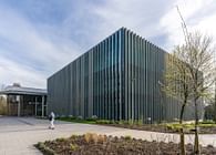
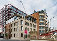
The complete refurbishment of Stopford House for Stockport Council by Manchester-based designers SpaceInvader has now been shortlisted for a BCO North Award 2023. Stopford House is a key asset in Stockport Council’s workplace estate and was purpose-built in 1975 to accommodate a wide range of Council services. The Brutalist-style, 6-storey building, which has a net internal area of 72,505 sq ft, features concrete external panelling that matches the council’s Neo-Wren Town Hall building directly opposite.
When the Council came to SpaceInvader in late 2020 to carry out an initial workplace strategic review, this included assessing the building’s current and ongoing fitness for purpose. After a thorough examination of the building’s structure, services and space, the consultancy recommended a strongly sustainable stance for the future, proposing a strategy of modernisation through re-use and refurbishment rather than building anew. This route would not only save costs, but be much more sustainable, ensuring the project’s embodied carbon would also be kept as low as possible.
‘This was a fantastic project to work on’, John Williams, Founder of SpaceInvader commented. ‘A major upgrade to the building was needed, in order to provide a future-facing workplace for the council’s own team, as well as the best possible spaces and services for the community the council serves, but it was a real joy to be able to celebrate this building’s beautiful existing brutalist architecture and seek every possible way of re-using the building’s fabric with a less-is-more, circular economy approach, adding interventions only where necessary.’
Interiors Rationale
For the best use of the building’s interior spaces, the brief was to create a new generation workplace to support hybrid working, enhance the culture of the council and embrace the council’s sustainability strategy, whilst keeping a very tight control of costs. The brief also included a strong emphasis on flexibility, so that departments could move with ease throughout the building and work within differing ratios of focused and collaborative working to suit their specific needs.
Key objectives and priorities for the project included:
• Improving facilities
• Efficiency across the portfolio
• Adopting hybrid and new ways of working
• The attraction and retention of staff
• Employee wellbeing
SpaceInvader kicked off the project by conducting vision workshops, engaging with the council at every level to understand the rationale behind each objective and help develop the business case for the new space plan. A detailed questionnaire was circulated to accompany the initial vision, asking Council workers about home working and exploring any perceived barriers.
Vision and Brief
A clear vision was created as a result of the workshops, with SpaceInvader then delivering a full workplace strategy, enabling the Council to adopt a hybrid way of working and, thanks to a reduced footplate, to vacate other elements of real estate for release to alternative, public-facing council services, including liberating space on the ground floor to house CAMHS – a dedicated children and adolescent mental health service.
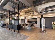
The new workplace strategy then informed the design and fit-out of the space, whilst firmly embracing sustainable principles. The building was stripped back to reveal key architectural features, whilst improvements were made operationally to make the building more sustainable. The new strategy ensured that peak in-office days and differing work types could all be accommodated. With staff both emerging from the pandemic and needing to get used to radically new ways of working, the new layout now supports both a collaborative philosophy and a healthy social culture, whilst at the same time, mindfulness spaces and quiet rooms were built into the design to encourage colleagues to take a moment as needed and to promote wellbeing within the Council team.
SpaceInvader delivered the project alongside main contractor Overbury, with Overbury’s Victoria Dootson, Sustainability Manager, reporting on the project’s carbon reduction strategy: “Overbury utilised their in house embodied carbon calculator called CarboniCa to measure the emissions associated with the architectural elements of the fit out. CarboniCa helped to identify carbon hotspots within the finishes so informed decisions could be taken to reduce the embodied carbon. The total cradle-to-gate emissions at completion for the architectural elements was – 325.7 tonnes CO2e, which equates to 31.8kgs per m2. Overbury also worked closely with SMBC and their MEP designers to improve the energy efficiency of the building from an EPC rating of E to B, with the existing annual primary usage of 378.6 kWh/m2 reduced to a new annual primary usage of 163.06 kWh/m2.”
Achieving Objectives
Many base-build enhancements were required to the building as part of the modernisation process, including stripping back walls to the core structure to reveal the original concrete and brick and exposing services and the ceiling to uncover the building’s architectural features. To future-proof the space, SpaceInvader saw the potential for areas of the building to be sub-let. It was important therefore to provide the same functionality for all floors so that they were able to be operated individually. MEP services were designed to allow for the splitting in half to either side of the central core for even more flexibility if required. Where less drastic changes might be required in the future, measures have been taken to accommodate this. Floor finishes are not overly split up, for example, so as not to define spaces too strongly visually, allowing for greater flexibility if any design elements were to be moved. Efficiency and new ways of working were also two key objectives of the space and these were built in from the start. A raised access floor was added so that floor boxes and grommets could be used in place of only perimeter power, allowing furniture location and grouping to be as flexible as possible.
The new range of work settings provided (working to a 1:6 occupancy overall) encourages movement through the day rather than staff sticking to a fixed desk. Employees are welcome to use the new work settings as best suits them, with these settings appealing to differing missions as well as the individual needs of the workforce – colleagues with back trouble may prefer to use a task chair for the majority of the day, for example, or chairs with sufficient back support when breaking out, whilst neurodivergent colleagues may opt to take advantage of quieter areas. An existing Faith Room has also been refurbished to a high standard to support colleagues practising their faith during the working day. Work clusters alternate from collaborative to focused with ‘spill over areas’ between. Active travel facilities including a cycle store, whilst showers have been added to encourage colleagues to save fuel and maintain a healthy lifestyle.
M&E Challenges
One of the key M&E (mechanical and engineering) challenges was to come up with a strategy that would not require network upgrades to the existing electricity serving Stopford House, which the project could not afford within the client’s tight cost plan. The proposed design strove therefore to be as energy efficient as possible, whilst using passive design elements, such as exposed thermal mass, openable windows, LED lighting, and minimal cooling to keep peak electricity demands down. Trench heating also replaced radiators for a more energy-efficient solution.
Interior Design Concept
‘The interiors concept was driven by the building and surrounding site and took inspiration from Stockport’s textile history, in particular the contrasts between soft, woven textiles and the built up, hard environment of the factories that produced them’ John Williams commented. ‘The relationship between Stopford House’s Brutalist building and the unique patterns and repetition this has to offer was also explored, feeding into the ‘Textile Towns’ concept with a unified relationship created between patterns found in this type of architecture and the patterns found in woven textiles.’
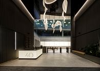
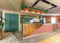
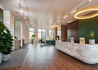
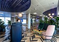
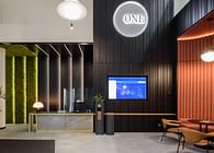
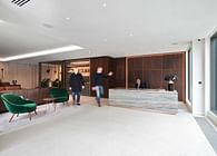
The workspace sought to celebrate a sense of touch through texture, pattern and textile in order to create a connected experience for its users. The interior colour palette, meanwhile, is heavily inspired by the Stockport landscape, as well as art and textiles. The design team looked for inspiration to the LS Lowry’s paintings of Stockport during the height of its textile industry and similarities were drawn from the muted grey backdrops of the paintings, similar to the concrete base build of Stopford House, with pops of terracotta, teal and yellow finishes adding another layer to the Stockport-inspired red brick palette.
Space Planning
The space plan for each floor was tested many times with multiple departments to ensure everything would function in an optimal way post-completion. The narrow floorplate with windows to each side allowed a great deal of natural light into the space. With the addition of the raised floor, ramps were added throughout to ensure the space was accessible and suitable for every type of employee and visitor. Enclosed rooms and fixed partitions were placed around cores and wings, with open office floorplate for the majority to aid flexibility. These flexible areas took advantage of minimal fixed furniture which could be changed easily in future where required.
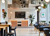
Flexible areas are made up of a mixture of desks and collaborative settings. Two meeting or training rooms were allocated per floor, with flexible furniture to accommodate multi-use facility and different employee needs day to day. Each floor also has a social lunch area to encourage further interaction and collaboration and to offer a place with great coffee and areas to eat with other colleagues. Pockets of communal space are dispersed throughout to support the council’s goals for increasing employees working together. Many of these spaces are also tech-enabled to support remote workers. A range of bookable and non-bookable spaces supports all types of interactions, from formal meeting through to chance encounters.
One of the building’s great qualities is its abundance of daylight due to its narrow floorplate, with existing windows a feature in their own right in a recognizably Brutalist style. Refurbishment to include a greater amount of openable windows allows users to control their environment with ease. SpaceInvader also replicated the design of the windows as a design language in other areas of the scheme, including in a pattern based on the shapes of the frames and the building’s façade, which has been used for manifestations in the meeting rooms.
Furniture, Walls and Floors
Furniture in the scheme was managed carefully by responding directly to Stockport Council’s needs and minimising over-specification. Desking and task seating were kept simple, functional and economical, with high levels of component sharing. The budget was then able to accommodate breakout furniture of the best quality specification, contributing directly to the ongoing success and usage of these key areas.
When the premises were cleared, furniture was stored with many pieces selected for re-use. SpaceInvader also re-used many products from Senator who have a recycling facility for end-of-life products. Informed choices led to the prioritisation of more sustainable products. For example, Shaw Contract carpets were specified for their carbon neutral manufacturing, whilst Tarkett was specified to supply vinyl flooring in the scheme due to their product recycling initiatives. Egger laminate finishes in all the joinery pieces are FSC-certified, whilst acoustic screens are made from post-consumer PET bottles.
Signage and Wayfinding
Signage and wayfinding were carefully developed within the design team, using key elements from the interior design concept, as well as applying the council’s branding guidelines where appropriate. From a building longevity point of view, these were deliberately not too heavily branded to allow scope for potential future letting of one or more floors. Graphic patterns were developed for the meeting room and external glazing manifestations, whilst directional signage, alongside an icon suite, was developed for wayfinding.
Brand fonts were used in heavier weights for the characteristically heavier look of Brutalism, and the shapes in the building’s façade were also one of the major inspirations for the look and feel of the graphic approach. A brand colour was allocated to each of the floors, so that wayfinding applications would remain consistent and give each floor an identity. Over time, users will associate each colour with the appropriate floor to support wayfinding. Accessibility-awareness also included reviewing fonts for easy legibility and consideration of differences between text and background to ensure sufficient contrast for vision-impaired users.
Conclusion
Every aspect of the design was scrutinized in relation to Stockport Council’s needs and related back to the five key objectives outlined in the initial brief. Facilities were improved both in the building’s construction and by adopting a hybrid working strategy, allowing a range of supporting spaces to be added rather than solely desking. New ways of working were supported with the uplift in facilities which have revolutionised the way Stockport Council works. Improvement in connectivity and technology allows better connections between colleagues whether in Stopford House, at home or at another site in the council’s estate. The attraction and retention of employees and employee wellbeing have also been improved through wellbeing-led design and the provision of wellbeing specific spaces.
“The Stopford House project was the result of an extensive process, from providing a business case for refurbishment, to a full workplace strategy engaging with all colleagues in the space, to the design and fit out of the building and consideration of the future’ John Williams concluded. ‘The timing of the briefing period during the unprecedented times of Covid-19 helped create a unique proposition and pushed the client further than might otherwise have been possible, with a forward-thinking approach that has definitely paid off. We are confident that the thorough amount of research undertaken at the outset makes the resulting space the ideal solution for Stockport Council, and are extremely pleased that we were able to justify the argument for refurbishing the existing building rather than building anew from both a sustainable and historical point of view.”
Cllr Malcolm Allan, Cabinet Member for Finance and Resources at Stockport Council commented: “Our Stopford House refurbishment project is an example of us investing in our workforce. We know that our people are our best asset - and having a great place to work is important for team morale, productivity and an organisation that has ambition running through its core.
Stopford House is also part of our drive to become a more sustainable council, and the building was designed with the climate central to its features. Thank you to Overbury and SpaceInvader for their hard work in creating such a fantastic space for our colleagues to work from.”
Status: Built
Location: Stockport, GB
Firm Role: Interior Designer / Workplace Strategist
Additional Credits: Client: Stockport Council
Workplace Strategy/Interior Design:SpaceInvader
Photographer: Andrew Smith / SG Photography
Project Manager: Hive
Main Contractor: Overbury
M&E Consultant: Cundall
M&E Contractor: Hurstwood Environmental Consulting
Cost Consultant: Edge Consulting Engineers
Lighting Supplier: Tyson Lighting / Chiara Lighting
Carpets: Shaw Contract Carpets
Laminates: Egger
Vinyl Flooring: Tarkett
Furniture Supplier: Senator
(Other furniture procured by Overbury’s FF&E team included pieces by:
Mobili / Naughtone / Orangebox / Ocee / Connection / Johnson / Workstories / Frovi / Boss Design / Edge / Pledge / Verco / Gresham / JDD / Modus / Halle / Bisley / Impact Acoustic / Lintex / Hey Sign)


