hey everybody...i am finding out for elegant elevations suitable for my house..it is cubical in shape and i want a house elevation which should look dynamic and flat roof...please sumbody help..
First let me start off by saying the shape of your house is probably the 2nd most underwhelming shape on earth. The most boring would probably be a square with a gable roof. A cube is about as undynamic as you can get.
That being said, no good designer is going to be able to put together any elevations off of "my house is a cube".
How are the interior spaces arranged? What is their size? What is their function? How is the house divided sectionally? Is it 1 story or 2? Does it face North, or South?
This is one of my biggest pet peeves in architecture, namely designers who just do things out of convenience. Poking holes in the facade wherever is easiest. "They want a window over the kitchen sink". *poke* This is lazy man's design, and it's why growing up I didn't consider being an architect until I found people who actually thought about how a building should look, inside and out, and not just throw darts at elevations figuring out where stuff should go.
ZzzzzZzzzz what? Huh? Someone say something? Hmm. ZzzzZzzz
Just kidding.
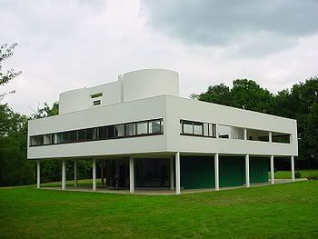
Anyway, the Villa Savoye is hardly the most dynamic thing designed. I find it a downright snoozefest from the outside. Sure if I was there I might have the urge to pull out some hand lotion and kleenex (funny story about the time I stayed at Taliesin for 3 weeks...), but only because every architecture student has seen pictures of it. It is one of the least undynamic (is that even a word? If not I invented it.) cubes out there.
I could use some medical advice, does anybody know a good blog for doctors that I go on and ask for their professional opinion on something? I'll make sure I say please.
paperboy -- just sign up for match.com or some other dating site and dig for doctors there. you might have to go dutch on dinner, but you'll get your medical questions answered eventually :)
ideas for elevation of my house
hey everybody...i am finding out for elegant elevations suitable for my house..it is cubical in shape and i want a house elevation which should look dynamic and flat roof...please sumbody help..
I have some advice. Hire an architect.
Haha. That's good.
___
[ ]
Hire me, I will work for bread and butter, and some water!
First let me start off by saying the shape of your house is probably the 2nd most underwhelming shape on earth. The most boring would probably be a square with a gable roof. A cube is about as undynamic as you can get.
That being said, no good designer is going to be able to put together any elevations off of "my house is a cube".
How are the interior spaces arranged? What is their size? What is their function? How is the house divided sectionally? Is it 1 story or 2? Does it face North, or South?
This is one of my biggest pet peeves in architecture, namely designers who just do things out of convenience. Poking holes in the facade wherever is easiest. "They want a window over the kitchen sink". *poke* This is lazy man's design, and it's why growing up I didn't consider being an architect until I found people who actually thought about how a building should look, inside and out, and not just throw darts at elevations figuring out where stuff should go.
cubes can be dynamic, Mil08 !!

just copy this:
de-sign done, pay me now!
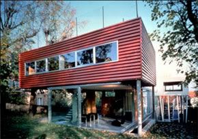
last person did that 'copy' job came up with this:

ZzzzzZzzzz what? Huh? Someone say something? Hmm. ZzzzZzzz
Just kidding.
Anyway, the Villa Savoye is hardly the most dynamic thing designed. I find it a downright snoozefest from the outside. Sure if I was there I might have the urge to pull out some hand lotion and kleenex (funny story about the time I stayed at Taliesin for 3 weeks...), but only because every architecture student has seen pictures of it. It is one of the least undynamic (is that even a word? If not I invented it.) cubes out there.
That's funny Orhan. Hadn't seen that before. Proportions are just a tiny bit off, no?
yes the proportions are off. that's why you have to COPY the original!
seriously though, when i say 'copy it' i mean in the way that rem copies mid-century classics:

put some shutters on it, it'll really spice things up.
I hear aluminum siding is all the rage, can't go wrong adding that
Try putting small circular black dots on the facade. A different number on each side - 1, 2, 3, 4, 5, 6
I could use some medical advice, does anybody know a good blog for doctors that I go on and ask for their professional opinion on something? I'll make sure I say please.
paperboy -- just sign up for match.com or some other dating site and dig for doctors there. you might have to go dutch on dinner, but you'll get your medical questions answered eventually :)
mespellrong,
I was being sarcastic, were you.
Block this user
Are you sure you want to block this user and hide all related comments throughout the site?
Archinect
This is your first comment on Archinect. Your comment will be visible once approved.