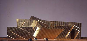
The archtypal form of the ancient Mesopotamian ziggurat (and related structures from antiquity) is the basis for UN Studio's design, which transforms that sacred, symbolic structure into a contemporary model combining public and private programs.
the idea of the hokusai wave as design explanation tool for the limp-minded is funny more than provocative.
the terminal showed up in lots of commercials here btw cuz its really cool, like zumthor's bath at vals w/ madonna; the imagery is enticing and the setting unique. great place for events on tv that wanna have a bit of a vibe to them. and it really is a masterpiece.
it make sense that buildings can become recognisable because of their connection, perceived, real, or otherwise, to a more common everyday object. but the connection is hardly proof of a move towards more sophisticated iconography...that is a bit like saying that we have moved from the donut to the glazed donut and now the world is gonna be alright...
even the oldest and most icon-filled buildings of the rennaiscence and baroque period are now mostly seen as icons of themselves, remembered for their spatial power or their experiential force, or their history rather than the images that adorn them...to be honest there are very few people today even capable of translating the icons to begin with.
personally the thing i remember most about the duomo in milano was the party on the roof, the sunbathers over an amazing cavern devoted to god. the sculptures and glass made hardly an impact. most architecture is like that, no?
Willem-Jan Neutelings in Icon Magazine on iconography:
“We make a lot of foam models to make a strong sculptural building, because we do mostly public buildings,†says Neutelings. “With a public building, you usually want ones that are more iconographic, that have a certain expression, to express their special function in the city.†His contemporary distinction between iconographic and iconic is a striking element of the practice’s best work. There is no desire to make an icon – self-referential forms that express individuality through lack of precedent. His work is iconographic – a pictorial illustration of a subject, or a set of representations, that illustrate the content of the building and its place in the city.
[...]
"Our buildings are born naked, so if we make these sculptures, we have to think how should we dress them. Should they have stripes or flowers, and how does that affect them.†These skins are often representational, taking cues from the content of the building and turning themes into wrapping materials.
At their fire station in Breda (1999), for example, the concrete panels that clad the building were imprinted with a pattern taken from an enlarged imprint of a tyre tread. This seamless-looking skin makes the two-storey building look more substantial, and refers to the fire engines inside.
especially:
"thus bringing back [re-enacting?] an "architecture as delivery of content," which happens to be Quondam's 7th definition at www.quondam.com
"he so far fails to acknowledge is that iconography on buildings today, be it either electronic or not, is almost always advertising, advertising, advertising
"if I were commissioned to design content for some real (generic) building whose 'skin' was an electronic screen, I'd propose a vast series of 'webpages' that act as a museum of architecture, thereby making the building, at least on the surface, a 'virtual museum of architecture.'
"I could go on and on, like pondering what kind of content I would propose for a hospital that had screen facades, or electronic/iconographic houses that change decorations by seasons or holidays, or even imaging the imagining of a house of ill-repute.
she was on the bbc and discussing this project 2 or 3 months ago..the speaker asked her about this idea wheter it will work or not she replied it did and it will as a landmark..If you analyse her previous projects carefully, she was always dealing with the "program"..the forms and the voids were always becoming from the variations of the program and organisations..Maybe this is a revenge for english government, not to let her design anything in Britain until this one :)
Mar 4, 06 2:17 am ·
·
jump, the surface examples I listed above are within the context of electronic screens on buildings, and not meant to imply that iconography cannot have depth as well. Nonetheless, an architecture of just camoflage seems to be an interesting typology.
The main reason for the post, however, was to address the notion of architecture as delivery of content, which was (subsequent to quondam) also addressed by Willem-Jan Neutelings in Icon Magazine (January 2006).
Architecture as delivery of content seems to be the opposite of architecture of just camoflage, doesn't it?
In 2005 FOA build the Spanish Pavilion for an Expo in Japan. The walls refer to the Spanish Paella, as Rem Koolhaas remembered at his lecture at the Berlage.
The Guardian:
Even the extravagantly and enjoyably designed Spanish Pavilion, themed by the London-based Foreign Office Architects, relied too heavily on Don Quixote, fiestas and a tapas bar to sell the joys of contemporary Spain.
This was a pity as FOA have worked hard to transform the steel kiwari box allocated to Spain into something special. The 18m x 18m x 9m pavilion is dressed in an all-embracing wall of hexagonal ceramic tiles, the colours of the Spanish flag. These make reference to historic Spanish Caliphal and Mudejar architecture, while nodding appreciatively at Japanese ceramic craft. They also provide an airy screen, sheltering the pavilion - summers are hot in Nagoya. As Higgins says, the "real trick with Expo pavilions is to make the narrative they are trying to tell gel with the architectural envelope; but this is rarely done". the guardian
its called branding...i think it is funny that architects have to wrap so many words around what graphic designer deal with all the time...giving something an identity beyond itself...branding.
everything else starts to sound like blah blah blah blah blah blah, etc.
It's not about giving an identity beyond itself, but giving an identity related to the program, structure, context. Iconography can be used for branding, but that is not necessarily the case.
The positive thing about the use of iconography is that architecture gets to broadcast new content in the city. The city is not criticized or something, but gets extra content. The city is enriched.
As the discussion progresses iconography somehow becomes more and more unescapable as we find more and more axamples. Even 'serious' architects as Zaha Hadid seem to need it when referring to 'waves' for their olympic swimming pool, that is -not by accident- part of the masterplan by FOA.
semantics...what architects are doing are trying to sell boards in competitions which means they have to have a theme, identity, complexity, etc...i.e. a brand which the boards speak.
Its salesmanship...without the story the architect has a hard time selling it...so they infuse it with concepts throughout the charette process....are they actually valid? who knows...but i would argue they are pretty skin deep, shallow, as their purpose is much the same as advertising...just within a competition arena.
gotta have a 'concept' man...even if it's all bullshit.
I like to think I can enjoy a building without wrapping it with intellectually weak platitudes.
I totally agree that you have to be able to experience architecture without prior knowledge. Iconography is not only about selling architecture, but also about to try to connect to references people will make to form in architecture. Often the story of the architecture conflicts with the perception of the visitor. But that doesn't mean that you can't try to match them.
I had an interesting experience with tha Shipping and Transport College that is designed by Neutelings Riedijk... what do you think it refers to?
A friend of mine was very enthousiastic about the building... until I told her that the skin of the building refers to stacked containers and that the inside-cladding of -for instance- the hovering college-room refers to rescue-bands... the building is totally absorbed with all these references to the maritime world. After I explained that, she was a bit horrified by it for a moment, but after a while she turned around...
I truly think it's a magnificent building, with a unique client. The explicit use of iconography keeps puzzling me. It's a bit out there, but hey, it's possitive content.
maybe shipping containers...but only slightly though, as a vaneer.
I think that there is a delicate balance with putting real thoughtful conscientious ideas into a building, or anything, and putting a disneyland coating on things.
I would like to hear discussions on how much these buildings cost the public and how long they actually function...how valuable are they really? Do people not make their own cultural space as it is?
It would be good to know what works and what does not...but I think many architects are not interested in POE's on projects like this...I wonder.
so...again azp: "The image/iconography that is being used both conceptually structures the organization of the building, and is useful in the communication of the project to the public. "
so, then, a wholesom revision, a uniform hand passes over all the stages..tweakes and pinches the building 'into shape' (the shape recognized by the architect within the cloud), and shape is all about a recognition, or at least (as in the sydney opera) a recognition of recognition (it looks like this..it looks like that...it looks like this and that...it looks like it wants to make me sense my own sense of recognition). the supporting argument is that the structural properties of that cloud pre-empted the shape that the architect saw drawn by its lining. why that shap?
"Our decision to resort to iconography as an alternative to a coded or indexial language is a kind of primitive choice - a protocaol of communication that comes bound with form and can therefore be directly coupled to material organization"
askewing the apriori, coded language... read as contingent and artificial...the justification for 'image' is given as, a frankly strange terminology for people like azp, "primitive"...read 'more natural'. for a mentality that claims to see the artificial, the cybernetic or whatnot, as an extention of natural forms...this argument is a wonderful trap. crouching behind is a typical nature vs culture attitude...translated into vision vs language...a romantic-mimicing residue kernel implanted amongst the scientifically-sounding rest.
in the fight against the "critical", azp seem to be embracing..in a very unromantic, personally non-engaged way...in a sort of marketing trend-study manner...populism. the architect decided the image that will please people (or rather, askewing the messy human-related word 'people'...will tick of the trend-setting marketing strategy list)..ie is iconographic and becomes iconic. its an interesting common martini-dry black-suit-donning grounds between modernist reserve and marketing team instinct. and of course a scattering of some neo-pragmatic european-capitalism (that is, clever enough to argue against european "critical" intellectuals and with more class and charm than their american counterpart). though, honestly,
i think they are culturally very confused.
ever watched 'the last unicorn'? there was that zeus-bull character-type..and then unicorns, so many unicorns set free. i think it was covertly a gay animated film.
he was giving a lecture in istanbul a few months ago and he talked about this project a bit. During the lecture, he talked about the representation of book and layers and how he integrated these into the program. Frankly, I have a chance to visit and experience some of these places and I can say that yes they scream like 'Whatever People Say I Am That's What I'm Not' but still they have a very important potential to affect the program and the users. The catch is, they started to talk about these on lectures, millions of students listen to them -like me- and they may get wrong or they could make the mistakes that were already done by the others in the past both in po-mo and mo eras.
merely wallpaper, flat ducks ... I can't believe that people still have such angst over what has become a very generic building condition. There is no connection between exterior and interior - it's a modern myth that for countless practical, economic and theoretic reasons, doesn't need to exist anymore.
j-turn, not arguing that good architecture can't be a flat duck...nor that i am upset overly by it. more that it is real boring. i mean have you SEEN any of venturi's built work? great writer, terrible practioner...
am more impressed by, for example, s. holl's st. ignatius or zumthor's spa at vals.
even the bigness man hisself, the man who told us inside and out as pair don't matter, makes the most amazing spatial and experiential buildings where inside and out shape each other in an abstract and powerful way. The porto building is a good example, but even in smaller stuff, like the nexus world housing, the surface is volumetric.
surface as space is cool. surface as wallpaper (and only as wallpaper, a special effect)? a bit too fad-y for me. why bother?
Mar 6, 06 7:17 am ·
·
jump, I don't recall advocating content disregarding the interior, and I think you're interpolating as to what I did advocate.
'Wallpaper' can be applied both inside and outside, can it not?
Is there some kind of law dictating that 'wallpaper' can only be applied to flat surfaces?
I'm curious as to which Venturi et al buildings you've actually seen in person.
A sinuswave clearly relates to swimming or/and water , so the shape is related to the function , thats clear , in that way how can the shape of a house relate to living in it ?
truth be told i quite admire venturi, but have always thought his practice fell very much short of his academic/text work, which is brilliant. I think he has/had a lot more in him but kept catching himself up with the writings, taking them too seriously maybe...or maybe not serious ENOUGH...
as for wallpaper, i am not sure how to articulate the reason for my discomfort. building as surface is clearly ok (H +DeM did a lot of this sort of thing brilliantly). Maybe it is the simultaneous step towards making the media the message that bugs me...it feels to me like the architecture will thus be, a priori, a gimmick, with no possible future history, no room for inhabitation.
i suppose my view is that it would be a mistake to stop with thinking that once the surface/imagery is done the architecture is too. which is what venturi does so often...and which admittedly many of the examples michiel provided clearly do NOT do. from my point of view what they LOOK like is in some ways only tangential to their effect; even if they are icons.
sorry, i kept timing out so it posted 3 times. then they all showed up at once!
i love the internet...;-)
mea culpa.
Mar 7, 06 3:34 am ·
·
jump, when you write, "it would be a mistake to stop with thinking that once the surface/imagery is done the architecture is too. which is what venturi does so often," it is obvious that you really don't know the work and practice of VSBA. Plus, what you've written overall is a mish-mash of subjectivity mixed with very little objectivity--I'd sort that out before I'd make any sweeping conclusions.
The best I can do right now regarding architecture as the delivery of content is to continue adding more content to Quondam.
admittedly purely subjective, and i am only making conclusions for myself.
the house venturi did for his mother is very rich, and am sure there are other works by his firm that are interesting, but the fascination with surface and sign feels to me like a red herring ( i am willing to be shown otherwise, mind...)
The dalmation wall for the emergency services building at disney is semantically correct, at a few levels even, but is spatially and experientially about as powerful as the side of a 7-11. for me that is really dissapointing. i don't believe it is a particularly unusual project for vsba. Is it?
Mar 7, 06 11:44 am ·
·
Gosh jump, do you really have to be spoon fed? Go experience the architecture yourself. To talk about a buildings spatiality and experientiality via looking at pictures is a poor and very disappointing way to critique architecture.
Plus, how 'powerful' does an emergency services building (fire station) really have to be?
My local fire station is a nice and modest civic building, although it still saddens me that the tower was taken down a number of years ago--towers for the drying of hoses are now obsolete. The Rite-Aid store across the street is not as attractive but somewhat visually more powerful.
I just RTFA, and mainly it was like "ok fine". The only major problem I took away is with AZP's rhetorical device, he pretends he's the first person that ever made stuff that looks like other stuff:
"Today, the Hokusai Wave is no longer exclusively ours. Projects like Herzog & de Meuron's chinese basketlike, birdsnestlike Beijing Olympic Stadium, Norman Foster's Gherkin, or the branding excersice of UN Studio's trefoil/wheel Mercedes Benz Museum in Stuttgart - to name just some of the most acomplished - are also cross breeding very obvious iconographies with processes of material organization."
Wow, all those other guys owe Foreign Office money, way to advance the discourse!
@Quondam: Chain drugstores (Rite-Aid, CVS, Walgreens, etc.) are some of the most anti-architectural, anti-urban places in contemporary american cities.
didn't think i was asking to be spoon fed, which makes me think i is saying/doing something wrong...i mean i have travelled through about 20 countries now, lived on three continents (well 1 continent and 2 islands), and seen as much as i am able long the way...
i agree it is better to see the buildings in person, but oportunities have not yet come up to see much. i could be wrong, but even with such a poor perspective i gotta say there does not seem to much consideration of space or experience in this
or this
(actually i was wrong, i saw this one in 1993, just after it opened, on the way to mexico)
nor this
what intrigues me about the firm is that venturi can be so interestingly observant about not trying to make architecture/urbanism so neat and clean and prescious, but then goes on to sanitise so much in his own work. and it isn't just with the smaller stuff. much of his larger works have an urban character that is commendable, but it is very controlled, less las vegas than cambridge. and i really do wonder what happened to the man who embraced complexity and the everyday but now makes this
my take on the use of iconography in architecture is that it works better when there is room for interaction, when everything is not thrown at you in a single one-liner (or a series of related one liners, even), when it is not all spoon fed and the users have a chance to make changes, take different routes, understand the place in a different way; this is i think really difficult if the content of the building is mostly loaded into a graphic facade and the rest is sort of blank, including the volumes.
i like that i can see this in utzon's work
and another person can see the sails posted above.
from what i can tell there is not so much of that in venturi's work and i think that is precisely the point alejandro zaero-paolo is making when he evokes more complex iconography as a step forward. That is soemthing i can totally agre with, but when you get that far into complex/abstract form it seems to me there is enough going on that the icon itself is no longer so important and the need for theory supporting it sort of lost under the weight of reality.
the wave doesn't need to be KNOWN when you are sitting on the luxurious grass roof of the ferry terminal at yokohama, nor the sail (or the geometry) understood when standing under those amazing shells of the opera in sydney. The experience is so rich that the extra layer of what they mean, what they were inspired by, and what they stand for, are lost in the experience of being human in an amazing place.
btw, for those who don't venturi et al so well, all of the images above, except the utzon model, are their work.
Mar 10, 06 3:15 am ·
·
Learning from jump, I'll say that by looking at pictures of the "luxurious grass roof of the ferry terminal at yokohama" I right away get the feeling that I would be quickly bored being there. Would I actually be bored? I really couldn't say unless I was actually there. Nonetheless, I am quickly bored by the pictures.
Seeing the Sydney Opera House at night from the ferry coming into the harbor is a beautiful sight. Being at the building outside during the day was not too exciting, except for the flocks of sea gulls that occasionally attacked someone else's unattended lunch.
jump, I really can't discuss VSBA architecture with you because I know too much, ie, I know a lot of the buildings first hand, and I know all the writings of Venturi, Scott Brown and Izenour, and I know a lot about how the firm operates because of a friendship with one of their former associates. Relatively speaking, you know very little, and thus I find your 'critique' mostly uninformed and even somewhat misleading.
Milwaukee museum which looks like ...
Rodan, which sounds like Rodin the creator of ...
Man with Broken Nose, which looks vaguely like ...
George Carlin, who played The Architect in Scary Movie 3, which is ...
The the profession the architect of Love Park in Philadelphia, who happens to be Ed Bacon, the father of ...
Mar 15, 06 4:48 pm ·
·
The architect of Philadelphia's John F. Kennedy Plaza, aka Love Park, is Vincent Kling.
Edmond Bacon was a planner.
"And we become these human jukeboxes, spilling out these anecdotes."
--Six Degrees of Separation

Iconography, or the problem of representation
more reenactionary architecturism:


UN Studio in Artforum March 2006.
The archtypal form of the ancient Mesopotamian ziggurat (and related structures from antiquity) is the basis for UN Studio's design, which transforms that sacred, symbolic structure into a contemporary model combining public and private programs.
Hail Ziggurat!
-->has fallen down and can't get up
the idea of the hokusai wave as design explanation tool for the limp-minded is funny more than provocative.

the terminal showed up in lots of commercials here btw cuz its really cool, like zumthor's bath at vals w/ madonna; the imagery is enticing and the setting unique. great place for events on tv that wanna have a bit of a vibe to them. and it really is a masterpiece.
it make sense that buildings can become recognisable because of their connection, perceived, real, or otherwise, to a more common everyday object. but the connection is hardly proof of a move towards more sophisticated iconography...that is a bit like saying that we have moved from the donut to the glazed donut and now the world is gonna be alright...
even the oldest and most icon-filled buildings of the rennaiscence and baroque period are now mostly seen as icons of themselves, remembered for their spatial power or their experiential force, or their history rather than the images that adorn them...to be honest there are very few people today even capable of translating the icons to begin with.
personally the thing i remember most about the duomo in milano was the party on the roof, the sunbathers over an amazing cavern devoted to god. the sculptures and glass made hardly an impact. most architecture is like that, no?
inhabitation always trumps intent.
Willem-Jan Neutelings in Icon Magazine on iconography:
“We make a lot of foam models to make a strong sculptural building, because we do mostly public buildings,†says Neutelings. “With a public building, you usually want ones that are more iconographic, that have a certain expression, to express their special function in the city.†His contemporary distinction between iconographic and iconic is a striking element of the practice’s best work. There is no desire to make an icon – self-referential forms that express individuality through lack of precedent. His work is iconographic – a pictorial illustration of a subject, or a set of representations, that illustrate the content of the building and its place in the city.
[...]
"Our buildings are born naked, so if we make these sculptures, we have to think how should we dress them. Should they have stripes or flowers, and how does that affect them.†These skins are often representational, taking cues from the content of the building and turning themes into wrapping materials.
At their fire station in Breda (1999), for example, the concrete panels that clad the building were imprinted with a pattern taken from an enlarged imprint of a tyre tread. This seamless-looking skin makes the two-storey building look more substantial, and refers to the fire engines inside.
Icon Magazine
Subject: Re: dead languages
Date: 2002.06.19 13:00
at www.quondam.com/25/2415.htm
especially:
"thus bringing back [re-enacting?] an "architecture as delivery of content," which happens to be Quondam's 7th definition at www.quondam.com
"he so far fails to acknowledge is that iconography on buildings today, be it either electronic or not, is almost always advertising, advertising, advertising
"if I were commissioned to design content for some real (generic) building whose 'skin' was an electronic screen, I'd propose a vast series of 'webpages' that act as a museum of architecture, thereby making the building, at least on the surface, a 'virtual museum of architecture.'
"I could go on and on, like pondering what kind of content I would propose for a hospital that had screen facades, or electronic/iconographic houses that change decorations by seasons or holidays, or even imaging the imagining of a house of ill-repute.
if there is depth to iconography, treated in most examples above as surface does this mean architecture is just camoflage?
wups. meant to say , if there is NO depth to iconography does this mean architecture is just camoflage?
I was quite comfortable until any of zaha's work did not get involved such things...

"sinuous S-shaped roof inspired by the flow of water, that is certain to make it a London landmark."
she was on the bbc and discussing this project 2 or 3 months ago..the speaker asked her about this idea wheter it will work or not she replied it did and it will as a landmark..If you analyse her previous projects carefully, she was always dealing with the "program"..the forms and the voids were always becoming from the variations of the program and organisations..Maybe this is a revenge for english government, not to let her design anything in Britain until this one :)
jump, the surface examples I listed above are within the context of electronic screens on buildings, and not meant to imply that iconography cannot have depth as well. Nonetheless, an architecture of just camoflage seems to be an interesting typology.
The main reason for the post, however, was to address the notion of architecture as delivery of content, which was (subsequent to quondam) also addressed by Willem-Jan Neutelings in Icon Magazine (January 2006).
Architecture as delivery of content seems to be the opposite of architecture of just camoflage, doesn't it?
In 2005 FOA build the Spanish Pavilion for an Expo in Japan. The walls refer to the Spanish Paella, as Rem Koolhaas remembered at his lecture at the Berlage.


The Guardian:
Even the extravagantly and enjoyably designed Spanish Pavilion, themed by the London-based Foreign Office Architects, relied too heavily on Don Quixote, fiestas and a tapas bar to sell the joys of contemporary Spain.
This was a pity as FOA have worked hard to transform the steel kiwari box allocated to Spain into something special. The 18m x 18m x 9m pavilion is dressed in an all-embracing wall of hexagonal ceramic tiles, the colours of the Spanish flag. These make reference to historic Spanish Caliphal and Mudejar architecture, while nodding appreciatively at Japanese ceramic craft. They also provide an airy screen, sheltering the pavilion - summers are hot in Nagoya. As Higgins says, the "real trick with Expo pavilions is to make the narrative they are trying to tell gel with the architectural envelope; but this is rarely done".
the guardian
its called branding...i think it is funny that architects have to wrap so many words around what graphic designer deal with all the time...giving something an identity beyond itself...branding.
everything else starts to sound like blah blah blah blah blah blah, etc.
It's not about giving an identity beyond itself, but giving an identity related to the program, structure, context. Iconography can be used for branding, but that is not necessarily the case.
The positive thing about the use of iconography is that architecture gets to broadcast new content in the city. The city is not criticized or something, but gets extra content. The city is enriched.
As the discussion progresses iconography somehow becomes more and more unescapable as we find more and more axamples. Even 'serious' architects as Zaha Hadid seem to need it when referring to 'waves' for their olympic swimming pool, that is -not by accident- part of the masterplan by FOA.
semantics...what architects are doing are trying to sell boards in competitions which means they have to have a theme, identity, complexity, etc...i.e. a brand which the boards speak.
Its salesmanship...without the story the architect has a hard time selling it...so they infuse it with concepts throughout the charette process....are they actually valid? who knows...but i would argue they are pretty skin deep, shallow, as their purpose is much the same as advertising...just within a competition arena.
gotta have a 'concept' man...even if it's all bullshit.
I like to think I can enjoy a building without wrapping it with intellectually weak platitudes.
I totally agree that you have to be able to experience architecture without prior knowledge. Iconography is not only about selling architecture, but also about to try to connect to references people will make to form in architecture. Often the story of the architecture conflicts with the perception of the visitor. But that doesn't mean that you can't try to match them.
I had an interesting experience with tha Shipping and Transport College that is designed by Neutelings Riedijk... what do you think it refers to?
A friend of mine was very enthousiastic about the building... until I told her that the skin of the building refers to stacked containers and that the inside-cladding of -for instance- the hovering college-room refers to rescue-bands... the building is totally absorbed with all these references to the maritime world. After I explained that, she was a bit horrified by it for a moment, but after a while she turned around...
I truly think it's a magnificent building, with a unique client. The explicit use of iconography keeps puzzling me. It's a bit out there, but hey, it's possitive content.
a snake, a perascope, plaid, i don't know.
maybe shipping containers...but only slightly though, as a vaneer.
I think that there is a delicate balance with putting real thoughtful conscientious ideas into a building, or anything, and putting a disneyland coating on things.
I would like to hear discussions on how much these buildings cost the public and how long they actually function...how valuable are they really? Do people not make their own cultural space as it is?
It would be good to know what works and what does not...but I think many architects are not interested in POE's on projects like this...I wonder.
ok, out to walk the dogs...enjoy your day.
whats a delivery of content? dhl architecture?
so...again azp: "The image/iconography that is being used both conceptually structures the organization of the building, and is useful in the communication of the project to the public. "
reading into it:
in the confusion, all the possiblities lumped, of slopes around the design in its conceptual/self genertative state, the most powerful force of recognition (and this a decisive coup d'état by the "subjectivity" of the architect..this subjectivity being read against and forming the the counterpart for the architect as a spatial engineering device in its seemingly subjectivally-numb number-churning diagram plotting role) sends it tumbling down into an iconographic 'thats it, thats what it looks like' exhale.
so, then, a wholesom revision, a uniform hand passes over all the stages..tweakes and pinches the building 'into shape' (the shape recognized by the architect within the cloud), and shape is all about a recognition, or at least (as in the sydney opera) a recognition of recognition (it looks like this..it looks like that...it looks like this and that...it looks like it wants to make me sense my own sense of recognition). the supporting argument is that the structural properties of that cloud pre-empted the shape that the architect saw drawn by its lining. why that shap?
"Our decision to resort to iconography as an alternative to a coded or indexial language is a kind of primitive choice - a protocaol of communication that comes bound with form and can therefore be directly coupled to material organization"
askewing the apriori, coded language... read as contingent and artificial...the justification for 'image' is given as, a frankly strange terminology for people like azp, "primitive"...read 'more natural'. for a mentality that claims to see the artificial, the cybernetic or whatnot, as an extention of natural forms...this argument is a wonderful trap. crouching behind is a typical nature vs culture attitude...translated into vision vs language...a romantic-mimicing residue kernel implanted amongst the scientifically-sounding rest.
in the fight against the "critical", azp seem to be embracing..in a very unromantic, personally non-engaged way...in a sort of marketing trend-study manner...populism. the architect decided the image that will please people (or rather, askewing the messy human-related word 'people'...will tick of the trend-setting marketing strategy list)..ie is iconographic and becomes iconic. its an interesting common martini-dry black-suit-donning grounds between modernist reserve and marketing team instinct. and of course a scattering of some neo-pragmatic european-capitalism (that is, clever enough to argue against european "critical" intellectuals and with more class and charm than their american counterpart). though, honestly,
i think they are culturally very confused.
ever watched 'the last unicorn'? there was that zeus-bull character-type..and then unicorns, so many unicorns set free. i think it was covertly a gay animated film.
here is another example of Daniel Libeskind for "The Wohl Centre
The Book and the Wall" project.
wohl
he was giving a lecture in istanbul a few months ago and he talked about this project a bit. During the lecture, he talked about the representation of book and layers and how he integrated these into the program. Frankly, I have a chance to visit and experience some of these places and I can say that yes they scream like 'Whatever People Say I Am That's What I'm Not' but still they have a very important potential to affect the program and the users. The catch is, they started to talk about these on lectures, millions of students listen to them -like me- and they may get wrong or they could make the mistakes that were already done by the others in the past both in po-mo and mo eras.
[url=http://www.desert-tropicals.com/Plants/Cactaceae/Mammillaria_zeilmaniana.html]
Mammillaria_zeilmaniana.html[/url]
ziggu


http://hush.gooside.com/name/l/La/Langley/Langley.html
spanish pavilion
http://members.at.infoseek.co.jp/kemurin/plapuzzle/no22/index.html
2000.08.09 and just after
scheme 1
scheme 2
scheme 2
scheme 2
scheme 2
scheme 2
scheme 2
scheme 2
scheme 3
scheme 3
scheme 3
again, "This comparison is not about precedents, rather predictabilities."
quondam,
if the content is on the surface and disregards the interior (in the physical sense) is it not merely wallpaper? a flat DUCK...?
merely wallpaper, flat ducks ... I can't believe that people still have such angst over what has become a very generic building condition. There is no connection between exterior and interior - it's a modern myth that for countless practical, economic and theoretic reasons, doesn't need to exist anymore.
j-turn, not arguing that good architecture can't be a flat duck...nor that i am upset overly by it. more that it is real boring. i mean have you SEEN any of venturi's built work? great writer, terrible practioner...
am more impressed by, for example, s. holl's st. ignatius or zumthor's spa at vals.
even the bigness man hisself, the man who told us inside and out as pair don't matter, makes the most amazing spatial and experiential buildings where inside and out shape each other in an abstract and powerful way. The porto building is a good example, but even in smaller stuff, like the nexus world housing, the surface is volumetric.
surface as space is cool. surface as wallpaper (and only as wallpaper, a special effect)? a bit too fad-y for me. why bother?
jump, I don't recall advocating content disregarding the interior, and I think you're interpolating as to what I did advocate.
'Wallpaper' can be applied both inside and outside, can it not?
Is there some kind of law dictating that 'wallpaper' can only be applied to flat surfaces?
I'm curious as to which Venturi et al buildings you've actually seen in person.
wallpaper would probably peel off if it was applied to the outside.
Oh gosh, the problems of representation.
Why does nothing last forever?
A sinuswave clearly relates to swimming or/and water , so the shape is related to the function , thats clear , in that way how can the shape of a house relate to living in it ?
quondam,
actually just that extension in london, and i didn't mind it for what it was. but the PICTURES of his other projects? oy vey is me.
[img]http://www.bluffton.edu/~sullivanm/florida/disney/venturi/0089.jpg width=350[img]
truth be told i quite admire venturi, but have always thought his practice fell very much short of his academic/text work, which is brilliant. I think he has/had a lot more in him but kept catching himself up with the writings, taking them too seriously maybe...or maybe not serious ENOUGH...
as for wallpaper, i am not sure how to articulate the reason for my discomfort. building as surface is clearly ok (H +DeM did a lot of this sort of thing brilliantly). Maybe it is the simultaneous step towards making the media the message that bugs me...it feels to me like the architecture will thus be, a priori, a gimmick, with no possible future history, no room for inhabitation.
i suppose my view is that it would be a mistake to stop with thinking that once the surface/imagery is done the architecture is too. which is what venturi does so often...and which admittedly many of the examples michiel provided clearly do NOT do. from my point of view what they LOOK like is in some ways only tangential to their effect; even if they are icons.
apoolgies
apoolgies
wot the heck?

3rd try the charm...
aargh.!
...
sorry, i kept timing out so it posted 3 times. then they all showed up at once!
i love the internet...;-)
mea culpa.
jump, when you write, "it would be a mistake to stop with thinking that once the surface/imagery is done the architecture is too. which is what venturi does so often," it is obvious that you really don't know the work and practice of VSBA. Plus, what you've written overall is a mish-mash of subjectivity mixed with very little objectivity--I'd sort that out before I'd make any sweeping conclusions.
The best I can do right now regarding architecture as the delivery of content is to continue adding more content to Quondam.
could be.
admittedly purely subjective, and i am only making conclusions for myself.
the house venturi did for his mother is very rich, and am sure there are other works by his firm that are interesting, but the fascination with surface and sign feels to me like a red herring ( i am willing to be shown otherwise, mind...)
The dalmation wall for the emergency services building at disney is semantically correct, at a few levels even, but is spatially and experientially about as powerful as the side of a 7-11. for me that is really dissapointing. i don't believe it is a particularly unusual project for vsba. Is it?
Gosh jump, do you really have to be spoon fed? Go experience the architecture yourself. To talk about a buildings spatiality and experientiality via looking at pictures is a poor and very disappointing way to critique architecture.
Plus, how 'powerful' does an emergency services building (fire station) really have to be?
My local fire station is a nice and modest civic building, although it still saddens me that the tower was taken down a number of years ago--towers for the drying of hoses are now obsolete. The Rite-Aid store across the street is not as attractive but somewhat visually more powerful.
I just RTFA, and mainly it was like "ok fine". The only major problem I took away is with AZP's rhetorical device, he pretends he's the first person that ever made stuff that looks like other stuff:
"Today, the Hokusai Wave is no longer exclusively ours. Projects like Herzog & de Meuron's chinese basketlike, birdsnestlike Beijing Olympic Stadium, Norman Foster's Gherkin, or the branding excersice of UN Studio's trefoil/wheel Mercedes Benz Museum in Stuttgart - to name just some of the most acomplished - are also cross breeding very obvious iconographies with processes of material organization."
Wow, all those other guys owe Foreign Office money, way to advance the discourse!
@Quondam: Chain drugstores (Rite-Aid, CVS, Walgreens, etc.) are some of the most anti-architectural, anti-urban places in contemporary american cities.
ha quondam, that is funny ( seriously ;-) ).


didn't think i was asking to be spoon fed, which makes me think i is saying/doing something wrong...i mean i have travelled through about 20 countries now, lived on three continents (well 1 continent and 2 islands), and seen as much as i am able long the way...
i agree it is better to see the buildings in person, but oportunities have not yet come up to see much. i could be wrong, but even with such a poor perspective i gotta say there does not seem to much consideration of space or experience in this
or this
(actually i was wrong, i saw this one in 1993, just after it opened, on the way to mexico)
nor this
what intrigues me about the firm is that venturi can be so interestingly observant about not trying to make architecture/urbanism so neat and clean and prescious, but then goes on to sanitise so much in his own work. and it isn't just with the smaller stuff. much of his larger works have an urban character that is commendable, but it is very controlled, less las vegas than cambridge. and i really do wonder what happened to the man who embraced complexity and the everyday but now makes this
my take on the use of iconography in architecture is that it works better when there is room for interaction, when everything is not thrown at you in a single one-liner (or a series of related one liners, even), when it is not all spoon fed and the users have a chance to make changes, take different routes, understand the place in a different way; this is i think really difficult if the content of the building is mostly loaded into a graphic facade and the rest is sort of blank, including the volumes.
i like that i can see this in utzon's work
and another person can see the sails posted above.
from what i can tell there is not so much of that in venturi's work and i think that is precisely the point alejandro zaero-paolo is making when he evokes more complex iconography as a step forward. That is soemthing i can totally agre with, but when you get that far into complex/abstract form it seems to me there is enough going on that the icon itself is no longer so important and the need for theory supporting it sort of lost under the weight of reality.
the wave doesn't need to be KNOWN when you are sitting on the luxurious grass roof of the ferry terminal at yokohama, nor the sail (or the geometry) understood when standing under those amazing shells of the opera in sydney. The experience is so rich that the extra layer of what they mean, what they were inspired by, and what they stand for, are lost in the experience of being human in an amazing place.
btw, for those who don't venturi et al so well, all of the images above, except the utzon model, are their work.
Learning from jump, I'll say that by looking at pictures of the "luxurious grass roof of the ferry terminal at yokohama" I right away get the feeling that I would be quickly bored being there. Would I actually be bored? I really couldn't say unless I was actually there. Nonetheless, I am quickly bored by the pictures.
Seeing the Sydney Opera House at night from the ferry coming into the harbor is a beautiful sight. Being at the building outside during the day was not too exciting, except for the flocks of sea gulls that occasionally attacked someone else's unattended lunch.
jump, I really can't discuss VSBA architecture with you because I know too much, ie, I know a lot of the buildings first hand, and I know all the writings of Venturi, Scott Brown and Izenour, and I know a lot about how the firm operates because of a friendship with one of their former associates. Relatively speaking, you know very little, and thus I find your 'critique' mostly uninformed and even somewhat misleading.
Milwaukee museum which looks like ...


Rodan, which sounds like Rodin the creator of ...
Man with Broken Nose, which looks vaguely like ...
George Carlin, who played The Architect in Scary Movie 3, which is ...
The the profession the architect of Love Park in Philadelphia, who happens to be Ed Bacon, the father of ...
The architect of Philadelphia's John F. Kennedy Plaza, aka Love Park, is Vincent Kling.
Edmond Bacon was a planner.
"And we become these human jukeboxes, spilling out these anecdotes."
--Six Degrees of Separation
Spoilsport.
Block this user
Are you sure you want to block this user and hide all related comments throughout the site?
Archinect
This is your first comment on Archinect. Your comment will be visible once approved.