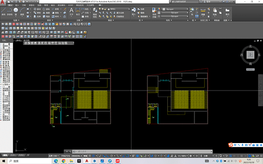
This is a community theater located in the street of New North Road, New Zealand. My mentor thought that my space design was too bland and boring, and suggested that I modify the form
I'll admit I didn't enjoy architecture school much, and really don't know what this assignment is about nor the specifics of what your professor has said. I still look back on my schooling and don't know what I was doing.
With that in mind, if you've presented the same material to your professor as you're presenting to us and in a similar way, I would say you need to step back and at least explain or discuss your starting point. I can't speak to your design as there's little context, and I'm also not on the receiving end of your tuition fees, but if someone told me I had a boring design I'd be asking myself the following questions.
1. What's important about New North Road? Why was it important to tell us in this post, but not explain how it's reflected in the design.
2. Why is anything where it is? Practicality? The Program? An experience as you move through spaces?
3. What inspired this? Is there a theme? Is there history?
4. What difference does it make that it's a community theater? Why would I visit this theater? What's the point of anything?
Boring layouts can be beautiful. In my first year studio I once did a very simple rectangular volume. My professor described it as a "nice swiss box" but told me with it's simplicity I had to think through all the details. In the year end review I was told I had many nice features although horrible bathrooms.
Nothing is ever a blank slate, something is informing this design. I don't know if it's good or bad. Maybe it doesn't need to change, but I don't know why I would come visit this theater.
Could you give me some advice on my plan of the theater
This is a community theater located in the street of New North Road, New Zealand. My mentor thought that my space design was too bland and boring, and suggested that I modify the form
I'll admit I didn't enjoy architecture school much, and really don't know what this assignment is about nor the specifics of what your professor has said. I still look back on my schooling and don't know what I was doing.
With that in mind, if you've presented the same material to your professor as you're presenting to us and in a similar way, I would say you need to step back and at least explain or discuss your starting point. I can't speak to your design as there's little context, and I'm also not on the receiving end of your tuition fees, but if someone told me I had a boring design I'd be asking myself the following questions.
1. What's important about New North Road? Why was it important to tell us in this post, but not explain how it's reflected in the design.
2. Why is anything where it is? Practicality? The Program? An experience as you move through spaces?
3. What inspired this? Is there a theme? Is there history?
4. What difference does it make that it's a community theater? Why would I visit this theater? What's the point of anything?
Boring layouts can be beautiful. In my first year studio I once did a very simple rectangular volume. My professor described it as a "nice swiss box" but told me with it's simplicity I had to think through all the details. In the year end review I was told I had many nice features although horrible bathrooms.
Nothing is ever a blank slate, something is informing this design. I don't know if it's good or bad. Maybe it doesn't need to change, but I don't know why I would come visit this theater.
holly menu bars Batman.
haha, I was thinking that too. On a 17" laptop screen that's like an entire inch lost to just icons.
Block this user
Are you sure you want to block this user and hide all related comments throughout the site?
Archinect
This is your first comment on Archinect. Your comment will be visible once approved.