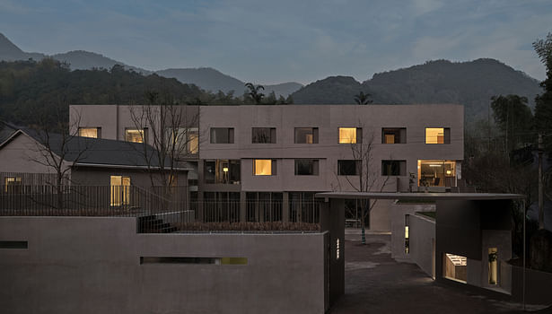
In the summer of 2021, Qingshan Village, which is located in Hangzhou City, commissioned TEAM_BLDG to complete the reconstruction of the long-vacant Longwu Spring Water Plant into Qingshan Co-space, which can accommodate "residence, office, exhibition, shops," and other functions. This project intends to construct a "Co-Living & Co-Working" building with areas that accommodate start-up businesses and temporary vacation-style jobs in the village. In addition on attempting to address the building's current issues, this reconstruction project aims to strengthen the bond between residents and residents with the village by creating a shared place in which both the existing and new villagers may engage and share among each other.
Come and halt
The Yuhang District of Hangzhou, where Qingshan Village is located, has strong rural economy background. Compared with traditional houses, wealthy local villagers prefer to live in brand-new self-built villas. Almost all of the few old houses have been renovated and used by the new villagers who have relocated here in recent years.
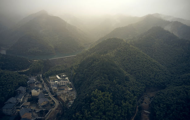
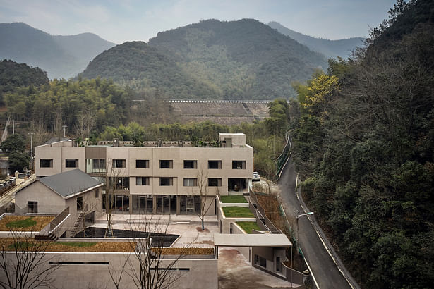
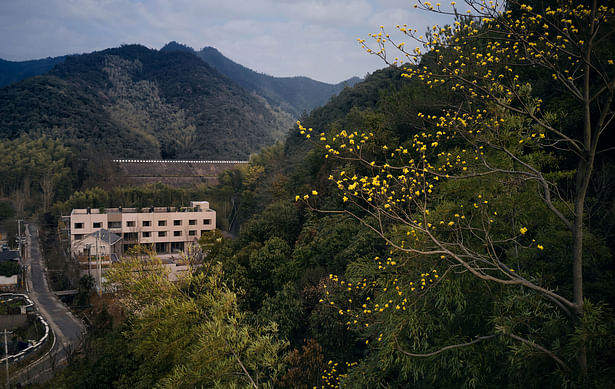
Although there are almost no traditional buildings left in the village, the natural village texture formed according to the water has been well preserved. As you go upstream along the river, you will pass by farmland and houses in several natural settlements alternately, and you will see bamboo forests and narrow roads. Walking to the center of the mountain is the most important water source in the village: Longwu Reservoir, and the last few buildings in front of the reservoir is the site of this project.
During the visits in the beginning of design stage, the architect found that no matter what kind of transportation people took to get there, most people would stop before arriving at the site and shift to walking due to the narrow and steep slope of the road leading to the reservoir. This strong sense of "stopping" provides some ideas for the later design. If the village is thought of as a house, the Co.space is like a study or bedroom, pleasant during the day and quiet at night.
Architecture - blending into the environment or into habits
The project's initial structure is a three-story half-frame building with an attached double-sloped roof chamber and a few single-story podiums. The enclosed factory buildings are connected to each other and have roof heights that decrease from east to west. Originally, this spatial arrangement was meant to accommodate the water plant's production and transportation lines while also being in keeping with the topography in the area. The site's north side has a creek that gurgles during the time of abundance, and its south side is near to a mountain with a varied range of biological species. The owner has assigned a simple design challenge. There are just two requirements in addition to fulfilling the space's numerous functions: the desire to blend in with the surroundings and the desire to create "real space".
Originally, the three-story main building had red exterior wall tiles , and the remaining buildings were painted in white. The older structures had poor connections to nature, and there even seemed to be a sense of conflict between some of them. Changing the facade's material and color can help a refurbished structure blend in with its surroundings, but this solution is too simple and uninteresting. From this, we conceptualized the "real space" the client had mentioned. Can the so-called integration be formed based on usage habits?
Terraces farmland
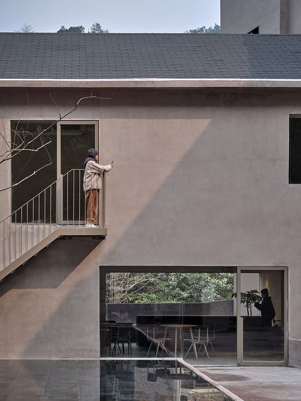
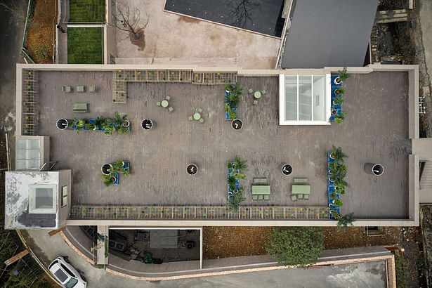
The factory's original purpose was "processing", but the attribute of the village was more of "planting". The design originally kept the factories connected, then enlarged the podium's original five spatial units to seven, creating a 0.75-meter stepped roof with a "回" shape. The "terraced" shape of the terraces is intended to compensate for the building's location on a hill while also enhancing the outdoor area and circulation. Second, the design divides a number of planting areas and rest areas on the roof of the podium, and lays out two 1.2-meter-wide walkways running through them. Long-term residents can grow vegetables, herbs and other simple crops here. On the roof of the main building, more than sixty 1-meter-high movable plant racks are used to enclose multiple groups of leisure spaces. The different levels of the roof add to the versatility of the view. The fifth façade, with its staggered heights, reflects the surrounding environment, and the relationship between architecture and topography and nature becomes closer.
Greenhouse
Many indoor spaces in cities have light and temperature set at constant values, making it difficult for people to perceive changes in natural factors throughout the day. In Qingshan Village, even with modern public facilities, villagers still rely more on natural light for their daily activities. For example, even if the roads in the village are well-lit, people are rarely seen walking outdoors after dusk. Based on these habits, we wish to improve the "variability" of the area and provide more natural light to the building.
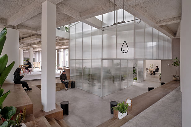
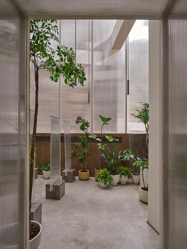
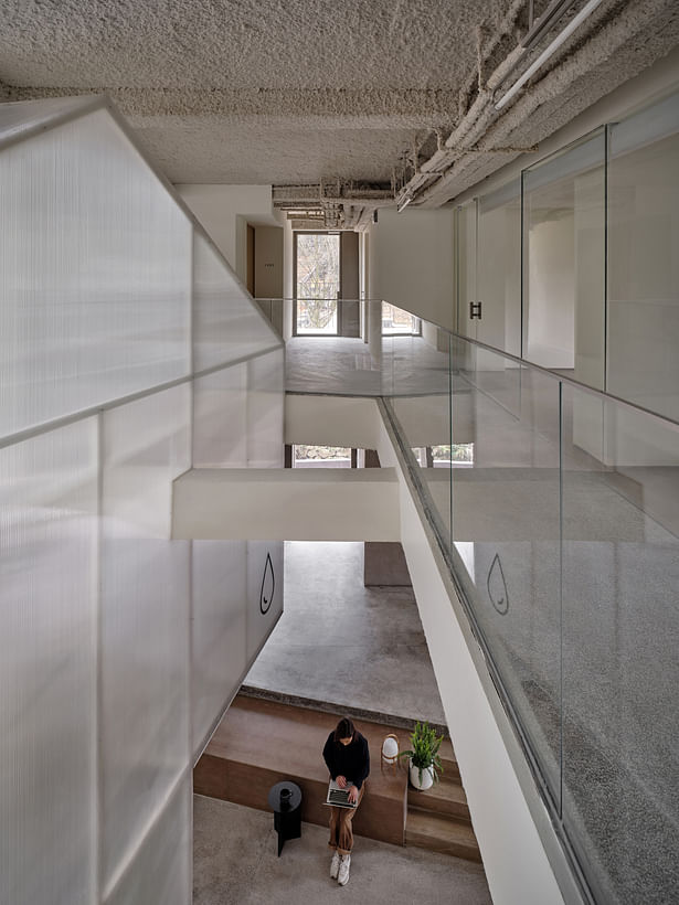
The client hopes to place an exhibition space with the theme of "water" in the main building, and the exhibits in it will be diverse. Inspired by the surrounding environment, we take advantage of plants to represent the idea of water. The design scales the double-slope roof house proportionally and "grows" it into the main building, creating a greenhouse about 7 meters high that runs through three floors to accommodate plants and serve as an exhibition hall. Sufficient natural light penetrates through the skylight onto the greenhouse constructed of polycarbonate sheets, causing refraction and dispersion, which creates a variety of tones and atmospheres throughout the day. This ensures that the plants are resistant to activity and also makes the greenhouse as the "core" of the entire project more attractive and transparent. At the same time, the design deconstructs the west facade of the main building into 11 units, with the greenhouse as the focus to form a wall composition that cascades and extends inward. It seems to be squeezed by the growth momentum of the "greenhouse", echoing the overall "terraced" form of the building.
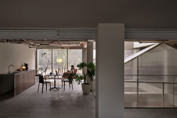
The first floor serves as a shared office space, it provides as many glass curtain walls as possible on the east and west sides to replace the original walls. More variations in light and shadow may take place in this area, and convection and ventilation are able to produce a spatial environment that connects the inside and the outside. On the second and third floors, two leisure spaces close to nature are created at the end of the guest room corridor by opening the wall and ceiling on the south side.
Interior- behavioral guidance space
In this place with an area of 2,000 square meters, it carries a variety of functions. If the people entering the building are classified by purpose, they may include: office, dining, visiting, gathering, cooking, workshop, long-term rental, short-term stay, and etc. Through spatial division and placement of circulation flows, it may be possible to prevent several flows of people from disturbing each other, but to a certain extent, it destroys the commonality of this random community and violates the original design intention of "real space".
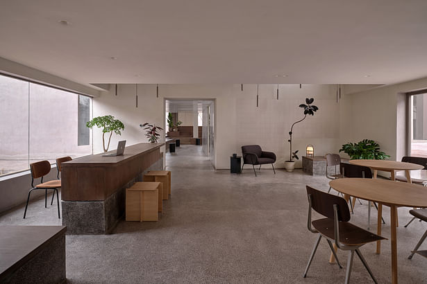
With the exception of the 23 guest rooms on the second and third floors of the main building, which are the highest level, we organize the users according to the level of privacy needs, and all public places are allowed a certain amount of freedom in accordance. For instance, the main building's first floor houses a public exhibition hall and reading room in addition to a shared office space that is accessible via card swipe. The only thing separating the two sections visually is a wall of greenery. With the exception of the two conference rooms, the common office space is an open, continuous area. The site is simply separated by the rising and lowering of the ground. There are no constraints on the precise functions of each region, so the users can alter the layout on their own.
Of course, some privacy is also necessary in such a liberated public setting. The design adds semi-enclosed rooms to a number of moving lines to offer some solitary places in "station" style.
It's important to note that TEAM_BLDG also handled the project's signage and guie design in order to guarantee that a vacant area won't pose problems for use.
Courtyard- Trees gather people
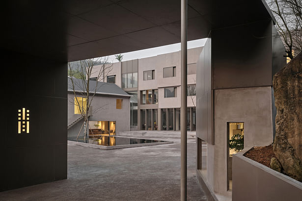
The Co.space's inner courtyard is where the designer gives people back control of the area. Only the trees and ponds were kept, despite the fact that the architect had made various layout arrangements and considerations in the early stages since they always felt like an intentional "imposition" in such a setting.
According to a new villager who has lived in the village for six to seven years, "big trees can gather people here, and everything else is secondary." In the end, the architect chose to plant three sapiums with wide branches and high fork points of the main pole. From May through July, the sapiums bloom, and the thick canopy provides shade. The vegetation is lush and withered, symbolizing the four seasons. On the other hand, the courtyard pool is an outdoor extension of the double-slope roof house, and the two have a vertical relationship in space. The pool is about 30 centimeters high, with water-brushed stone covering the bottom. When the water ripples fluctuate, it gives the square courtyard a spatial agility. So naturally, this is an open-air stage, a courtyard where people communicate and meet.
Construction- Save more energy for the second half of the process
Building a house in the countryside is completely different from that in the city. Architects are more like craftsmen due to differences in construction level and design cognition. The building phase requires more energy than the design phase since every aspect must be directly experienced from top to bottom.
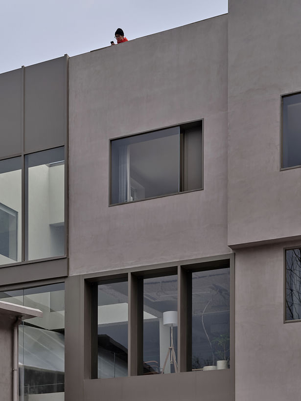
Co.space uses low-tech and low-cost building methods, yet it still requires designers to work for many months on more than 80 mock ups. Throughout this process, we also became aware of the progressive degradation and disappearance of several traditional rural construction methods. For example, the washed stone commonly used on rural building facades in the 1970s and 1980s has made it difficult to find skilled labors here. Even after switching to yellow sand lime for the outer walls, the technical issues with the building were remained unresolved. In the end, we had to choose a less "rural" texture paint. During the construction of the exterior wall, the architect increased the frequency of on-site visits and communicated with construction parties who had similar experience in past projects. This helped the master workers conduct repeated on-site tests on the color, texture, and thickness of the paint, creating some rough and uneven handcrafted traces that are more compatible with the environment, and the color is more similar to the local mountain red soil.
Despite this, the design made a conscious decision to avoid using standardized and industrially produced finished goods as much as possible and instead employed more unique and locally manufactured products. At the same time, TEAM_BLDG created two pieces of plywood furniture specifically for this project, and a modified and reproduced factory chandelier from the original building was installed. For on-site construction errors, rather than strict complete rework, it is more about making partial adjustments to make them reasonable.
Status: Built
Location: Hangzhou, CN
Firm Role: Architect
Additional Credits: Project Name: Terraced Courtyard | Hangzhou Qingshan Co. Space
Function: Residence、Office、Commerce、Exhibition
Design Period: 2021.06 - 2021.11
Construction Period: 2022.02 - 2023.05
Location: Hangzhou
Building Area: 2033㎡
Firm:TEAM_BLDG
Architects: Xiao Lei, Yang Yuqiong, Deng Zhaojing, Li Jiajun
Cooperation: N/A
Owner: Hangzhou Yuhang Greenwater Future Rural Development Co., LTD
Type: Architecture, Interior And Landscape
Custom Furniture、Lighting Design: TEAM_BLDG
Furnishing Brands: Lost&Found、PINWU、HAY、Flos、Workwonders、MUUTO、Artemide
VI Design: TEAM_BLDG
Status: Completed
Photographs: Jonathan Leijonhufvud
Assistant Cameraman: Wai Wai
