New York, NY
Scope of work:
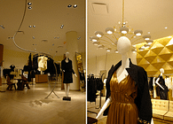
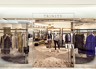
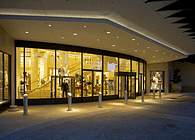
A new 90,000 s.f. store for Saks Fifth Avenue, located at Brickell City Centre in downtown Miami opened in December 2016. The store spans three floors (1st through 3rd levels) with access directly to the street and the open air mall at each level. The program includes all of the main merchandise product categories of a “full-line” store. Not included as a part of this project is a food hall on the 1st floor as well as a wine bar on the 3rd level. JHA and all consultants designed all elements in the project inclusive of finishes, fixtures, selection of furniture and lighting.
Project goals and objectives:
Create a unique and dynamic store for SFA that evolves the brand’s modern contemporary vocabulary and viewpoint. Given the multiple points of entry into the store, particular care must be given to the customer journey and establishing key focal points in each location to orient the customer and to provide them with an exciting introduction to the store. Since there are 3 levels, it is important to create separate identities for each floor that relate to the overall image of SFA. Additionally it is a priority to create a unique store for Miami – infusing local culture.
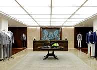
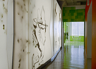
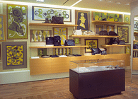
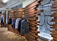
SFA is a contemporary luxury brand. While the design respects this vision, it was important to create a more unique design, with a nod to the location, Miami. For example, the decorative custom tile walls in the Beauty Department are inspired by an abstract painting. When the customer enters each floor, there is a distinct and separate feel or vocabulary for each one, but all of them relate to each other. For example, the customer enters the 3rd floor to a modern cubist inspired men’s world highlighted with a gray on gray palate.
Intended customer journey:
Given the various entrance points into the store, developing a clear point of view on circulation was critical. It was a client requirement to provide an escalator to access all levels in the store. The central location was selected to facilitate an increase in customer exploration. Additionally, it was important to establish other visual clues that there were multiple levels to the store, especially as you enter the store from each of its different locations. Finally it was important to create visual variation from one area (or floor) to the next to allow for visual “land-marking” and customer orientation.
Project Details - Branding:
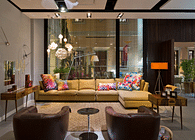
The design reflects a contemporary luxury brand through the variation of visual experiences and the material palate used. Particular attention has been paid to scale and adding residential sensibilities through a variety of seating areas, lighting and finishes as well as such signature elements.
Project Details – Graphics:
In keeping with the direction to reinforce SFA’s contemporary luxury brand, signage and graphics were designed to be consistent and minimal. There are no separate vendor shops and therefore signage could be consistently controlled.
Project Details- Circulation - Planning:
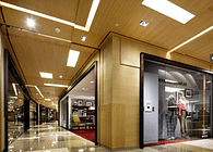
Each level has its own entrance from the mall and its own identity. The main floor is the Beauty Hall. The 2ndfloor is a “World” of Women’s and the 3rd floor is a “World” of Men’s. The design incorporates a central escalator, a stair and floor openings.
Project Details – Fixturing:
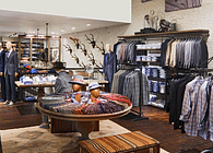
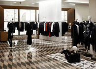
The fixtures are designed for an approachable shopping experience appropriate to the product category. Focus on the product was critical. The design of the fixturing and its arrangement allows for each product category to tell “stories”. Small alcoves were created to create more separation for specific product categories or brands.
Project Details – Finishes:
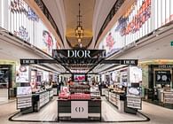
Beauty - geometric stone tile wall inspired by abstract paintings.
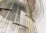
Staircase- gray oak paneling - interior and polished white powder-coated metal shell.
Women’s - deco inspired geometric crème and walnut color stone floor.
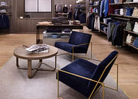
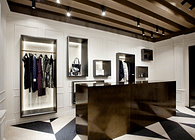
Men’s – Wood and Drywall cubist inspired forms. Oak flooring in two tones set in an abstract pattern.
Project Details - Lighting:
The design focused on two key aspects of lighting, Ambient lighting and Task (functional) lighting. Ambient lighting was critical to creating different moods and “highs and lows” in the space as well as add to the design character of each area.
Project Details - VM:
In keeping with the SFA brand, visual display zones are many and are located in key focal areas. All Visual display areas are intended to activate the space through dynamic groupings and positioning of mannequins and propping.
Status: Built
Location: Miami, FL, US
