
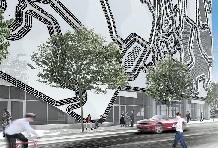
An eight-story parking garage and mixed-use office building becomes an ever-changing reflection of its street art surroundings with Faulders Studio's modifiable Wynwood Facade.
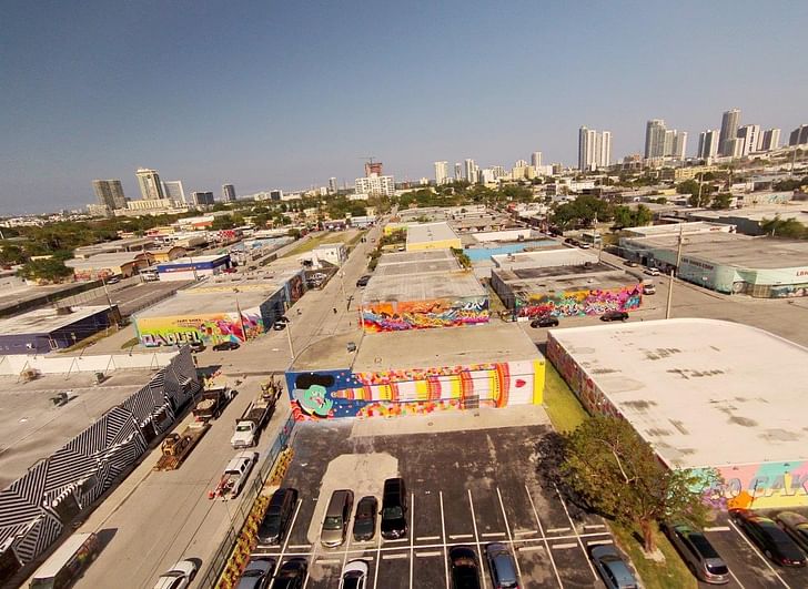
How can a building remain permanent while reflecting a constantly changing environment? Faulders’ Wynwood Facade, sited in the midst of a strong street art scene attracting visitors and graffiti tourists from around the world, reflects these surroundings with removable aluminum panels featuring work from a variety of different artists. It is this constantly updatable aspect of the facade that distinguishes it architecturally: a relatively unremarkable parking garage becomes a canvas.
And it's a welcome change, as the parking garage has long been one of our more underused, if ubiquitous, interstitial urban spaces. Too often, those office buildings that elect to build their own parking facilities create a moat of a parking lot, or if burying garages below ground, create acres of fluorescent-lit concrete warrens. It’s therefore a relief when an office building's above-ground structure plays host to a prominent and attractive visual feature. Miami in particular is no stranger to dramatic carchitecture, with structures by the likes of Herzog & de Meuron, Gehry Partners, Arquitectonica, WORKac and others. After all, Miami is a car-city, so its garages should rise to the same standard.
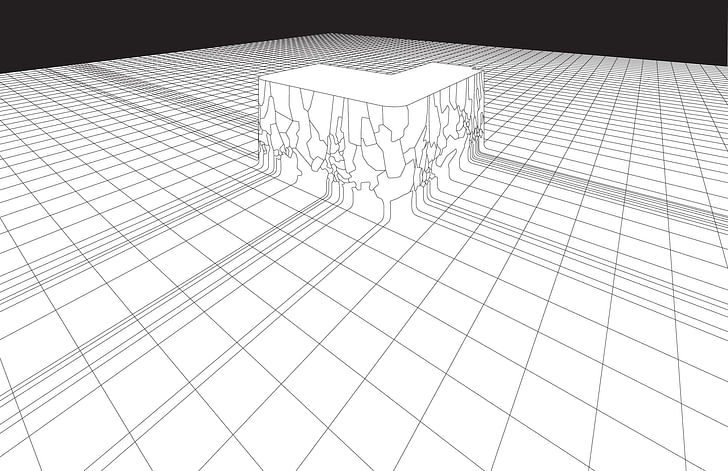
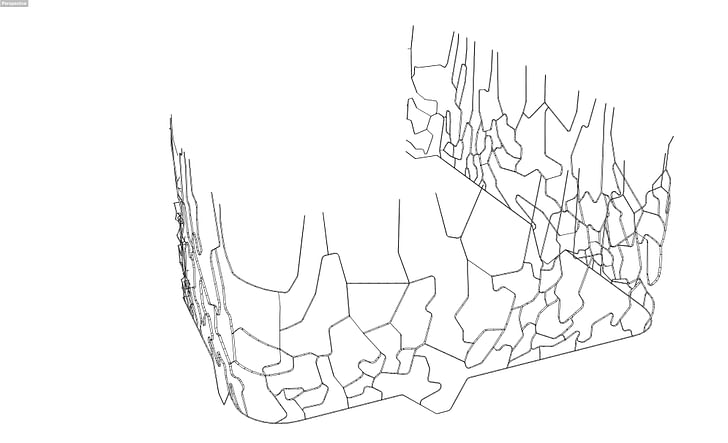
The Wynwood Facade changes via removable, irregularly-shaped panels dubbed “blankspots” that can be modified by a variety of different artists and then re-attached to the facade. The idea is to replace these panels on a fairly regular basis in the same way that the neighboring street art is gradually replaced by other work, creating an overlapping series of imagery and artistic visions.
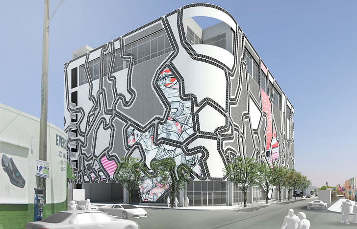
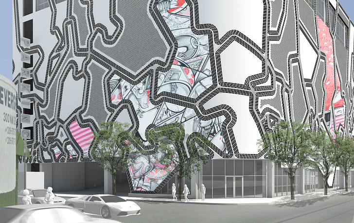
Digital printing technology allows artists from around the world to easily and remotely contribute their work. The panels range in size from 50 square feet to six stories in height, and are fastened to vertical metal supports. The building beneath is painted black to provide contrast to the white painted panels. The result is a facade that incorporates contemporary printing technology with the longstanding traditions of the neighborhood.

On the streets immediately adjacent to the building, low-slung warehouses with graffiti and elaborately conceived murals make up a vivid, industrial enclave. The eight-story structure is therefore something of a outlying giant among its neighbors; the facade helping to anchor the building into its context. There are numerous perforated panels that provide both ventilation and natural light to the parking garage behind the facade. The panels themselves experience subtle shadowing via a series of individually laser-cut and welded fins which are also painted white. As the sun passes overhead, the panels lend a kind of distinguishing depth to the smooth skin.
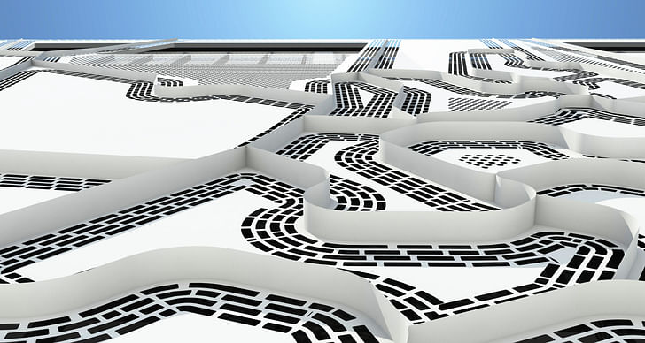
Due to the irregular shapes of the panels and specially rounded corners, the building beneath the facade becomes secondary to its aesthetic and communal effect: to be perpetually of the moment.
Julia Ingalls is primarily an essayist. Her work has appeared or is forthcoming in Slate, Salon, Dwell, Guernica, The LA Weekly, The Nervous Breakdown, Forth, Trop, and 89.9 KCRW. She's into it.
6 Comments
hey artists - come put your work in our irregular warped grid - no, we didn't want to make our design part of the art. Ever think there is a reason for the white cube or white surface....derp.
chigurh, the clean well-lit white box as a space for art is a long-dead idea. And this place is about *street art*. Street artists just need a flattish surface.
I reckon you're missing the point.
Donna that is not true at all about the clean well lit box - look at every contemporary gallery and recently completed museum - gagosian, zwirner, gladstone - new museum, broad, SFMOMA - all of those gallery spaces are exactly that. Most artists have a very difficult time working in spaces where the architecture directly competes with the art or interferes with the desired configuration of their work - bilbao is a classic example. On top of that - just because the artists intended to host work on that building are street artists, I really doubt they would want to crop work to fit into these oddly shaped areas. My whole point being, is that skin is all about its own artfulness (even though I find it tacky) - not about a street artist showcasing their work. If that is the intent then houston street wall is a much better example of how that should be handled. The "art" component to that design is totally secondary to this hokey warped grid that is going to look entirely dated and terrible in 10 years.
chigurgh - street artists that I know fit themselves into oddly shaped spaces all the time. It's part of that mode of working that you have to deal with givens. This might be a bit turned up and overdetermined, especially with the dotted lines everywhere, but it'll be interesting to see how artists respond.
I love the drawing that shows the lines of the city crawling up to compose the facade, but I don't see that as present anywhere in the more realistic renderings, mostly because the whole thing loses its connection when it's lifted up one level. Nice idea and a beautiful drawing, but it seems like post-rationalization.
I hear you chigurh but honestly, with barely any exaggeration: I haven't seen any really good contemporary art that *wasn't* in some way street art or street art-informed in a decade. The white box is a great way to turn art into retail - it's shorthand for "You'll be sophisticated if you buy this."
Block this user
Are you sure you want to block this user and hide all related comments throughout the site?
Archinect
This is your first comment on Archinect. Your comment will be visible once approved.