
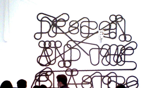
In the past few decades, individuals have experienced dramatic changes in some of the most established dimensions of human life: time, space, matter, and individuality. Working across several time zones, traveling with relative ease between satellite maps and nanoscale images, gleefully drowning in information, acting fast in order to preserve some slow downtime, people cope daily with dozens of changes in scale. Minds adapt and acquire enough elasticity to be able to synthesize such abundance. One of design's most fundamental tasks is to stand between revolutions and life, and to help people deal with change. Designers have coped with these displacements by contributing thoughtful concepts that can provide guidance and ease as science and technology evolve. Several of them—the Mosaic graphic user's interface for the Internet, for instance—have truly changed the world. Design and the Elastic Mind is a survey of the latest developments in the field. It focuses on designers' ability to grasp momentous changes in technology, science, and social mores, changes that will demand or reflect major adjustments in human behavior, and convert them into objects and systems that people understand and use.
MoMA.org
To mark the closing of MoMA's special exhibition Design and the Elastic Mind , Archinect would like to present the following set of reviews that cover the show's web space, individual pieces of interest, and the themes at play throughout. For those of you that were able to visit the show, we hope reading the perspectives of our guest contributors will compel you to share your own in the comments section below. For those of you that weren't able to make it, we hope you will find this glimpse intriguing...

Brian Moroz
Brian Moroz began his academic career in film. He obtained his masters in Medical Sociology and then promptly became a futures trader. After some time, he moved to New York to work for Reuters. Currently he works at Google, where he analyzes businesses for them.
According to the site designed for the MOMA Design and the Elastic Mind exhibit, "Adaptability is an ancestral distinction of intelligence..."
Not really. Ask a daisy. Highly adapted, many organs, deeply evolved genetic structure. Not much for chess. Missed metaphors and strange analogies abound on the site.
The first element of the online exhibition that strikes me is the redesign, poorly, of standard browsing navigation. Confronted by a wall of text one attempts to learn how to move within it. Frustration begins with the arrows that appear on the right and left side of the screen. Click the left hand arrow, see what I mean. Traditional browser buttons like the Back button don't work, increasing frustration. My focus shifts almost entirely to the interface, leaving the art (and science and ungodly vistas of white text) behind, as 'design' takes front stage.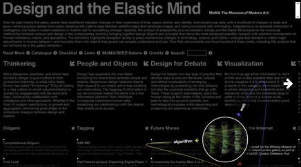
Screen capture from www.moma.org/exhibitions/2008/elasticmind/
One interesting aspect of the web is that it is about 20 years old, maybe, depending on your definition. Give or take. So we are looking at a medium that, unlike the book, say, or even the newspaper, hasn't had centuries to evolve. We are in the middle of the bloody, wet birth of this nascent creature. That said, the nature of the web lets designs and interfaces flourish and die at astounding speeds. This is why the browser has settled on it's current design- it works for everyone, pretty much across cultures, ages, language. It makes simple, intuitive sense. We won't discuss the inelegance of a qwerty keyboard or a mouse here, since software always outpaces hardware in iterations. My experience of Design in this exhibit is a website in which they (the Designers) have disrupted my usual techniques of manipulation, and done so to my dismay and annoyance. Like a book where the subtle but incessant grammar and typesetting errors drag your mind from the narrative to focus on structure, the Design and the Elastic Mind site presented a wall between me and the art by it's very construction.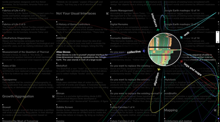
Screen capture from www.moma.org/exhibitions/2008/elasticmind/
I wish I knew of some historical use of fireworks to distract an enemy army, perhaps in imperial China, or maybe some moment where they were used to confuse a flock of geese for mythical reasons. I really crave an analogy for the images that pop up every few seconds, arcing like tracer fire across the text I'm trying to read. Imagine a Bladerunner-style electric novel, where every other page or so a hologram ad popped up- small enough that you could read around it, but colorful and animated and bright. That's the look here.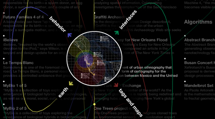
Screen capture from www.moma.org/exhibitions/2008/elasticmind/
The 'virtual exhibit' seems intent on explicitly disallowing submersion in any one project, tract of text, or even area of the site. If you consider a website as a physical space (as, indeed, many web designers do, using terms like 'screen real estate') the DEM site is closest to a carnival or, perhaps more directly, a casino. 1000 ways in, no way out. It encourages, no, demands an attention deficit. Until, that is, you click on a specific piece. For me, the sensation distinctly paralleled the experience, late at night, when a car alarm is going off outside your window, whoooop whooop whooop beeeeep beeeeep beeeeeep unnnnngh unnnnnnhg and then... it stops. Clicking on any of the pieces feels like a mental exhalation, a freeing of trapped limbs or compressed lungs. To my surprise, these oasis of flat, quiet recess are actually pleasant.
Screen capture from www.moma.org/exhibitions/2008/elasticmind/
I'll leave to finer critical minds than my own to discuss the relevance, importance or beauty of the individual exhibits. I frankly find them interchangeable. Nature items? Delightful. Science? My favorite. Interfaces, the Web- once sunk into a field, a parameter, the online exhibit goes from unbearable to hypnotic. As a Google employee, this isn't my favorite, given the multiplicity of clever and valuable Maps mashups, but it is fun: http://www.moma.org/exhibitions/2008/elasticmind/#/228/ Even more so when paired with the text which accompanies it. Did Jah Rastafari have bladder control issues?
For an exhibit that has an entire tagged library of art based on Interfaces, the DEM exhibit online has a markedly disruptive one, until you relent and dive. It creates a barrier that you have to struggle with to gain from. Maybe that's the point. Maybe I'm being conciliatory. I'm really not sure. And I suppose I'd count that as a small success, or, to my preference, a fortunate and lovely mistake of deeply wayward design.

Mimi Zeiger
Mimi Zeiger founded loud paper , an architecture zine and now blog, in 1997. A Brooklyn-based freelancer, she writes on art, architecture, and design for a variety of magazines including Architect , Dwell , and Azure . Zeiger is a contributing editor for Architect and author of New Museums: Contemporary Museum Architecture Around the World .
Hearts and “Mind” [excerpted from upcoming CMYK magazine article]
Design and the Elastic Mind, on view at MoMA through May 12, 2008, sets out to map what is going on in today’s rather murky design culture. The project is ambitious enough to sum up radical changes in technology and science—a weighty subject, which encompasses both the Internet and nanotechnology—and then place design as the great interpreter of innovation. “Designers stand between revolutions and everyday life,” reads the wall text that greets visitors at the entrance of the museum’s sixth-floor gallery. The statement raises expectations of what it means to be a designer; just tackling form is no longer enough, a lab coat is required. Scientific inquiry and research is the trend.
Organized by MoMA’s Department of Architecture and Design curators Paola Antonelli and Patricia Juncosa Vecchierini, the cross-disciplinary exhibition brings together every type of designer: graphic, interactive, and industrial, as well as architects, engineers and actual scientists. With some two hundred objects and installations, the displays have a science fair urgency—drawings, photographs, models, mock-ups, text, and video all vying to be understood. Given that a number of the projects have an anthropomorphic quality to them, this eight-grade longing for the blue ribbon isn’t such a stretch. To tame potential chaos, the curators organized Elastic Mind into three broad categories: small scale, human scale, and large scale.
If there is scientific discipline that wittingly or unwittingly emerges from the show, it is biology (with a slight whiff of health class from the future.) “Human scale” is represented by design in all its odoriferous and hairy glory, such as the prototype, Smell + (2006-2007) by collaborators James Auger and Jimmy Loizeau, and the support of the Design Interactions Department at the Royal College of Art (RCA), London. The piece is powered by pheromones: suction cups at a user’s pubic and arm pit areas are linked to plastic tubing trade body odor with a potential partner. Each unique smell is inhaled through a facemask and can be used to screen for mates and genetic matches.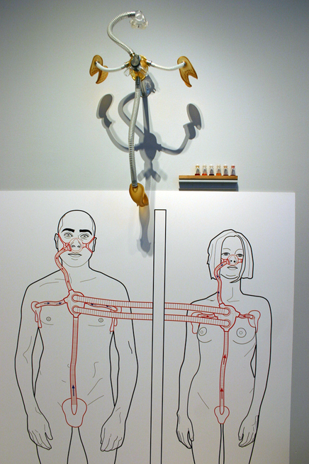
Smell +. Prototype. 2006-07
image credit: Ryan Somma
Susana Soares’ Fertility Cycle Object from the BEE’S project (2007), another entry from the RCA, takes advantage of bee’s ability to respond to odor and toxins. A plastic globe fitted with a mouthpiece and three internal chambers, the piece uses bees to identify pre-, post-, and current ovulation periods. The user blows into the globe, and the bees collect in the appropriate chamber. As if scent wasn’t bodily enough, skin, fingernails (by way of additional RCA designers), and hair are part of a possible CSI subtext to the overall exhibition. Stuart Karten Design’s conceptual Epidermits Interactive Pet from the Cautionary Visions project (2006), uses tissue samples to generate toy-like organisms. Modeled on the Tamagotchis (handheld digital pets) craze, each Epidermit takes on hair and skin characteristics mirroring the DNA sample, and can be tanned, tattooed, or pierced. According to Karten, this “Chia Pet with real hair” is a cautionary tale of muddling with Mother Nature.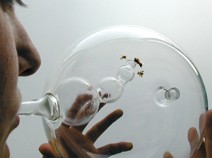
Fertility Object. Prototype. 2007
image credit: Susana Soares Epidermits Interactive Pet. Model. 2006
image credit: Stuart Karten Design
There is something comfortingly familiar rather than shocking in all this derma and ruff. The MoMA’s collection contains Object (Le Déjeuner en fourrure), (1936), Meret Oppenheim’s fur-covered cup, saucer, and spoon—a touchstone of Surrealist art. The pelts render the teacup simultaneously useless and sexual. Like a number of the Elastic Mind prototypes, the artwork is less about function than social commentary. Noam Toran Accessories for Lonely Men Project (2001) continues the history of the surreal object. The Chest Hair Curler , for example, does what the title says: it mimics the feeling, physical and emotional, of intimate gestures. Accessories is shown in conjunction with Toran’s Object for Lonely Men, a 2001 video that tells the oft-repeated story, Frankenstein or Metropolis, of a man building his dream partner out of parts.
The charge commonly lobbed at contemporary culture is that with this revolution in communication (email, SMS, cell phones, etc.) individuals still bowl alone. The emotive quality of the human-scaled part of the show reflects this struggle. Yet it isn’t a particularly contemporary existential plight. Both the Dada and Surrealist movements were artistic-cum-psychological responses to trauma in the wake of technology. Bridging the gap between online experience the real world is PainStation, a prototype by the German team of //////////fur//// art entertainment interfaces , Volker Morawe and Tilman Reiff. With a big graphic nod to Sony’s Playstation (2001-04), it’s a two-person console that emits shocks or whips to the player’s hand as he misses points. With the consequences of losing this real, the virtual is appealing.

PainStation. Prototype. 2001-04
image credit: www.fursr.com

Rosten Woo
Rosten Woo is the executive director and co-founder of the Center for Urban Pedagogy, a non-profit organization that makes educational projects about places and how they change. He teaches design history and theory at Parsons, the New School for Design and produces historical research and writing on history, design and public policy for Place Matters, the Municipal Arts Society, Metropolis Magazine and the Village Voice.
“Landscape with figures with gadgets. True sons of Archimedes, the Americans have gone one better than the old grand-daddy of mechanics. To move the earth he required a lever long enough and somewhere to rest it – a gizmo and an infrastructure – but the great American gizmo can get by without any infrastructure.“ - Rayner Banham - the Great Gizmo.
Jack London fights Rayner Banham and Rachel Carson in Douglas Turnbull’s spaceship.
As I walked into the show a man yelled into my face (through his cell-phone) “I can’t talk right now, I’m at the most AMAAZING exhibition!” It was an apt introduction, being there feels less like stuffy MoMA and more like being at a world’s fair or Expo 86. Not just for the crowds, but for the atmosphere of giddy techno-optimism. Regardless of the curatorial intentions the first response to what’s on display is unmediated gee-whiz: “Helen, come here, look at THIS!” The exhibition’s curatorial statement suggests that the focus of the show will be designs that help us cope with a changing world, but the few low-tech interventions featured (a set of pins, some wooden dolls) seem positively out of place. The real theme of the exhibition is technology, obviously.
At the same time, it's not at all like a world’s fair. Design and the Elastic Mind is preoccupied with anxiety, discomfort, and unease (especially in the sections that aren’t clearly bookmarked that way). It’s a world’s fair in spiritual crisis. No longer convinced that technology can deliver us from trouble, how should we engage it? But the exhibition turns out to feel much more like a false argument than it should. The exhibition flirts with an earnest interest in the way design can be useful, but can't tear itself away from its fascination with design as an aesthetic reification of our terrible predicament. Mind-expanding, sure. But the show also exaggerates the autonomy of design as a solver of problems, and (in a mutually fulfilling way) exaggerates the unsolvability of the problems themselves.
The opening bays of the exhibition are devoted to designer’s attempts to relinquish human agency. What if we generate our designs from algorithms? What if we model our forms on animals? What if we just let plants and insects produce our forms outright, no questions asked! A related anxiety hung out in the checklists. Some works listed, traditionally, the physical materials of the object before you; others listed the various software applications employed in the design, others list nothing at all. A series of children’s drawings are noted for their imaginative concepts, but the children go, oddly, uncredited, in favor of their RCA-student teacher. They’re like the bees elsewhere tasked with producing a vase –a natural, anonymous resource for exploitation! A great number of included works are noted as prototypes, in development, and dated as “ongoing.” This ambiguity provokes the question: what are we looking at then? works? ideas? ideas for works? tech-demos? Admirably, perhaps, the exhibition is unclear. At times, you feel like you’re being bombarded with thought-experiments more than objects.
These projects, meditations on a friendly competition between human ingenuity, the integrity of natural forms, and the changing nature of the design process, open up into the terrors of the larger exhibition space, a showcase of scattered attempts to use technology to improve the human condition –mostly attempts to mitigate or tolerate our previous attempts at the same.
Rather than treating these problems or their proposed solutions in a historical context (a good counterpoint would be “Sorry, out of Gas” organized last year at the CCA), we’re treated to a barrage of objects (mostly designed in the last five years) that seem mostly chosen for their ability to evoke the terrible conditions that they might be required for. A big swath of the exhibit looks like it descends (still!) more or less directly, from Stanley Kubrick and Douglas Turnbull. Even the most straightforward projects (air purifying planters for instance) seem to be as much informed by dystopian science fiction as anything else. Lot of smooth white plastic. Even the most uncomplicatedly cheerful augmentations (an exoskeleton that allows people to pick up many multiples of their body weight!) come with sobering, anxious back stories (designed so that hospital orderlies can move around Japan’s increasingly aged and feeble population in their hospital beds!) Instead of feeling comforted by the ingenuity of the solutions, we’re left feeling a little queasy – thinking about the scope of the problems these gadgets are designed to combat.
If we can no longer credibly believe that our role is to conquer nature, Jack London-style, or harness nature with optimistic gizmos, Rayner-Banham style, what then? Is the world even knowable? The data visualizations that make up the back third of the exhibition suggest that it’s not. While truly remarkable advances in humanly graspable visualizations have been made, most of the selections made here focus on visualization as a portal to the numerical sublime. Uncountable paths cloud almost every visualization on offer. I'm reminded of the David Berman lyric “Is the problem that we can’t see? Or is it that the problem is beautiful to me?”

Michael Surtees
Michael Surtees publishes the daily blog DesignNotes.info in which he tries to see life filtered through design as opposed to placing design on a pedestal. When Michael is not talking about design, he's the Design Director of Daylife. Originally from Canada he now resides in New York.
When it comes to design in galleries I’m of two minds. On one side design becomes something tangible when it’s in its natural environment. Of course all design is not something that you can hold in your hand which makes it debatable how you express ideas as part of the process before it becomes a "thing." On the other side galleries are a neutral environment that allows for exploration of concepts that in theory do not have the same financial pressures that a design would have in the marketplace.
I wasn’t really sure what to expect with MoMA’s Design and Elastic Mind Exhibition. I didn’t do a lot of background research before I stepped in. My simplified over view of the exhibit was that MoMA wanted to attempt to show examples where science and design are coming together to create new things and in turn change the world (for the better). Anyone that has hung out on a design blog will no doubt recognize a number of the objects on display. A crowd favourite was the video of Sketch Furniture by the Swedish design firm Front Design. There was a number of samples of the furniture. It was something that I appreciated seeing in three dimensions after their video had been release on the net. Looking at the objects in person it made me wonder how strong they actually were. Could you sit on a chair and not worry about it breaking? I also wondered how heavy it was too - was the plastic lightweight?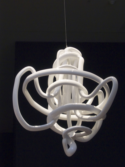
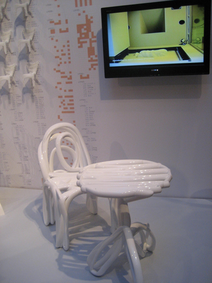
Sketch Furniture. 2005
image credit: Michael Surtees (1), Joanna Berzowska (2)
For all the things that were familiar there were things that I had no background on. The section on nano design became a blur to me. The images made interesting patterns but I had nothing to compare it with in my daily environment. I felt that maybe for others that were going through other parts of the exhibit may have felt the same way about other things. If there was one thing missing from the exhibition, it might have been to create some context for how the products would exist in the outside world more explicitly.
One of the more important concepts that I think a lot of people may have missed with a passing glance was the Dressing the Meat of Tomorrow by James King. I was first introduced to the idea of "disembodied cuisine" at a talk with Anthony Dunne from the Royal College of Art last year. It’s essentially meat that is created in a laboratory. Compared with the energy and waste that real livestock produce, this could be a convenient solution via sustainability. Of course if this meat can be created, what’s the aesthetics of the form and flavour(s)? As an opportunity to create new forms I find the idea quite compelling. I expect to see more of this visual experimentation in the upcoming years.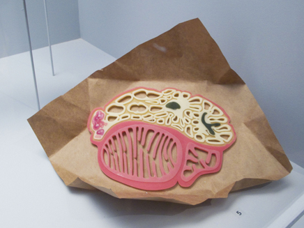
Dressing the Meat of Tomorrow. Model. 2006
image credit: Michael Surtees
For anyone that is interested in visualization there’s a number of examples. There’s both examples that you can see on the net like Flight Patterns while others were created specifically for this exhibition. Another talk I saw more recently was with Jonathan Harris who talked about "I Want you to want me" which MoMA commisioned. It’s an interactive piece in the true sense in that you press the screen to see an exploration of Web dating. Another project that I think has a lot of potential but isn’t entirely understandable was NYTE . The display was quite high so I couldn’t exactly tell what was going on - it’s probably better to check out the site at www.senseable.mit.edu/nyte before visiting.
There’s a lot to take in with this exhibition and it became apparent that I did miss some stuff after looking the Design and Elastic Mind Exhibition website at moma.org/exhibitions/2008/elasticmind/ and the book that I bought. Design and Elastic Mind is on till May so I suspect that there will be a lot written on the topic of Design and Science merging in the context of this exhibit. That’s a good thing because I don’t think that topic is going to be disappearing anytime soon.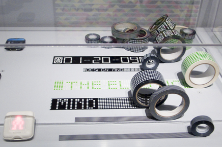
Instant Labeling Tape. 1999
Pixel Tape. 2005
image credit: Michael Surtees
You can view all the photos that I took of the exhibit here .
As an addendum to the photos, it was interesting to see a couple of the designers from the exhibition favourite their work that I took photos of via flickr.

Adam Greenfield
Adam Greenfield is Head of Design Direction for Nokia Design, and an instructor at New York University's Interactive Telecommunications Program. Adam speaks frequently on issues of design, culture, technology and user experience before a wide variety of audiences. In the last two years, these have included the Royal Society of London, Harvard's Graduate School of Design, the LIFT conference, the International Conference on Pervasive Computing, and AIGA's DUX.
Here’s the thing: curatorially, “Design” is a mess. It's overly ambitious, it overreaches, it tries to shoehorn too many entirely unrelated phenomena into one proposition. And yet, at the same time, it fails to draw at least some of the really interesting connections that should have been made. (For example, I was particularly disappointed that the show didn’t connect the dots between Aranda/Lasch’s awesome generative-algorithm piece Rules of Six and Tomás Gabzdil Libertiny’s equally beautiful, made-entirely-by-bees Honeycomb Vase.)
Rules of Six. 2007
image credit: Anna Lee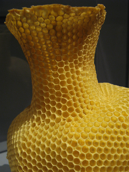
The Honeycomb Vase "Made by Bees." Prototype. 2006
image credit: Anna Lee
The "Design for Debate" section, I thought, particularly suffered from a lack of contextualization. Many of the more conceptual pieces here - and here I’m thinking particularly of Noam Toran’s and Dunne & Raby’s - need a good deal more explication, at least if visitors outside the particular social/intellectual fold in which these artifacts were produced are not to take them at face value, which is something I overheard happening. And wouldn't it have been more "elastic" to have allowed the logic of exhibits to cross-fertilize, rather than segregating infovisualization here, new-materials work here and algorithmic design over there?
Practically, too, there were shortcomings, not all of them due to ambition. Clumsy user flow through the galleries made contemplation of any one work particularly difficult, the show’s Web site is all but useless, and the attempt at information-design graphics bizarre and ineffectual. (In this latter regard, I surely applaud the designers' attempt to incorporate some Ed Tufte sparkline action, in the form of odd little illegible “scale” icons, but it might have helped if the icons had actually conveyed information useful to the viewer's understanding of a given piece.)
But at the end of the day, the thing I had the most trouble with was trying to figure out what, if any, coherent argument or proposition could possibly undergird everything I was being exposed to. Honestly, I would have had much, much more respect for Paola Antonelli and MoMA had they merely called their show “Here’s A Bunch Of Really Cool Stuff,” and left it at that.
However.
All that said, it’s a great show. It’s great because these are exactly the ideas and materials and practices and strategies that I’d want an authoritative institution like MoMA presenting to its audience at this point in history. It’s great because it doesn’t need to be coherent to be important. It’s great because you can never say “selective laser sintering” too many times. Never least, it’s great because of the sheer and considerable beauty of so many of the artifacts on view.
I mean, of course I’m biased - they're good friends - but Stamen’s Cabspotting in the new, bespoke colorway produced for the show? Stunning. But not more stunning than Joris Laarman’s Bone Chair , Rules of Six, or Brad Paley’s TextArc. Simply put, there's more astoundingly beautiful (and more provocative, and more resonant) work up on the sixth floor at this moment than there has been in a very long time; friends told stories of wandering into the museum's other, more conventional galleries afterward, and hearing other visitors trying to interpret a Picasso in the context of a dynamic visualization, Schwitters in the light of a permutative assembly. That's brilliant.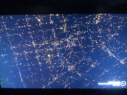
Cabspotting. 2004-ongoing
image credit: Adam Greenfield
TextArc. 2001
image credit: W. Bradford Paley, Digital Image Design Incorporated
If you can manage to unpack the actual projects on display from the relatively unconvincing rhetoric surrounding them - and fortunately, this is not difficult - you will have a wonderful time at “Design and the Elastic Mind.” You will definitely see minds being blown and fun being had, simultaneously, which is a neat trick for any cultural institution to pull off, and especially one so set in its rails as MoMA. There is of course always abundant reason to be depressed about the state of the world, but in some of the specific strategies, philosophies and processes on view here there’s also just enough support for reasoned hope. Experienced in the presence of others’ (occasionally perplexed, but genuine) delight, if the prospect of that hope doesn’t get you out to MoMA to check this show out, then nothing will.

Addie Wagenknecht
Addie Wagenknecht‘s interests vary from generative art to biomimetic architecture and exploring remote regions of the world. She is currently an Artist and Fellow at Eyebeam in New York City, where she hopes to challenge the status quo and create a sense of bittersweet irony (preferably both at once). Addie is also the other-half of studio NOR_/D.
http://www.nortd.com
http://placesiveneverbeen.com
Art is shifting.
The type of person who defines art and the people who view those definitions are also shifting. Anyone who has attended Design and the Elastic Mind exhibit can see the obvious shift in demographics. Art is no longer for the elite social classes who stand in front of an oil canvas.
Art's definition much needed shift is happening before us.
People no longer look at art from a distance but instead are actively engaged in the pieces, art is no longer a static representation of an artist intentions, it has become a reactive collaborative relationship between the viewer and the maker. In many pieces within the Design and the Elastic Mind exhibition, the piece does not exist without the user or external inputs.
The starkest reaction occurred during this exhibition. The rooms where the new installation took place were loud and exciting and young-- when you transferred spaces, the silence sat in, the rooms filled with paintings were empty and dead of any presence.
Museums must be acknowledging this at some level, attendance to openings and exhibitions will dramatically increase when the artist and the viewer are allowed to collaborate. Thankfully the MoMA is realizing this and appears to have started to actively shift its collections.
Fred Scharmen
Fred Scharmen is an unlicensed architect, amateur urbanist, part-time writer, half-time photographer, and former professional DJ. He has studied Port Infrastructure in Scandinivia, Figurative Intricacy in Southern Spain, and Post-Precarity Labor Politics in Los Angeles. He currently works at Ziger/Snead and lives in a warehouse by the railroad tracks in South Baltimore.
Information Starchitecture
'The street has its own uses for things'
- William Gibson, Neuromancer
It is fun to be an architecture student. We know the salty tang of laser-scorched chipboard, like chemicals and barbecue sauce. We let our computers mercilessly grind for hours, calculating the path of light through an imaginary place. We feed vectors to Adobe Illustrator until it rolls over and dies. We use industrial robots, as large and expensive as luxury cars, to make delicate objects out of foam and dust. Few other demographics are as adept at this kind of misuse, re-use, and abuse of technology. We can program these machines to destroy themselves.
Architects, especially those of us that are relatively new to the field, have become inured to the use of CNC fabrication, augmented reality, visualization, scripting ... not to mention all the cultural/ science fictional narratives that get spun out to support and contextualize the accompanying artifacts. One of the greatest pleasures of MoMA's Design and the Elastic Mind is watching people outside those discourses discover these things for the first time. The show is complete sensory overload, and when I was there, the civilians were literally freaking out because they had no idea any of this existed.
The Elastic Mind of the exhibition's title is curator Paola Antonelli's tag for the state of almost suspended belief that a designer must maintain to find out what things want to be. In her catalog essay, Antonelli sets up the complexities of scale, hierarchy, category, and objecthood - all inherent in the disruptive tendencies of new technologies - against the desire of the 'the masses' for a simple, intuitive relationship with everyday stuff. It is designers who must take up the slack, remain elastic, to find the patterns and interfaces that translate possibilities into things.
In that old William Gibson quote above (Neuromancer was published 24 years ago!), read "the street" as "architecture and urbanism". It's an obvious leap, but it foregrounds the notion that one way to navigate and negotiate through this territory is to think like an architect. Those familiar with the field will recognize Cecil Balmond, Xefirotarch, Chuck Hoberman, Neri Oxman, Aranda/Lasch, and Greg Lynn FORM.
But there's another angle here, and that's the nascent field of Information Architecture. The assumption behind the term is that to organize and present information on a sufficiently large and complex scale is to perform a task comensurate with the orchestration and coordination necessary to construct a built space. From there, it would be too easy to call out other participants like Stamen, the Graffiti Research Lab, and Ben Fry as 'Information Starchitects'.
This show illustrates that what's at stake here is much larger. The best work here (and almost all of it has been produced by the aforementioned people and groups) hints at the existence of another, more all-encompassing way of working and making: a yet-un-named field that comprises the kind of systems-level thinking that architecture itself might be a subset of. Locally customizable objects with their own displays, data halos, and communications protocols are the components of the coming world, they wil define our appliances, our houses, our cities, and to some extent, our societies. In this show there is a template, or really several templates, for making sense of that.
Design and the Elastic Mind is useful not the least for recognizing the elastic boundaries between art and design, and it almost single-handedly makes the rest of MoMA seem obsolete and irrelevant (an impression that I really hope is just temporary). But it's also inspiring because it has mixed up the scales and levels and methods: putting designers and civilians in the same state of childlike wonder at the possibilities, and also introducing diverse fields into each other's elastic mindsets, to hopefully help us realize that we have more in common than we know.
Archinect would like the thank our guest contributors for submitting their thoughts to this feature.
Creative Commons License
This work is licensed under a Creative Commons License .
/Creative Commons License
Aaron Plewke is an associate at Deborah Berke Partners. He designs and manages projects in all sectors, distilling each client’s needs into unique, transformative solutions. Aaron began practicing architecture in 2005 and has worked in Florida, St. Louis, and New York, on projects ...
1 Comment
Great review and format - thanks for the variety of perspectives.
Block this user
Are you sure you want to block this user and hide all related comments throughout the site?
Archinect
This is your first comment on Archinect. Your comment will be visible once approved.