

The development of specialized treatments of concrete and glass, customization through digital fabrication, and parametric design tools have brought about a contemporary resurgence of surface articulation, reopening the general issue of surface composition as a “legitimate” aspect of design, after almost a century of (near) omission by modernism. A wide variety of firms, among them Zaha Hadid (Patrik Schumacher), Herzog and de Meuron, Weil Arets, Aranda\Lasch and Foreign Office Architects, have been reintroducing this aspect of design -- most notably the last, which in addition to built work, Farshid Mousavi’s The Function of Ornament includes surface articulation as part of its theoretical explorations.
With this current resurgence of surface articulation comes a renewed value in revisiting historical examples from veins of architecture that have previously pursued this line of development, with Islamic architecture being particularly relevant due to its avoidance of representational iconography in favor of highly sophisticated geometry and pattern. What follows does not attempt any sort of general survey or overview -- instead it focuses on two features of the surface articulation of one building, the Sheik Lotfallah Mosque (1618) in Esfahan, Iran, one of the gems left by the Safavid dynasty. The goal is not reverse engineering all the surface articulations in this building, as this would require volumes; it is simply to record a couple of the things I noticed while there. I claim no authority in Islamic Architecture -- what follows is merely the product of a contemporary designer observing.
The surface articulations to be discussed are: 1) the ceiling of the dome, and 2) the corner, where the square of the floor plan is reconciled with the circle of the base of the dome.
The Ceiling
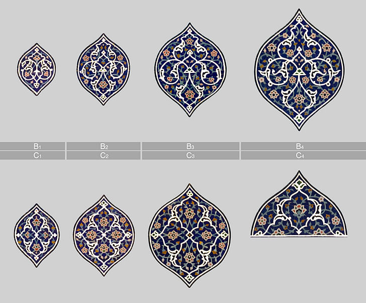
The pattern is composed of radial arrays, concentrically staggered around a central densely patterned core. As shown in the diagram below, the “pods” increase in size as they move away from the central core, increasing in scale in sync with the pointed dome on which they are mapped, enveloping the viewer below. There are three basic types: A, B, and C. The A ring is closest to the central core, and a compelling case can be made for interpreting it as having nascent features of the other two types. After the initial A ring, the B series and the C series are set in play alternating ring after ring. Each concentric iteration develops the type from the previous iteration, further articulating pattern details while maintaining the general structure, as seen in the comparison diagram further down.

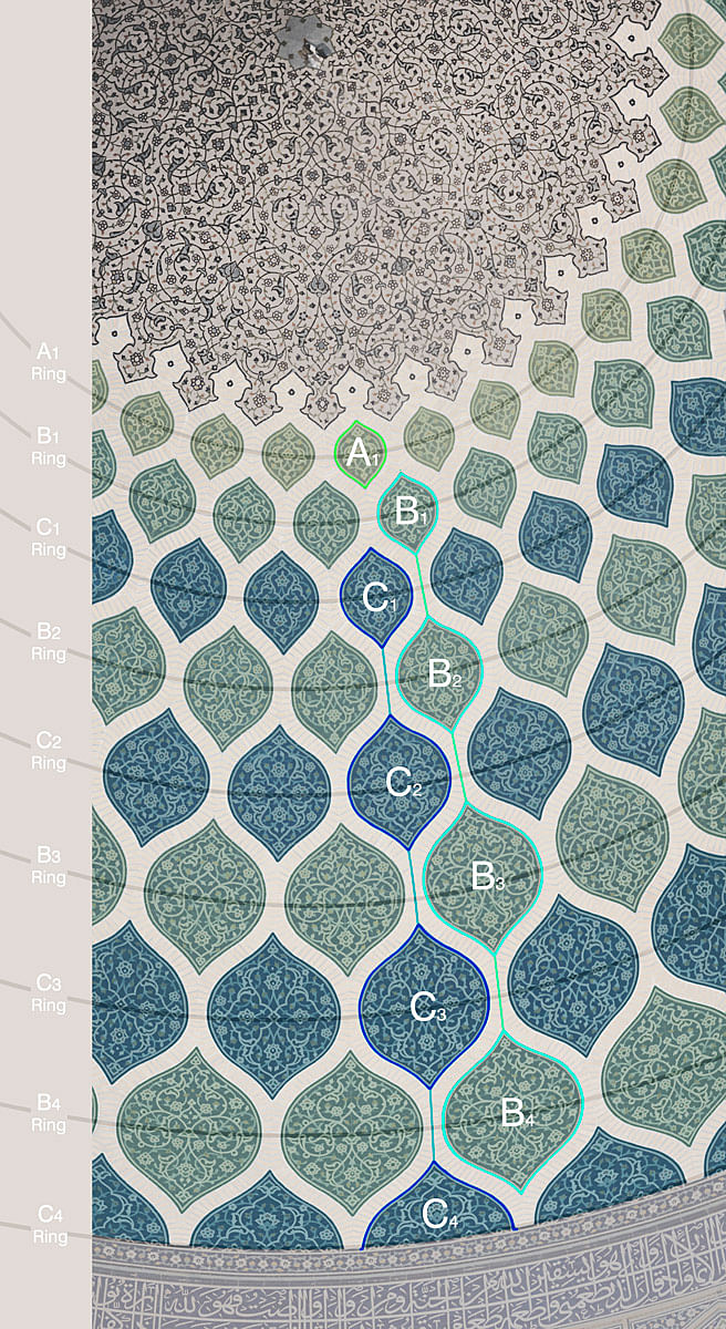
Starting from the generally floral theme of all the surface ornamentation of the ceiling, the line weights and the scale of the design features within each pod are kept constant, such that as each iteration increases in size there is more space left to be filled due to the line thickness not scaling up. The extra space that is opened up this way is then filled by further developing the detail and extension of the pattern -- stems are extended, buds appear, the flowers grow, flourishes project outward, etc. Depending on if you read the movement inward or outward, this design could feed any number of interpretations, but to take one narration that jumped out at me as an example: If we take the nebulous region centered on the highest point as God, moving out from this center a threshold is crossed, on the other side of which discreet beings emerge, moments of creation originating from God. Starting with type A, the sequence differentiates to types B and C, and from there through successive iterations becomes a poetized model of emergence, pattern growth, and escalating complexity -- the world evolving, emanating in waves. Here, far pre-dating any form of scientific discourse to express concepts of complexity -- even in primitive form -- they are incorporated into an elaborately articulated representation of god as the origin of the complexity of the world. As a graphical/spatial conceptualization of religious cosmology, nothing I’ve seen in a cathedral compares.
The Corner
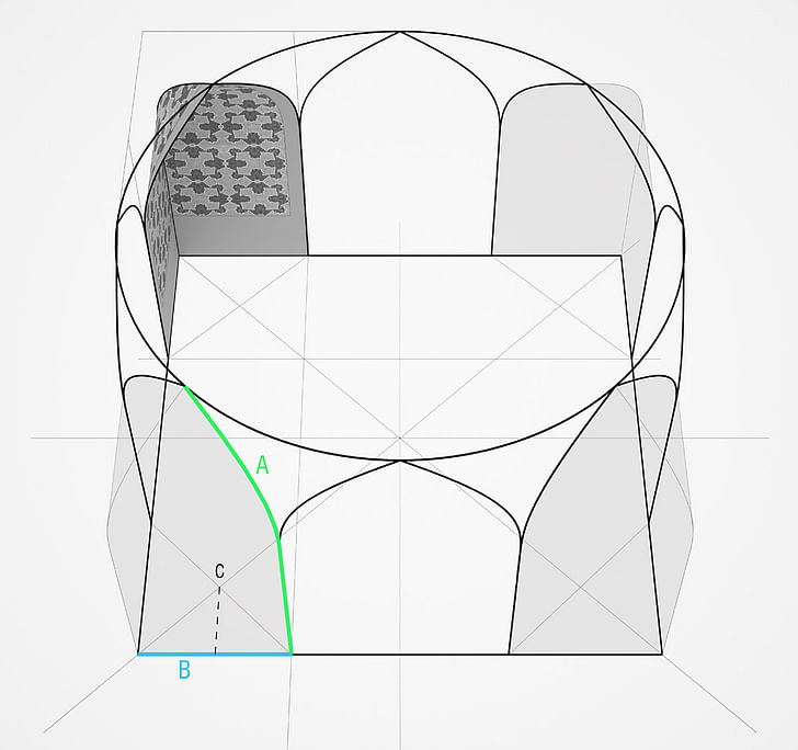
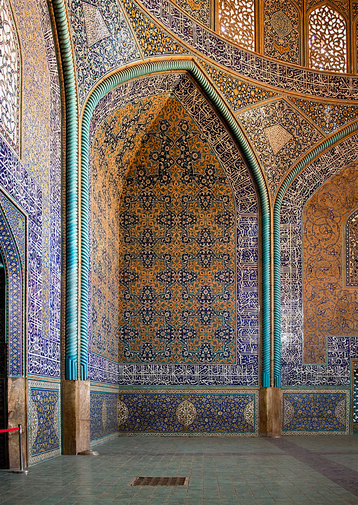
The floor of the mosque is a square, and the base of the dome is a circle inscribed within the square, tangentially intersecting the midpoint of all four sides. Reconciling these two geometries necessitates some geometric elegance in the corners. The two identical surfaces of the corner, which are themselves axially symmetrical, are mirrored 90 degrees from each other, which due to their curvature and taper intersect at a point on the circle. The very specific Z curvature (to borrow Rhino vocab for a moment) of each surface follows the UV curvature of the edge trim curves, i.e. as the edges curve in, the surface bends in the z axis. One method of constructing the surface: sweep path A along path B, mirror A across C and trim.

With the fixed geometry of these surfaces as the starting point, a surface pattern is applied. Instead of a nebulous pattern that fills the whole (like the center of the dome), the designers instead defined a clear base module, as diagrammed below:
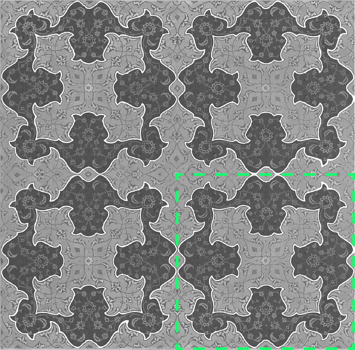
This pattern can easily be seen in the bottom portion of the corner surfaces. We can see here that the pattern clears almost three rows before the surfaces start to curve.
This is where the fun starts. Below is a comparison of what the pattern actually does vs. what the pattern would do if it were left unaltered as it was applied from bottom to top. First, the as-built: Focusing along the corner intersection of the surfaces, starting from the bottom: first half a cross, then two 4-point crosses, then as the curvature of the surfaces starts, a 3-point form, then a 5 point “star”, then a 5 point “crown” at the top, with the outer two points cut in half.
Now look at what happens in the second diagram that simulates the result if the pattern base module is left unchanged as the surfaces start to curve. Again following the intersection from bottom to top: exactly the same until the curvature of the surfaces starts, where we get a very similar 3 point form, then instead of the perfect 5-point of the previous there is a 6-point mess, and above that another mess instead of the 5-point crown.
If this is what results if the pattern is unaltered, then let’s look at what is required to get the result that they got.
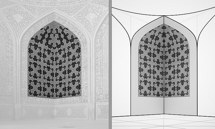
Here we reorient a view perpendicular to one of the corner surfaces, and isolating just the portion with the modular pattern.

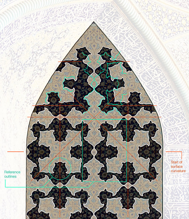
The diagram helps clarify what they in fact did. Following the red axes from bottom to top and comparing the shapes of the main pattern features, it becomes clear that they introduced sub-pattern module localized distortions, executed with exacting control, as necessitated by the coherent forms they wanted to achieve along the intersection of the curving surfaces. Locations of features within the module are shifted, proportions stretched and skewed, horizontal becomes sloping, some features completely revised -- and importantly, most of these modifications occur only within the darker “ground” portion of the pattern; the features and proportions of the lighter “figure” of the pattern are kept as close as possible to the original base model. Correspondingly, all the lower level details that populate the macro features of the pattern are re-designed to suit. And... to hammer an obvious point, all of these precise pattern alterations on curving surfaces composed of individually cut pieces of tile were determined without computers. The iterations of trial and error, we are left to imagine. The depth of design exploration, the clarity of intent, and the evident time spent refining this relatively small corner of a small building, is something that is difficult to contemplate from the vantage point of current architectural production.
Afterthoughts
Framed within current concepts of architecture, both design features discussed above would fall under “interior decorations”. Technically, compared to a modern building, this mosque amounts to little more than a domed stack of bricks with a tile skin inside and out. No systems, no active performance, no advanced assemblies, no tectonic connections... given that, plus the fifteen year span of construction, one hopes that there was some room to think about the tiling patterns. But this is precisely what distinguishes the expenditure of time and effort described above -- it was singularly focused on one aspect of the building: the aesthetics of the space. More jarring still, it was spent on superficial surface decorations -- for almost a century now deemed unworthy of architectural concern.
Something analogous to the expenditure of thought that we put toward building performance and coordinating the systems, they put toward the articulation of surface patterns. If nothing else, the pattern work here is a reminder of the depth of thought that ornamentation, as a line of development, opens -- that building form can be just a first pass, and most importantly: that if we are going to re-open surface articulation as a compositional design device for today, then we also have to open up space in the design process for it to be taken seriously -- rather than a quick appliqué or afterthought. For it to be meaningful, time is required.
With both of the above examples of pattern articulation, the first question is not: are we today capable of producing patterns of this sophistication? With our tools, we had better be, this and beyond. The more important question is: are we today capable of a process of aesthetic design refinement carried this far -- in which the specificity of intent drives the tools, as opposed to the tools filling an absence of specific intent?
These painstaking yet minimal pattern alterations in this mosque show the level of consideration necessitated by their persistence in the pursuit of a very specific design intent -- which is a point that bears directly on current day use of parametric design tools.
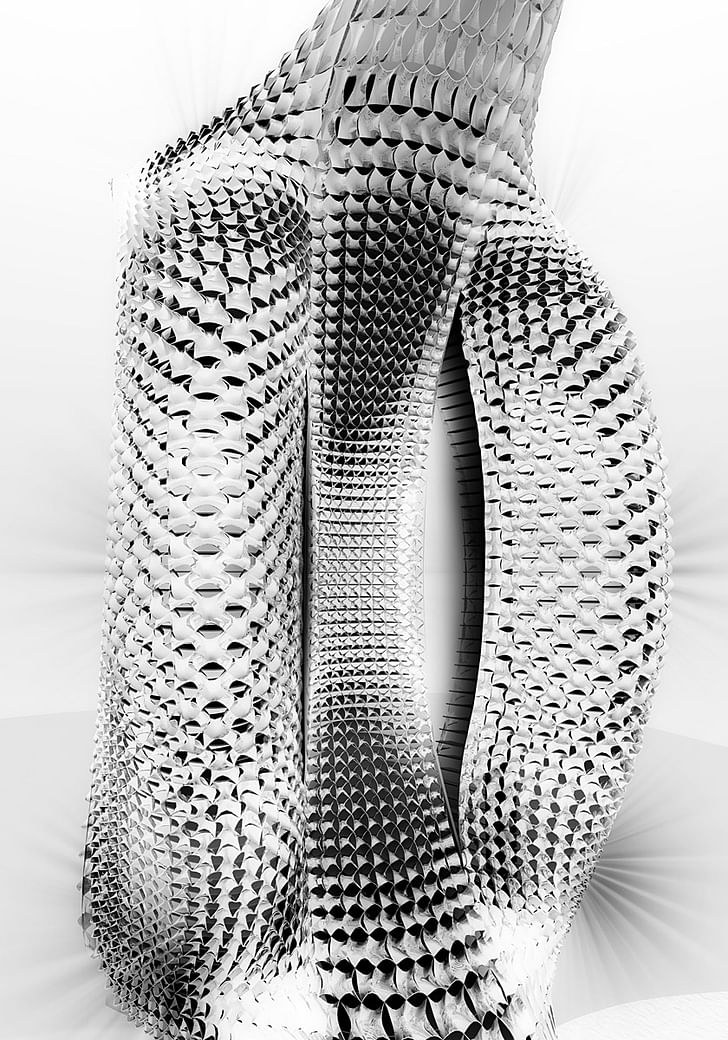
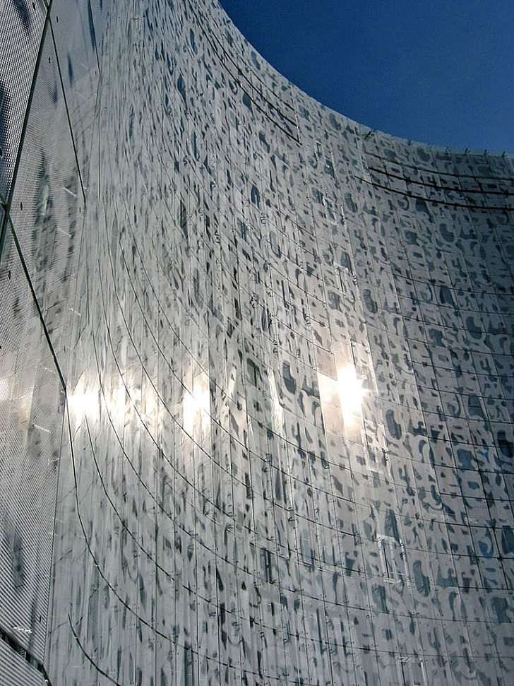
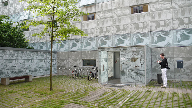
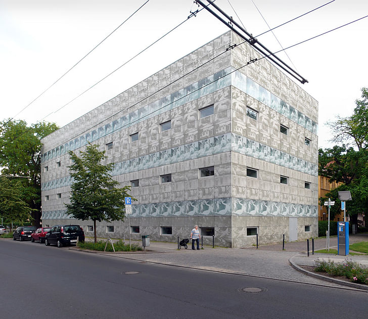
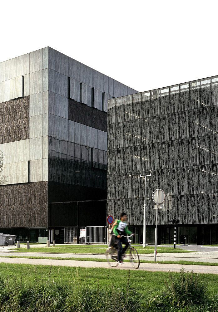
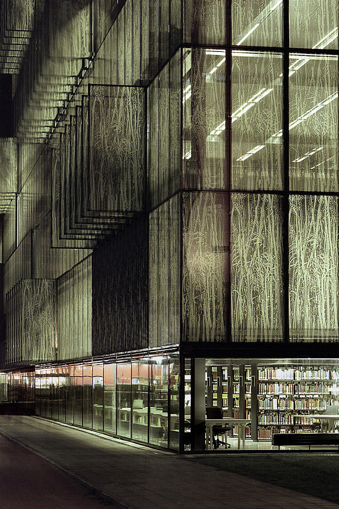
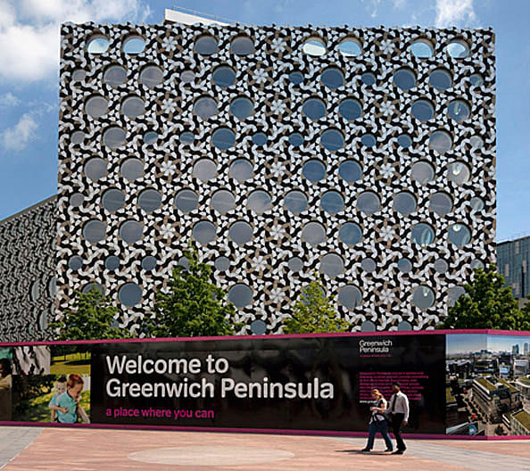
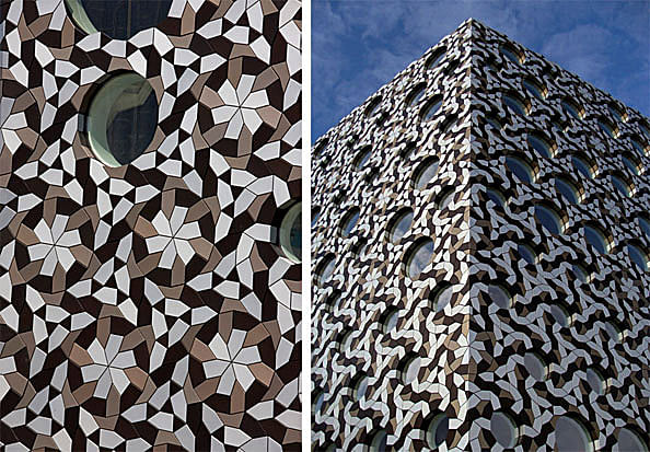
The relationship between the curvature of the surface and the alterations introduced in response to it is different in kind from the pattern variation we find in parametrically populated 3D surfaces (such as the image below, referenced by Patrik Schumacher as an example of surface pattern responding to form). In typical parametricism such as this, the distortions follow rule-bound transformation gradients, for example distorting pattern module scale and proportion in response to the curvature of the host surface. The transformations happen in aggregate: each pattern module is only slightly varied from its neighbor -- and most importantly, the variation is automated according to explicitly defined rules.
In the case of the corner surfaces of the mosque, the relationship between the pattern module alterations and the host surface is both arbitrary and singularly customized. It is arbitrary because there is no way to make the pattern modifications directly dependent on a variable property of the host surface. And it is singularly customized in that the distortions they introduced make sense only on these surfaces -- and this is the critical point -- when combined with their specific design intent. Thought of as a grasshopper definition, there would be no way to directly relate those required sub-module distortions to the curvature of the host surface -- if the curvature of the surfaces were changed, the change in the necessary distortions required to maintain the intent would not occur linearly along a gradient. In consequence, it would be impossible to automate -- it must be thought.
The difference between the two hinges on the degree of specificity in the intention, down to the scale of the articulations within a pattern module, which is governing the extent that the design process is pushed.
One lesson that we can take from examples such as the surface articulations of this mosque is a reminder of the clarity of intent required to compel us to fight beyond the easier products of our tools, as opposed to a forfeiture of authority to the tools. The more sophisticated our tools, the more difficult this becomes.
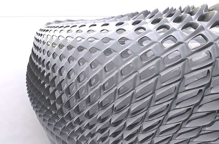
Credits: All photography, drawings, text, and analysis by Derek Kaplan (unless otherwise credited)
Painter, took a tangent that became a degree in philosophy, then ventured into architecture for its career stability, promises of wealth, and care-free lifestyle... ...
10 Comments
this is really great—thank you for posting it.
is this published anywhere, other than this site? also, do you have references/biblio information? it is a topic that i'd like to explore myself for thesis in a year. . .
wow, that sounded a bit presumptuous—sorry!
the reason why i ask is that i am interested to look at more of what you've done on this topic as part of my research, and then also properly reference your work posted here as i continue my own research.
thanks uhhhh,
no, this is only on archinect. I have no obligations toward tenure, so I'd much rather put it somewhere people might actually see it -- but that's a whole different discussion. this being the case, any referencing would just have to point here... if when the time comes you want to use any of my graphics I can send hi-res files to you under a creative commons license.
Thank you for this fascinating study!
this is very interesting...nice to see on here.
one side note, there is a certain collective intelligence and accrued knowledge that comes with craft...a series of incremental developments and advancements that results over years or generations into what can be a skill-set of great complexity. I'd bet the craftsmen that designed and executed these highly complex patterns had a few tricks up their sleeves that greatly simplified the process and that would be fascinating to know...like how a skilled seamstress can make a fully-lined dress that is impossibly all sewn from the inside just by rolling the entire garment up and pulling it through the shoulder strap...
An excellent study and illuminating conclusion. Thank you!
Liked your article very much ... have posted a link to it on our Blog: http://kamilkhanmumtaz.blogspot.com/
great article!
Thanks Derek,
I would like to translate this article into Persian and publish it in the "Architecture" magazine under your name if you agree
ss3723,
thank you for contacting me about this -- please msg me (click my name at the top of the article, and on my profile there is a button for "Contact Derek").
Block this user
Are you sure you want to block this user and hide all related comments throughout the site?
Archinect
This is your first comment on Archinect. Your comment will be visible once approved.