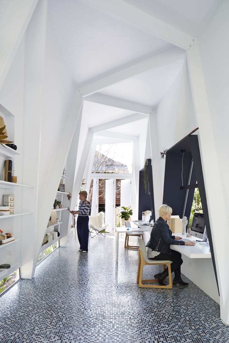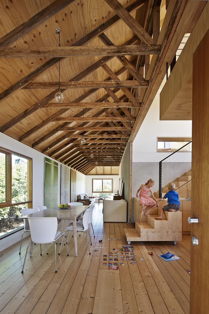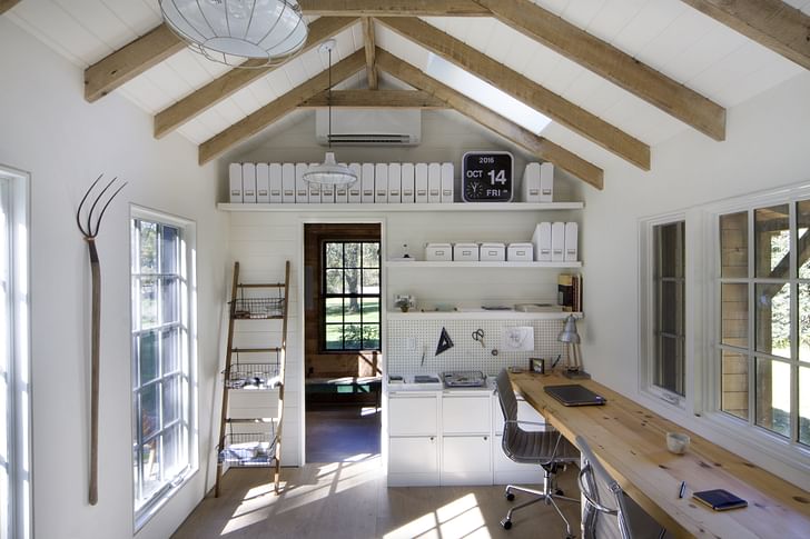

Published last year, registered architect Donald M. Rattner wrote My Creative Space: How to Design Your Home to Stimulate Ideas and Spark Innovation to help creatives optimize their home environments in a way that heightens their powers of creativity. Pulling from years of psychological research and countless case studies, Rattner takes the reader on an educational and enlightening journey. The book offers 48 spatial strategies that help facilitate creativity in the home. Covering everything from which colors lead to peak creative performance to how smells can influence problem solving, My Creative Space is an intriguing exploration during this time when we are all confined to our homes.
This article is adapted from the book My Creative Space: How to Design Your Home to Stimulate Ideas and Spark Innovation, 48 Science-based Techniques (2019), by Donald M. Rattner, Architect. All photographs are courtesy of the designers.
WHAT TO DO
Perform creative work in spaces with ceilings ten feet or higher, or visually manipulate your surroundings to exaggerate apparent height.
WHY DO IT?
Researchers found that subjects occupying a room with ten-foot ceilings scored higher on creativity assessment tests than subjects who performed the same exercises under eight-foot ceilings.
WHY DOES IT WORK?
I have described at several points in the book how our perception of mental space moves in parallel with our perception of physical space. The greater our sense of spatial depth and expansiveness, the more open our minds will be to unorthodox ideas and fresh perspectives.
But space doesn’t exist in strictly lateral directions, which is to say, in front of and behind us, or from side to side. It also exists in the third, vertical dimension. It therefore stands to reason that if our thinking becomes freer and more open when we perceive space to be expanding horizontally, it will do the same if we intuit that space is opening up above us as well.
...our perception of mental space moves in parallel with our perception of physical space
This assumption was borne out in a 2007 study that explored the influence of ceiling height on cognition. The scientists who conducted the study discovered that subjects were more adept at coming up with out-of-the-box solutions to creative problems when placed in a room ten feet high than subjects who took the same tests in the same room, but with a hung ceiling installed at eight feet. On the flip side, they also found that people who worked under the dropped ceiling did better than their peers on exercises that measured analytic and logical thinking.

A later experiment utilizing fMRI brain scans found a neurological correlation with the laboratory results: the part of the brain involved in the visual exploration of space was activated when subjects were shown pictures of rooms with high ceilings, but not when they saw images of low-ceiling spaces. In other words, spaces with high ceilings instill a willingness in people to explore, to take a big brush abstract view of the world, while a less lofty ceiling plane induces a more focused, detail-oriented, and concrete outlook.
The design writer William Lidwell dubbed this phenomenon the Cathedral Effect. His choice of words is apt. The central nave of many of the great cathedrals of the world, especially those built in Europe in the Middle Ages, are extraordinarily tall—as high as 156 feet in one case. And what could be more abstract than contemplating the divine? It’s safe to say that the people who conceived and built these structures understood the effects of extreme vertical space implicitly, and designed accordingly.

HOW TO DO IT
Those of you who already have an idea space with ceilings ten feet or higher or who plan to incorporate one in their design schemes are in luck. But what about everyone else? What do you do? Give up? Move? Demolish your domicile and build another?
...in matters of the human psyche, what you perceive to be true is far more potent in eliciting a psychological response than what is actually true.
Nothing so radical. Fortunately, in matters of the human psyche, what you perceive to be true is far more potent in eliciting a psychological response than what is actually true. You can take advantage of this by drawing on techniques that will make your ceiling appear taller than it really is. Some of these techniques are cosmetic in nature, a few involve light renovation. All are designed to emphasize the vertical axis by encouraging the eye to move in an upward direction, and thereby simulate the Cathedral Effect.

Apply vertical elements and patterns to walls. Wall coverings and paint treatments embellished with stripes and other vertically-oriented motifs, architectural paneling, and trim or structural elements running in an upright direction will visually lift a room.
Exploit furnishings and décor. Tall bookcases, full-length drapes, artwork in portrait-oriented frames, decorative accessories mounted on walls in vertical arrangements, tall mirrors resting on the floor and angled upwards, and standing lamps are among the various interior components you can leverage to amplify visual height.
Lighten up. I’ve read a lot of opinions about how the color of floors, walls, and ceilings affects our estimate of height. Some of it’s right, some of it’s wrong. To set the record straight on maybe the most prevalent misconception, the contrast between the color of your ceiling and the color of your walls and floors has no impact on height perception. What does matter is how light your walls and ceiling are independent of each other. In a nutshell, the lighter they are, the taller your space will seem. According to the research, floors don’t factor at all.

Continue the wall color or material into the ceiling. Another technique involving finishes is to extend the wall color up into the ceiling as a border. This tricks the eye into reading the wall as continuing past the vertical plane. To strengthen the illusion, curve the top of the wall where it meets the ceiling and do away with any intervening horizontal trim, like cornices and picture moldings. Ready for the Full Monty? Do this, then apply the same color to both walls and ceiling (or construct them entirely out of a single material, as in the example of the exposed stone vaulting). Your eye will have nowhere to stop as it travels up from the floor.
Raise door and window heads. The relationship between the tops of your door and window openings and the ceiling is a crucial determinant of height perception. All things being equal, the higher up the openings, the more elevated you’ll judge the space.

Top off your space. The researchers who uncovered the Cathedral Effect took pains to point out that subjects had to be made aware of room height, if only momentarily, for the prime to function. They hung Chinese lanterns from the ceiling to draw their subjects’ attention upwards; you can do the same with light fixtures, skylights, ceiling fans, beams and coffers, textured finishes, decorative appliqué, and other features commonly found in residential ceilings.
Musts to avoid. Just as some design elements accentuate height, others have the contrary effect of diminishing it. Avoid chairrails, oblong wall paneling, deep friezes, picture molds, heavy cornices, wallcoverings and drapery with longitudinal patterns, openings wider than they are tall, oversized furniture and furniture with long horizontal profiles (e.g., straight-back sofas) in creative environments with ceilings lower than ten feet.
—————
References and Further Reading
Jaffe, Eric. “Why Our Brains Love High Ceilings.” Co.Design (website). May 5, 2015. goo.gl/6xoPjP
Lidwell, William, Kritina Holden and Jill Butler. Universal Principles of Design: 125 Ways to Enhance Usability, Influence Perception, Increase Appeal, Make Better Design Decisions and Teach Through Design. Beverly, MA: Rockport Publishers, 2010. “Cathedral Effect”: 38–39
Meyers-Levy, Joan and Rui (Juliet) Zhu. “The Influence of Ceiling Height: The Effect of Priming on the Type of Processing That People Use.” Journal of Consumer Research. 34.2 (Aug. 2007): 174–186. goo.gl/oCJQw
Oberfeld, Daniel, Heiko Hecht and Matthias Gamer. “Surface Lightness Influences Perceived Room Height.” The Quarterly Journal of Experimental Psychology. 63, 10 (Oct. 1, 2010): 1999–2011. goo.gl/gKuJcB
Vartanian, Oshin et al. “Architectural Design and the Brain: Effects of Ceiling Height and Perceived Enclosure on Beauty Judgments and Approach-avoidance Decisions.” Journal of Environmental Psychology
Sean Joyner is a writer and essayist based in Los Angeles. His work explores themes spanning architecture, culture, and everyday life. Sean's essays and articles have been featured in The Architect's Newspaper, ARCHITECT Magazine, Dwell Magazine, and Archinect. He also works as an ...
3 Comments
I have been voting for this design thinking for years now so it is a pleasure to read about your piece about the vertical space dimension and degrees of creative thought. Bravo!
I have a graphic that I drew some years ago in 2015, that talked about the importance of the Z dimension. I will try to upload it here.
Douglas Wittnebel
https://dougwittnebel.com
you were right all along! I love the abstract art on your website, by the way. really wonderful!
Hey there and thanks for the comment about the art on my website.
Block this user
Are you sure you want to block this user and hide all related comments throughout the site?
Archinect
This is your first comment on Archinect. Your comment will be visible once approved.