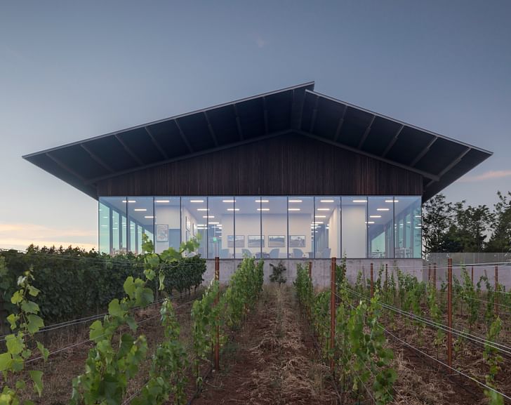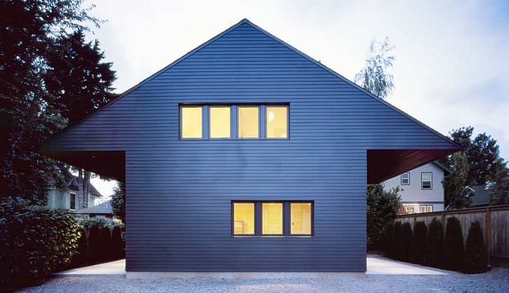

The work of Portland, Oregon-based Waechter Architecture is focused, in a word, on clarity.
Spatial clarity, compositional clarity, material clarity, systems clarity, experiential clarity—All play a guiding role in shaping the firm's eclectic output. The goal of this clarity, according to Ben Waechter, founder and principal of the firm, is to allow, in a way, architecture to fall away, to "heighten and inform the experience of community and landscape," and to create "environments in which we feel most alive, awake, and present; where the relationship of elements is apparent and intertwined."
Started in 2007, Waechter's eponymous practice has grown at a steady clip in the 12 years since, a trajectory that culminated recently with the firm's recent selection as one of the Architecture League of New York's Emerging Voices cohort for 2019.
For this week's Studio Snapshot, Ben Waechter discusses his firm's learning curve, its recent experiments with Cross-Laminated Timber, and the office's never-ending quest to simplify architecture.
Where and when did your studio start?
2007.
How did you come up with your name and company ethos?
The name is simply my last name. The ethos of the studio is to find simple, clever solutions for projects. We find that this approach gives strong clarity and identity to buildings, which results in places that feel the best to be in.

How many people work at the company?
12 people
Why did you decide to start your own office?
I felt like that was the best way to pursue the type of architecture I was interested in.
What are other offices that you look at for guidance and why?
I am most interested in architecture offices that balance material, construction, and spatial experience to create simple and distilled buildings. These architects exist all around the world, but currently, seem to be more concentrated in Switzerland.
What do you want your firm to be known for?
I would like our firm to be known for making buildings that have strong sense of clarity. I mean clarity in all its forms: spatial clarity, compositional clarity, material clarity, systems clarity, etc. Ultimately, I’d like to be known for making buildings that have experiential clarity, as well, places where people can have an aesthetic experience.
What were the first 365 days like?
The first year was spent designing and building the Z-Haus. It was only me at that point, and I did my best to be a good builder—It was not as easy as I thought it would be when I started the endeavor. It was a lot of work that year, but it was a success, and the studio had its first completed project.
What were the biggest obstacles along the way?
Bringing quality projects into the office is by far the most difficult thing.
What are you currently working on?
We are currently working on a wide variety of project types ranging from a 244-unit workforce housing development to a new retail space for Blu Dot in downtown Portland. We are also working on a number of CLT projects.
What other avenues of creative exploration does your office pursue?
Our ongoing outside creative project is reflecting on our work and always trying to improve our design process. We call it our "Clarity Project." It has taken the form of retrospective model projects, lectures, university design studios, and many happy hour design talks.
What are the benefits of having your own practice? And staying small?
It's easier to self-reflect, refine, and improve a certain way of working.
What is the main thesis of your office and has it changed over time?
Since the beginning, the focus of the office has been on design clarity. I think this will always be the case. What’s changed over time is how good we are at achieving it. We are always improving. Our approach is to refine and distill—rather than reinvent—ourselves.
Where do you see the office in 5 years? In 10 Years?
Most of our projects thus far rely on cladding to provide material experience. With our aspiration of getting closer and closer to designing buildings [that convey] pure clarity, we would like to work on projects that use structural materials that also serve as the finish. In an ideal world, these structural materials would also act as the thermal and weather barrier. Our first step in this direction is our own office building that is in the permitting phase right now. It is a 100-percent CLT building with both walls and floors made out of mass timber. There is zero sheetrock in the project. The structure of the building will also be what gives each room its material character and visual identity, helping give the overall project a strong constructional clarity, as well.
How do you look for talent for your office?
We look for people who are excited about architecture, share a similar design aesthetic, and are hard-working, self-motivated problem solvers.
I see that model-making represents a big part of your office’s creative output, how does model making influence the design process?
We like to work with physical models because they tell the truth and reveal all. Often times 2-D renderings can be misleading. The physical models take longer to make, but end up saving time by streamlining our decision making. We make all types of models from concept models to study models and retrospective diagram models.
Your practice engages deeply with residential design, particularly dense urban housing types, what types of innovations in this realm have you been able to develop as your office has matured?
Privacy, openness, and natural light are a consistent challenge for our denser infill housing. We try to develop clever techniques that creating private outdoor space and large openings without sacrificing privacy.
How is your work influenced by vernacular building types and traditions?
We like vernacular buildings because they tend to have distilled material palates, simple and well-thought-out plans, and a strong sense of identity. We don't want to copy vernacular buildings, but there is a lot to learn from them.
Some of your projects include workforce housing and other affordable types; How can high-quality design make housing cheaper, more available, or more accessible to average people?
I don't know if good design can be cheaper than bad design, but it certainly doesn't have to be more expensive. A good plan is the same price as a bad plan. For all of our projects, we strive to have efficient plans, simple facades, and a distilled set of details. We feel that these are key ingredients to buildings that feel good to be in. They are also ingredients that help construction be more efficient, of course.
Antonio is a Los Angeles-based writer, designer, and preservationist. He completed the M.Arch I and Master of Preservation Studies programs at Tulane University in 2014, and earned a Bachelor of Arts in Architecture from Washington University in St. Louis in 2010. Antonio has written extensively ...
2 Comments
Awesome Designs
That Origami project is astounding. Still cannot follow where all twelve houses lie. Gorgeous pictures to go with an architect's brilliant, simple lines. Incredible job, Mr. Antonio. Continued success.
Block this user
Are you sure you want to block this user and hide all related comments throughout the site?
Archinect
This is your first comment on Archinect. Your comment will be visible once approved.