
The power of visual representation is key when expressing thoughts and ideas. The Syracuse-based architecture studio pulls together their passion for research and design practice to create projects which question the way people think about architecture and current issues.
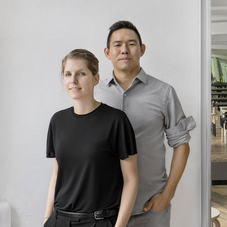
For this week's Studio Snapshot, Archinect chats with Nicole McIntosh and Jonathan Louie of Architecture Office. During this segment, we discuss what it means for a promising practice to take risks and excel creatively while running a firm. After founding their practice in 2015, McIntosh and Louie explore the opportunity of how different perspectives strengthen research-based experimentation.
How many people are in your practice?
Two to Seven. The two of us are consistently working on every project, but, we often hire interns for certain periods of time.
What prompted you to start your own practice?
We met at Syracuse University, on design reviews in 2014. We talked about ideas we were working on and a year later we began working together. But one might have not called it a practice back then.
Our practice matured while applying for the 2017 Architectural League Prize for Young Architects and Designers. When considering the theme of the 2017 Architectural League Prize, Support, we thought of how images prop our architecture up and facilitate new ideas, new forms, and new opportunities for action. The theme challenged us to critically assess our practice by exploring the myriad values of images. This continues to drive our design pursuits today.
Is scaling up a goal?
We welcome the idea of scaling up, but, it is not our primary focus. Our goal is to develop a body of work with projects that support a research and design practice. We want to continue to invest in a practice that is informed by our research no matter at what scale. All Square is our biggest project so far and we hope to build a ground-up building within the coming years.
What are the benefits of having your own practice? Staying small?
We like being able to choose what we work on. The value of staying small is that we control the details in our design work. That allows us to control the design, its relationship to our research, and the execution of the built product. For example, we will be traveling our installation Big Will and Friends to Los Angeles for the LA Design Festival (June 20-23, 2019). While there we will collaborate with audio artist, Paul Chavez, to create an immersive experience.
What we like about being small is that we don’t feel the stress of taking on projects for paying employees’ salaries. This allows us to use our practice as a vehicle for developing our design research.
What we like about being small is that we don’t feel the stress of taking on projects for paying employees’ salaries. This allows us to use our practice as a vehicle for developing our design research.
What have been the biggest hurdles of having your own practice?
We hope to continue designing and building things that question the way people think about architecture and current issues.
So far, we have been fortunate to have had clients that support us and our often-unusual ideas. But it is not easy to convince people, especially clients to take a risk and invest into something less conventional that they might not be familiar with. The biggest hurdle is to not make too many compromises and to stay true to our intent.
What do you want your firm to be known for?
We want our work to reveal aspects of familiar things that are unexpected. We look closely at stuff that may be overlooked by others and by collecting photographs of these things aim to reveal new opportunities and trajectories in our work – ordinary wallpaper, a Swiss-themed town, an old cabin, frames or a truss system.
House in House for example, references two aspects of the site; the surrounding forest and a small deteriorating cabin. The inner house is analogous to the cabin that was removed, and the appearance of the outer house is mapped with photographs of the forest context. The project conflates two images of the site for the cost of a single house.
Where do you see your firm in 5 years?
Everyone wants to know our 5-year plan, and we never know what to say. In a few months, we will be moving our practice to Texas and are looking forward to new opportunities as faculty of Texas A&M Department of Architecture. We’re excited to be in a new environment as it challenges us to consider our work from another point of view.
Beyond the Texas landscape, the school has an interesting faculty and fabrication facilities that we think will align with, and, provoke new avenues in our work. While there we will start a design and research lab that will be the vehicle for our research activities and publications.
The project showcases our methodology of collecting and deploying images as a conceptual framework that supports our work. Our intention for the installation was to expand the visitor’s field of vision to reveal a selection of images from our collection.
Do you have a favorite project? Completed or in progress.
Our exhibition Viewfinders, completed for 2017 Architectural League Prize exhibition at Parsons School of Design highlights our way of thinking and working. The project showcases our methodology of collecting and deploying images as a conceptual framework that supports our work. Our intention for the installation was to expand the visitor’s field of vision to reveal a selection of images from our collection.
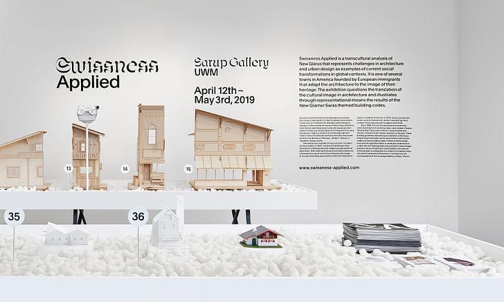
The idea of collecting and deploying images as a found condition is continued in our traveling exhibition, Swissness Applied. The exhibition includes the Viewfinders exhibit, and amongst other things, the photographs and texts that make up the archive of New Glarus, Wisconsin. This found collection is significant as it is the context for the design of the village.

Congratulations on “Swissness Applied.” Can you talk a little more about the project and its focus on dissecting cultural appropriation in architecture and urban design?
We simply think that New Glarus is an interesting urban type that emerges from the context of images. The exhibition’s focus is on the documentation and projection of building codes in New Glarus, Wisconsin that use picture books alongside written descriptions, as the contextual framework for the design of the village. These images portray a variety of traditional chalet styles in the cantons of Switzerland into a composed style recognizable as “Swiss.” Simply put, New Glarus is an American town that uses images of the Swiss chalet style to construct the appearance of their village.
What has the feedback been like on the exhibition?
It’s been great! In particular, the exhibition establishes cross-disciplinary and cultural conversations around the research of these types of American towns. We recently exhibited and presented Swissness Applied at the University of Wisconsin-Milwaukee and we were amazed at the range of people in the audience. Of course, academics and students, but also, townspeople from New Glarus drove to see the models of their homes in the show!
In September, we will be exhibiting the project at Kunsthaus Glarus, and will host a symposium for a Swiss audience in Glarus, Switzerland. In this case, many of the Glarner’s may know of the American town but likely have not been there. So, the exhibition will be a form of representation of the village that may be all they know.
Your practice seems to emphasize the visual narrative and cultural associations between architecture and space. Where did this design theme come from? Did it derive from your time in school or after?
This interest is born from the combination of our two cultural and educational experiences. Jonathan’s design research is influenced by his education at UCLA and the conversations around the intersection of graphic culture and the built environment. Nicole’s research is influenced by her education at the ETH in Zurich and the discourse at the school around typological studies of the built environment.
As we have matured together these interests have evolved to how images produce new settings, by looking at familiar things and defamiliarizing their physical characteristics from their traditional cultural and disciplinary associations.
Can you talk a little bit about All Square? Visually it’s an extremely interesting project, but after reading its design focus this project focuses on much more.
All Square is a non-profit and restaurant in Minneapolis whose mission aims to employ formerly incarcerated individuals. We were fortunate to work with the client, Emily Turner, and Whittier Advertising to shape the outward appearance of the project. To give the non-profit mission and branding of All Square a physical presence, we inserted a series of mirrors and frames that are all nearly square. Both elements serve to focus and unify the interactions between users that are both planned (such as at the point of sales, at the bar, at the entrance), as well as unplanned. Altogether, the composition, framing, depth, and lighting construct an interactive setting that focuses the spectator on both looking and being looked at. The restaurant is a framework for seeing objects and people in the space but from another point of view.
Research plays a heavy role in your firm's design ethos, can you talk a bit more about this and the role images play in your work?
While images saturate the contemporary world they are not just everyday occurrences; they offer new views and mediate the world around us. Our design process begins and ends with images. In our office, we gather, deploy, actualize and mediate with images to support our work. The images, specifically photographs, in our collection are constantly changing as a way to push the limits of familiar forms and materials.
As educators, how do you see the future of architecture changing? What advice do you give to your students?
We have noticed that increasingly our lives are saturated with images of all kinds and they are affecting the way we see and understand familiar things in the world. Now more than ever our conception and perception of things are complicit with the myriad of images and imaging types.
Nowadays, images are often consumed too quickly and chosen randomly. Our coursework engages this condition and challenges students to control its implications on material, structure, form, and culture. We try to teach students ways of working with images and to communicate with them in precise ways. In our work and pedagogy, the images act as a reference, they are typically iconographic, and they are the generator for the design. Throughout the design process they are exchanged, removed, manipulated, and added as a means of altering the frame of reference, whether that is a context, or viewpoint, or system of thinking. And by engaging with many images, or colliding many references, it is a means of estranging the things that we design from the cultural and disciplinary context we are in.
If you could describe your work/practice in three words what would they be?
Literal, witty, and weird.
Katherine is an LA-based writer and editor. She was Archinect's former Editorial Manager and Advertising Manager from 2018 – January 2024. During her time at Archinect, she's conducted and written 100+ interviews and specialty features with architects, designers, academics, and industry ...
1 Comment
Sometimes staying small is smart to have all flexibility, and control you can have.
Block this user
Are you sure you want to block this user and hide all related comments throughout the site?
Archinect
This is your first comment on Archinect. Your comment will be visible once approved.