
Callouts is a review series in praise of architecture, art, and the city.
Contrary to the common use of the modal verb “to call out” which emphasizes negative criticism, “Callouts” here draw from the architectural drawing tradition. Callouts in architecture establish a closer look towards a part of a project that requires more explanation and emphasized attention due to its complexity, uniqueness or typicality. They create a different, more detailed view of what has already been seen, expanding the reader’s understanding of the project.
Following that tradition, “Callouts” is a series of carefully selected complex, unique and banal projects, that have the potential to initiate a discussion, be didactic and affect their contemporary contextual mythology. Reviews for projects that do not satisfy these criteria can be found by typing “architecture” on your search bar.
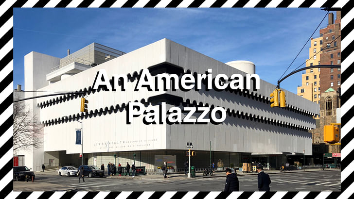
An American Palazzo
Awe-full
Finding exquisite buildings is sometimes an arduous task. Most times it becomes a destination, a visit in need of special planning. Search the internet, open google maps, postpone visiting one or two times because the temperature is too extreme, and if the world does not end in the meantime probably encounter the desired “object.” Have you ever had this magical moment though? That moment when you turn on a street, move to a new neighborhood or just change your typical trip to work and you suddenly stop and stare? The moment when you mind your own business, and you see something that demands your attention and sparks your most primal sense of curiosity. This is a story about one of these rare occurrences, about a found object, a programmed yet program-less building in New York City. An archetype, at the gates of Greenwich village.
It’s like...
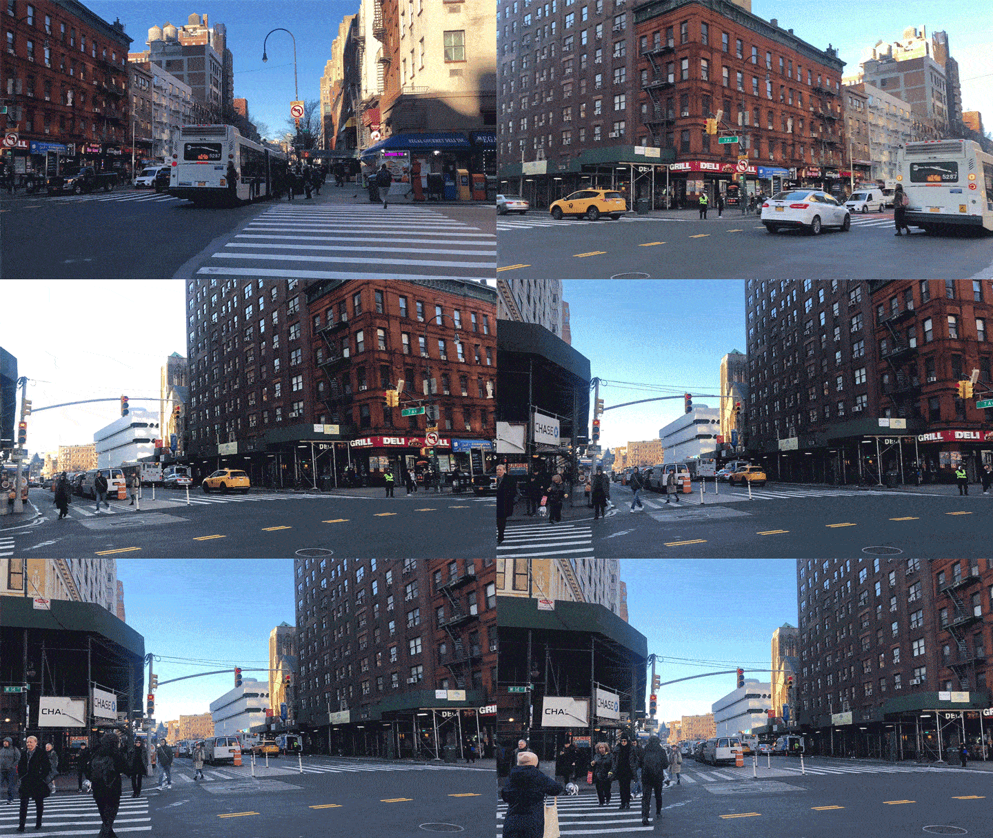
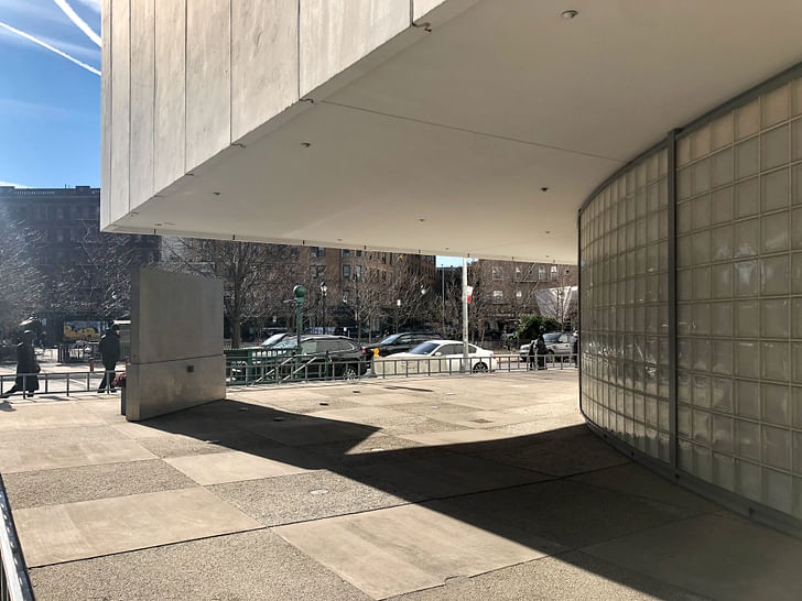
You have probably seen it too. Walking down 14th street, heading to that elevated garden by the West side. It has probably caught the corner of your eye as it stands out, surprisingly lower than its surroundings. Yes at 7th Avenue. Turn to the left. Don’t worry, no awkward silences. It will break the ice. The encountered object stands proud, in its white stucco glory, as a pure, almost purist, rectangular volume in front of the NYC AIDS Memorial Park, right at the intersection of 7th and 12th Street. It floats, detached from the ground through a duet of intersecting cylinders, formed by an array of smaller semi-transparent rectangles, that while lifting the mass above, doesn’t take (away from its volumetric reading as a whole.
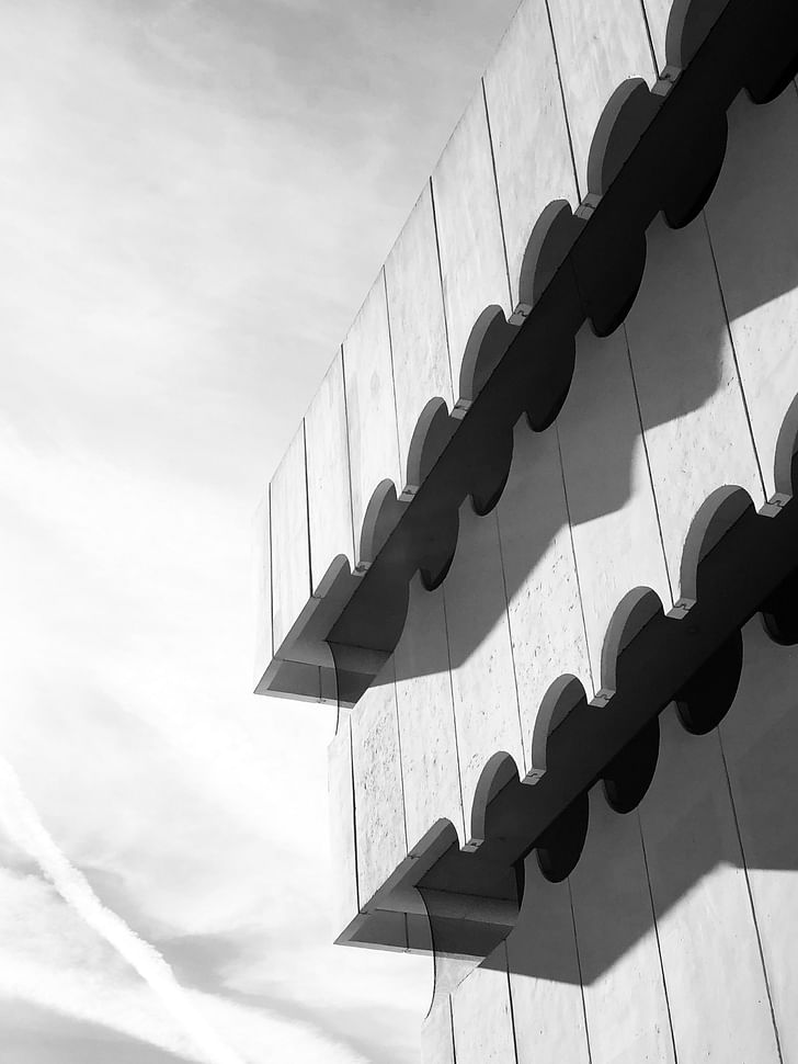
The purity of the volume is broken, yet emphasized through two undulating shadow lines running horizontally across its elevations. Formed by one hundred thirty-five densely arrayed circular apertures each, the two lines delineate the first sign of inhabitation of the white mass. The pristine volume is further dissected through the dramatic expression of its levels of interiority tapering outward, cantilevering one over the other forming a reverse pyramid. Interestingly enough, the break of the floor plate happens on a very critical moment on the face of our deformed white box. Each row of circles is split horizontally through their centerline, and sheared away from each other sectionally, doubling down on the sequence of circular geometric operations.
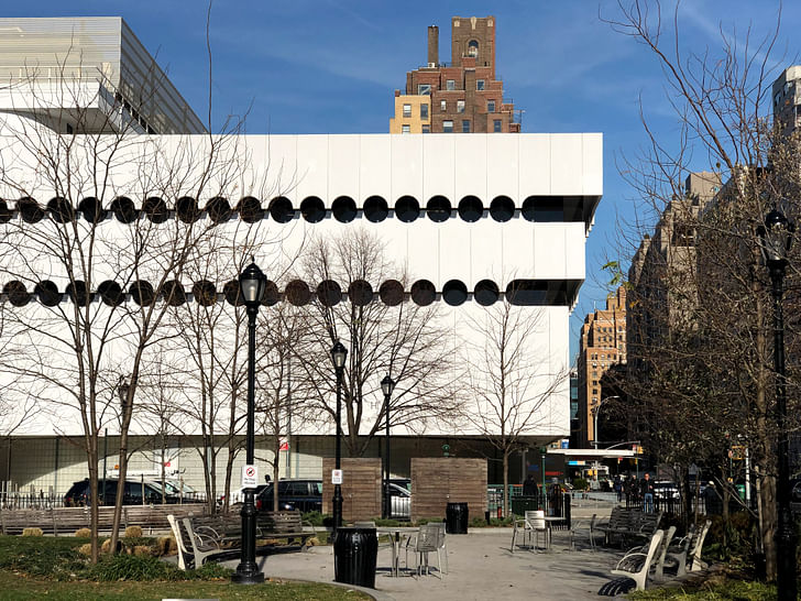
Further accentuating the object’s texture, a third surface is added at each split of the volume. The third plane detaches itself from the apparent vertical white surfaces, adding depth to the solid, further expanding the object’s mythology of occupancy. The shadow lines become windows, canopies, shades, outlooks, and balconies moving the white box from the realm of inscription to the animate.
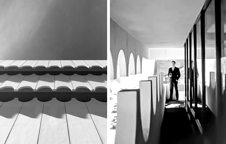
Above the datum set by its higher edge of the white box, a series of uncanny objects and smaller extrusions scatter across its top surface, peeking through the cornice, announcing their presence to the passer-by, invoking further inquiry of the mysterious object’s interiority. It's like… It's like that locker in your parents' house, you were never allowed to open, that red door in the “haunting of hill house”.
Program-less
In search of the satisfaction of the morbid curiosity created by the mysterious object, I gravitated towards its most visible portal leading to its interior world, or at least the one most visible for passers-by, under a canopy spelling the word: “EMERGENCY.” Walking up to the front desk, the uncanny volume slowly became tangible. “Welcome to Lenox Hospital’s ER! How may I help you?” The thing was then a building; That has a program; That has a name. “Yes, hmmm…I am sorry, no emergencies here. Do you happen to know who is the architect of this building?” The receptionist sights. “Bob! There is another architecture kid at the door!” Seventy-year-old Bob came from a door behind the reception, carrying a flyer with the Lenox’s logo and some general info on the front and “Our building’s history” on the back. It turns out that the building has had quite a life indeed.
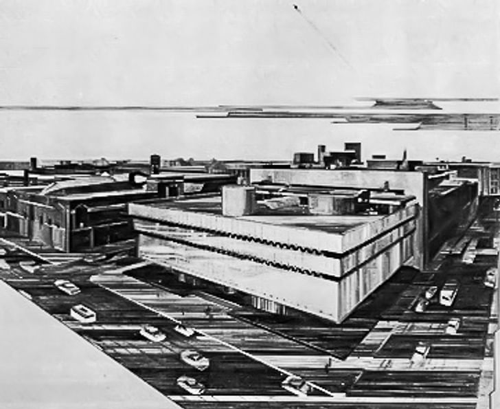
The building was originally the Headquarters for the National Maritime Union in New York, designed by Albert C. Ledner, a New Orleans based architect and Frank Lloyd Wright student at Taliesin. Ledner was hired by the Union’s president Joseph Curran in the early ’70s and completed the project in 1964. For 10 years it remained a populist palace, representing Maritime workers along the East Coast, and across the US at large. The aforementioned duet of intersecting cylinders, in section, extend its exterior perception into the double height hiring halls, event space, and lobby of the union. The shadow lines of the facade hide offices of operations whereas the rather strange selection of shapes and on the rooftop hold the union’s executive offices, council chamber, conference rooms, and an apartment, (probably Curran’s). Less than 10 years later, in 1973, and after the depletion of the union’s funds, the Joseph Curran Building was sold to the St. Vincent Hospital, renaming it as the Edward and Theresa O’Toole building. Our protagonist here has to abruptly change his name and identity; his “career” from an office space, which is pretty loose and generic in its planning, to a hospital, a program with almost no match in its specificity and complexity. The O’Toole/Curran building was finally donated to Lenox Hospital in 2011 and was renovated, serving as the New York’s medical giant’s imaging department.
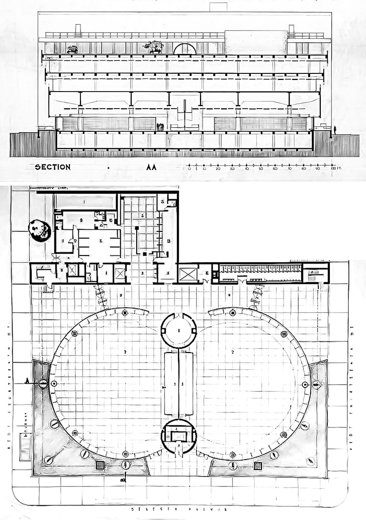
This is not a history lesson, however, but merely an identification of the box’s well-concealed content. Reading the drawings, Ledner does not delineate any specific use, no activity taking place, no furniture declaring repetition or uniqueness of program. They are left program-less, with the bathrooms in plan and four scale figures in the section, only there to provide a vague sense of scale. Even though the project was designed with the intention to host a very particular type of occupancy, the documents of its construction leave its life open to interpretation. A mythology to change, adapt and continue creating histories of its immediate past. One knows the strange object is inhabited but is intrigued to challenge its interiority again and again. Archetype However ever-changing the programmatic nature of the project might be, one thing is for sure: Its form, or rather, its architecture. The first encounter with the object has only created knowledge through sheer observation. Looking closer, the found object has an entrance, a lobby, structure, facade, windows, and a roof garden. It is a building, a piece of architecture, just like its surroundings, but entirely different.
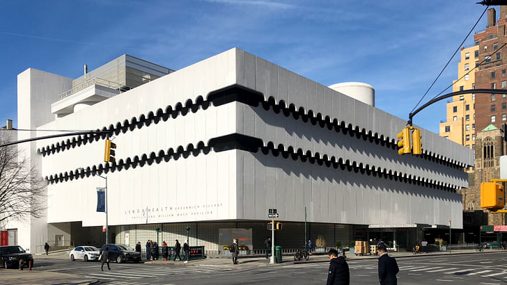
The project presents itself as solid from its exterior. An impenetrable fortress, a piece of marble freshly extruded from a quarry, carved in its architectural existence. Seeming to defy its then concurrent Miesian glass box trend deployed by around the US as the new American prototype for office buildings turns opaque. It resembles the heaviness represented by an architecture other than the International Style which it then served. A typology produced in another time, in a different cultural, political, and economical environment.
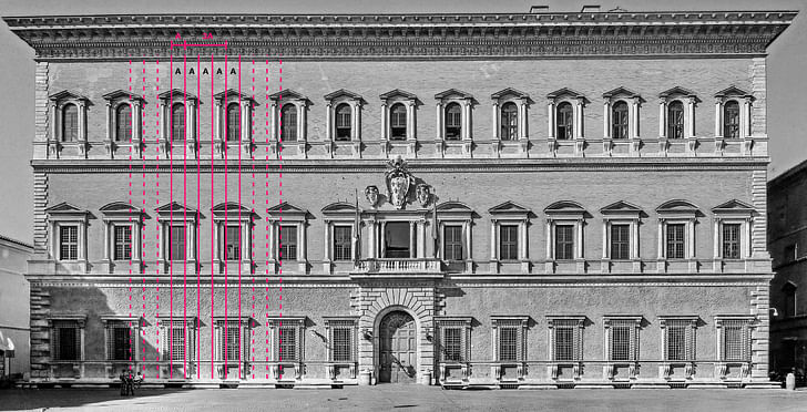
Such proportions, rhythm, and harmony can only be observed in 16th century Italy, specifically in the Renaissance Palazzi, as best represented here by the Farnese in Rome. The Palazzo Farnese operates according to the classical principles of rustication, holding a distinguishable, rugged base, two levels of inhabitation, and a heavily articulated crowning at its zenith. Its apertures form a 1 to 3 relationship with the adjacent solid wall and the structure hiding behind the exterior walls remains dense at the base of the building and lighter towards its top. It poses as the Farnese Family icon in the Roman skyline defying its surroundings, that one perfect golden rectangle dominating the city’s figure-ground. That perfect anomaly in the center of medieval Rome.
Yet the Palazzo has crossed the pond before. Yes, it grew taller and its order became gigantic in service the developing identity of the new world, with fine examples in the likes of McKim and Sullivan, but its organization remained the same. Impervious base, fluted body, imposing capital. All of these characteristics hold true for the Headquarters of the National Maritime Union in New York, however, they operate within the framework of 20th-century American economy and construction and new-found pursuit for democracy.
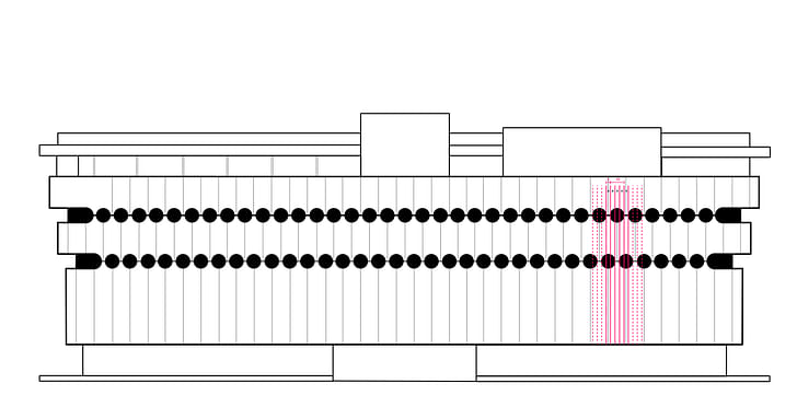
Thus the structure is steel, allowing for an open ground floor organized by scarce massive columns that support a transfer plate for the dense more regular structure above. The light structure is then dressed with an array of two intersecting cylindrical glass brick walls connecting ethereally to the street level. Above, the white overhanging facade itself is comprised of standardized concrete panels drawing a veil over an internal layer of continuous curtain wall wrapping around the building’s corners reminiscent of the mid-century office zeitgeist. The circular apertures formed by the undulating concrete paneled veil are arrayed in a 3 to 1 relationship to the adjacent solid. Ledner inverses the Palazzo. He operates in a system of reverse rustication where base allows for the illusion of openness towards the public space, where glass office hides behind the decoration of thin protective panels, and the capital serves as Le Corbusier’s 5th point of modern architecture (try remembering before googling). His is not an icon of remembrance of a glory long gone, but a vessel of transitional collective meaning. A perfect white box in the middle of Delirious New York. A palazzo on lease.
Our solitary box, today as it did when it was first designed, stands out of its brick, townhouse-filled surroundings. It remains misfit amongst Jane Jacobs’ New York. A programmed, yet program-less palazzo for the working class and the sick, operating in the framework of American modernity. A “monster” that balances on the fringes of the ordinary and the mythical, invoking fantasy, curiosity, and imagination through its mere existence. An architecture that combines the types of the 20th-century office and renaissance palace in a new archetype. An American Palazzo in Greenwich village.
Konstantinos Chatzaras is a New York based architect and writer, focused on the contemporary multiplicity of the architectural and urban form seen as a plural whole. Konstantinos holds his Master of Architecture degree with commendation from Harvard University's Graduate School of Design ...
1 Comment
This reminds me of I M Pei's argument that his Society Hill towers fit in to their Colonial surroundings because their window proportions mimicked those of the Federal townhouses surrounding them.
Block this user
Are you sure you want to block this user and hide all related comments throughout the site?
Archinect
This is your first comment on Archinect. Your comment will be visible once approved.