
Cross-Talk is a recurring series on Archinect that endeavors to bring architectural polemics and debate up-to-date and up-to-speed with the pace of cultural production today. Each installation will feature an introduction premise along with four responses by four practitioners to a single topic. For this week's iteration, we look at 'Academic Aesthetics'.
From Anthony Morey's introduction to "Archinect's New Critical Debate Forum ‘Cross-Talk'":
Can we discover a way to turn hourly, weekly, and monthly statements, and potent declarations into a just-as-often conversation? [x] Should we? What do we lose by questioning and conversing with the same tools and methods that the other side employs to advance theirs? Here, we attempt—if only to say we have—to bring criticality to the now.
Topic: Academic Aesthetics[y]
Things I'm sick and tired of re: Academic Aesthetics, in no particular order*:
[1] "Post-Digital" Bad Renderings.
[2] The GLITCH Aesthetic.
[3] The VRAY CHANNEL Aesthetic.
[4] Dogma Copycats.
[5] Illustrator Hatches.
[6] Serif Text.
Goodbye to all of these things. Good Riddance.
* Note: Please read footnotes before trolling. Or don't. Who cares.
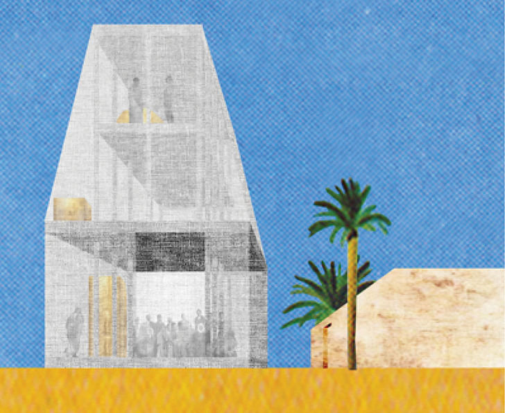
[1] "Post-Digital" Bad Renderings. (ex: KGDVS)
Some attributes of this aesthetic include the use of Photoshop noise, collage techniques, Gaussian blurs, intentionally bad people lassoing, bad lassoing in general, flatness, incorrect use of perspective and/or orthographic projection, etc.—basically, anything you see on KooZA/rch. It's been said that this new style is a direct response to the hyper-realistic renderings and imagery produced by architects and designers during the 90's and early 00's, brought about by advances in rendering software and technology (see: Jacob, Sam, "Architecture Enters the Age of Post-Digital Drawing"). This seems plausible and likely but, if this is the case, why do we still deploy the technique? Others might point out that collage-style renderings allow for the illustration of a larger, conceptual project, where the exactness and precision of minutiae are secondary concerns, if at all. Detailed concerns are then relegated to the world of the orthographic projection. Fine, I can get behind this; however, just like with any skill set, why not learn it to the highest level, and then selectively and intentionally "dumb" it down? By only requiring, and even encouraging, the use of the most basic of techniques, is the academy failing and stunting the education and growth of its students? For a much more informed critique on this topic, take a look at Lane Raffaldini Rubin's response to Sam Jacob's article: "We will never be post-digital."
[2] and [3] The GLITCH Aesthetic and the VRAY CHANNEL Aesthetic. (ex: MILLIONS)
There seem to be two other popular aesthetics in the academy today, which I believe are in grave danger of being re-appropriated as simply "images with nothing to say"—I'll call them the GLITCH Aesthetic and the VRAY CHANNEL Aesthetic. There's some crossover between these two styles, and at this point, we are all too familiar with them. The GLITCH is known for GIFS, for mashups, for scratches, tears, and streaks. The VRAY CHANNEL utilizes shapes of contrasting colors that are typically found in the VRay output of render channels such as RenderID, MaterialID, etc. While some may not readily admit, or are shy to discuss their firm's own representation decisions, the originators of these aesthetics (see: MILLIONS, MOS) were grounded and inspired first and foremost by intense architectural ambitions, either through the elevation of an architectural thought about form, organization, or program, or through a meta-level critique of architectural representation itself. However, these aesthetics have already begun to be misused, misunderstood, and poorly imitated, perhaps even more aggressively in the contemporary Instagram age because of their intensely seductive imagery.
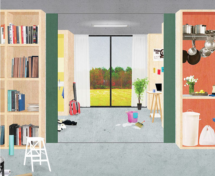
[4] Dogma Copycats (ex: DOGMA)
Some major issues with this one. First, it features architecture with no people. Instead, a ton of junk – crumpled dress shirts, kid's tricycle, easel, laptop, shitty folding chair – is displayed in what looks to be a big kind of open space, post-and-beam structure, uninhabited, etc. It can easily be confused with the "Post-Digital Bad Rendering Style," and while there are some overlaps, it remains its own category because it is typically a one-point perspective, rather than a distorted orthographic projection, and thus has some spatial ‘accuracy' or ‘experiential' quality. As far as I can tell, this trend began with PV Auerli and Martino Tattara from Dogma, and I will admit that as far as the representation goes, I understand how it supports Dogma's, and perhaps more specifically, Pier Vittori Aureli's own architectural propositions. Aureli has written about the dissipation of formal specificity of architecture as we move towards a society where program becomes less dependent on space itself (see Communal Villa: Production and Reproduction in Artists' Housing, The City as a Project, Dogma: 11 Projects, to name a few). Re-calling the ambitions of Corbusier's Maison Domino, for Aureli, here again, the role of architecture is to act as a flexible container, or rather, a framework, for program and organization, albeit slightly updated and modified for today's age, the age of backslash, the age of this AND that, i.e., the era of live/work, live/live, work/live, work/play, etc. It's a bit of a simplification of Auerli's thesis, and he does in fact call for architectural specificity—at the scale of the wall—but for the sake of this argument, we can leave it at that. While I may have some objections to Auerli's project, I believe that his representation technique does indeed support his proposal. Here, the representation technique and the decision to include interchangeable junk and no people illustrate this project of flexibility, of specificity through program and organization and not form; however, I'm not so sure the countless Dogma Copycats have the same architectural agenda. Maybe they do, but based on the form, based on their plans, elevations, sections, I get the sense that generally, they do not, and are largely uninformed. Dogma Copycats: pick a representation style that supports your architecture. Let the image, the aesthetic, compliment your individual project. Or don't. If it looks cool, people will probably like it. I'll probably like it. And you'll probably get a bunch of likes. I suppose if you like it, that's all that matters. Just understand that it did start out with intention and as a critical decision that supported an idea at a theoretical, and fundamentally architectural, level.
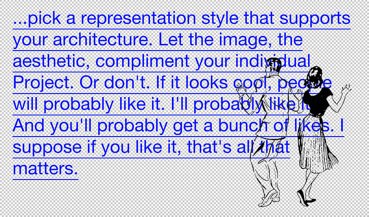
Dogma Copycats: pick a representation style that supports your architecture. Let the image, the aesthetic, compliment your individual Project. Or don't. If it looks cool, people will probably like it. I'll probably like it. And you'll probably get a bunch of likes. I suppose if you like it, that's all that matters.
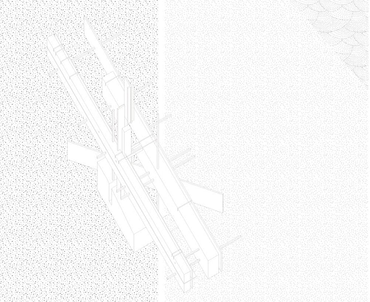
[5] Illustrator Hatches.
Don't even get me started.
[6] Serif Text (ex: LCLA)
I can't stand this new phenomenon. What's going on here? When did this become a thing? When did our drawings become too precious for the ‘brutish' sans? Is this the text equivalent of the "Post-Digital" Bad Renderings, a backlash to the hyper-real, the "modernist," the mechanistic, and the computational? Or is this just some kind of petty validation and superficial authentication of architecture as a field of importance, of value, and sophistication. Or maybe, it was just time for a change; maybe, we had it all wrong with moving to sans-serif in the first place; maybe, we're back where we belong with serif. Okay, I've actually changed my mind—very pro-serif. I think perhaps the issue I have is that it is just such a mystery to me when, how, and why we shifted back, not the fact that we have.
[x]
What Morey is referring to is his belief that "the slow pace of traditional text-centric publishing appears to be losing ground to the rapid production and transmission of images" ("Introducing Archinect's New Critical Debate Forum ‘Cross-Talk," Anthony Morey, 3/22/17). He asks whether text can and/or should catch up to the image. It is clear that text should (see [y] Academic Aesthetics), but I think there is something here in Morey's introduction to Cross-Talk that needs to be teased out a bit more. When Morey addresses this mass proliferation of architectural images, it must be noted that this is only possible by the production OF THE MANY. The thousands of images we scroll through are authored by thousands of individuals, and these images are often the culmination of hours and hours of labor, sometimes entire semesters, sometimes entire years. Thus, one might argue that the production of architectural images is just as slow as the pace of architectural writing, and perhaps even slower.
The thousands of images we scroll through are authored by thousands of individuals, and these images are often the culmination of hours and hours of labor, sometimes entire semesters, sometimes entire years.
Then, if it is not the production of the content that is the issue, but the transmission and publication, what's the problem exactly? I'll speculate two answers. First, we don't write enough. Many of us don't like to write, and critical writing is hard. And it's not necessarily about writing well, but rather, writing thoughtfully. I realize the absolute importance of writing, and despite my lack of experience in the field, here I am (Big thanks to Tony for the invitation to participate in this amazing forum). Second, we are not nearly as interested in scrolling through architectural texts with the same intensity, and perhaps speed, as we do with architectural images. For many, reading takes time and energy in ways that the architectural image does not. (If you disagree, then you are most likely someone who appreciates the value of both architectural writing AND visual representation, which explains why you are interested in this forum in the first place.) Here, the problem resides in the absorption of content, not the production or transmission; generally, we are Lazy Absorbers.
So, what do we do? If the problem is production and transmission, then it's on all of us to write a whole lot more. If the problem is absorption, we need to be less lazy. But is there a way that writing, like the image, could provide the same kind of eye candy the architectural representation can? Can we provide "text the freedom that the image has accepted and embraced?" ("Introducing Archinect's New Critical Debate Forum ‘Cross-Talk," Anthony Morey, 3/22/17). The answer might lie, like the architectural representation, in a new consideration of form and content. We must rethink the formal structure of how we write for mass-absorption—bullet points and polemical statements that lead to sub-threads of further insight and inquiry—as well as the way in which we write for mass-transmission—thoughtfully messy, quick and from-the-top, informal-yet-critical writing, full of bolds, CAPITALS, italics, em-dashes, breaks, run-ons, etc. – so that perhaps finally, we can breathe new life into architectural writing, and save it from falling behind the image.
[y] Academic Aesthetics
The following is an obvious point, but one that is worth restating: representation must be in discussion with the architectural content itself; it cannot stand alone. It MUST highlight, uncover, and reveal something about its design, about the aspirations of the Architectural Project itself, about the FORM and ORGANIZATION of space. If it cannot perform in this way, it is a Bad Architectural Representation. The image must take itself seriously in support of its architectural project, and the architect/Instagrammer must be held responsible for his or her choice of image aesthetic.
The issue I see with Instagram, KooZA/rch, and this mass proliferation of architectural imagery is that it is being absorbed by students, and young designers – these sites remain the go-to source of "inspiration" -- and are thus fed back into the academy, without any knowledge of their intellectual underpinnings and architectural content.
By splitting up text and image, the image and the representation have now become merely aesthetic, devoid of any of the criticality that a particular mode of representation may have once intended to have and to hold as it related to a specific architectural project. This is just the way it is; there are no signs of this slowing down. In fact, this split seems to be one of the underlying reasons Morey has created this forum in the first place. The issue I see with Instagram, KooZA/rch, and this mass proliferation of architectural imagery is that it is being absorbed by students, and young designers. These sites remain the go-to source of "inspiration" and are then fed back into the academy without any knowledge of their intellectual underpinnings and architectural content. The image on the newsfeed, though its meaning is not lost, has in effect lost all of its architectural agency through the process of transmission, absorption, and re-transmission. Fed back into the academy, Good Academic Aesthetics become Bad Academic Aesthetics. Bad Academic Aesthetics are fundamentally opposed to the role of the architectural image, and of architectural representation in general…they are irresponsible, un-intellectual, and lazy.
6 Comments
"Or is this just some kind of petty validation and superficial authentication of architecture as a field of importance, of value, and sophistication"
Well, for starters, LCLA is primarily a landscape architecture practice. And the use of serif in that field references botanical and geologic mapping practices at the turn of the 19th/20th centuries, which were instrumental in the creation of the discipline. Also, there are many LA practices--and LCLA is one of them--who are interested in critical cartography and thus draw heavily from cartographic graphic standards. One of those graphic standards is the use of serif font. In this case, Garamond.
This is all very architecture-centric, but aesthetics are never limited to a single field. There is an enormous body of critical analysis of contemporary aesthetics that could help clarify what architects and architecture students are doing with their images.
http://commonedge.org/what-we-...
"The issue I see with Instagram ... and this mass proliferation of architectural imagery is that it is being absorbed by students, and young designers. These sites remain the go-to source of "inspiration" and are then fed back into the academy without any knowledge of their intellectual underpinnings and architectural content."
Young designers and students can't be trusted to absorb, understand, and filter the visual world on their own? How very condescending. Lets get one thing clear, the future belongs to young designers and students. Don't hold them back. Don't dismiss them, or their aesthetics. Just try your best to keep up with them.
Get a #2 pencil with an eraser; learn how to sharpen it.
The pointy end is shadow the round end is light;
Keep adding light until it feels right; then stop.
That's a good point. Architectural image style are supposed to explain intention. No matter if it is ugly rendering or hyper realistic rendering.
But we must realize that we live in high traffic information era, that i think it must be a big advantage, not only for people but also for us, architects. we could maximizing these image platform, to make people understand our intention is. It's definitely not to be constrained by image style. but we are challenged to make an image that could easily explaining to people, in this high traffic information era.
Block this user
Are you sure you want to block this user and hide all related comments throughout the site?
Archinect
This is your first comment on Archinect. Your comment will be visible once approved.