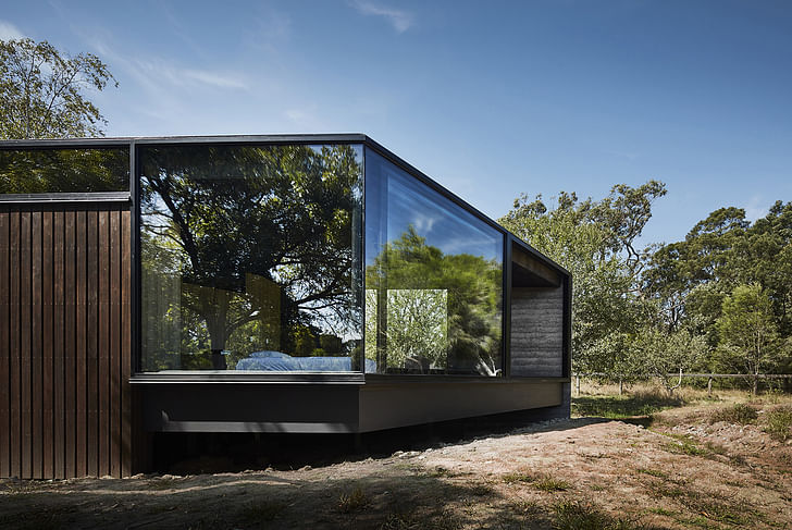

“A Pavilion Between Trees” in Balnarring, Australia stands out nicely in its rural landscape without being overbearing. Designed by the aptly named Australian practice Branch Studio Architects, the 85 m2-building is a new, private residential extension comprising a bedroom, an ensuite, and incorporated ancillary spaces that allow its occupants to take a breather and slow down. The structure's quiet atmosphere reflects on idyllic, simpler times long before the days of our tech-driven lifestyles.
Built on a 40,000 m2 site, the existing residence — a 1990s owner-build that the client inherited from purchasing the property — had little interaction with its context, Branch Studio Architects describes. The client and design team wanted to counter this with a new pavilion extension that strongly connects with its rural landscape.
To further emphasize this connection, Branch Studio Architects and the client decided early on that the trees surrounding the project site would be left alone. The extension was designed to be semi-detached, which would allow it to have its own identity and provide occupants with the necessary “breathing room” so to speak, away from the main, open-plan family residence.
The overall aesthetics of the extension are earthy and calming. On the exterior, the material palette comprises raw charcoal-rammed earth, timber, steel and glass that will naturally weather and patina over time. Steering away from excessive artificial lighting, the interior also uses charcoal-rammed earth, timber, and honed bluestone with accents of brass trims, concrete, and steel.
The pavilion can be accessed through an exiting central corridor from the main house. “This central ‘boardwalk’ splits the ensuite areas into two distinct spaces before peeling away into two circulation paths around a central arrangement of joinery dividing and defining the robes. As the spaces unfold, the floor level rises gradually (to about 1 meter above ground level) via a series of platforms that subtly ascend and divide the spaces across the length of the building,” the architects say.
“Starting as a simple rectangle, the plan evolved through a series of restrained but deliberate formal gestures to directly reference the existing context. A small gouge was made, creating a courtyard space to house an existing silver birch tree to the south. This courtyard acts as the threshold between the bathroom areas and the rest of the pavilion providing separation between the ensuite and the main bedroom spaces. External and internal seating is arranged around the courtyard.
The other formal interventions consist of two extruded window boxes that are pulled out to directly interact with the existing adjacent trees [as well as] the angular slice to the end of the pavilion to orientate the space towards a view corridor through existing vegetation, towards the setting sun to the west.”
Find more photos in the gallery below.
Editor/Writer for Archinect + sister site Bustler. Leans toward: public interest design, illustration, graphic design, history, and general pop-culture geekiness, among other things. Enjoys a good bowl of noodles.
3 Comments
nice project
An odd mix of uncomfortable materials in somber tones. The glazed projections are nice. The stained plywood ceiling is hideous, the corporate-gray carpet is sterile, the built-in benches(?) awful. Not much warmth and seemingly no place to hang art. Add some racks and mannakins and it would make a trendy designer clothing store.
Dig the rammed earth and luxe-bunker vibe, but given the almost 1000 sqft project size and it's residential / permanent nature, "A Pavilion" seems perhaps not quite right...
Block this user
Are you sure you want to block this user and hide all related comments throughout the site?
Archinect
This is your first comment on Archinect. Your comment will be visible once approved.