
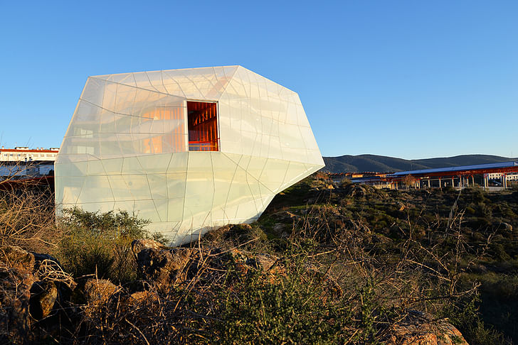
Located on the boundary between the town and the country, in outskirts of Plasencia, SelgasCano's dreamy auditorium sits on a steep hillside—the edge between the nature and the city. Gently occupying the lot, cantilevering off the ground, the building stands out from the mountain landscape, its surprising materiality and colors both—complementing and contrasting the shrubby semi-urban setting.
Resting on and covering the least possible area of the allotment, the building connects to the street that lies 57 feet above the natural terrain through the vivid orange entrance on top of the auditorium. The bright entry porch punctures through the building, opening up to the panoramic views of the Sierra de Gata mountains. From there, one can access the building by travelling down the building's sides. The elaborate ramp and stair system runs between the translucent "raincoat"—panels of ETFE plastic and the concrete structure, mingling between the interior and exterior.
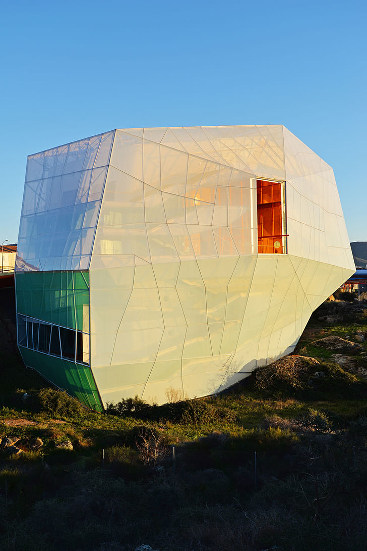
The architects attribute the building's form to its section, in which most of the program is superimposed over the main hall. The secondary hall, meeting rooms, and an exhibition space all rest on top, allowing for the building to cover the smallest possible part on the ground. 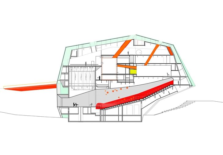
SelgasCano intended to accomplish both—preserve an island of natural earth in the future expansion zone, and to create a monumental structure that catches the eye from all sides. Pale and luminous during the day, its skin becomes a glowing lantern at night, completely transforming the color-saturated perimeter circulation areas and upper stories.
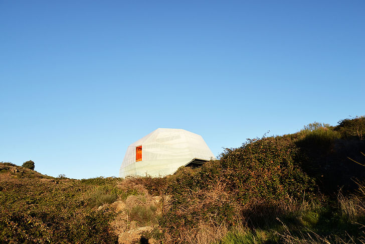
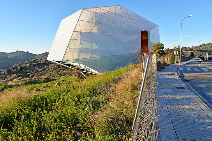
It’s like a rock that is poised over the landscape but could fly away at any moment.
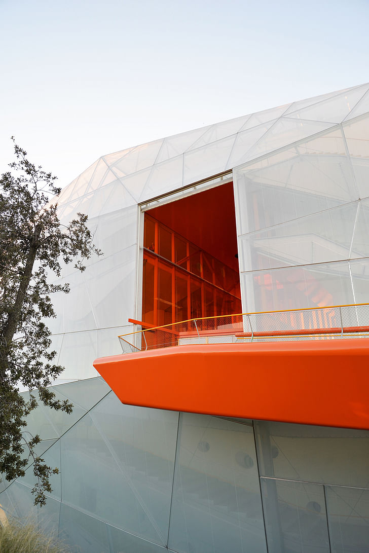
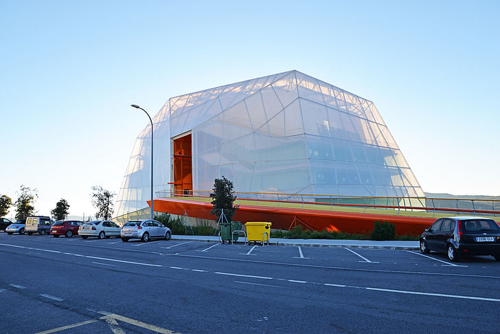
The building will be visible in the distance from an entire western perspective, from north to south. It will be seen when passing by at high speed in a car, which is why we have planned it as a snapshot or a luminous form, acting as a sign for passengers by day and by night, playing at being a correspondence between sensation and reality, between the position it seems to be heading for and the position from where it will move.
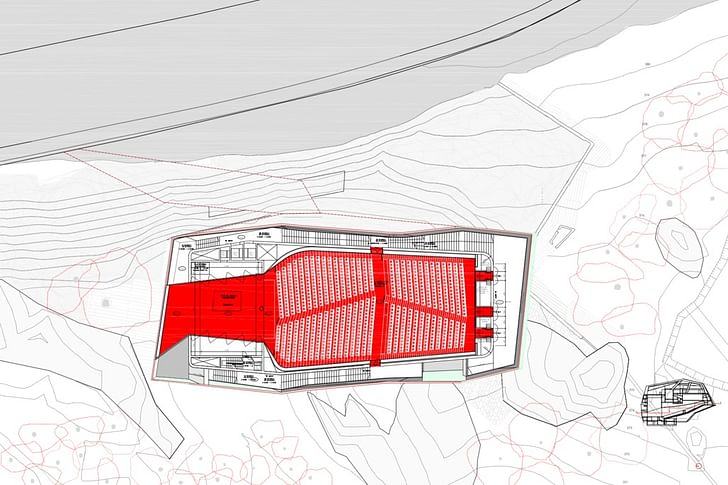
As Cano refers to them, “the warm heart” of the building—the seating, floor, and the lower portions of its walls are red. The entry portal pops with its yellow, green and orange hues. Poetic and mysterious, the design appears as a further exploration of the firm's strategies previously explored in other projects—bright and playful interiors, maze-like circulation, white ETFE plastics and the unpredictable geometries.
A designer & writer based in Los Angeles anastasiatokmakova.comyouthartsclub.com
No Comments
Block this user
Are you sure you want to block this user and hide all related comments throughout the site?
Archinect
This is your first comment on Archinect. Your comment will be visible once approved.