
Earlier this year, we launched the UK portfolio competition to celebrate and expose the wealth of fantastic work already up on Archinect as well as to encourage individuals not registered to upload and share their work with our global online community.
These awards aim to celebrate and promote the exceptional talent, vision and innovation of UK architects, interior architects, landscape and urban designers, and will henceforth become a yearly event.
We received so many fantastic applications and I want to thank all of you who applied. The calibre of work was extremely impressive and choosing the winners was an extremely hard task!
Make sure to click on the winner's profiles and view their full portfolios on Archinect's new hosted PDF portfolio service. There is no need to upload and manage your portfolio with Issuu anymore. Not only is it faster and easier, but it will also show off your work in a much nicer format with no ads.
The 2017 winners are...


Judges said:
"Clear and easy to read with a consistent layout and visual style. "
"Very well presented portfolio of work that demonstrates a broad range of skills from architecture, to graphic and product design. Each project thoroughly described through the use of different drawing styles and media while at the same time in a consistent language. The inclusion of models and process photographs a good addition. Clear layout with full bleed images across both pages. The use of vignettes particularly effective in illustrating moments within the project. Original design ideas and particularly liked the 'Blow your glass of wine' project."
"Very nice variety of initiatives. Good understanding of place, and focus on nature. "
"Very clear and well-designed layout. It was easy to follow the progression of projects and was enjoyable to look through."


Judges feedback:
"Professional visuals with a clear concept. Good use of colour."



Judges Feedback:
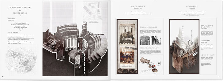
"Good to see a consistent use of hand drawing and model making as a way to develop the proposals.
Particularly liked the Community Theatre project that is described in great detail through a number of drawing studies that explore context and materiality for both the external expressions and the interiors, with reference to history and narrative."
"Made the project seem real and demonstrated real skill with explaining a concept with a wide variety of techniques. "
"Beautiful, atmospheric and sensual drawings with some really lovely view perspectives ."



Judges Feedback:
"Intricate, detailed images that are very intriguing."
"Bold, evocative. impressive level of detail."
"Intricate 3D drawings and renders successfully illustrate the spatial complexity of each project. Well presented alongside text and diagrams to clearly explain proposals."

Judges feedback:
"Very impressive imagery, that is imaginative and characterful."


Judges Feedback:
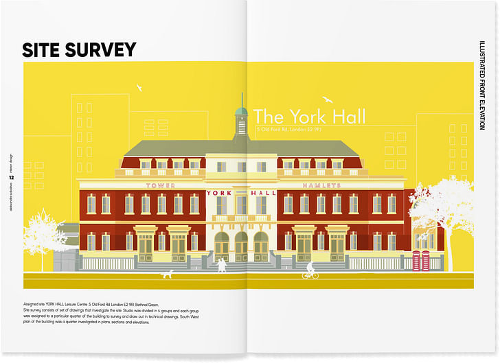
"Superbly elegant typography, creative and fun, clear and dynamic ."
" Strong directive clear text layout that suits the style of the portfolio and looks great. "
"Clear headers which make you feel like your know where you are in the document. Clean, attractive text that provides a guide without competing with the imagery. "
"Giving a title and subheading to each project creates a strong identity. Clear layout focusing on large format images - allowing enough white space is important as some portfolios can be too heavy in content."
"A fun and playful design with a bold typeface that invites you in further."


"Very striking, well designed ."


"Good to see a different format used and this square shape carried through in the drawings and imagery throughout. Good use of colours and a design style which provides a clear and easy to understand portfolio."
"Consistent theme; engaging use of colour; we liked the take on Mondrian theme."
"Very thorough research and grounding for the concept - has really thought outside the box. "
"Good use of design to curate content. The colour guide is particularly effective, it is clear and well planned and enjoyable to look through."
"Liked collage style shown in the work. Shows originality and playfulness which is important when communicating ideas. Projects are animated with inhabited sections showing life and movement. Strong use of colour. "
"Superbly creative, fresh, dynamic, interesting, really lovely!"

" Nice to see different sizes and paper formats used in a creative way. A good mix of detail drawings, model photography, renders and diagrams. "
"Great to see the inclusion of self initiated projects/competition work in a portfolio as these show an interest in design and creativity outside the academic and professional environment. Flair for hand drawing with some very nice sketches and illustrations."
"In a class of it's own!"
"The chunky, bold text of this portfolio adds a fun and playful touch while making it clear and easy to understand. There is a nice balance between white space, amount of text and size of imagery which means you are not confronted with too much all at once. The colours and imagery portray the projects well and give a sense of delight."
"This portfolio stood out for its clear communication of ideas through the a range of drawings, collage, photographs and models that demonstrate a broad range of skills and originality. Liked the use of colour and animation used in the images which bring the projects to life."
"Overall this is a very coherent well-designed portfolio that has a clear tone and style throughout. "
"A wonderful subversive concept which although tongue-in-check provides a practical solution for public action. "
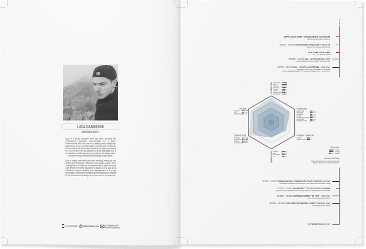
"Very intriguing and make us stop to consider what was going on in each image; we felt that Luca was very expressive in his drawings; the cover was captivating; the length of the portfolio was just right. really good work."
Thank you to everyone who attended the Interiors Educators Freerange show and awards ceremony and thank you to all those who helped organise the event as well as our judges.
Keep your eye out for more Archinect competitions and if you didn't enter this year make sure you do so next year.
Thank you also to our sponsors:
Archireport – the building site management application for architects and project supervisors
Beswick Printing Solutions – who are offering 50% off on all printing – just quote ARCHINECT when ordering
Laurence King Publishers who are also offering 25% off all books just enter ARCHINECT (in capitals) into the discount box online.
Ellen Hancock studied Fine Art and History of Art at The University of Leeds and Sculpture at Mimar Sinan Fine Arts University in Istanbul.Now based in London she has a keen interest in travel, literature, interactive art and social architecture.
No Comments
Block this user
Are you sure you want to block this user and hide all related comments throughout the site?
Archinect
This is your first comment on Archinect. Your comment will be visible once approved.