
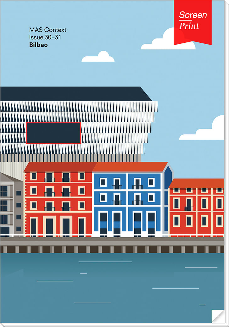
The story of Bilbao—and its Architectural Wonder™—has been told to the point of cliché. Yet in MAS Context's BILBAO issue, the familiar trope is given new life and depth as a series of architects, designers, and denizens of the city explain how they helped to transform this Spanish industrial town into a case study for holistic, rejuvenating design. In this excerpt from the issue for Screen/Print, Iker Gil interviews the late, great Diana Balmori about her firm's work on the Abandoibarra master plan.
It seems odd that a city would forget about its river, until you realize that other major global metropolises—Los Angeles chief among them—have in the past often treated rivers or other water sources as nuisances. This trend has abated in recent years as landscape architects have started to show city planners and its residents the power of rivers to not only connect people, but also create a satisfying and enriching design element. Diana Balmori, who passed away in November of last year, was among one of the finest practicing landscape architects. Her ability to inject natural beauty into an urban environment while enhancing and even streamlining infrastructure is unparalleled. In this interview with MAS Context's Iker Gil, Balmori discusses the process behind her design.

An Interview with Diana Balmori
Conducted by Iker Gil
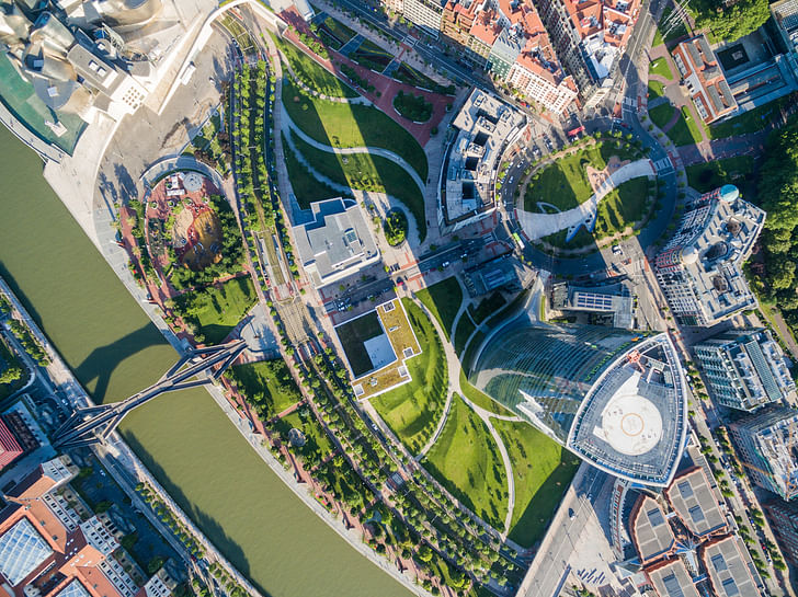
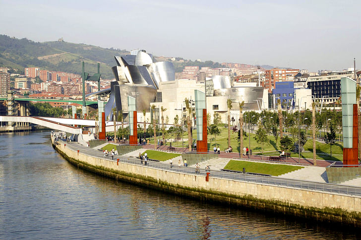
The Nervión River, or Ría de Bilbao as it is more commonly known, is arguably the most important piece of infrastructure of Bilbao. The city, founded and developed for centuries along the riverbanks, turned its back on the waterway during the industrialization of the last century. This ultimately mutated the river into a physical barrier, inaccessible for the residents of Bilbao and occupied mostly by industry. In 1993, the Bilbao City Council organized an international competition to design the Abandoibarra master plan to recover the former industrial area and reconnect it to the city. A team formed by Cesar Pelli & Associates, Aguinaga & Associates, and landscape and urban design studio Balmori Associates won the competition for the area that would become the symbol of the transformation of Bilbao.
Balmori Associates was founded in 1990, just three years before the Bilbao City Council organized an international competition to design the Abandoibarra master plan. What were the aspects that you were interested in exploring in the office at the time?
Many jobs in the office were focused on how landscape can interface with cities. The two typologies we were exploring were linear parks and water management in the public realm. At the time, I was also writing Redesigning the American Lawn, A Search for Environmental Harmony (Yale University Press, 1993), which I co-authored with Yale colleagues Herbert Bormann and Gordon Geballe. Linear parks, which I have called the twenty-first century park, are not what we previously called “park,” usually empty land made into a densely planted terrain in the picturesque style. The linear park is also usually abandoned nineteenth century in- frastructure, railroads, canals, etc. in which planting and greenness is engineered in. These parks were planned as a destination to contrast as dramatically as possible with the city itself.
What projects were you working on then?
In the early 90s, the office was working on the Farmington Canal Green- way master plan in New Haven: a then abandoned railroad and former canal which preceded the railroad. We worked for a citizens’ group, the Farmington Canal Rail-to-Trail Association, founded by New Haven and Hamden residents and chaired and led by the New Haven activist and ecologist Nancy Alderman. The master plan was an exploration of what this new linear invention could lead to. We used the long passage to intervene along its course into the immediate The linear park is a new prototype of open public spacecity elements around it. I have compared itto a centipede because the sides of the greenway offer infinite new opportunities: a temporary closing of a crossing street for a fair, a farmers market on certain days, the opening of a back door on a building towards the linear park, intersections where buildings or land is for sale, etc. The linear park is a passage not so much as destination, but a route that takes you places and weaves together pieces of the city. The linear park is a new prototype of open public space. In this particular project, a great amount of research was devotedto understanding the possibilities of such a narrow, 25-foot-wide corridor, which might eventually extend to a length of as much as 84 miles, since the railroad line runs up to Northampton, Massachusetts. Our commission from the Farmington Canal Citizen Association, for a first conceptual presentation of the New Haven section, was followed by two grants, one from the NEA for work on the second section of the Farmington Canal, in Hamden, and another from the Carolyn Foundation for further work on the New Haven section.
The result of all these ideas became an exhibition at the Museum of Contemporary Art (MOCA) in Los Angeles, curated by Elizabeth Smith as part of a show of fifteen new US urban projects, called Urban Revisions: Current Projects for the Urban Realm (1994). In 1995, the exhibition traveled to the Canadian Center for Architecture, in Montreal. Concerning water management issues, one of our projects was on the outer edges of Minneapolis, in Farmington, MN. The city council asked us to provide an alternative plan for draining the development. We designed an innovative riparian system, a network of channels, swales, and ponds that would function as an ecological drainage system and, at the same time, create the open green spaces have become an integral part of the communitypublic green space for the community. The landscape design resolved several naturally occurring and man-made ecological issues for the development. The chosen site was a flat plain with a high water table that caused frequent flooding and storm water to empty into nearby rivers. Suburban developments typically produce problematic amounts of water run-off due to the large areas of impermeable surfaces in its roads, roofs, and driveways. To mitigate these environmental problems, Balmori Associates proposed an open water drainage system in place of the usual underground pipelines. For the nearly 500 homes in this new development, the excess drainage water was channeled into a system of small ponds and swales, areas of planted grasses and sedges that absorb and filter the run-off rainwater. As part of the drainage solution, the project created 91 acres of planted public space consisting of a civic lawn, playing fields, and bike and pedestrian paths. The wetland ecology of the designed landscape also created a healthy habitat for regional wildlife increasing biological diversity. Dubbed “Park Place” by the local residents, the open green spaces have become an integral part of the community, functioning as part of its infrastructure as well as a much-valued public amenity. We created a landscape shaped by natural systems, establishing a “productive park” that set a new standard for responsible suburban development and stands as a plan for the growth of a city as it expands.
For the competition, Balmori Associates teamed up with Cesar Pelli & Associates and Aguinaga & Associates, ultimately beating the other participants in the competition: Ricardo Bofill, Jose Antonio Fernandez Ordoñez, Eduardo Arroyo, and Francisco Mangado. Can you talk about how the proposal was structured and its goals?
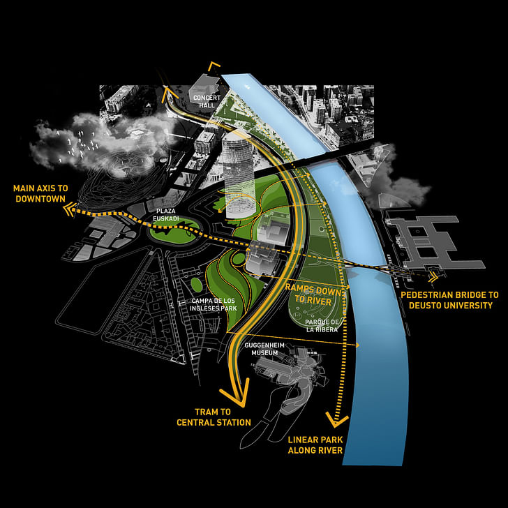
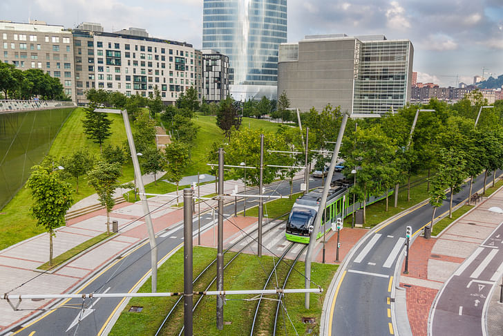
While we were in charge of the streetand open-space master plan, the buildings' layout was master-planned by Cesar Pelli and Associates and a Bilbao architect, Eugenio Aguinaga. Three main goals of the master plan were to increase connectivity, access the water edge, and expand the amount of green space while incorporating sustainable design practices. I conceptualized the master plan as a series of parallel lines, or thin bands, each representing a different zone or floodlevel, each of a different material, and each charged with a function. Its most critical space, the line between the water and the land, had already been determined. The master plan reinforced it with parallel spaces: walkway by the water; walkway three feet above the shore; boulevard with sidewalks; and green center The additive potential of the parallel edges was understood and expressed clearly by connecting themmedian for a light rail. The high-speed roadway was ‘slowed down’ and turned into a boulevard with multiple pedes- trian crossings. A light rail now connects the two main cultural centers of the development, Frank Gehry’s Guggenheim Museum and the opera house [Arriaga Theater]. The additive potential of the parallel edges was understood and expressed clearly by connecting them. One main straight road, Ramon Rubial, cuts across these parallel lines and moves from city level to water level—a forty-two feet drop—and then, via a new pedestrian bridge, to the old University of Deusto on the other side of the river. The plan’s node, where the second and third levels end up and connect with existing city streets, became the central plaza— Plaza Euskadi—which we would later be commissioned to design.The master plan became a legal document and could be changed only in minor ways. The biggest change that occurred was to allow the Deusto University library designed by Rafael Moneo to be built one floor higher than originally planned.
When you participated in the 1993 competition, did you have a sense of the importance that the site would have in the transformation of Bilbao?
The competition was organized by the public agency BILBAO Ría 2000, a non-profit entity, the product of a commitment on the part of all public authorities in a common task to transform the metropolitan area of Bilbao and the former industrial spaces around the city. In 1993, they had just been created, but their ambition and comprehensive approach to development, cultural institutions, and transportation was promising. Also, by the time we entered the competition, we knew that the Guggenheim Foundation had decided to open a new branch of the Guggenheim in Bilbao and that Frank Gehry would be the architect for it.
The original 1993 competition entry was later revised in 1994, with a third and final version prepared in 1998. What were the changes in each one of the proposals and what conditions drove those changes?
There were no changes in the proposals as to the open space, although the elimination of the underground railroad line service made for a delayed resolution of Plaza Euskadi. All the other changes affected the buildings more directly. They did not affect the open spaces except for the decision to build the bridge to the university.
The project was completed in 2012, almost two decades after the original competition. What are your thoughts about the result? Is there anything that has surprised you?
I am satisfied that two of the main aims for the open space were achieved; (1) to connect the piece of land indirectly to the main city on both sides of the river and (2) to give the public that access to the river with generous amounts of green space. In 2008 the construction of the Plaza and Park was impacted by the economic downturn in Spain and the original budget was cut drastically, leading to a complete redesign for both. Decisions were made for these leaner times with a mixed prairie planting, mixing grasses and wild flowers, with only large trees for the perimeter of the plaza, and fewer flowering trees in the park. Water features were removed and a moss garden and a reflecting puddles section were designed.
After your initial work for the Abandoibarra master plan, you worked on two other permanent projects and a temporary installation in Bilbao. The two permanent projects, Plaza Euskadi and Campa de los Ingleses Park, are connected with your first project, but they have a very different historical context. While the Plaza Euskadi is a new space in the city, the Campa de los Ingleses is an area with a relevant presence in the history of Bilbao, having been a British cemetery and a soccer field for Athletic Club Bilbao, among many other uses. Did those different contexts play a specific role? How did you approach both projects?
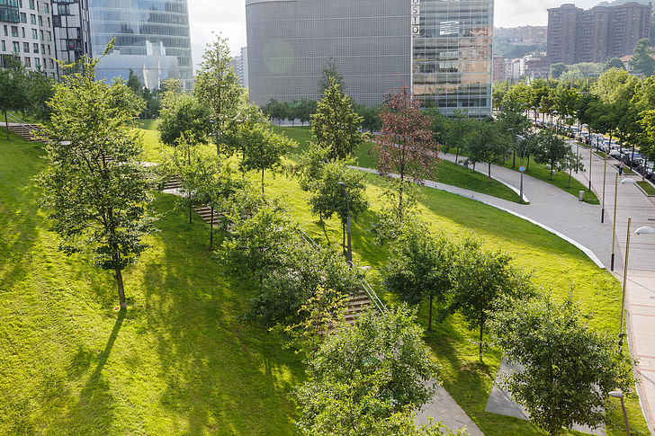
Yes, in 2003 Balmori Associates was commissioned to design Plaza Euskadi and in 2007 we won, together with RTN Architects, an international competition to design Campa de los Ingleses. Both projects are in Abandoibarra. The third one you’re referring to, the temporary installation of the Garden that Climbs the Stairs, is 1,500 feet east of the Guggenheim. We also authored the landscape for Iberdrola Tower, which is seamlessly integrated with Campa’s. Abandoibarra used to be Bilbao’s port, and when we started working on the master plan, it was a brownfield site. Abandoibarra used to be Bilbao’s port, and when we started working on the master plan, it was a brownfield siteThere were no remnants of a British cemetery or a soccer field. The part of Campa was treated as the place to be in and remain while Plaza Euskadi was treated as a place of passage. Both projects deal with the concept of connectivity. For the park, the challenge was to mediate the height difference between the linear park at the river’s edge, Parque de la Ribera, with the level of the old city—a 40-ft. drop. Ramps, undulating paths, and stairs flow into one another to sculpt a park. Plaza Euskadi has one central path on which three public “pockets” are hooked.
Some critics of the transformation of Bilbao mourn the removal of the industrial traces in the process. They argue that, while the lifestyle around industry was not adequate in many ways, the industrial architecture is part of the history of Bilbao and it should have been incorporated and used in new ways. What are your thoughts on that?
Some early drawings in the processs how elements of the old port, such as some remaining old cranes, placed along the path as colossal sculpture. These were not kept, but López Chollet Dalmau’s design incorporated the use of copper in the lighting elements and using the scale of the previous cranes. My own take is there was no great industrial architecture in that port, and this was the opportunity for the city to create a totally new section for itself, much as the Ensanche was a new piece of city in the nineteenth century.
As Bilbao starts the next big urban transformation with the initial work as part of the Zorrotzaurre master plan, what are the lessons that should be considered from the last two decades?
The public agency BILBAO Ría 2000 is now being dismantled and the success of these future developments lay in the capacity of the different public agencies to work together. With the support of BILBAO Ría 2000, we were able to work seamlessly with the Department of Transportation and Park department.
Has your experience working in Bilbao for two decades shaped your current projects or thinking in the office in any way?
It has been very rewarding to work from the planning stages to the design and construction of these major spaces in Bilbao. We have been able to see our ideas through, which produced a more comprehensive design. The concepts of the master plan, the series of parallel thin edges I was mentioning earlier, moved to a concept of Thick Edge with the design of the Campa, the space between the Plaza Euskadi, and the Nervión River. The Thick Edge became a way to approach the interface of two disciplines, landscape and architecture or landscape and city; two materials, water and land. And this concept of interface has influenced many of the projects in the office, including the recently completed new governmental city of Sejong in South Korea for which we designed the master plan almost ten years ago. In Sejong, we proposed a new approach to city-making, one that starts with landscape architecture. The master plan consists of a Landscape’s task in cities today is not about creating parks. Nor is it about greening cities. It is about embedding the city in nature.continuous linear park on a continuous roof joining all the ministries. The government buildings are not separate, closed structures; they form a continuum at the ground and roof levels. This gesture means bringing access to all and encourages communication among the ministries. The park on the roof is intended as a fifth facade. Each of the six towns surrounding the Administrative City looks down on the park and the government buildings below it. The elevated park whose shape was generated by tangential lines to the existing topography and the river runs on top of a grid of streets and transit through the center. Landscape’s task in cities today is not about creating parks. Nor is it about greening cities. It is about embedding the city in nature. It is not about planting trees, but about setting up a different type of relationship between ourselves and each of the elements of nature: soil, water, air, plants and animals. We want to change the ways of relating to them, treating them as part of ourselves.

Screen/Print is an experiment in translation across media, featuring a close-up digital look at printed architectural writing. Divorcing content from the physical page, the series lends a new perspective to nuanced architectural thought.
For this issue, we featured MAS Context's Bilbao issue.
Do you run an architectural publication? If you’d like to submit a piece of writing to Screen/Print, please send us a message.
Julia Ingalls is primarily an essayist. Her work has appeared or is forthcoming in Slate, Salon, Dwell, Guernica, The LA Weekly, The Nervous Breakdown, Forth, Trop, and 89.9 KCRW. She's into it.
No Comments
Block this user
Are you sure you want to block this user and hide all related comments throughout the site?
Archinect
This is your first comment on Archinect. Your comment will be visible once approved.