
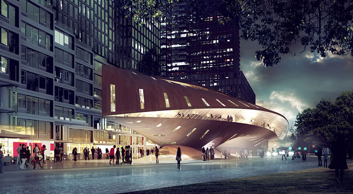
Founded in 2007 by Eran Chen, ODA’s distinctive residential projects seem to ripple and blossom in the urban realm. From housing to libraries to mixed-use structures, ODA’s design philosophy is both socially inclusive and visually compelling. I spoke to Eran Chen about his ideal city, the challenges behind designing “permeable buildings,” and what he learned from his dealings with Donald Trump.
Eran Chen is a busy man. In addition to running his decade-old practice ODA, which so far has designed 45 buildings in New York City, Chen is also on the board of the Bezalel School of Art and Design in Jerusalem, where he guest lectures. The week I sent him questions, his PR agent informed me that the 45-year-old architect “just clinched Beauty was never a matter of choice for me but rather an intuitive reflexa very exciting international commission and had to, somewhat unexpectedly, travel abroad.” This dynamic spirit is reflected in ODA’s work, which upends expectations of what high-density housing can be. Chen, who after graduating from school in Israel started out by designing McDonald’s branches, is an architect who combines a keen understanding of commercial reality with aesthetic adventure. Our conversation touched on everything from ODA's work on the Melrose housing project in Brooklyn to his reflections of encountering the titular tyrant of the Trump Tower.
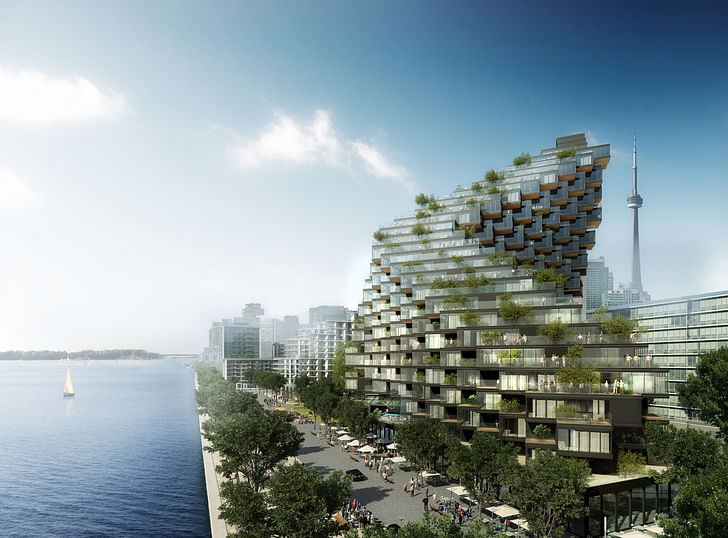
What is your concept of an ideal urbanity?
The urban ideal is, for me, an overlap of city and country living. Imagine the best things about the countryside; an abundance of open landscaped areas, abundant wildlife, a seamless transition between indoors and out, clean fresh air, the quiet, a sense of community and intimacy to name just a few. Now imagine the best qualities of the city; diversity, intensity, accessibility, cultural richness etc. What if we could build a city that gave access to both? What intuitively might look like opposing and impossible contradictions are actually taking shape, in baby steps. A vital place that accommodates and inspires a diverse group of people to live, work, think, play and create in high density, while still maintaining intimate connections to nature, to their immediate environment and to their community.
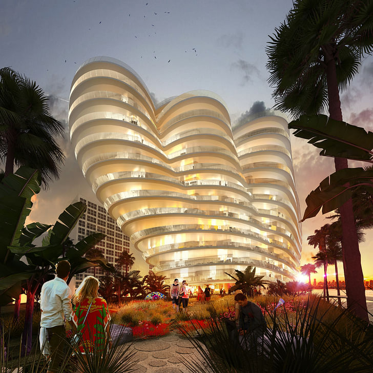
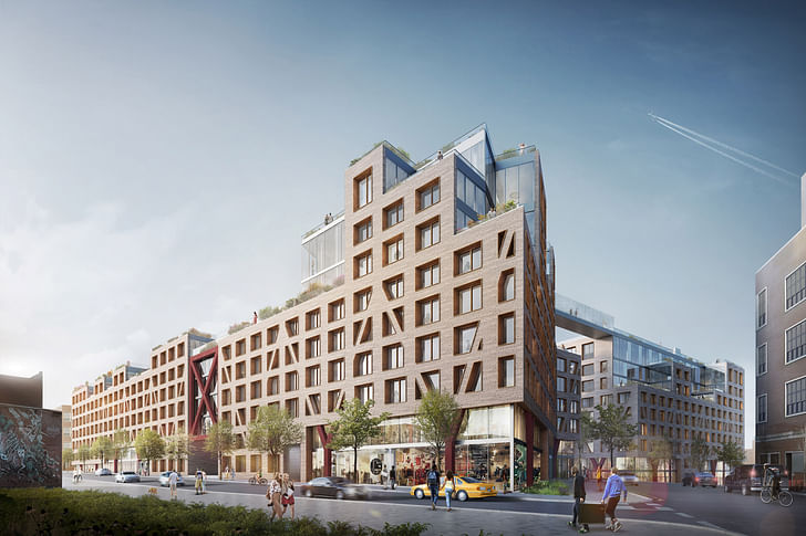
ODA’s stated purpose is to create “permeable buildings” that help people connect more with nature. Your 123 Melrose project in Bushwick, Brooklyn, which basically threads public life through private spaces, seems to embody this concept, especially if you consider community to be a form of nature. How did you come up with the design? What obstacles or surprises have you encountered while working on it?
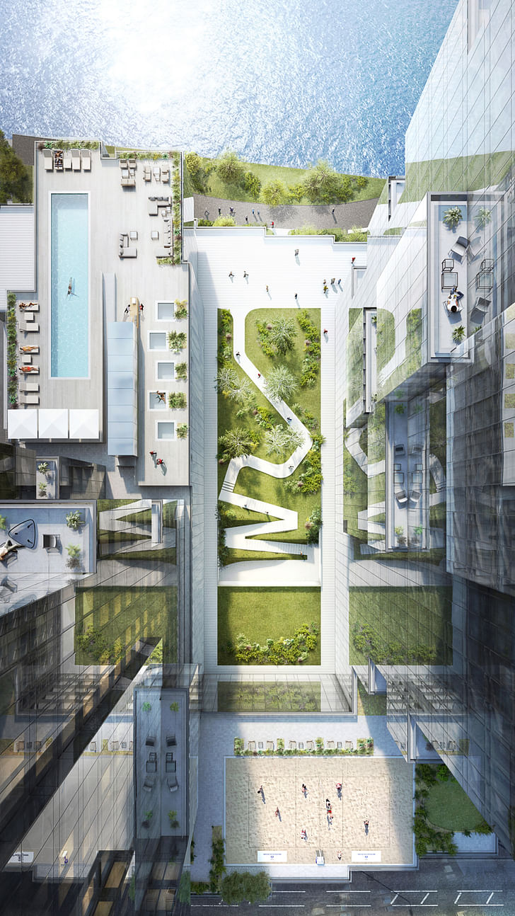
The site is enormous, by NYC standards, as it encompasses two full city blocks. The scale of it presented us with an opportunity to test an urban idea we’ve been thinking about for a while. The obvious zoning solution would have been to create two independent inner courtyard buildings that would form typical street walls clearly delineating the public and private spaces. We decided, instead, to take advantage of the unusual opportunity to design on this scale and work to create qualities that don’t traditionally exist in NYC or in other urban settings, where one plus one equals more than two. We realized that the diverse nature of Bushwick and its architecture is an important element of its character. That the transition between these old industrial buildings, Thoughtful design, contrary to popular belief, is neither more expensive to build, nor does it take more timesmall housing units and retail created a random mix of scales with no clear definition of streets and yards. This very combination allowed for the development of secret, unexpected, and intimate public spaces which allowed restaurants and bars to pop up in courtyards or on roofs, but also, unfortunately, occasional cover for illegal activity. We thought about the positive example of fragmentation in old European cities, where small pedestrian streets and plazas interconnect, often unexpectedly. We decided to overlap the typical NYC grid with a less uniform layout, similar to those European villages, and created four independent pedestrian courtyards connected to a linear park as well as to each other. The roof of the entire project is also connected, forming a huge park with bike lanes, pools, urban farms and other opportunities for outdoor activity.
There were many challenges along the way including making sure that the new format for living that we created is “as of right” and can be approved by the city with no special process. But the biggest challenge, actually, was to convince the clients that opening the private areas of the project to the public would ultimately be beneficial. They came to appreciate that the unique aspects of the project - the urban qualities of integration, the abundance of green spaces, the seamless engagement between inside and out, and the many opportunities to form intimate communities - were the very things that would attract potential residents.
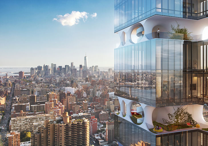
The renderings of the Hunter’s Point Library are visually stunning, and seem almost cinematic. You’ve spoken before about architects not getting too carried away with visual spectacle in our heavily media-saturated times and instead focusing on how to make buildings that make life better for the people who will inhabit and visit them. How has your career thus far enabled you to create visually arresting work while making functional, comfortable, life-enhancing structures? Was there any particular moment or project where you began to understand how to blend sustainability and aesthetics?
It is a good question that I might not have the answer for! Beauty was never a matter of choice for me but rather an intuitive reflex. I believe that beauty is a human need and should be an inherent quality in everything that we do. Buildings have to be beautiful. What I found with time, though, is that the physical expression of clearly developed ideas almost always results in something. Clutter and embellishment for their own sake does not. So, if the end result isn’t pleasing, then perhaps the idea behind it was not crystallized sufficiently. That belief becomes a tool for me. If I look at a project that we are working on, and I don’t like how it looks, then I go back and challenge the ideas behind it to ensure they are fully developed.
In an interview on ODA’s website you talk about your experience working in Trump Tower and briefly with Donald Trump. Now that he is a president, do you anticipate working with him again? Based on your interaction with him, what do you think architects should expect from his administration in terms of policy affecting architects?
When I was a second year architecture student, we were asked to design a structure that lets one enter but not exit. It was an exercise in formal computing, and I designed a flytrap, a very beautiful dead-end for flies. My professor, Mr. Urbach, told me something that I'll never forget. Architecture is meant to make life better. We, as architects, should use our talents to improve our lives on planet earth. A lofty ambition, but ultimately true.
History provides plenty of examples where architecture was used as a tool for suppression, for separation or in celebration of one’s power over others. I believe that we, as architects, should fight such expressions with all our might.
What sort of work would you like to see ODA undertake in the next decade?
I would like for us to take on more public work, education, cultural, health care or transportation projects. We are eager to share our ideas for a diverse scale and range of geographies.
What frustrates you the most about architecture? What inspires you the most about architecture?
With the rapid development of cities around the world, especially with the rapidly expanding middle class in third world countries, I am deeply concerned that we might repeat the same mistakes of the post-war era, where buildings are built only to address the urgent needs for additional housing and office space with little or no consideration given to quality or innovation. Architecture is meant to make life betterWe see countless nondescript vertically extruded boxes popping up all over the world with enormous speed. Those neighborhoods are destined to fail socially, and are a ticking bomb. Thoughtful design, contrary to popular belief, is neither more expensive to build, nor does it take more time. We should make sure that the privatization of our cities promotes richer collaborations between the architects and developers and not simply mindless opportunism. I am highly motivated by the fact that globalism and communication spread awareness and knowledge, thereby setting the bar higher for the expectations people have for their quality of life and the potential for architecture to affect it. The environment we design, designs us back.
Julia Ingalls is primarily an essayist. Her work has appeared or is forthcoming in Slate, Salon, Dwell, Guernica, The LA Weekly, The Nervous Breakdown, Forth, Trop, and 89.9 KCRW. She's into it.
No Comments
Block this user
Are you sure you want to block this user and hide all related comments throughout the site?
Archinect
This is your first comment on Archinect. Your comment will be visible once approved.