
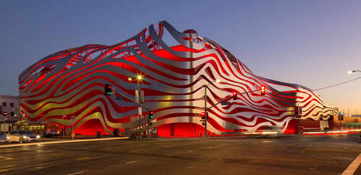
That the Petersen Automotive Museum is an architectural critical atrocity is not news; that the public will interpret it as being representative of Los Angeles’ architecture and urbanity is.
By now, many prominent architectural critics have eviscerated the tacked-on facade of the recently redesigned Petersen Museum, decrying its new, chrome fettuccine exterior by Kohn Pedersen Fox Associates as the kind of swoopy, thoughtless architecture-lite that makes developers smile and aesthetes weep. People stop to stare at it; it's arresting, a kind of oversized Medusa headThey’re not wrong. The thing is humorous, really, especially if you stand at the rear exterior at take a gander at where the facade meets the (likely) value-engineered box. (And once you’re inside the only slightly modified building – originally a Seibu department store designed by Welton Becket and Associates – the interior is still so relentlessly boxy and absent of design finesse that you look at the cars just to avoid looking elsewhere.) It’s a cartoon of aesthetic gesture, lacking any substance. What’s troubling is that it’s not a private joke but a public failure, a blemish in what was shaping up to be one of L.A.’s most genuinely gorgeous and authentic urban corridors.
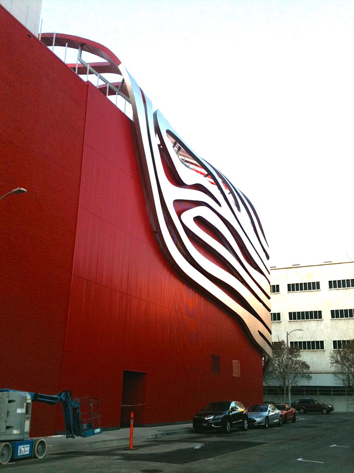
Despite its title, this is not museum-grade architecture. Whole swaths of the public will be visiting this place and subconsciously coming away with a soulful queasiness, a kind of artistic radiation poisoning. The Petersen Museum is a slick showroom for gearheads, but it’s also a smug dismissal of all the civic qualities that have been blooming along this stretch of Wilshire. It is an insult to the public realm.
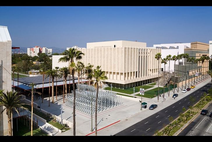
Why should this matter? After all, the public could educate itself on what qualifies as great architecture, right? Well, yes and no. Stand outside the Petersen Museum and talk to people on the street about their impressions of the building, and it rapidly becomes evident that the facade, especially when encountered as a distracted pedestrian, has a certain mind-warping charm. If you’re coming from the east on Wilshire, you walk past food trucks, segments of the Berlin Wall and the old A&D Museum building. Most of these spaces have a stepped-back feeling; as a pedestrian, you are allowed to wander without being Confronted By Architecture. This is a really big dealership where you are being sold on a heavily edited idea of the pastEven Chris Burden’s now iconic Urban Light installation at the Los Angeles County Museum of Art on the opposite north side of the street gently welcomes you in; nowhere are you being pummelled into interaction the same way you are with the Petersen, which with its red LED lights and serpentine, sunlit bands of shininess leaps into the sidewalk and abruptly pulls you away from whatever it was you were thinking about. People stop to stare at it; it’s arresting, a kind of oversized Medusa head.
It also completely recontextualizes the street and the urban energy. As the Petersen will eventually be adjacent to a major transit stop at the intersection of Fairfax and Wilshire, the Petersen’s interaction with the sidewalk isn’t just some petty architectural grievance: it’s an affront to our urbanity.
And the people on the street like it. At least, the ones who were Instagram-ing it, smiling in that sort of vacant way of people who are at last blissfully transfixed (really). “It evokes emotion, speed, and air flow,” a fellow on the street named Roberto Angelo told me about the facade when I asked him what he thought of it. I pressed him a bit about its relationship to the street and its overall context, to which he replied, “The design is very whimsical. We could use more whimsy in our lives.”
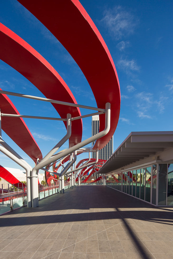
If you enter the museum from the parking garage, the experience is completely different: it's a study in the effects of Robert Venturi and Denise Scott Brown's driveby urbanism. At driving speed going south on Fairfax, the facade is a blur of what appears to be dynamic energy; it bustles and shouts at you, and then gradually simmers down into the thin steel band of the Petersen’s logo and deposits you into the parking garage. Every new public monument is part of a larger fabric that, idiosyncratic as it might be, is representative of who and what Los Angeles is. Of course, parking garages have their own peculiar role in the public realm in Los Angeles; because so many Angelenos drive their own cars, parking garages often function as the inadvertent foyer of most public spaces: your experience of any given institution begins when you park. In this way, the Petersen excels: the parking garage is open, spacious, well-lit, inviting. It’s an extended porte cochère of a very elegant automotive showroom; you park your car, stroll across the enclosed lot, and walk into the glass-doored realm of Bugattis, Maseratis and the Batmobile.
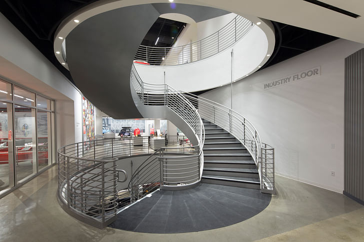
But that’s the extent of it: the three different display floors (starting at the top with History, then descending into Industry, and then at last into Artistry) are linked by a wide staircase in the center of rooms sans natural light. There is no better way to define a complete absence of architectural concept than the Petersen; this is a really big dealership where you are being sold on a heavily edited idea of the past.
Which is also a shame. As a monument to industrial innovation and car culture in a city practically birthed by the former and married to the latter, the Petersen is a placeholder for what could have been a genuinely arresting cultural landmark, especially since it is within visual sight of the LACMA. Depth, substance, far-reaching cultural significance – these do not seem to be of particular interest to the Petersen, and so the architecture is an honest reflection of that mindset. Perhaps in this way the Petersen is a complete success, in that it preserves a kind of surfacey mindset that is simply unsustainable in the 21st century: I got my hot rod, what’s it to you?

Here’s the thing: with every public monument, with every major institution, we are collectively creating not only our present city, but the city we all want to inhabit in the future. Poorly conceived architecture in this city isn’t atomized, anymore; every new public monument is part of a larger fabric that, idiosyncratic as it might be, is representative of who and what Los Angeles is. The Petersen Museum is a part of Los Angeles’ public architectural and urban identity now; and that’s why the public has been very, very badly cheated.
Julia Ingalls is primarily an essayist. Her work has appeared or is forthcoming in Slate, Salon, Dwell, Guernica, The LA Weekly, The Nervous Breakdown, Forth, Trop, and 89.9 KCRW. She's into it.
17 Comments
"By now, many prominent architectural critics have eviscerated the tacked-on façade "
I think they object to the fact that the tacked-on façade didn't fully wrap the whole 'box'. This kind of criticism reminds me of the republicans complaining about Trump. You reap what you sow.
speaking of giving back to street and making a worthwhile pedestrian experience; i can't wait to see what zumthor does with lacma. right now it looks like it will be a barren waste land of unprogrammed space. i'm sure future renderings will show the typical carnival-esque atmosphere of children carrying balloons and food trucks.
But has the public really been cheated? The argument here seems to be that an opportunity to make a nuanced high-level statement regarding car-culture, Los Angeles and civic identity was not taken, or at least not engaged with in a manner that is considered well-conceived by the critical community. I do not think that failure to do the latter equates to the former. I find it telling that the members of the public quoted in the article itself not only like the museum but find that it fills the role of providing whimsy in the architectural landscape.
Is it a masterful piece of design-as-criticism? Absolutley not. But Urban Blight? Hardly. I think a more apt description might be costume jewelry. Shiny but lacking substance.
FU urban blight. The other way to look at it is that they spent the least amount of money in revamping it and it looks great.
Thayer-D is spot on with his Trump analogy. It even has the look of a wispy inadequate comb-over.
Like Trump, it represents how cultural fragmetation disrupts long held professional or academic standards. This building will satisfy a large portion of the public that might find a building Tod Williams and Billie Tsien boring.
Give the People what they want
the only determining factor of whether a building is good or not is if people who are not architects have their picture taken in front of it. in the future all buildings will be the equivalent of kapoor's shiny bean.
vado - you must be referring to the broad. it was built for selfies. that's all i saw people do there. cheezn and pretending to be models.
Piano's new Academy Museum of Motion Pictures is going to be in the historic May Co. building, across the street. Big sphere attached the rear end of box.
These bad architects need to take a cue from BIG and look to elegant, refined architectural masterpieces that will stand the test of time.
What's wrong with liking an ugly building? They're like babies - familiarity conditions appreciation.
I think it's fascinating. Brash, inelegant, but amazing. A future historic landmark.
My theory as to why architects almost exclusively despise architecture like this is: it's too easy. If you can find someone who'll pay for it, there isn't necessarily a lot of struggle in figuring something like this out. It's just a built sketch. Doesn't really take years of education at a top school to develop this kind of approach to design.
Oh well. Sometimes other people get paid more for work that's easier than yours. No excuse for bitterness.
midlander, I agree with you. Architects tend to like rigor, and this project seems like it has no rigor. It's a plain bright but blank box wrapped by ribbons of metal. The placement of them isn't important on any theoretical level, they're just applied. It's too easy!

In a way, this project makes the Longaberger Basket look like an intellectual tour de force!
How is the Peterson any less intellectually rigorous than, say, the Broad Museum, which is a square box wrapped in a perforated grater screen? One could argue that the Peterson is more intellectually rigorous, since one could argue that the ribbons are emblematic of the fluidity and speed of the modern automobile. What does the perforated screen of the Broad have to do with modern art, or the City of Los Angeles, or anything, beyond obsession with computer-generated pattern?
This is a central problem with a lot of the super-expressionist neo-modernist work that is being built today. At what point do we just throw up our hands and say, "WTF". Or to quote Donna , "Why the fuck not?".
Petersen and the Broad are intellectual masturbation. Sorry, psuedointellectual masturbation.
There is no bottom when it comes to dumbing down culture.
Word.
Respectfully, I don't think your critique reflects a full understanding of the original structure. The Seibu building was also virtually windowless, and in fact the structure was selected by the Petersens for that reason. Well, that and the ample garage for drive-ins and fun lowbrow car stuff *wink.* Sometime during its conversion to a museum, "wings" were added, making it sort of programmatic. I find that the new facade, while kind of annoying (seriously, can steel as an exterior material be over now) is an homage to that programmatic building. It brings to mind an oil puddle, chrome, or just... movement. It's a g-d car museum.
I know it's kind of a given on this site, but just because it's not a black cube of pretentiousness doesn't mean you can't appreciate some of the collection or like... learn anything. How can you shit on a 1939 Bugatti? They're design masterpieces.
Finally, the museum is an improvement over the mid-rise profit-maximizing shitboxes taking over Wilshire (and everywhere). Sigh.
Block this user
Are you sure you want to block this user and hide all related comments throughout the site?
Archinect
This is your first comment on Archinect. Your comment will be visible once approved.