
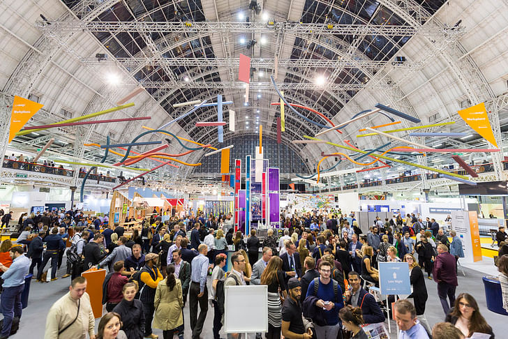
London may currently be undergoing a regenerative process akin to heavyweight cosmetic surgery, but under its shiny new surface remains a cranky old soul. The surgery is not without complications: the lack of affordable housing makes mainstream news on a regular basis. Gentrification, displacement of communities and encroaching globalization where one size fits all, has brought about an identity crisis to this brisk and confident city. But despite this crisis, the creative industries that form the largely unwitting infantry for property developers march on. The London Design Festival is at the vanguard of this march.
Presented as one of the world’s most important annual design events, the London Design Festival is staged across the city every September. First staged in 2003, the festival programme is made up of over 400 events, the festival’s role in the exchange between public and private enterprise should not be underestimated. This year's theme was "Design takes London", and this wasn’t a mere boast: London felt the impact of the festival, on the streets, in large scale venues, shops, boutiques and studios. However there was something else at play, the festival this year highlighted just how much London is evolving.
Each new “design district” added to the festival program from prior years denotes a new pasture (and battleground) for creative enterprise followed by property development. Recent additions to the festival map that would raise the eyebrow of even the hippest Londoner include Queens Park and Chelsea. Queens Park, called Queens Park Design District for the festival, was known until recently as a mix of rundown housing projects to the north and expensive but dull Victorian properties to the south.
London never stands still for long, and nor did IChelsea, now also a design quarter for the duration of the festival was once a throbbing Austin Powers-eque 1960s hangout of wealth meets working class, summed up by the likes of Michael Caine. But by the 1980s and 90s, the only man standing (apart from Michael Caine) was Terence Conran, owner and and founder of the iconic 1970s furniture store, Habitat. Most recently, the only change has been the development of Chelsea Harbour, but this largely ultra exclusive luxury apartment and residential area is not best primed for artists’ studios and artisan workshops.
London never stands still for long, and nor did I for the duration of the festival. What follows are some highlights:
Brutal Utopias: A National Trust Celebration of Brutalist Architecture at the Southbank Centre
My first port of call was to “Brutal Utopias: A National Trust Celebration of Brutalist Architecture at the Southbank Centre”, just south of Embankment over the River Thames. The Southbank Centre is a battleground of old. First formed from the back of the Festival of Britain in 1951, the Southbank Centre is home to Royal Festival Hall, Queen Elizabeth Hall, Purcell Room and the Haywood Gallery. One of the finest examples of Brutalist architecture in the UK, the site is Brutalism in its rawest form, practical spaces that resemble a series of boxes on top of each other. With this aesthetic gut punch comes the almost inevitable Into the bowels we went, the entire backstage resembling a Doctor Who set.consequence of being hated by the mainstream press (and quite a lot of the public). In 1967, The Daily Mail labeled the centre Britain's' “ugliest building” and by the 1990s even the Chairman of the Southbank Centre wanted to pull the whole thing down and start again. We were taken “into the bowels of the building” by an enthusiastic new ambassador for the site, Joseph Watson – the London Creative Director of National Trust. Watson guided us around just prior to a renovation that will restore much of the interior to its original condition, with added cosmetic changes to the front of house and backstage areas.
Into the bowels we went, the entire backstage resembling a Doctor Who set. This feeling was keenly felt when we were led into a small service tunnel between the Queen Elizabeth Hall and the Purcell Room. Here, low and behold, Watson informed us was where Doctor Who scenes requiring a subterranean feel were filmed.
We then climbed to the top of the building to see the auditorium air supply room and were led into the air filter. Here we were sucked towards the turbines, perhaps purely to amuse Watson, before being led back to safety. Watson finished the tour with a prophetic tale, reminding us that not long ago, the now much in-demand Victorian buildings of London were maligned and out of fashion. Brutalism must be saved because it marks a “power to the people’s spirit” that has all but been forgotten in contemporary politic and practice in London. Watson finished by noting that the National Trust, once the caretaker of stately homes and cathedrals, had the duty to reach out to preserve the more recent past, especially at a time when over 200 high rise buildings are currently planned for the capital.
Royal Institute of British Architects: Building Brighter Futures
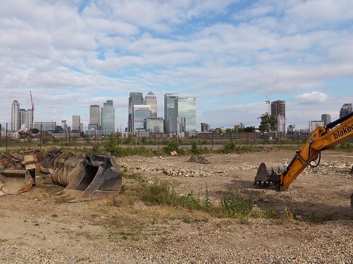
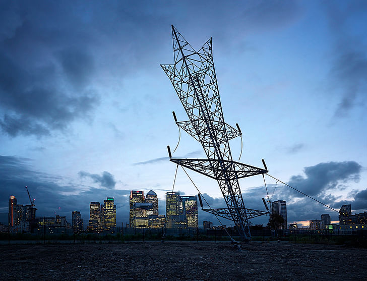
Next, a visit to the Royal Institute of British Architects for a talk sponsored by Travis Perkins and Dragon Rouge, entitled “Building Brighter Futures”. The question, “What are the long-term forces shaping the future of the built environment and what opportunities will these create for innovation?” was posed. After looking out to a sunset across the building site that is London, we settled into the debate. The discussion was led by Aaron Johnston (Head of Product for Technology Will Save Us), Adrian Dobson (Executive Director Members at RIBA), Rachel Armstrong (Professor of Experimental Architecture at Newcastle University School of Architecture), and Robin Proctor, (Supply Chain Director, Travis Perkins plc).
The debate was roughly split between the erstwhile and practical deliberations of Robin Proctor and Adrian Dobson, while Rachel Armstrong and Aaron Johnson braved the new and cerebral world of nanotech and experimental practice. The question “Why do we rebuild?” also led to a lively discussion with Rachel Armstrong posing the thought: "we design for dryness yet we know the world is going to get very wet. Why do we rebuild after a flood with the same thing?” Aaron Johnson led with emotion, leading with "what use is tech in an old-build housing?” And that companies like Hive, the smart home heating system, were not a technology solution but a quick fix. This comment was backed up by the suggestion that smart home devices moderated short term use rather than added long term embedded structural resolution to the issue of energy use. Aaron Johnson pointed to the issue at hand: “a city is not solved, a climate is not solved, we have become fixated by systems for transformation”.
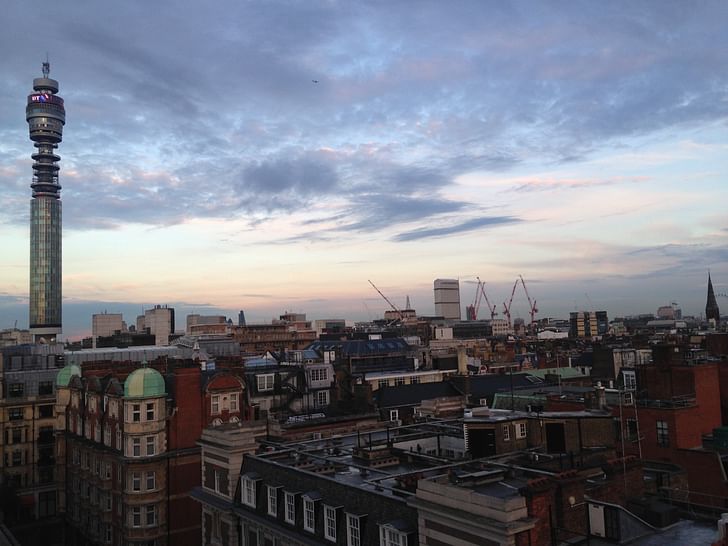
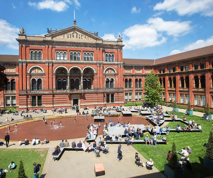
On the other side of town, in South Kensington, Exhibition Road is home to the monoliths of Victorian wonderment and bombastic imperialism: The Natural History Museum, The Science Museum and The Victoria & Albert Museum. Forming part of The Brompton Design District for the duration of the festival, The V&A has gradually become the festival hub with major parties, installations and design talks taking place within its grounds.
FRONT London at the V&A: Why slow design matters
One such talk, organized by FRONT London, was a debate on “Why slow design matters” hosted by journalist Helen Chislett, featuring rug designer Jan Kath, interior designer Daniel Hopwood, and Aigars Zelmenis of FRONT London. Jan Kath played a long and cool hand throughout the proceedings and by the end came across like an absolute design star.
His conversation began with an awkward film that appeared to revel in projecting a “happy” third world manufacturing industry to a bemused audience of cynics, myself included. However, our prejudices were soon exposed. From the knee-jerk thought of first world mining of third world creative resources and manufacturing, tables were eventually turned by Kath showing great sensitively and moral fibre in the reasoning behind his business and creative process.
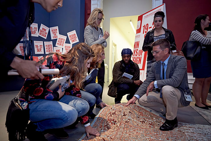
Kath employs traditional weavers from Nepal for his luxury carpets, each one created by hand over a four month period (hence the slow design theme). For Kath, it's not just about quality of product – it's about keeping traditions and techniques from dying out. As he says: “new ideas are needed to keep traditions alive”, and that it's about “breaking the rules whilst respecting tradition”. The conversation become one not about slow design, but about luxury and investment in time.
Is it a job stipulation in product design that you have to sound like a politician on acid?Interesting concepts that came up included the idea that “luxury is no longer about brand”, and that the maker movement had a part to play in this concept. Kath's work had the opportunity to shine, as three pieces were placed on the stage, winning over the crowd as he explained his process and working ideology. This ideology was tested when a member of the audience asked Kath why he didn't take up an opportunity to set up a business in Afghanistan. This question was handled with firm diplomacy as Kath stated his job was not that of first world ambassador for politicians but to make the appropriate contacts and connections for the benefit of everyone involved in his creative process: “To progress with sincerity”, which is exactly what he did throughout the debate.
V&A Global Design Masterclass: Erwan and Ronan Bouroullec
Talking with sincerity was a trend during the Global Design Master classes, also based at the V&A. Billed as Erwan and Ronan Bouroullec but minus brother Ronan, Erwan Bouroullec’s event was a masterclass in self-deprecation. The Bouroullecs work in Paris for clients including Habitat, Cappellini, Ligne Roset and Domeau & Peres. They’ve worked as a team since 1990 and are most widely known for their work for Italian furniture producer, Vitra.
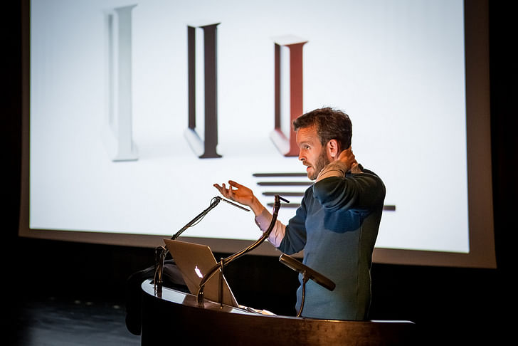
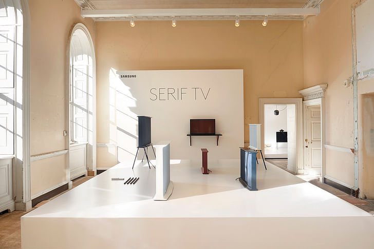
For his talk, Erwan quickly had the room eating out of the palm of his hand, asking “Is it a job stipulation in product design that you have to sound like a politician on acid?” Much of the talk focused on the Bouroullec’s recent work with electronics firm Samsung. Samsung had asked the studio to come up with a new design for a television. But as Erwan noted, "I think Samsung didn't expect a product from us. We asked ourselves 'how do we frame a picture and what is a picture these days' and we went from there."
The studio did, in fact, make a television. Their so-called SerifTV boasts a user interface designed by the Bouroullec brothers – an electronic on-screen curtain that provides the user with the ability to temporarily cover the screen from unwanted ads, or items that the viewer deems unworthy watching. In our case this was demonstrated with an episode of The X Factor. This was probably the most stereotypically French / Parisian piece of design interface I've ever seen: dismissively anarchistic, flamboyant and fun.
V&A Global Design Masterclass: Tom Dixon
Typical Londoner Tom Dixon – self-reflective, cantankerous and punk – is widely recognised as the most prominent high street furniture designer of the 1980s. Dixon is most remembered for his creative direction at retail store Habitat, his own brand products, and most recently, his interior design for institutions such as the Restaurant at The Royal Academy London, Jamie Oliver’s Barbecoa, and members club Shoreditch House.
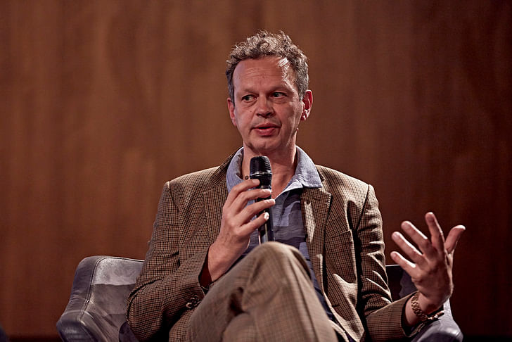
From the outset, Dixon charged with the modish belligerence of a bittersweet historian, showing a slideshow of London through the ages: from heads on spikes on Tower Bridge, through to the manufacturing meltdown of the 1970s and 80s. Dixon, one of London's most This site was much loved in its time and to see it functioning again as a creative space brought up a range of emotionssuccessful designers, summed up his career by saying he had “turned muck into gold” by working with volume rather than prototypes. He made a nod towards the mainstream, noting how “IKEA were very clever to get the customer to come to the warehouse and then get the customer to make the furniture themselves.” But this aside led on to an interesting observation, one that industry is once more moving closer to the city, and that once again, through technology, industry was everyone’s for the taking. His presentation of London through the ages built on this theme as he made an argument for positivity in the face of change: London has always been about change.
Change in use could be seen at every turn on the streets of town. Several large scale shows dominate events: Tent London + Superbrands to the east, Designersblock at Bankside, Designjunction to the center and 100% Design to the west.
Tent London + Superbrands & Designjunction
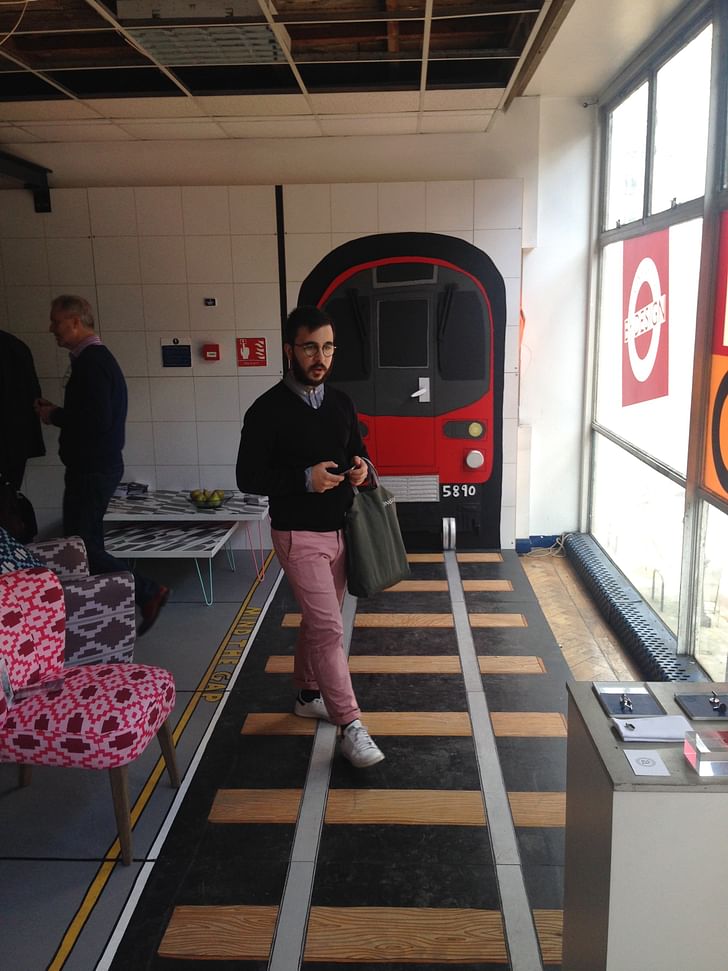
Tent London + Superbrands are punk-pretenders, playing host to brands that like to appear edgy alongside mid-weight, established (but still genuinely edgy) product designers, ceramicists and furniture designers. Design & Craft from Ireland, an initiative from the Irish government to promote homegrown creativity, was a stand out, but on a personal level, the Designjunction exhibition at Southampton Row was swallowed up in nostalgia. This site was much loved in its time and to see it functioning again as a creative space brought up a range of emotions. A favorite was the gem room: the old jewelry department, complete with original furnishings, was skillfully brought back to life to show a range of ceramic works. Another leading piece was a crowd friendly, life-sized London Underground tube station on the top floor of the building, created by Camilla Barnard and Gunter Luck. This become one of the figureheads for the public and media face of The London Design Festival; accessible and fun.
Designersblock
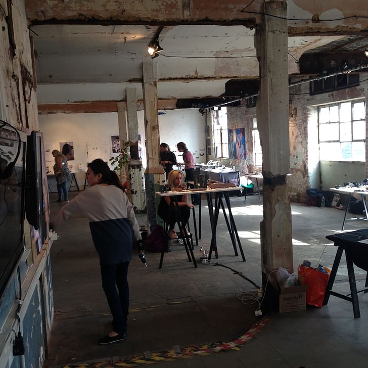
Over at Designersblock where Gunter Luck heads up the technical team, the mood was more low key. Designersblock were arguably one of the first (if not the first) to bring us the likes of Tent London and Designjunction. Co-Founders Rory Dodd and Piers Roberts were early adopters of using formerly disused spaces for design shows. Designersblock were part of a movement that made the East London and Shoreditch area popular with young designers, but while others have taken a more corporate route Designersblock have stuck to their guns, celebrating new and unsung design and working as a family of long-term friends, rather than a collection of workers in a corporation. London has always needed this attitude to prosper even if the eventual winners are often those in direct opposition and competition to those that start the movement. Such is life.
Groves Natcheva Architects: Black Ice
Finally, along the street from the pomp and Victorian circumstance of Kensington Olympia, sits a small architectural practice in a former horse stable: Groves Natcheva Architects. Inside, “Black Ice” plays on a screen – a dark, psychotic short film of infidelity and revenge reminiscent of the 1980s Roald Dahl-created television series, “Tales of the Unexpected”. The unexpected here is that Groves Natcheva Architects have chosen this medium to sell their work. Across the balcony from the practice is the setting for the film, a lived-in property renovated by them in 2010. The practice is seeking new forms of representing their discipline, and by doing so they seem to make a fitting tribute to London and the true festival spirit. In their own words, London is not “populated by animated mannequins”, but by idiosyncratic people with stories and lives of their own – forget this and we skate on thin ice.
Robert studied fine art and then worked in children's television as a sound designer before running an art gallery and having a lot of fun. After deciding that writing was the overruling influence he worked as a copywriter in viral advertising and worked behind the scenes for branding and design ...
No Comments
Block this user
Are you sure you want to block this user and hide all related comments throughout the site?
Archinect
This is your first comment on Archinect. Your comment will be visible once approved.