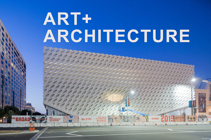

Architectural criticism that begins with “it looks like [insert Platonic object here]” is suspect at best, but the temptation to gamble with semiotic stickiness is too great: if I see a contraceptive sponge when I look at the new Broad Museum, I want to say that.
It’s not an obvious comparison, after the cheese graters and citrus sack-webbings have been thrown out. But after taking a long look at The Broad’s distinctively dimpled wrapping, the metaphorical prospect of a giant contraceptive sponge sitting on Grand Avenue, just south of the Walt Disney Concert Hall, is too juicy to dismiss.
the metaphorical prospect of a giant contraceptive sponge sitting on Grand Avenue, just south of the Walt Disney Concert Hall, is too juicy to dismiss.Bunker Hill, home of the new Broad and one of Los Angeles’ oldest and historically most dense urban areas, has seen downturns as steep as its topography in the last century, from a posh downtown suburb to mid-century slum to involuntary New Urbanism laboratory. Now, it’s bedecked with institutional art and culture jewels, including the Museum of Contemporary Art (MOCA), the Walt Disney Concert Hall, the Colburn School, and Grand Park. The Broad is the latest addition to this gaggle, alongside downtown’s ongoing Grand Avenue Project of ambitious developments, and sits directly across 2nd Street from Gehry’s Concert Hall, whose glinting flickers reach out from their sidewalk setback, deferential to their gridded plot while deflecting light as buckshot for attention.
making the museum itself into a spectacle comes naturally to new art institutions.It’s impossible to consider Grand without Gehry, and especially without the Disney Concert Hall. The Broad, when it’s finally open, will also be an icon on Grand, but a different one. Its light is diffused and absorbed through its exterior’s concrete webbing, and its edges are calmly orthogonal, not so easily given away to the Disney’s rapturous writhings. If the music in Disney Hall demands liquid architecture, then The Broad’s art collection provides a solid, frozen counterpart. And in its prophylactic reading, The Broad is a mature reminder to the neighborhood – there when you need it, should development get out of hand. OK, that metaphor is done with.
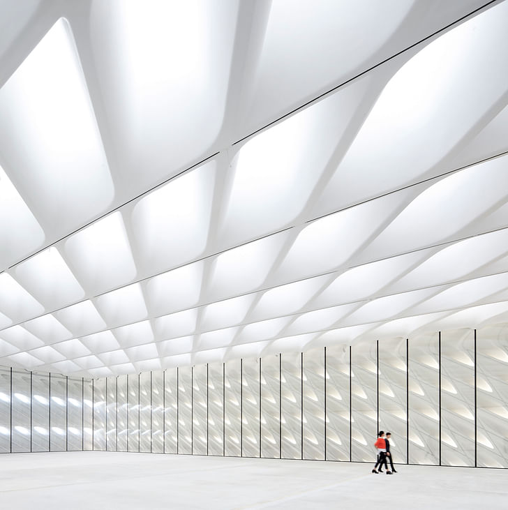
This piece will not dive deep into the comparative architectures of Gehry’s Hall vs. Diller Scofidio + Renfro’s Broad, as indicative of a “new” Bunker Hill and by extension the “new” Los Angeles. Instead, it’s an attempt to reflect on The Broad before it self-actualizes into a publicly open museum. This stems from a rare luxury I had not yet experienced – heading into the “blank” space of a museum before it’s fully inhabited by the stuff that will make it a museum. Such an opportunity was made possible back in February, when The Broad opened for a one-day public viewing event known as Sky-Lit, with construction tape and scaffolding still intact.
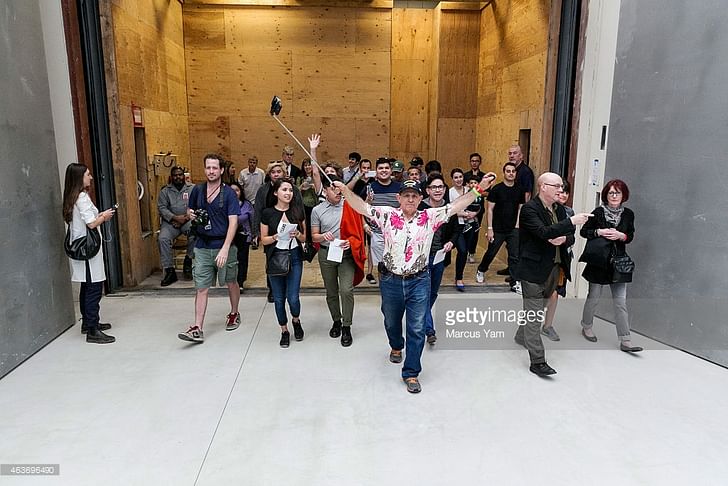
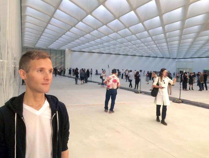
The rough-opening spectacle felt like a coming out party for a somewhat awkwardly undeveloped, but still opulently dressed, adolescentThe event copy read “For one day only, visitors were able to see The Broad’s vast, column-free third-floor gallery in its raw state, before the art walls are put in place for the museum’s opening on September 20, 2015.” What visitors were also able to see, was a completely packed art museum, requiring crowd control more akin to a music festival than an art exhibition. In this particular moment of contemporary art, where spectacle and performance are increasingly taking the exhibitionary places of static, physical pieces, as well as demanding real estate unique to their own needs (as DS+R know all too well), making the museum itself into a spectacle comes naturally to new art institutions. This aligns as well with the museum’s benefactors’ desire to convey transparency, through both its design and collecting practice (while the bulk of the museum is devoted to the Broad’s personal collection, temporary exhibitions will highlight other artists, and bring in more from LA). The rough-opening spectacle felt like a coming out party for a somewhat awkwardly undeveloped, but still opulently dressed, adolescent: soon, it will be given away to the society of Grand Avenue.

Touring The Broad’s interior without any visual art was an affecting, if not somewhat frustrating, experience. Perhaps overly accustomed to the white box, my positive museum experiences tend to occur in spaces that defer to the art’s atmosphere – or are completely overtaken by them. One particular version of this took place during a 2010 visit to the Hamburger Bahnhof in Berlin, where in the museum’s main hall, I wandered into Roman Ondák’s "It Will All Turnout Right in the End". The installation appears on the outside as a kind of mobile trailer unit, but once inside, unveils itself as a scaled-down replica of the interior of the Tate Modern’s Turbine Hall. The Tate’s interior is objectified as an art object, and the museum visitor slips through a wormhole of art-space-time into becoming an art object within a reconstituted art space. This prompts the disembodying experience of feeling simultaneously as the viewer and the viewed, locked in a quantum entanglement analogized by a selfie stick.locked in a quantum entanglement analogized by a selfie stick.
This kind of self-aware social-affectedness was on full display at The Broad. People were not entirely sure how to act: What social cues do I follow when I’m in a museum with no visual art? Is the building I’m touring now a piece of art that I’m meant to appreciate and study? How do I do that? Can my kids run around? This recalled the Gulliver-esque experience of being inside the Bahnhof’s Tate, which turns the viewer’s (visitor’s? inhabitant’s?) gaze back onto their own movements, now that they’ve found themselves insides the receiving hall of a power station-turned-museum-turned-art piece. And while technically there was art on display during The Broad’s preview day (BJ Nilsen’s DTLA sound installation was played throughout, and after dark, Yann Novak’s sound and light work, Stillness, came on display), it was very easy to entirely dismiss in the murmuring midst of wandering selfie-takers and roving toddlers. The human social experience had fully become the subject of the “exhibition”.

This is exactly the kind of dynamic that arises from the contemporary art explainer-theory of relational aesthetics – that art derives not from an authored product, but from the relative social and human interactions that an artist provokes. This is not a self-descriptive theory, but a put-upon by the theorist Nicolas Bourriaud who coined the term in the late 1990s – his exhibition “Traffic” was a showcase of artists who he believed confirmed his theory of "relational aesthetics". It’s Bourriaud’s post-rationalized explanation for other artists work, an explanation that the artists themselves might not actually agree with. It could be argued that relational aesthetics is equally responsible for both the praise and hate shoveled on recent spectacle-based exhibitions like Carston Höller's slide (Tate Modern 2006-2007), Random a step away from the individual author as a key concept of artistic production, and towards the murkier machine of social agency.International's "Rain Room" (MoMA 2013-2014), Pierre Huyghe’s Ibizan hound and beehive (LACMA, 2014-2015), or even BIG's maze (National Building Museum, 2014). The theory itself is also nowadays derided within art criticism, for its shrugging-emoji approach to art as anything any artist stages in a museum.
But maybe Bourriaud’s theory wasn’t ever intended to last – perhaps it was devised to move past the fallout from 1960s radicalism in performance art, and play upon new conventions of connectivity and the visualized networks of the rapidly changing 1990s’ World Wide Web. Maybe it’s best treated as a transitional growing pain. It arose far before the industrial social media machine added followers to friends, but seems (to me at least) to have become a helpful lens for considering 21st-century art. It’s not as simple as “Instagram changed how we look at stuff”, nor is it a shortcut for saying art is now more democratic, or that art should be an “experience” – rather, it’s a step away from the individual author as a key concept of artistic production, and towards the murkier machine of social agency. The aesthetic objects of architecture are the lived platforms for that agency, and Sky-lit briefly shone light on that fact.
It’s unlikely that The Broad’s architecture will ever receive this much unadulterated public attention again, after the art moves in and the museum opens this September. It would also be too pithy and not at all helpful to say that all architecture is driven by relational aesthetics. The theory was intended for the art world, not architecture, but what Sky-lit broke open was the explicit treatment of architecture as an art object. And gee does stuff get confusing when that happens. Especially given that the architecture in question is a treasure chest museum for its benefactor’s personal collection, the structure’s latent social provocations pale in comparison to the stature of its owner and owned objects – which, coincidentally, became a repeated critique of the major 2008 relational aesthetics-themed Guggenheim show "theanyspacewhatever", featuring RA’s biggest players (itself a discordant idea).
more akin to a rave than an open-casket funeralToday, categories of art and design do not necessarily strike a harmonious "style" chord, unlike prior art historical trends throughout the 20th century, up to the 1990s. Before, movements or styles could be identified by form, or content. Now, it’s time to focus a bit more on behavior, or as designer Andrew Blauvelt calls it, the pragmatics of a piece of art, design or architecture. Blauvelt, a graphic designer and curator at the Walker Art Center, believes that because reading 21st century aesthetic objects by form or content won’t ever produce a coherent, intelligible style of practice, this era isn’t going to predict where things are headed next. There is no "post-now". Digital tools and networks have put us in transition, not on any one track. Tools are not style and there’s no excuse for tunnel-vision.

So sure, let Relational Aesthetics die, and with it let go of the idea of the artist as “experience curator”. And while the Sky-lit event made The Broad into a stage for something akin to the post-rationalized experience of relational aesthetics, the architecture itself isn’t exactly concerned with stirring the social pot. In her reading of the event, LA-based critic Mimi Zeiger praised the museum for its boring-ness, as a welcome change from the contemporary design obsession with crafting immersive experiences – The Broad’s “architecture succeeds in carry the reverberations of an unscripted performance into the scripted onedampening the urge for entertainment”. As the mood in contemporary museums changes, more akin to a rave than an open-casket funeral, opting out of that spectrum can be refreshing.
What Sky-lit accomplished was an opportunity for the architecture to be treated as a relational art object, but not so it could be handled with velvet gloves. Whether seeing the building as a symbolic prophylactic in a half-baked metaphor for downtown’s development economy, or as a momentary playground space on a lazy Sunday afternoon, Sky-lit momentarily recast the architecture in an unscripted role, leaving whatever human experience it elicits to define its impact. This isn’t a conclusion, but a reminder, to carry the reverberations of an unscripted performance into the scripted one. Once The Broad is full of art, remember that it stands without it.
Former Managing Editor and Podcast Co-Producer for Archinect. I write, go to the movies, walk around and listen to the radio. My interests revolve around cognitive urban theory, psycholinguistics and food.Currently freelancing. Be in touch through longhyphen@gmail.com
8 Comments
Haven't even gotten past the first paragraph and I'm in love with this essay.
(Now I'll go read it and find out if my image is totally inappropriate.)
brought to you by a billion tract homes polluting the west.
"Tools are not style and there’s no excuse for tunnel-vision." from above
american cement building v2.0
Referencing your reference to the Ondak piece: My classmate Alfred Zoellinger of Matter/Practice did a thesis project at that was a model of the Cranbrook Museum placed inside the Cranbrook Museum. But it was a weirdly altered model that didn't really have an exterior form, just prescribed interior views. The professor said it represented "the architect's desire to both be inside the building and have the god's eye view of the building simultaneously."
I do think it's odd that the event was titled: Sky-lit. This is maybe one of my hangups with the "art as experience" approach. If it was just advertised as an "open house" or "construction tour" would it have felt the same as it did having a title? Titling it gives it a gravitas that makes everyone more self-conscious of what exactly they're attending. I say this as an employee of a fine art museum that is deeply committing itself to experiences over objects for the foreseeable future, which I'm conflicted about (OTOH, I'm also conflicted about just how much capital gets tied up in preserving objects so as to completely fend off any appearance of aging occurring, which to me means the object is essentially already dead).
I also want to admit that when I was a young undergrad and had never been to Europe, but desperately wanted to go because I knew it represented a huge hole in my architecture education, I actually asked someone who was NOT an architecture student "So what are you going to Europe to look at? I mean, if you're not there to see buildings what is there to do?"
The thought of wandering around a museum *just* to look at the building seems wonderfully appealing to me. Art is great, I enjoy some of it a lot, and all of it some, but buildings are what really excite me (even when they don't look like something that reminds me of sex).
yes Donna great article, it's worth 2 or 3 reads...
Block this user
Are you sure you want to block this user and hide all related comments throughout the site?
Archinect
This is your first comment on Archinect. Your comment will be visible once approved.