
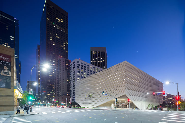
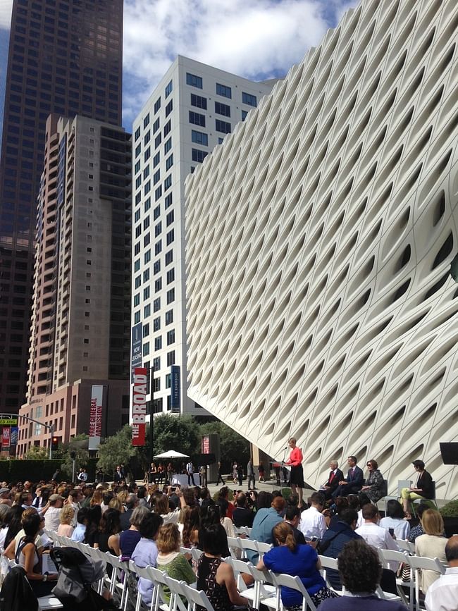
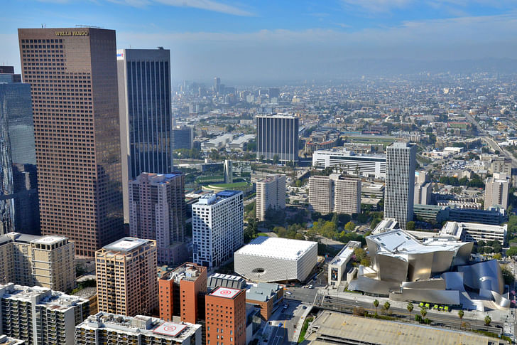
The white cube museum to end all white cube museums has touched down in Los Angeles. This past Sunday, the personal post-war and contemporary art collection owned by billionaire philanthropists Eli and Edythe Broad, housed in Diller Scofidio + Renfro’s meshed white box, opened for public viewing as the brand new Broad Museum, located just south of Frank Gehry’s Walt Disney Concert Hall on downtown’s Grand Avenue.
come out of the hot sun, it’s cool here under my pointy skirt.The five-year stretch from competition to realization of DS+R’s design left it remarkably unchanged from its initial conception, save for a car-park elevator that was nixed. Viewed from the street outside, The Broad has been scrutinized obsessively ever since its porous “veil” was constructed and the dimpled cube facade was set in place. But after the scaffolding and sidewalk barriers have been removed, it can finally breathe and its relationship to the street understood, as it lifts up its “veil” on the corners facing Grand Ave to welcome visitors through its glass wall entrance, as if to say, “come out of the hot sun, it’s cool here under my pointy skirt.”
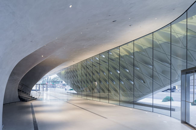
And it is pretty cool – smoothed, dark grey walls, with a slightly irregular undulation, curve around the space and dampen the (extreme) sun outside, forming a refined foyer-area that feels like a Neolithic waiting room for a very important cave person. The Broad will not charge general admission, so visitors can really just walk in off the street and directly into ground-floor gallery spaces, removing the need for overly prescribed entrance paths.
Split between the first and third floor, fluctuating exhibitions of the Broad’s private collection of contemporary art since the mid-20th century, considered one of the most heavy-hitting in the world, is on display – the majority of the remainder of the collection sits in the middle-floor’s storage vault, which visitors can peek into from windows in the stairwell. The inaugural exhibition, put together by The Broad’s Founding Director, Joanne Heyler, is designed to cut the widest swath through the Broad’s collection, giving viewers a taste of Eli and Edye’s taste. a Neolithic waiting room for a very important cave person.I won’t run through the artists on display here (see the image gallery for some examples), but overall, the Broads’ collection was estimated in 2014 to be worth $2.2 billion USD – the second-highest valued private art collection in the world. DS+R’s $140 million price tag suddenly seems eminently affordable.
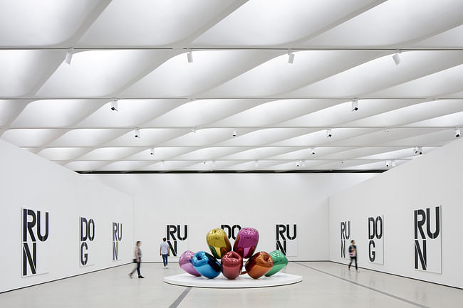
Inside the galleries, now that they’re full of art, the webbed veil of glass-fiber-reinforced concrete dissolves into the peripheral view as the pieces begin to compete for the visitor’s eye. Circulation through the galleries is determined by the whim of the exhibition – the 35,000 square-foot rectangular floors are completely uninterrupted by supporting columns, and the gallery walls are reconfigurable. This structural decision seems necessary in the light of the Broads’ personal, ever-expanding selections – museum director Heyler referred to the couple acquiring, on average, one new work a week over the 25 years she has worked with them.
Like a plain yogurt, its active culture slowly brewing in its own ferment.This lack of prescribed circulation and relatively simple layout (three floors, the middle one occupied by storage) in The Broad provides a simple analogy for the Broad’s interpretation of contemporary art, being: history has not had time to organize this yet. And given current trends in museum programming or design to push more interactive media, peppering the galleries with opportunities for constant stimulation, whether digital or physical, the Broad feels refreshingly basic. Like a plain yogurt, its active culture slowly brewing in its own ferment.
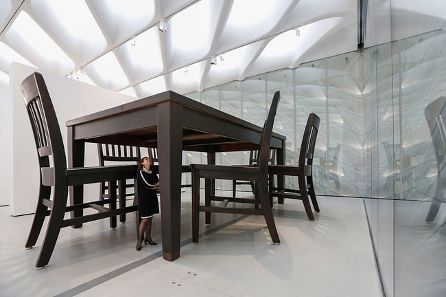
Nary an iPad or touch screen is visible in the galleries, and instead the educational opportunities are provided directly from the floor staff, who have been exhaustively trained to not only keep handbags from disrupting Warhols, but to answer questions about the art. There is also a Broad mobile app, and a handful of audio tours: one narrated by Elizabeth Diller herself on the architecture, and a “family” audio tour led by LeVar Burton.
an outer layer of the atmosphere, complete with gravitational acclimatization.And then there’s the escalator. Once you decide to leave the very important cave person’s waiting room, you can choose to ascend to the third-floor gallery by stair, elevator, or escalator. That DS+R managed to make the one-minute experience of riding an escalator not feel like a trip to the mall or waiting in line at Disneyland is a feat on its own. Instead, sucked up from the cave-foyer through a slim grey tunnel, emerging into the middle of the gallery immersed in light and art, feels a bit like traveling to an outer layer of the atmosphere, complete with gravitational acclimatization.
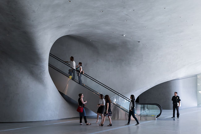
Ascending to the third floor, the veil diffuses in natural light to mix with the brightly white gallery space, while large southern-facing windows allow visitors to peek at 100-year old olive trees planted in The Broad’s outdoor plaza. But there’s no direct line of site at the neighbor to the north, Frank Gehry’s Walt Disney Concert Hall. “How do you build next to that beauty?” asked Elizabeth Diller at Wednesday’s press opening, relating one of the basic questions DS+R’s design team had to contend with. They didn’t wring their hands over it. “We actually got over it pretty quickly… We couldn’t compete, what’s the point?” Instead they “opted for a relationship of contrast,” in the “veil” and “vault” design (referring to the oft-analogized webbed facade and the founding purpose of storing the Broad’s collection).
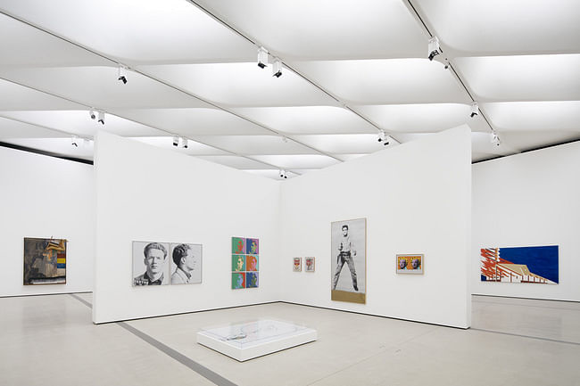
Giving a tour through the galleries, Diller very patiently responded to questions about her preferred metaphor for the veil (she doubts it could grate even a soft mozzarella), but there was no comparison to the firm’s other museum design efforts. While inevitably the New York / Los Angeles cultural tug-of-war was referred to, L.A. wins (once again) in sprawl: including The Broad along with the Museum of Contemporary Art across the street (where Broad was the founding chairman), as well as the Los Angeles County Museum of Art and many others, Los Angeles has “more museum gallery space for contemporary art than any city in North America,” touted Eli Broad to the press.
L.A. wins (once again) in sprawlAlthough while ironic enough that Broad (who made much of his early fortune by developing suburban tract homes) should contribute to the cultural development of L.A.’s newly burgeoning downtown, another sheen of the city’s shifting tides comes in the form of public transit access. The Broad will be linked up with a new subway station, and a new pedestrian crosswalk is being forged across Grand (a hopeful gesture, should there ever be any real foot traffic there).
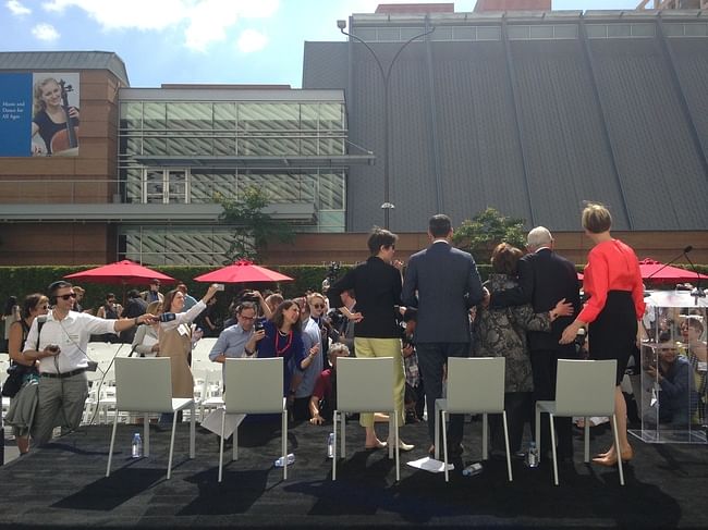
While it’s impossible to predict how The Broad will affect downtown L.A.’s cultural identity in the coming years, its form seems willing to accompany and adapt alongside all that grows in its midst, while holding its own as an institutional icon, unique in the city's changing landscape.
Former Managing Editor and Podcast Co-Producer for Archinect. I write, go to the movies, walk around and listen to the radio. My interests revolve around cognitive urban theory, psycholinguistics and food.Currently freelancing. Be in touch through longhyphen@gmail.com
15 Comments
It looks amazing. I can't wait to visit.
Nice video going up the escalator, but two things:
1. IMO escalators reek so strongly of shopping malls that they shouldn't be used in museums
and, related
2. it gave me great glee that the suggested video after the Broad escalator video ended was the 80's music video for Tom Petty's Free Fallin'. I think my point is made.
What a blue-chip collection to a fault. Is "art leader" a terminology yet? I'll go in few months after the hype dies down. Or maybe just to know the building and the collection from the pictures only.
Btw, this is Broads' old building in Santa Monica where they collected their art and gathered the chips. It was remodeled / tenant improved by Fred Fisher.
Orhan-
I've always admired that building - I live just a few blocks south. I always figured it was private gallery space, or an artist's studio. I'm bugged that the beautifully proportioned openings at the ground level have been filled in and are now blind.
I'm a little freaked out by the current trend of processional sequences that consist of humans ascending into organic looking, sphincter-like orifaces. What the hell is that all about? It reminds me of my colonoscopy video, or a scene from the movie Alien.
The show is on the second floor. Please step this way.
Corridor
you know what pisses me off. when people ride an escalator rather than walk up the fucking escalator. as if, it is to much effort. or move to one side and let someone with leg power get through the plaster birth canal and into the do run run room.
Vado, I feel you. Although The Broad's escalator is so narrow that two-lane traffic isn't really possible on it (no doubt this was on purpose). The more I reflect on it the more I like the escalator – a forceful moment of stillness and contemplation, longer and more atmospheric than the elevator ride. I don't think equating it with shopping malls is necessarily a bad thing; escalators are the only redeemable part of malls.
The Broad looks really cool--a greater emphasis on texture seems to balance DS+R's avant gardism with Piano or Tsien and Williams' materiality (ha).
On the other hand, the fact that all of the critics are falling over themselves to get the perfect Instagram shot is off putting. Seems like Guggenheim 2.0 all over again... everyone follows the $ i guess.... too bad the art inside is atrocious. Koons is dumb crap. Warhol is smart crap. Etc. etc.
I love LA, we love it
wow - that is some awful street design. At least Gehry tried to give people a little breathing room from cars, but there's absolutely no protection. makes the buildings seem more like objects on display in car (i.e. consumption) landscape rather than something contextual and social. You drive there on the 110, park your car, pay entrance fee, go on art conveyor belt, take pictures to post online that no one will look at, buy crap at gift shop, go back to car and pay your final fee for the total "experience" then you drive back to your house and put your new crap with your other crap.
that facade is begging for some fun installation art. giant colored balls. weird worms eating into it. little shiny things in every hole. i'm eager to see what kinds of things get commisioned for that. if dsr had that possibility in mind its brilliant; if not still truly fortuitous.
+++ EKE colonoscopy All you have to do is paint it pink. Alien has far too much textural detail to be used as a reference. The juxtaposition with Gehry's building does not work in DS+R's favor.
We seem to be at the point where money can make no mistake - the more expensive something is the better it is just because it's expensive.
The Seattle Library got it right...
Block this user
Are you sure you want to block this user and hide all related comments throughout the site?
Archinect
This is your first comment on Archinect. Your comment will be visible once approved.