
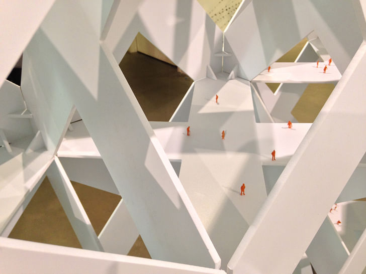
In the 1958 classic film "The Blob", a globular alien terrorizes a small Pennsylvanian town, ravenously absorbing everything and everyone in its path. It's formidable but silly looking at the same time, and the more it takes in the bigger and angrier it gets. Walking through the Architecture and Design Museum at the opening of their S,M,L,XLA exhibition, at times it felt like The Blob had overtaken curation.
Including a vast variety of styled architectural projects, ranging from Lego-models to board game pieces to pavilion-sized experiences, the exhibition takes its name from Rem Koolhaas and Bruce Mau's 1,300+ page architectural meditation, S,M,L,XL reflecting on twenty years of productions by Koolhaas' OMA. A+D's exhibition claims to use this text as a clarifying device, to funnel the noise of LA's youthful architectural and design scene into a coherent energy. The result is a pretty hectic and dissonant display of individually impressive projects, that have to fight to stay above the fray.
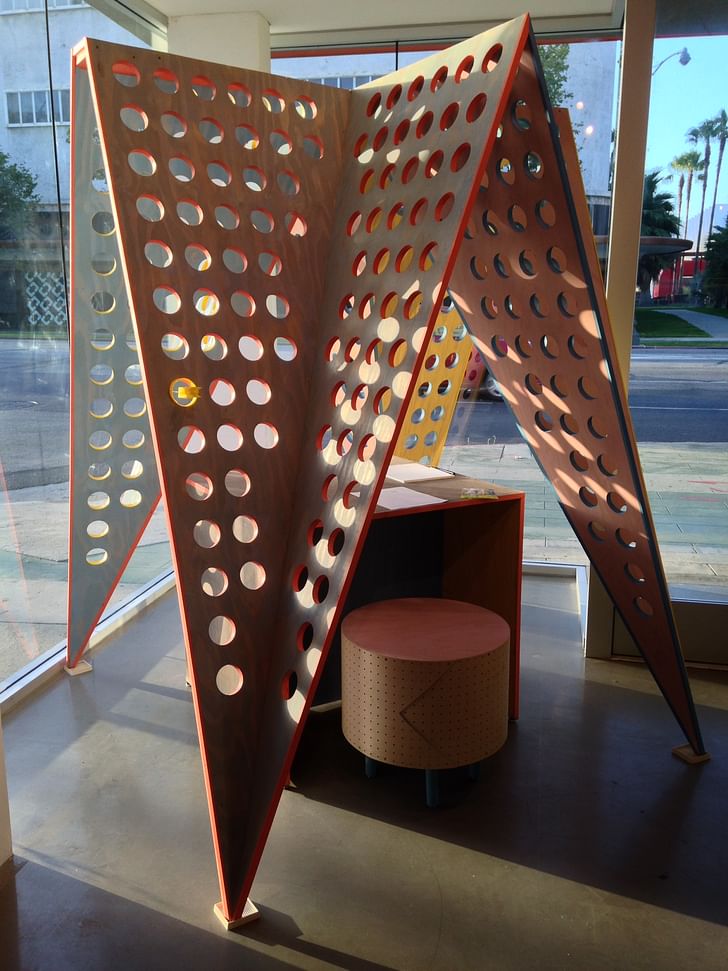
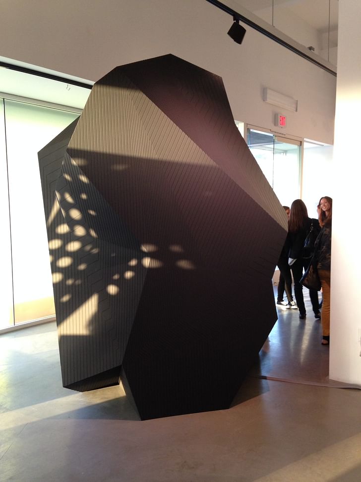
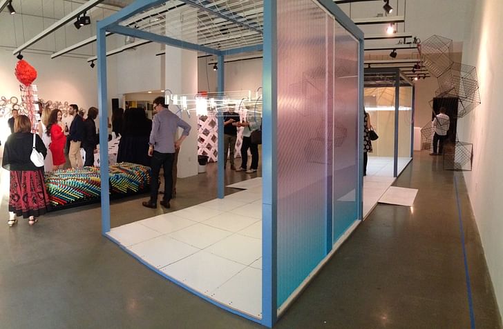
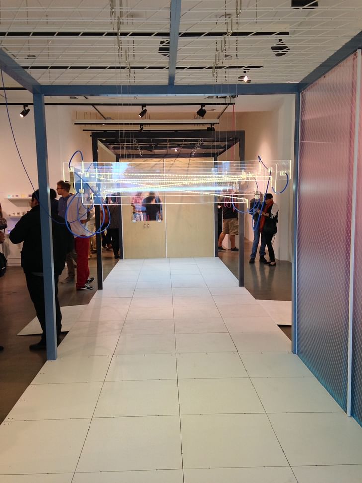
If a more precise theme than "young LA designers" had to be named, it could be something along the lines of "playful interactivity", as each piece invites or presumes some type of participation by the viewer. A couple of one-person pavilions offered slivers of spaces to fluorescent colors and plexiglass sparseness suggest a kind of tricked-out shipping container.retreat from the crowd -- Grey Crowell's porous wooden tent Objets d'architecture provides a public/private experience, while Steven Christensen and Mads Christensen's Zoom does exactly that, quickly focusing the viewer's attention from the wide-scale of the gallery to the narrow space of the enclosure. Between these two structures sits a raised platform with a canopy of hanging snake lights, embedded in clear plastic. One of NONdesign's NON BOXes, the shipping-container sized piece is actually a customizable, pre-fab commercial space. It was difficult to get a feel for the NON BOX's atmosphere within the competing light of the exhibition space, but the fluorescent colors and plexiglass sparseness suggest a kind of tricked-out shipping container.
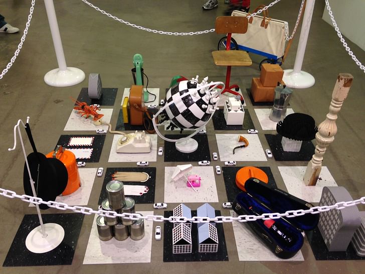
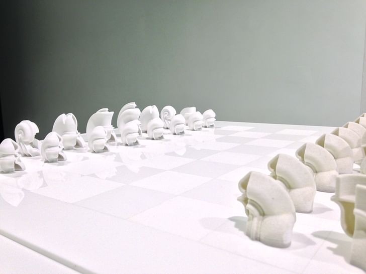
A few pieces were inspired by classic games, clearly referencing the interactivity and competition of board games. Laurel Broughton's (WELCOMEPROJECTS) "Retrospective City" had compiled a selection of objects, from their own designs, to array in a black and white linoleum grid, protected behind a white plastic chain barrier. The objects refer to domestic and recreational artifacts, but in their grid with intersecting "streets" trafficked by white toy cars, the collage of toy objects becomes a city simulacra, a tongue-in-cheek evaluation of cities as a gathering of architectural iconographies on a checkered "game board" grid. Another piece, Maxi Spina's riff on a chess set, with 3D printed pieces resembling amphibian creatures or digestive tracts (or perhaps a little of both), rendered in grayscale.
While individually interesting, taken together the pieces don't offer a clear statement on LA's current architecture and design scene. And given that A+D is a relatively small museum space, things get very cramped very quickly, meaning the congestion was both physical and Imagine stopping for space-gas on your Marvin the Martian vacation, and buying a postcard to send back to Earth from the convenience mart.curatorial -- there just wasn't enough space to breathe. On opening night, you couldn't stand still without completely blocking a pathway or majorly obstructing the art.
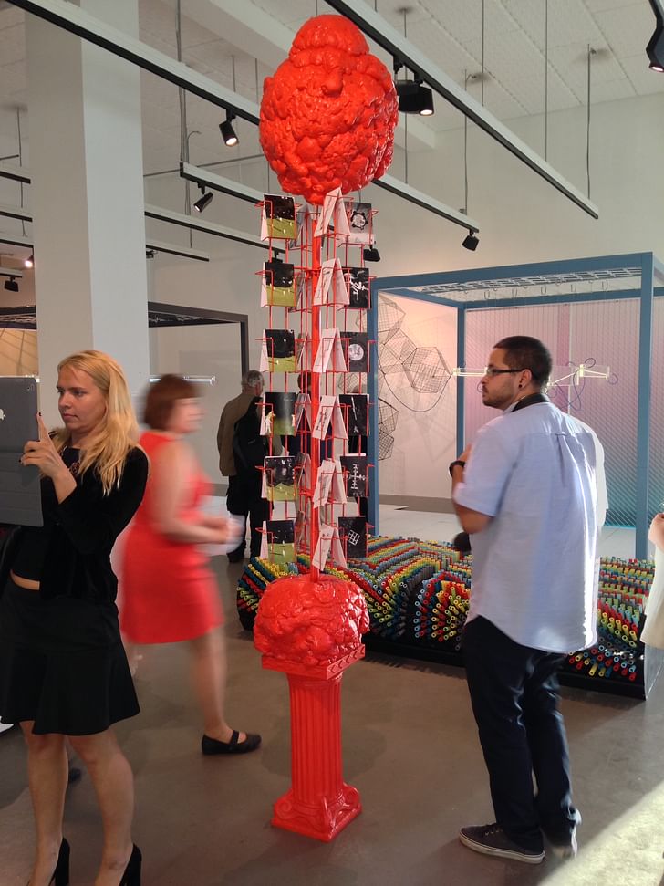
A+D usually packs its exhibitions to the gills, but this time the choice seemed a bit self-conscious, with Andrew Kovacs' "Archivemark 34° 3' N / 118° 21' W" placed near the entrance. "Within the sea of the A+D Museum, [Archivemark] is a conceptual buoy", states the placard, describing a fluorescent orange postcard rack whose structural gobs of orange inspired the introductory "Blob" analogy. Imagine stopping for space-gas on your Marvin the Martian vacation, and buying a postcard to send back to Earth from the convenience mart.
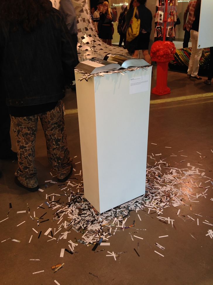
Next to Kovac's postcard rack sits the inspiration for the exhibition, Koolhaas and Mau's S,M,L,XL . The book is placed literally on a pedestal, opened to somewhere in the midst of its 1376 pages, with rectangular holes punched through from cover to cover. Reminds me of both the portrait of a saint and early-computing punchcards, at once irreverent and sanctimonious. So irreverent, in fact, that I mindlessly thumbed through the book for a bit before realizing "this is on display in a museum". I confess to not having read the whole thing, but it didn't seem to matter in the midst of the exhibition. Maybe it's enough to say both the book and L.A. are huge, so let's embrace the chaos.
Former Managing Editor and Podcast Co-Producer for Archinect. I write, go to the movies, walk around and listen to the radio. My interests revolve around cognitive urban theory, psycholinguistics and food.Currently freelancing. Be in touch through longhyphen@gmail.com
1 Comment
The punch holes in SMLXL seem quite similar to Eisenman's Chora L Works.
Block this user
Are you sure you want to block this user and hide all related comments throughout the site?
Archinect
This is your first comment on Archinect. Your comment will be visible once approved.