
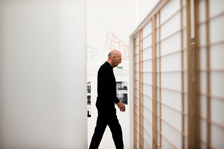
Is Modernism “history”? How do Modern concepts, especially regarding representation, nature, technology and housing, relate to the current state of architecture? These were some overarching questions embedded in the 14th Venice Biennale of Architecture, curated by Rem Koolhaas. The show opened June 7th under the “Fundamentals” theme, and it is worth visiting for the important questions it raises about the current state of architecture and building.
The President of the Biennale, Paolo Baratta, argues that the curators always use research in their methods but in this case research is produced during the Biennale itself. Those curators are not reporting on work done prior to the Biennale, but are instead bringing together concepts and assembling them to create new knowledge. Here is a new, critical and provocative way of thinking about Modernism. Koolhaas convinces attendees that it is important to look critically at Modernism in order to look productively at the present and forward into the future. He also proves that architectural research can be really entertaining.
The central pavilion is themed “The Elements of Architecture”, where fifteen components of buildings – floor, ramp, escalator, façade, wall, window, balcony, elevator, stair, fireplace, toilet, door, corridor, ceiling, roof – are categorized, reexamined, modeled, demonstrated and analyzed. The pavilion is the culmination of two years of research with Harvard School of Design and experts from industry and academia. It was certainly the first architectural exhibition this critic has ever seen with a barbecue mounted on the wall, or a global history of toilets on display, or an interesting visual presentation of disabled ramps. Baratta called the Biennale a “wind machine” that stirs up concepts. Agreed, there is a forceful, almost wild current in the show – it’s like being immersed in a stormy S,M,L,XL, with a glass of wine, and hundreds of other people. Read the entertaining field notes by critic Grace Mortlock where He proves that architectural research can be really entertaining.she quotes Australian critic David Neustein, saying Elements is “like a nightmare in which I have to study for an exam on the Architects metric Handbook while wandering through a crowded supermarket”.
This is the first year where the Biennale’s curator has influenced the overall theme as well as the national pavilions, which are themed “Absorbing Modernity 1914-2014”. Each of the 65 participating countries revealed diverse approaches to Modernity and their particular political and social context. The impact is powerful and unites the two parts of the Biennale (the national pavilions, largely at the Giardini venue, and the main installation at the Arsenale) which in previous years have had little connection. The Elements was the most dramatic: exciting, graphic, great variety of archival materials, video, interaction, product scale objects, full-scale models, mirrors, lights and colour. An architectural event, not just an exhibition. The organizing “elements” do not feel restrictive, but are rather constructive constraints to form a well-structured discussion. It is impossible not to be critical and reflective, to consider our Modern worldview – our need to compartmentalize buildings into elements, processes into procedures, and systems into hierarchies. The exhibition encourages dialogue, and feels like an exhibition of architectural research, not a survey of new trends in architecture.
There were a few areas that were mysteriously lacking, particularly the opportunity to think of how we transform, adapt, renovate, and renew modernism. All of these buildings were built during the biggest building boom the world has ever seen, so now renovation and transformation is a pressing, global concern. How must this be architecturally considered? Why is renovation often considered a lesser intervention than new building? How can we reconcile our elemental thinking towards a more systems based, integrated, ecological approach? What about the challenges of greening modernism?
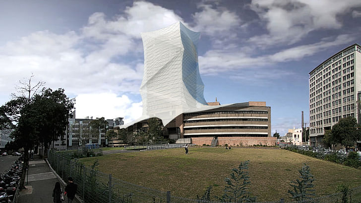
Our framing of the future is so grounded in these Modern worldviews. Only a few aspects of the show explicitly looked forward, for example Denmark held a lively and well attended panel debate with politicians, architects, planners and a futurist to conceptualize Denmark in 2050. Australia’s unconventional pavilion was a pop-up venue in a green courtyard between other pavilions, due to the fact that their permanent Pavilion is being renovated. The “Augmented Australia” installation was conveyed through iPads and people explaining how to scan images to show 3D views, and to read deeper into concepts using digital means. Examples of forward-looking Modernism included LAVA’s work, such as an experimental concept for wrapping a 1960s Brutalist building: “re-skinning” it in a lightweight, energy-generating membrane would improve climate and comfort. This begins to explore how Modernism can be renovated and improved over time.
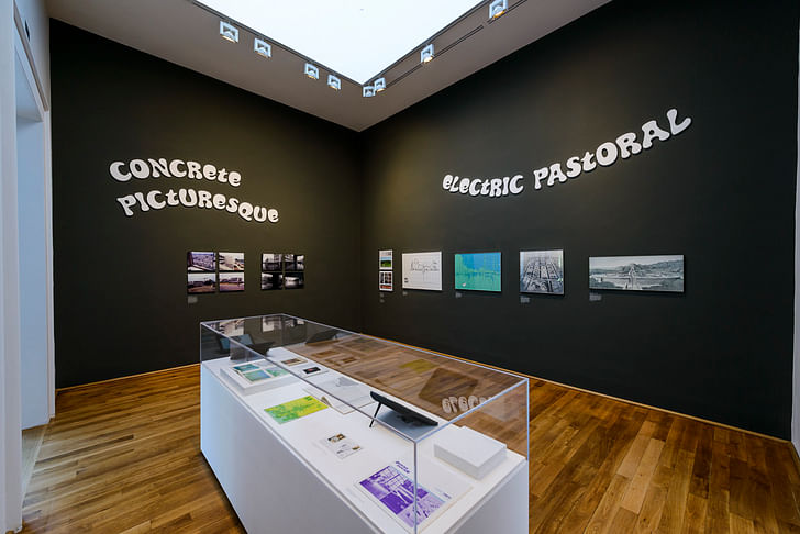
Other highlights included the “Clockwork Jerusalem” show at the British Pavilion, co- curated by FAT and Crimson Architectural Historians for the British Council. As a follower of Sam Jacobs’ Instagram, I was excited to see what he came up with for this show, and I was not disappointed. Science fiction, 60s music videos, demolition, poor maps, cartoons, album covers and brutalist concrete materiality were all contextualized in larger concepts of how history meets the future; how the ideological meets the aesthetic.
A totally different approach was taken by Denmark’s pavilion, “Empowerment of Aesthetics”, curated by famed landscape designer Stig L. Andersson. It was an installation for the senses. A damp mossy garden, the smell of fresh wood, the immersive experience of a pure white, infinite-seeming space, all brought inside to consider the future of a sustainability that explicitly includes aesthetics. “For far too long whenever we have had to make a case for what our future should look like, we have focused only on the rational aspect,” he argues. Here is a reflection on the fundamentals of Danish society, where the connection between nature and culture is alive in the poetic, aesthetic, scientific and architectural.

“Crows Eye View”, the Korean Peninsula's exhibition is a striking installation: it doesn’t try to provide a balanced look between North and South Korean points of view, but just tries to engage with both, together. Well curated and organized, the pavilion offers a glimpse into an unknown quantity: how North Korean architecture and culture engages with concepts of the monumental and the everyday. We’re familiar with these modernist concepts, but they take a very different form in North Korea. In contrast to an all-seeing, bird’s eye view, this is The exhibition encourages dialogue, and feels like an exhibition of architectural research, not a survey of new trends in architecture.conceived of as a show that “points to the impossibility of a cohesive grasp of not only the architecture of a divided Korea, but the idea of architecture itself”. There are current architectural magazines from North Korea, current photography of select monuments and approved documents relating to everyday life. A fascinating installation of an almost unknown architectural culture, it won the Golden Lion for best pavilion.
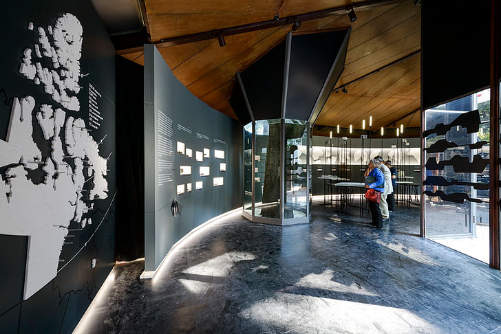
Canada’s Pavilion, “Arctic Adaptations: Nunavut at 15” explores the wild landscapes of the Canadian North, presented as a series of distinct landscapes with their own sense of place and people. Curated by a team led by design-research studio, Lateral Office, the exhibition marks the 15th anniversary of Canada’s newest territory, “Nunavut” and explores arctic architecture. Concepts of adaptation and resilience are explored in striking physical models and panoramic landscapes, displaying a diversity in climatic approach to building and urbanization. It won a special mention by the Biennale Jury for strong national participation.
The Biennale runs for an unprecedented six months, closing November 23 of this year. It is worth seeking out the fifteen small “Element” catalogues to really appreciate the 2+ years of research that went into the exhibition. Socially, the Vernissage opening weekend was fantastic as usual: highlights included the launch of the Guggenheim Foundation’s open international design competition, which took place on the rooftop of the Guggenheim Venice (and will probably end up being one of the most entered competitions of all time), as well as the British Pavilion’s dinner with music and projected moving images in a courtyard ruin. There were only a few disappointments, such as when the Saturday night rooftop afterparty, hosted by Danish office BIG, was so well-attended that it ran out of both rooftop and beer by 1am, or when the Airbnb pavilion closed earlier than planned. There is no architecture hangover this year – it was exciting, inspiring and I am already looking forward to 2016’s Biennale.
Video of Barkow Leibinger's Kinetic Wall Prototype by Terri Peters.
Video by Terri Peters.
I'm an Assistant Professor at Ryerson in Toronto. Originally from Canada, after studying at Dalhousie, I spent 8 years in London, UK studying and working as an architect and writer. I then moved to Denmark to study for my PhD in architecture 2008-2014. You can read some of my ...
2 Comments
Is Modernism “history”?
Everything before this moment is history. How one splices up the past depends on the function or agenda of the one doing so.
Koolhaas convinces attendees that it is important to look critically at Modernism in order to look productively at the present and forward into the future.
I hate to break it to Koolhaas, but looking critically at Modernism is about as old as Modernism, at least for those not burdened with its ideology. He needs to get out more.
Thayer-d I am with you.. was going to say didn't Eisenman address this with that "beginning of the end..." essay. Unlike say Eisenman with Koolhaas you can not only understand him but you can also get excited by how he describes his perceptions. First time I read s, m, x, xl - I was on my way to study in Germany and I made a pit stop in 1999 unified Berlin. I grew up partly in West Berlin and had never been to Alexander Platz or I think Karl Marx Alle? Had just finished some txt in koolhaas fat book and he used the word "slab" about I think social housing or something. Was touring this east berlin area with a fellow german language course student who happened to be a Columbia grad in architecture dating a german working for HOK..I kept saying "slab" and she couldn't quite understand me and I mentioned s, m, x, xl. She was suprised to learn someone was actually reading the book....this is why you can drink wine and learn, there is more to architecture than abstract rationalism and to talk about it rationally is silly...
Block this user
Are you sure you want to block this user and hide all related comments throughout the site?
Archinect
This is your first comment on Archinect. Your comment will be visible once approved.