
Sep '09 - Feb '12
Well no surprise but I owe you an apology. Soon after my last post my hard drive crashed and due to that tragedy, so did I. It's interesting how the demise of my personal computer felt way too personal...like I was also broken. But I suppose that in this digital world, feeling that kind of connection to a computer makes a lot of awful sense. Anyway, in the month or so that my computer was dead/getting repairs I fell out of the habit of blogging....so a very brief catch-up is in order. (I lied, it’s not that brief)
When I last updated, I left you with a series of models we were doing to think through our thoughts on program and sustainable strategies. After the initial few weeks of playing around with a general design through this method of model making we started feeling pressure to settle on a scheme. At this point we knew we wanted our building to do a few things. It had to engage the street with the offices above, the office spaces needed as much access to daylight as possible, the office workers needed plenty of space for breaks or to take their work away from their desks (if possible), and we wanted the offices from different businesses to interact with one another in some way. The final scheme we chose attempts to accomplish these programmatic goals by mashing up many of the ideas of all the models we had produced up to that point.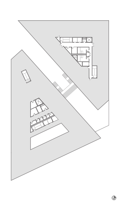
typical (5th floor) plan at 2 weeks
By severing the building site into one tower for tenant office space and one tower for prime office space, a direct path of movement is created from the northwest corner of the site (pedestrian traffic from the metro stop, the national ballpark, Tingey square, and the capitol building) to the waterfront park and pavilions at the southeast corner. This symbolically and literally opens up the city to its lost waterfront on the Anacostia River and allows the property to become a buffer space blending the park at the south into the urban fabric of the city to its north.
This sever also creates two separate buildings with facing facades that become a point of interaction between the prime office and the tenant offices. Placing outdoor balconies, lounges, and kitchen facilities along this axis creates a vertical neighborhood. Rather than stacking office on top of office with one entirely unaware of the others, this configuration allows the occupants to peer into the business day of another company...hopefully creating some sense of a community within the generic corporate structure of capitalism.
The next step was to figure out how we were actually going to build this structure and with what materials, systems, and strategies. We knew that we wanted our building to be smart about its environment and surroundings, responding to them in a dynamic way rather than operating completely passively where an observer wouldn't be aware of the building working. Our first decision to accomplish this was to investigate ETFE pillows as an envelope.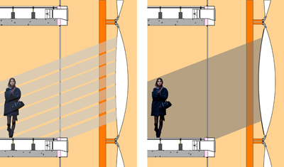
efte exterior application intent diagram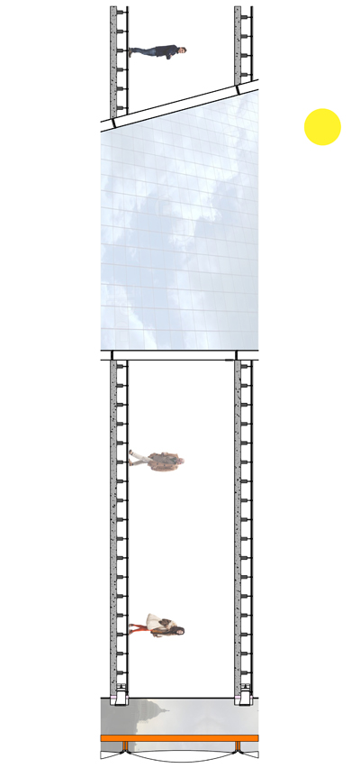
conceptual section through lightwell in prime tower
With this strategy, the pillows can be filled with different gases, inflated to different configurations to not only create thermal protection, but shield against solar heat gain when needed. A wall that is its own shading device. We had no idea how we were going to pattern or construct the pillows, but it was a start.
typical (5th floor) plan at midterm reviews
We also didn't want the building to be serviced by centralized (and thus massive) mechanical equipment. By heating and cooling with water-source heat pumps we were able to desegregate the equipment into smaller units placed within the raised floor system on each level. These units are able to respond more accurately to the space they condition allowing for efficiency and better dependability.
Then midterms came.
We didn’t get very much enthusiasm about our design from the jurors. This project is very peculiar and although we really wanted to go wild with our ideas, the fact that we had to back up every design move we made with proof that what we did would be buildable caused us to play it pretty safe. I didn’t even really realize it until the guest jurors said things that pointed it out. So after presenting our project, I started to really hate everything about it, wanting to change everything, or even just start over from scratch. Unfortunately we knew that it was too late in the semester with the nature of this project to even consider such drastic action, but I personally couldn’t look at our building without wanting to rip it to shreds. It was a horrible place to be in but I guess I eventually got over it because honestly our project doesn’t look much different than it did two months ago. The reality is that no matter what my personal beliefs are, this semester is more about production and documentation than design and ideas.
After midterms our efforts focused on working out the plans to adhere to building code regulations and detailing wall sections to get an idea of the construction assemblies and the heating/cooling and ventilation strategies.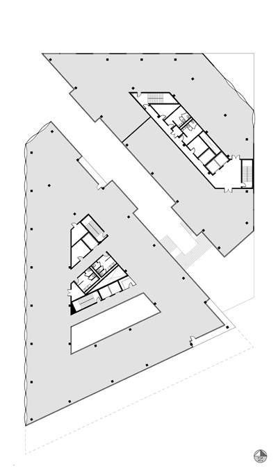
typical (5th floor) plan at early march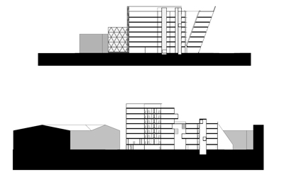
top section through prime tower and lightwell (rain collector). bottom section through both towers and vertical neighborhood.
For the articulation of the ETFE pillow my project partner, Chris, had originally envisioned a patterning that was created by the original master plan of Washington DC, but figuring out how to actually construct that idea was really complicated and we eventually gave it up (a similar death as many of our ideas). Eventually after a lot of debate and research (thank you Detail Magazine), the EFTE pillows became a diagrid curtain wall system that could be swapped for concrete panels or glazing depending on the function of the interior and needs of a particular elevation.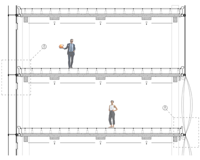
construction detail wall section, in development
And that sort of thing went on for a while up to now. Hey, we're kinda caught up.
I wish that I could have kept this up while we were struggling through this semester. There’s definitely plenty more to say but at the moment I’m totally pooped after spending all night calculating the electrical loads for one of the tenant office spaces. Yep. Even though we’ve learned most of this information before in our Environmental Technology courses, everything is way more complicated when trying to apply that knowledge to something other than the text book example. Especially since I’m STILL not an engineer (don’t get me wrong however, the perspective that feeling really dumb gives you is invaluable).
Our first final submission date is this Monday….the “black and whites” are due and will be meticulously graded by the fourth year faculty and the consultants…who each grade structural, mechanical/plumbing, and electrical drawings seperately. Models and presentations will be due (for the final critique of our undergraduate careers? What?) in another three weeks. It’s hard to believe it’s almost over.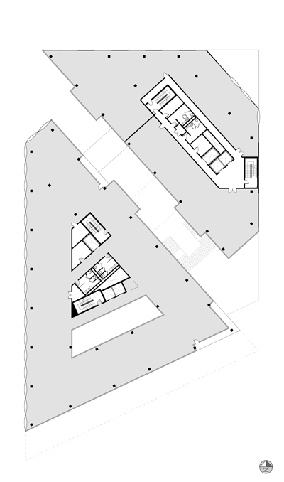
typical (5th floor) plan as it is now
But for serious now, I’ll be back here with another post soon.
Are you sure you want to block this user and hide all related comments throughout the site?
No Comments
Archinect
This is your first comment on Archinect. Your comment will be visible once approved.