
May '13 - Dec '15
The inaugural Chicago Architecture Biennial is almost through its first month (it runs now through 3 January 2016). Playing off of the internationally renowned Venice Architecture Biennale but with a distinctly different flavor and approach, each of the 100+ entries, installations, kiosks, and events brings something unique to the overall Biennial experience. See below for the 10 strongest installations that cover the spectrum of representational type, scale, and subject.
1. Atelier Bow-Wow, Piranesi Circus
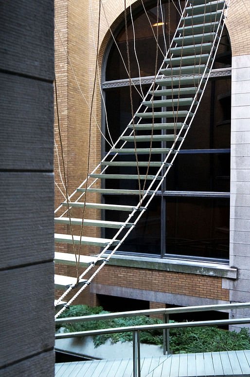
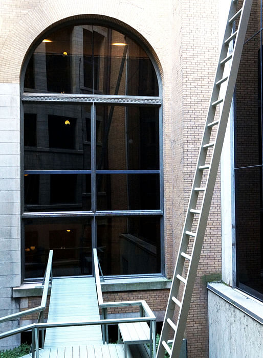
The building of the Chicago Cultural Center, originally constructed in 1897 with a renovation/addition in the 1970s, is organized around a central atrium which pierces the entire five-storey building, bringing natural light deep into an otherwise massive structure. The atrium houses mechanical equipment and is not a part of the building's occupiable space; it is therefore an unbeautiful space, even though it is visible from every floor. It was in this space that Atelier Bow-Wow chose to construct their installation. The series of ladders, ramps, cantilevered balconies, and trapeze-like rope bridges look, on first glance, like reasonable - if somewhat nonsensical - contrivances. On second glance, however, they become a bit more mysterious; all are intended as circulation and all either originate in nowhere (a window, atop a condensing unit) or climb to nowhere (midair, the [inaccessible] roof). It is circulation, after all, but only for the eyes; viewers’ glances travel all over the devices before they understand that the game is not to be in it, but in fact to be not in it.
Although Blair Kamin has referred to this installation as 'limp', I think it stands on its own merits, and that the main dysfunction lies between how the architects speak about it and how it actually performs in real life. Atelier Bow-Wow has framed it as a reaction to Piranesi, and therefore tried to force some language around imprisonment around it. In reality, the entire space is activated by the Hogwarts-like whimsy of ramps to nowhere and trapeze bridges that head off into space. 10 points for the classic architecture reference; a point deducted for missing cultural references and a slightly messy characterization.
2. SO-IL, Passage
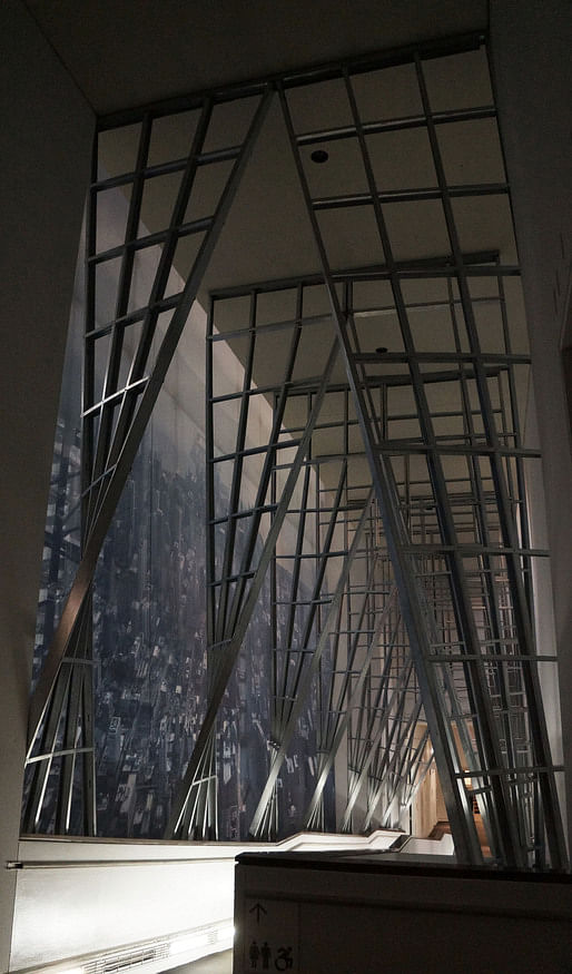
Passage is located on the northwest side of the building on the ramp that crosses from the second to the third floors. The switchback ramp, approximately 50' long, is bordered on the west side by a colossal silkscreened aerial photograph of Chicago by Iwan Baan, and on the east side by the atrium and Atelier Bow-Wow's Piranesi Circus. Because it is right next to two windows, the space relies on daylight and ambient lighting; in the evening, a continuous safety light near the floor uplights the space. For the Biennial, SO-IL has cladded the entire length of the ramp in standard commercial metal studs. The studs are clustered in small groups of 4-6 at approximately 5' intervals following the length of the ramp; each cluster on the left side of the ramp has a mate on the right. Each cluster pair, fastened to the outsides of the handrails, twist as they rise towards the high ceiling from paralleling the ramp to framing it, mimicking the form and movement of a gently undulating curtain. The subtle differences produced by the variation in height of each side of the ramp and its regular vertical progression from one floor to the next mean that each cluster is slightly different from the one just before and just after it, making the entire installation a close study in the big difference small changes effect.
On being chosen, the organizers of the Chicago Architecture Biennial made it very clear to participants: the event will be held in the Chicago Cultural Center, and it is up to you to engage the space. SO-IL’s response is an unfailingly graceful engagement of place and the uniqueness of this specific space. It calmly anchors the middle ground between Iwan Baan's colossus and Atelier Bow-Wow's eerie playground (see #1). The gently twisting metal studs contribute to the relentless reality and subtle poetry of the space. In theory, it's an exploration of the ramp type; in practice, it's by far the best installation in the entire building, especially in the evening. When the fading Midwest sunlight flares with crimson drama and the cool white uplights come silently on, the installation seems to offer the massive yet intimate embrace of a silent, pristine chapel.
3. Gramazio Kohler + MIT's Self-Assembly Lab, Rock Print
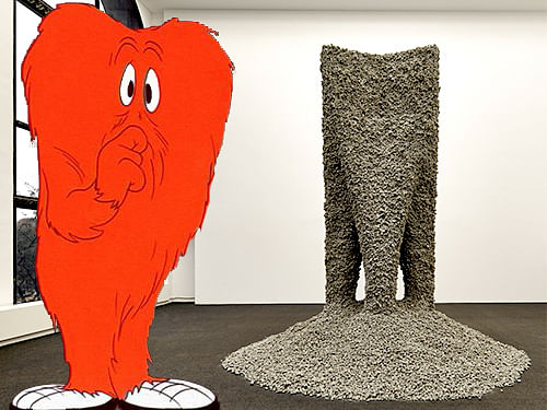
Look, let's just say it and get it over with: this installation looks exactly like Bugs Bunny's monster. That being said, this is billed as - and, in fact, is - a space-age project. The collaborators brought a multi-axis robot into the Chicago Cultural Center, programmed it with a four-quadrant trefoil pattern approximately 8' on a side, and loaded it up with an extremely long continuous length of string. They then began laying the string, building plywood formwork around it, and loading low-grade rocks into the formwork. Once the installation had reached about 15' high, they carefully removed the formwork, leaving a 8' x 8' x 15' rock column: solid without using any binder like adhesives or mortar. Carefully, the team scraped away some of the nonstructural rocks in between the trefoil-columned quadrants, forming an impressive pile at the bottom where they fell and voids where they fell from. The structure could be load-bearing; it's been tested up to three tons, or 6,000 pounds.
Rock Print did not originally make this list. Its mute brutishness was deeply off-putting. But the more I think about it, the more I get excited about it - not for itself, but what it means. The team managed to conceive and construct a structure that's load-bearing (up to 3 tons) using just two ordinary materials that could be found nearly anywhere in the world, and the theory is that the structural underpinning - a single, household, ordinary, continuous length of string - could be undone by a simple tug, like unraveling a sweater. Billed by the designers as “the first architectural installation to be built from low-grade granular material and constructed by robotic machines,” the implications for sustainability, resilience, and humanitarian building are potentially enormous, and so it's less the installation itself that I like, than the future that I can taste when I contemplate it. Chicago architecture critic Blair Kamin asks of the Chicago Architecture Biennial: “Are these ideas we can build on?” This installation gives a rare and resounding “YES.”
4. Noero Architects, 180 Square Meters
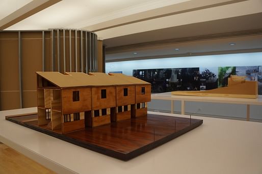
This is one of the rare installations in the Biennial that is an actual architectural model of an actual designed and constructed building - and they sent two. The installation is found on the first floor, just across from P-A-T-T-E-R-N-S' oversized wall print and sharing space with the full-scale drywall and metal stud construction mockups of The Entire Situation. The two models are mounted on separate platforms elevated to about 54", comfortable to look at without bending over. Both are made from model-scale wood, unvarnished and unpainted, and set into suggested landscapes. No other building or context is represented, leaving the focus of each model intensely on the building itself, and by virtue of their close placement to one another, on its relationship to its other. The description of the project makes the idea explicit: the practice designs high-dollar residential projects for clients with deep pockets, and use the financial cushion to work on multi-family sustainable housing in Cape Town, South Africa. In this way the practice accomplishes its mission: “to work simultaneously in both sectors [profitable commercial and pro bono NGO/state agencies], allowing one to subsidize the other.” With their installation, Noero Architects is quietly setting a precedent for how to design an architectural practice that takes on social justice as a design tool, not an inconvenience or a problem to react against.
5. Didier Faustino, BUILTHEFIGHT
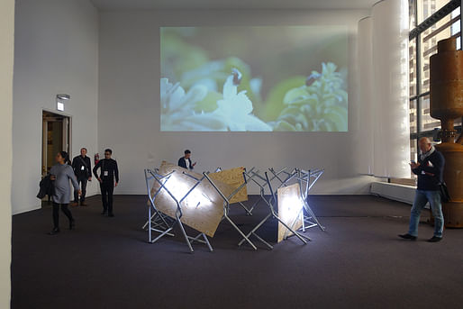
Three 4'x8' plywood panels, upright on their long ends, have been placed end to end in a rough circle and encircled with pieces of tubular steel, entwined and bolted together such that the steel ring ends up resembling the sharp defensiveness of barbed wire, or a crown of blunted thorns. Each plywood panel bears a one-word inscription in a handwritten scrawl, expressed in violently white neon: "Occupy", "Resist", "Protest". According to the designers, this is architecture intended to support and defend protest movements like the American erstwhile Occupy Wall Street. The idea is that it serves as both a call to riotous action and a human shield once it's been incited.
I'm generally a fan of underdogs and the people who champion them, and for that reason I have a pitying kind of affection for this installation, this prototype of sorts for an architecture of protest. Its raw materiality holds the same kind of seductive, dangerous appeal as barbed wire or construction zones. On the other hand, the thing is totally impractical. It’s too big and heavy to lug from protest to protest, and if you did decide to barricade yourself behind it, you'd probably be stuck there until a sympathizer with an outsized wrench (or a cop with a hacksaw) liberated you. There's also conceptual unease in architecture, actually tool and toy of the 1%, ostensibly now being co-opted and placed in the hands of the 99%. …Really? San Francisco Chronicle architecture critic John King said of the Seattle Public Library that “high concept and actual places aren't always snug fits”, and that unfortunately holds true here; the concept and language surrounding this installation are incendiary, but the physical manifestation curiously flat. Still, it’s worth contemplating for the thoughts it provokes.
6. Stefano Boeri Architetti, The Flying Gardeners
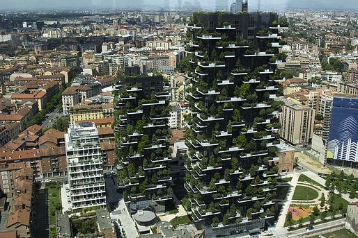
Each video installation in the Biennial is displayed differently. In this case, a projector is mounted near the ceiling and the video is projected onto a 30' high wall. It's in the same room as Didier Faustino's BUILTHEFIGHT, MAIO's floating inflatable columns, BIG's rusty Steam Ring Generator, and Smout Allen + Manaugh's LA Recalculated light boxes: a deeply diverse range of topics and representational styles, which somehow adds depth to the experience of this particular video. The subject matter for the video starts with the Bosco Verticale. Nicknamed the “vertical forest skyscraper,” it’s (in)famous in architectural circles for storey after storey of full-grown trees rising hundreds of feet in the air. As the video’s title suggests, it concerns the airborne groundskeepers for this unique property; or rather, it starts there, but it's really a story of what happens once construction is complete and people are living in the once-precious design.
Architects are notorious for abdicating responsibility for projects once a design leaves their hands. "The builders" or "the owners", they say with convenient regret when presented with real-world building dysfunction. This video is a refreshing antidote to that: the architects are taking time to explore the groundskeepers making their feat continue to be possible, those unique individuals who must have both rappelling and botanical cred. The film is ostensibly about the grounds (er, air?) crew, though the stories pivot from aerial gardening to messy houses, messy people, messy lives - it's a mess and a glorious one, and Stefano Boeri Architetti embrace it via this film with quiet exuberance.
7. UrbanLab, Filter Island
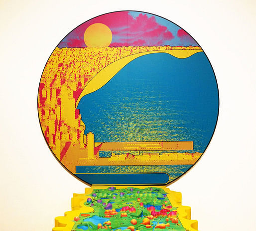
This installation is one of the "BOLD: Alternative Scenarios for Chicago" collection, a group of 18 projects proposing design solutions for various Chicago-specific issues. This proposal suggests that Chicago turn part of the city into what would functionally be a Living Machine: an emerging water treatment technology that uses a series of tanks and phytoremediation (active plantings) to process wastewater on site. It’s represented by a three-dimensional model that wraps from a freestanding platform up the adjacent wall; viewed from straight on, it looks like the effect a sun makes as it sets over the lake. The model is CNC-routed blobby shapes placed in a gestural map of Chicago
The whole thing is done in primary colors so loud that even the 80s would have winced and asked them to tone it down a bit. I have no idea what the Day-Glo colors mean or why such an earnest and meaningful proposal is presented in caricature, but this is an audacious proposal that deserves earnest consideration. F for format, in other words; A+ for content.
8. Kéré Architecture, Place For Gathering
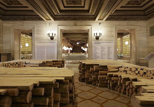
This installation is set up in the first interior space of the Cultural Center on the Randolph Street side. The room is large but intimate, with a relatively low ceiling. It is bordered on the north by the foyer, on the south by the grand staircase (and Pedro & Juana's reading room furniture installation), on the west by a closed-off auditorium, and on the east by the Biennial's bookshop and the bulky RAAAF installation. Kéré's installation is comprised solely of local trees, cut and planed and stacked up to about 42" high. The exterior echoes the shape of the room (a slightly smaller rectangle) with plenty of room for people to pass through to the spaces beyond on either side, and voids carved through the middle for central circulation as well. The installation is of a comfortable height and material for people of all ages and abilities to perch, rest, chat, and clamber. Although the materials are raw, the surfaces are not rough, and there is no fear about sap or splinters.
There's a lot of work in this Biennial, as in any collection of finished architectural work, that is precious. Self-consciously conceived and produced, it's functionally useless and relies on the users' imaginations and an uneasy hope in the future to produce some meaning. Not so with Kéré's installation. It is exquisitely simple and exquisitely effective. Made of locally-harvested logs, it makes for an absolutely wonderful juxtaposition between RAAAF's awkward "The End of Sitting" just to the east of it, and Pedro & Juana's Randolph just to the south. All three are designed to be areas of repose (you can't say 'sitting' for RAAAF's, whose 'affordances' allow you to do anything but that), but Kéré's is the most functional. In RAAAF visitors vogue uncomfortably, grabbing their obligatory Instagram moment and then moving to someplace more comfortable. Pedro & Juana's reimagined reading room is significantly more inviting, but there's still people being careful of the fragile fabrics and jumping out of the way of the counterweighted swinging light globes. On Kéré's installation, people have no fear; they sit and bump and clamber, they rest and recharge, they talk animatedly and seem to entirely lose the art fear that imbues every other part of the Biennial. Throughout all the projects, the architects state their intentions, but for the most part you'd have to read the blurbs to know what they are; with Kéré's, you just get it. Sit down. Chat with the person you're with, or a new face. Be where you are. It's architecture as we wish it always was: totally accessible.
9. Norman Kelley, Chicago: How Do You See?
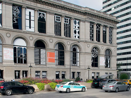
The Chicago-based design firm Norman Kelley has taken drawings of 65 of the city’s most notable architectural windows, reduced them to line drawings so clear that they’re nearly caricatures, turned them into white vinyl cutouts, and applied the cutouts to the grand windows of the Cultural Center. Tied with SO-IL (see #2) for first in the imaginary award of "Who Got The Cultural Center Right", Norman Kelley's project is so fun and light-hearted you almost don't want to call it an installation. Architecture becomes a joke we laugh with, not at, and even better - the Cultural Center and the Biennial are in on the joke. It's a wicked smart, wicked fun way to tie in a lot of architecture at once, and asks only a basic situational awareness of people in order to get it (or offers an ingenuous lightning-round tutorial to Chicago visitors for folks who don't know). It’s also a playful way of using the Cultural Center to advertise the Chicago Architecture Biennial. Way to play window scavenger hunt, Norman Kelley!
10. Anne Lacaton & Phillipe Vassal + Frédéric Druot, Imaginaries of Transformation
A freestanding flatscreen TV on a wheeled pedestal in front of four rows of 10 chairs each. The video plays with sound, but all the dialog is in French, and the video itself is cutaways between interviews with the design group and footage of the interviews and the construction process, so the entire video has English subtitles, which means you can sit and 'listen' even in the middle of a crowded room. The video installation finds itself in the same cavernous 4th floor room as Tatiana Bilbao and MOS Architects' full-size house models, and Sou Fujimoto's "Architecture Is Everywhere" pedestals.
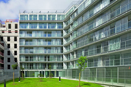
More than any other installation, this project left me thoughtful for days after my visit. It's physically not easy to take in during a visit to the Biennial; it's a longish video, 20+ minutes, all in French with subtitles, and an exhaustive technical and financial review of a 10-year-old proposal the group made to the French government. If you can get past the (mild) barriers to entry and take a little time with it, it's incredibly rewarding. You see a valuable example of some rare-in-the-wild behavior: architects being rigorous in collecting quantitative data and producing an analytical tactical response. Much architectural discussion revolves around new designs and construction, when in reality the overwhelming majority of architectural projects (80%+) contend with existing building stock: resource-inefficient, costly to maintain, aesthetically and programmatically outdated. This project shows one ultra-site-specific response to the nexus of issues; the specificity of this team’s solution to this project is simultaneously a window on the universality of their approach. The group makes it look simple, if not easy: they've reduced the entire conversation to a per/unit cost and the number of available social housing units. Their argument is, if you can find a way to reduce the per/unit cost while increasing the number of available units, you have a winning formula; and their approach of strategic renovation is pretty deeply compelling. This is made eminently clear in how the team talks about the process of defining the problem and finding a solution: rather than a simple recitation of the facts and long flashes of money shots, they've created a short film documenting residents' reactions to their spaces: how the people lived it in before, during, and after the renovation; what they thought got better, and what got worse. It's a clear-eyed look at this process - complex, with lots of shareholders and a lot of money at stake - and shows the results, not always perfect but ultimately with a net positive effect on both the community and the government's bottom line. It's a hope-giving case study of how urban renewal can get it quietly, profoundly right.
BONUS: THE Must-See of the Architecture Biennial.
Besler & Sons + ATLV, The Entire Situation
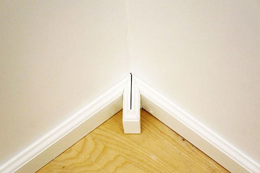
This installation is comprised of a large, wall-hung touch-sensitive flat screen and two full-sized wall section mockups. The screen is running a BIM (building information modeling) program that encourages viewers to draw shapes with their fingers and then calculates cut sheets and order lists that would be required to make it possible. The mockups are semi-enclosed, small, occupiable spaces, constructed out of drywall and metal studs and complete with traditional residential decorative mouldings.
This installation is Leonardo da Vinci’s dream of simplicity being the ultimate sophistication: the tools of the designer and the builder are put in front of us, and we are left to discover for ourselves where the pitfalls lie. The mockups are visually simple and conceptually rich: they demonstrate effortlessly the kinds of opportunities – and misfires – that can be found in the overlap of architectural design, construction, and BIM. It’s easy for an architectural designer to draw any set of lines suggesting space, and only slightly less easy to use a computer program to do the same thing. It’s significantly less easy to translate complex spatial ideas into something constructable, and hardest of all to translate designability and buildability back into a computer program that will then yield actionable information about construction efficiency and post-occupancy performance. The setup feels like a good-natured wink, a joke that comes at no one’s expense; it seems to say, “See? This is not as easy as we make it look!” The installation truly does depict the entire situation of architecture, from design to construction to review; it speaks with equal authority to everyone from the uninitiated to the most experienced hard hats; it relies on both reality and imagination, pragmatism and whimsy to make its point. In this author’s opinion, if you see nothing else at the Chicago Architecture, make sure you check out The Entire Situation.
This is the first article in the critical series on the Chicago Architecture Biennial. For the rest of the series, check out the following articles:
"Too Long; Didn't Read"
"The State of the Art of Sustainability"
"Hit Or Miss? A Review"
and a companion piece to the series, "The Definitive Visitor's Guide"
Architectstasy is a resource for the current, past, and projected built environments of Ann Arbor, SE Michigan, the U.S., and occasionally the world. Jessica A.S. Letaw and invited critics present critical readings of the city's trajectories that are situated within architectural discourse as well as news that is pertinent to residents and citizens.
2 Comments
This biennal should have been called "LIMP." Its amazing how far socialist agendas will get you--NOT. Most of these play off the strength of the existing architecture. Mostly they disappear altogether.
"What are you rebelling against?"
^what have you got?
Block this user
Are you sure you want to block this user and hide all related comments throughout the site?
Archinect
This is your first comment on Archinect. Your comment will be visible once approved.