
Oct '09 - Nov '09
Here is another example on my work with exploring the model as a design tool in the course "Alla Scoperta della manualità." This time the assignment was to work on an urban level, creating a model 50x50 cm representing a city and/or a landscape based on certain rules we set up by ourselves. As in the work with the etruscan tombs the goal was to explore the aspects of the physical model as a design tool.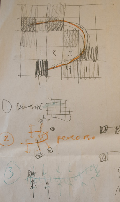
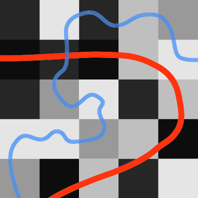 I chose to work with density, setting up a grid with different shades of black symbolizing different amount of tissue in each square. Then I thought of a river (blue in the image above) which would attract tissue, and a motor way (red) which would repell it. I quickly made a first verison of my "city", called "densicittà" without thinking too much. When studying the result questions started to arise. How were the borders between the squares to be dealt with? Should I also work with height or just on how much the tissue covered the surface?
 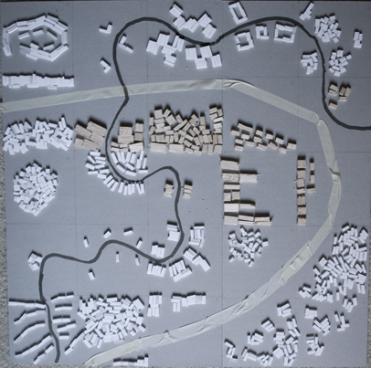 Thinking about these things, I modified my first verison and let the tissue swell and grow across the borders. Somehow though the whole system lost some of it's clearity and for the final version I tried to tidy things up a bit again. I also introduced some new materials.
  Suddenly there was some kind of fortress, thoughts of parts representing settlements in the mountains and other "towns" or "countries" (could it represent a region? A city? the whole world? etc.) beeing harbour cities or classical italian cities like Venice... Discovering my city through the camera lens was a pure joy...
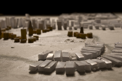 a medieval city in Holland?
 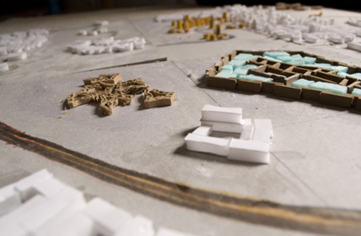 The highway passing a fortress?
  A dense city sprawling across the highway...
 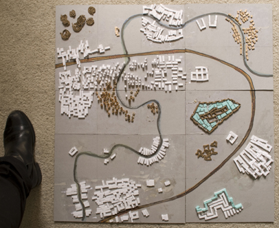 old town meeting the new town?
// What I would really like to take with me from this project is the feeling of working without beeing in control of things, letting something just grow and then have a look upon it trying to see what it could be... An interesting experience was also to change scale all the time, sometimes thinking of it as the whole world and sometimes like a single city...  What are the rules that decide how our cities grow today? How can we change them?
The strict but wonderful Professoressa Cianci wanted us to draw everything we saw, more or less. In the end of the course "Disegno e Rilievo" the students were asked to hand in 100 drawings size A4 or A5 +make 3 posters in A1 on the themes ancient, modern and contemporary architecture in Rome... View full entry
The most inspiring course during my year at Roma Tre was called "Alla scoperta della manualità" , where we learned about how to use physical models in the design process. These pictures give you an insigt in one of the projects, led by Bruna Cohan, a very skillful teacher. The theme I... View full entry
Light, efficient structures with the splendid prof. Rossi. Learning to think about shape and structure as something developing, evolving from simple rules. Talking about geometry, studying shapes of nature. Meditative work. Cardboard, sewing the pieces together. Light light light. shade shade shade View full entry