Pearl River, NY
In 1965, Edward Durell Stone was commissioned by A&P heir Huntington Hartford to design a Gallery of Modern Art on a prominent site on New York City's Columbus Circle. Forty years later, AlliedWorks of Portland, Oregon, led by architect Brad Cloepfil, was hired by a very different organization to revamp Stone's controversial but important building for the Museum of Arts and Design (MAD).
While Stone clad his building with creamy white marble panels, 2 Columbus Circle was better known for its signature of portholes and arcades. Writing in The New York Times, Ada Louise Huxtable called it "a die-cut Venetian palazzo on lollipops," jabbing at the ground floor's distinctive loggia. Though not an unequivocally admired image, preservationists (including the author Tom Wolfe) nonetheless fought to block any changes.
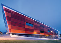
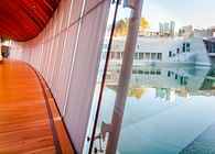
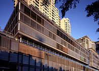
Taking this challenge to heart, Cloepfil preserved the sweep of its concave facade but updated it in a shimmering rainscreen of glazed terra-cotta tiles. That new iridescent cloak, produced by NBK Architectural Terracotta, a Hunter Douglas company, transports Stone's mass into the 21st century as much as the glass slit incised up and across the main facade. This time, The New York Times called the $90 million project "a transformation no one would have imagined."
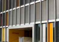
Cleopfil's main aim for the Museum of Arts and Design was to make Stone's original solid block less monolithic and more ephemeral, while retaining its grayish-white color. The 22,000 terracotta tiles, measuring a delicate 6 inches wide by 2.5 feet long, were fabricated in Germany then hand-glazed and fired in the Netherlands. NBK's customized skin, which BusinessWeek described as "light-catching," provides a ventilated and pressure-equalized enclosure that helps keep the building dry to reduce maintenance while also saving energy. At the ground floor, the rainscreen transitions into a sleek glass wrapping for the lollipop columns, memorializing Stone's masterwork.
While the renovation has been controversial and enjoys mixed reviews, Huxtable championed the changes.
The building's exterior walls were originally load-bearing, as Stone envisaged a decorated concrete city block with large openings at the top for the arcades and along each corners, for 1,000 porthole windows. In true Palladian style, the structure fills the lot line completely - and as it's on the traffic circle and crossed by Broadway, there's not a single right angle.
With a passion for subtle elegance and cutting-edge materials, Cloepfil chose to drop a terracotta scrim over the concrete and cut into the concrete as much as possible to let daylight inside. The most memorable cut is the 2-foot-wide strip of insulated glass, which traverses the building to outline the location of galleries within. The ribbon of light does more than bring controlled doses of sun into the galleries. It also reduces the ungainly scale of the original building mass.
Just as important, Cloepfil's client - formerly the American Craft Museum, and led by the director Holly Hotchner - saw the exterior changes as evidence of the museum's mission. The choice of the NBK terracotta tiles "speaks to who we are," Hotchner said, linking the cladding to the study of material and craft. Writing for Metropolis magazine, Peter Hall agreed: "We now have a museum dedicated to the tactile, lovable arts: throwing clay, blowing glass, firing glazes, weaving, and carving."
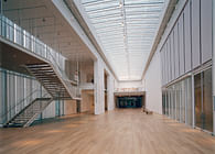
In addition to the decidedly modern exterior, the building was completely re-imagined on its 54,000-square-foot interior. The entrance lobby is bright and airy, with a hung staircase held aloft by steel cables. Elsewhere, the architects removed staircases and walls to add room and open up space. Several strategic cuts in the floorplates further opened up the interiors - yet taken together, all the modifications added 40% more usable space.
Glass walls, such as those enclosing the artist-in-residence studios, not only admit light and views, but also let visitors see craft in action. Reinforcing the experience is a series of interactive display screens that tell museum-goers what's happening where. They even show works from the Museum of Arts and Design's large collection.
Most important, "Cloepfil cleans up the convoluted circulation route through the building," wrote The New York Times critic Nicolai Ouroussoff, "and carves windows into the northeast and northwest corners of the gallery floors. The windows allow light into the galleries without sacrificing wall space, provide gorgeous views up Broadway and out over Central Park and allow the galleries to breathe, an effect that is a bit like loosening a corset."
Still, in a few places the design stays retstrained by the original. Just as with the famed "lollipop" columns outside, Cloepfil lets Edward Durell Stone's work speak for itself. The museum's 150-seat auditorium, for example, is restored to its bronze and blood-red glamour.
And glamour is, in part, what drove decisions about how to dress this important cultural landmark. For New York City, the sparkling finish of the NBK terracotta tiles seems precisely the right mix of Broadway's bright lights and Central Park's naturalism.
Learn more:
Status: Built
Location: New York, NY, US
Firm Role: Manufacturer
Additional Credits: Architect/Specifier: Allied Works Architecture
