Archinect
LAMBERT Architecture + Interiors

LAMBERT Architecture + Interiors

Winston-Salem, NC

anchor
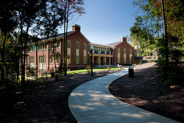
Nestled into a wooded site, the formal front of the Welcome Center faces the main entrance road to the University.
8 more images  ↓

Wake Forest University Welcome Center

Wake Forest University's Admissions Offices, formerly located in Starling Hall, doubled the number of applications received within the past ten years, quickly outgrowing its available space. With applications on the rise and enrollment increasing, LAMBERT Architecture + Interiors was charged with "revere and revise" upon creating a new Welcome Center to accommodate growth. This facility was to revere the Georgian Revival style of the campus, while taking advantage of modern materials and respecting the environment. A great amount of attention was paid to the first impression students and parents would get upon arrival, including the entry sequence and feeling provided in the public areas. The building primarily serves the Office of Admissions, which holds information sessions year-round to prospective students and their families, and conducts interviews and leads tours as part of the application process. For these visitor functions, an auditorium and large meeting room are included, along with interview rooms, waiting areas and visitor support spaces. The building received LEED Gold Certification, reflecting WFU's commitment to its environmental impact.

 
Read more

Status: Built
Location: Winston-Salem, NC, US
Firm Role: Architect of Record
 
The Welcome Center traverses three level changes in site elevation.
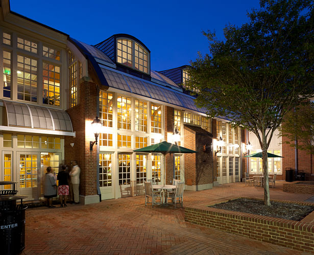
The back of the Welcome Center showcases a glass conservatory with a Kalwall roof.
The illuminated conservatory glows like a lantern at night and opens to the exterior courtyard, allowing the two to be jointly used for social events.
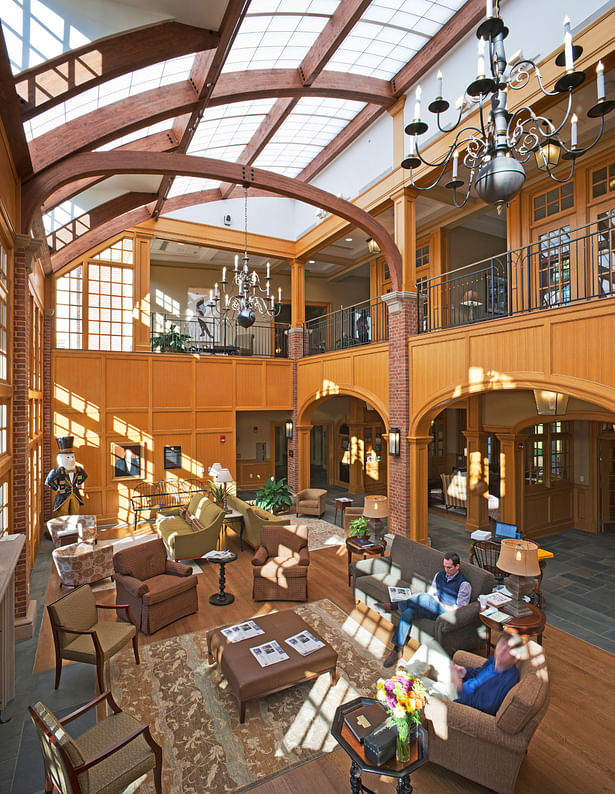
Rift-sawn white oak paneling similar to other campus buildings was used to define spaces while still giving an open feeling throughout. Historic light fixtures previously removed from other campus buildings were restored and relamped with energy efficient LED bulbs.
The building configuration allowed for introduction of natural light on three sides of the tiered auditorium. As in the opposite wing, painted millwork using classical detailing defines the space.
A columned gallery organizes space on the Main and 2nd levels.
Workspace within the center supports Wake's traditional design.
Wood paneling and trim in the wings of the building are painted to distinguish these spaces from the central block. In this large meeting room historic light fixtures were restored and reused.